In Design, we worked mostly relating to our product design project and later moving onto our movie poster that was related with our worldbuilding project. Before we start any huge project such as this one, we create a moodboard in order to get some sort of idea and details we wanted to add. This included the colour scheme, different methods or techniques we wanted to use and also any inspo we used in order to brainstorm. Below are some of the different moodboards and then the final products that were made for this Unit. The first two are related to the product design and the last one is related to our movie poster and worldbuilding project.

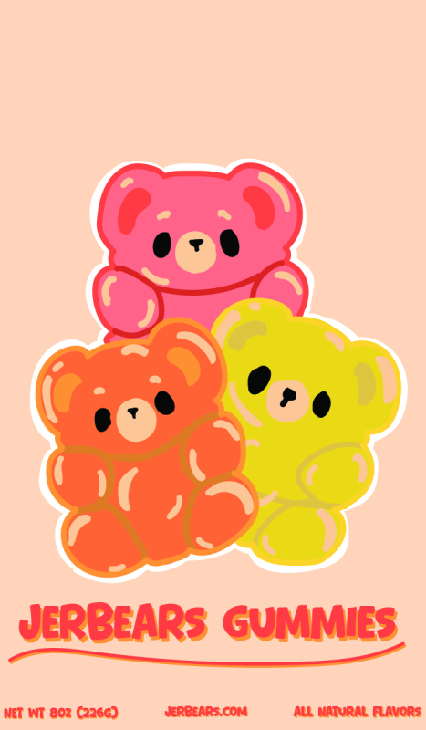
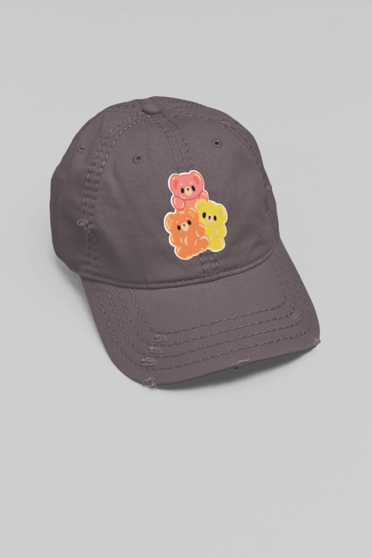
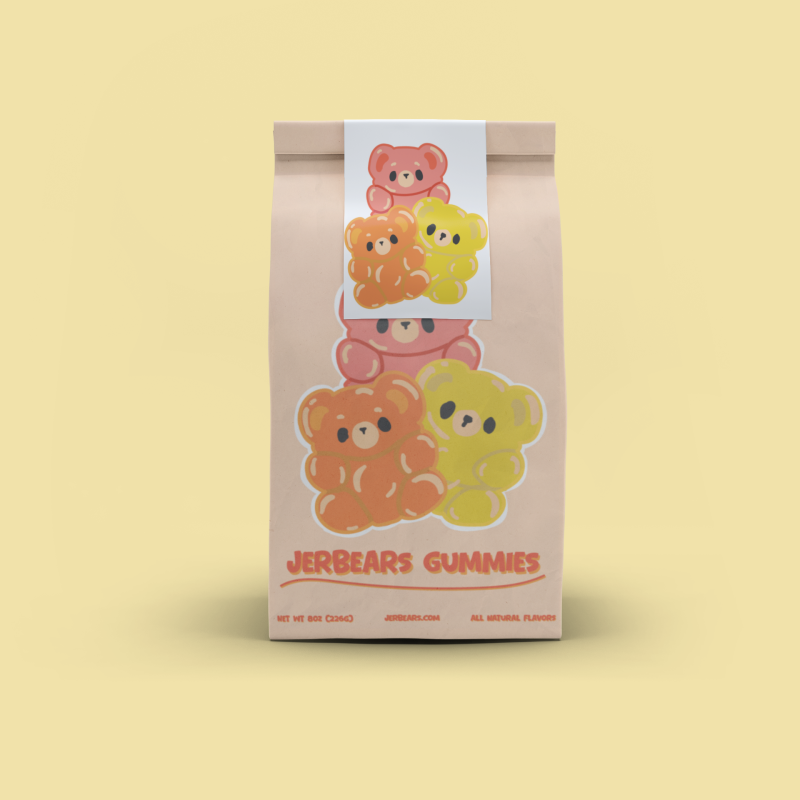
For my product label, I wanted to make a company that sold gummy bears. First of these steps of creating said product label was figuring out my audience and what kind of appeal I wanted for my product. I decided to go for the colorful look because I wanted the product to appeal as much as possible to young children as they would be the main consumer of the product. However I also had to make sure it also appealed to parents who would be then buying the product for their children. This then led me to picking what kind of packaging and phrasing I wanted for my product. I decided to appeal to the parents by making the label and packaging to have healthy benefits and comparing it to other leading brands.
After finishing all of the brainstorm and creating taglines, I then went into Adobe Illustrator to start creating what the product label would look like. I wanted to use the bright colorful colors so I went with an assortment of yellows, oranges and red to make the label really pop. I then decided on my label to include some gummy bears so I added three gummy bears to the packaging in the signature three colors of yellow, orange and red. I then went with a very neutral color for the background of the packaging to make sure it didn’t take attention away from the center focus. Then I created the text and tagline where I used a very fitting font “Bear Days” and decided to make it double layered meaning that it would be created with a shadow giving that 3D look to it. Overall, the product label came out very well and I’m really proud of how the entire thing came together with the text, the branding logo and also the color scheme of the entire packaging.