Intro
In Design, we used Photoshop and Illustrator to Learned typography and how to create out own font, Created a movie poster based on a fictional self-developed story, Created a marketing/branding package, Learned macro photography, and Created a print ad for our Package Design.
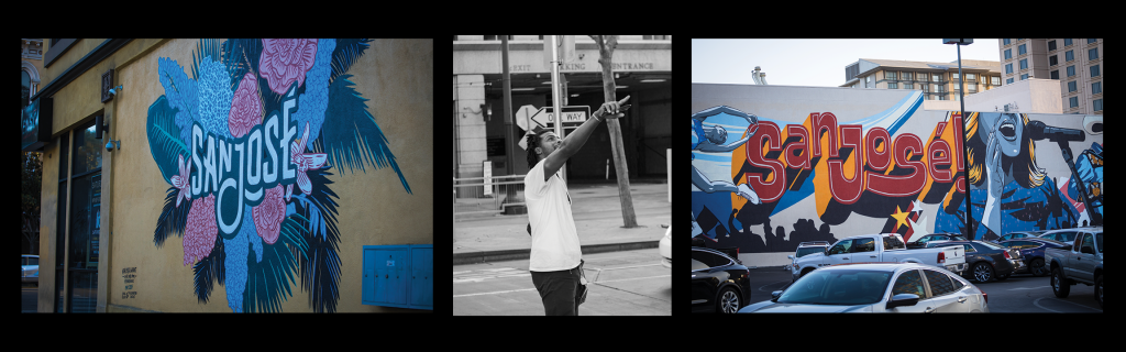
Citizen Diptych
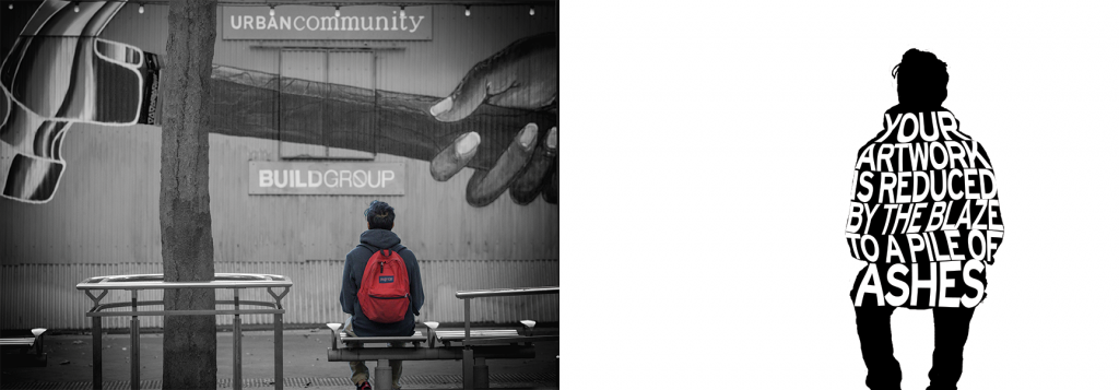
My lyrical essay, entitled “Flaming Art” represents the experiences of someone who loves art but their parents think it is a waste of time. This causes lots of self-doubt and self-hatred towards his art causing him to destroy all of his artwork from his college years.
I chose this photo because the main focus of my writing piece is the relationship between the artist and his artwork. I knew that I wanted some form of art in my photo when I was brainstorming the project. I decided to use street art to represent my subject’s art. I went around downtown San Jose taking photos of people in front of murals. Out of the hundreds of photos I took, I settled on this one because it really looks like the subject is thinking about the art.
First, in Abobe Camera Raw I edited the photo like a normal photo (correcting color and exposure). Then in Photoshop, I applied a black and white layer to the entire photo. Then I added a vignette to the photo with a solid fill and layer mask. I selected the subject and masked out a color version and placed it on top of the black and white version of the photo. I chose a sans serif font because if a serif font and warped it the readability would have decreased drastically. To warp the text I covered it to a shape and used the warp tool to distort the text.
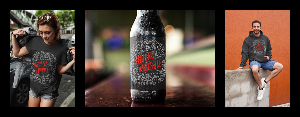
Product Triptych
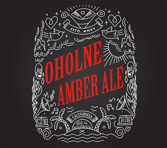
My inspiration for my label was a T-shirt from the Cal Poly Newman Center. The T-shirt had a very similar style to my label; purposely hand-drawn white doodles. I chose to do a monochromatic color scheme because I wanted it to be very simple. The choice of red was so the label would be very eye-catching if you were to see it on a shelf. The font I chose for my title was a fairly heavy serif font. Serif fonts have better readability and are associated with older design styles. The juxtaposition of the contemporary artwork and older font provided an intrigue to the design. For my sub fonts, it was my handwriting stylized to match the illustrations. I think this was the best choice because it adds more continuity to the design.
My original concept for the label was all of the information inside the silhouette of an animal. I struggled to find a way to make all of the information in the label fit and look cohesive. After many hours of trying different arrangements, I abandoned this design realizing that there were no arrangements of the type would provide a balanced design. I moved on to my current design concept. This concept made a lot more sense and I was able to make the design with a lot less frustration. I’m not content with the name of my beer so putting more time into thinking of a better name would have been beneficial. When I originally designed my concepts I started with the name and designed around it. When I restarted with my new concept I designed first without the name. I had to choose a name that somewhat related to my design because of this the name and design don’t have complete unity. I should have started with the name and designed around that.
Throughout the many revisions of this project, I learned a lot about the actual design process. I learned that not every idea turns out, sometimes you have to abandon a design and come back to the drawing board. I chose a T-shirt and hoodie for my triptych because they are very marketable products. I could have chosen a bag or cup but I felt that the clothing would market the brand better.
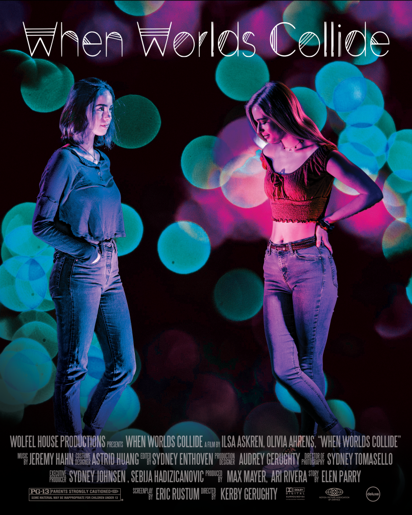
Movie Poster
When an alien spacecraft crash-landed in her small town. A fierce battle erupted as humans fought for control over their new rivals. 15 years later, the Galatians have been acclimated to life on Earth, but they are interned in a heavily-guarded camp known as the carcerem to keep them separate from humans. Now, for the first time, a group of gelation teens will enroll in a suburban human high school, with the goal of testing the feasibility of human/alien integration. When the teens integrate two of them have an instant connection and a romeo and Juliet love story of the future breaks out. To create this piece I first started by setting up photo studio with colored lights to emulate a more futuristic color scheme. Then I took photos of my models with my Canon EOS R at F/4, 1/100, ISO 600. I edited them in LightRoom for a more desaturated look. Then in PhotoShop I masked out the two subjects and brought them into a new document. I resized the subjects and added Bokeh balls to the background. Finally I added the credit block and title.
For this piece I was emulating the Photographer Brandon Wolfel. Brandon Wolfel was born on August 17, 1994, he currently lives in New York, and is a contemporary artist. I’ve always been drawn to brandons style because there’s nothing even remotely similar to it in the photography space right now. His use of neon and darkness has always intrigued me, because of this I decided to try and emulate his style.
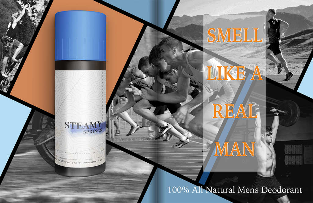
Product Ad