Welcome to my best works that I have created throughout my time at Freestyle Academy! Below you will find the images and their descriptions/artist statements.
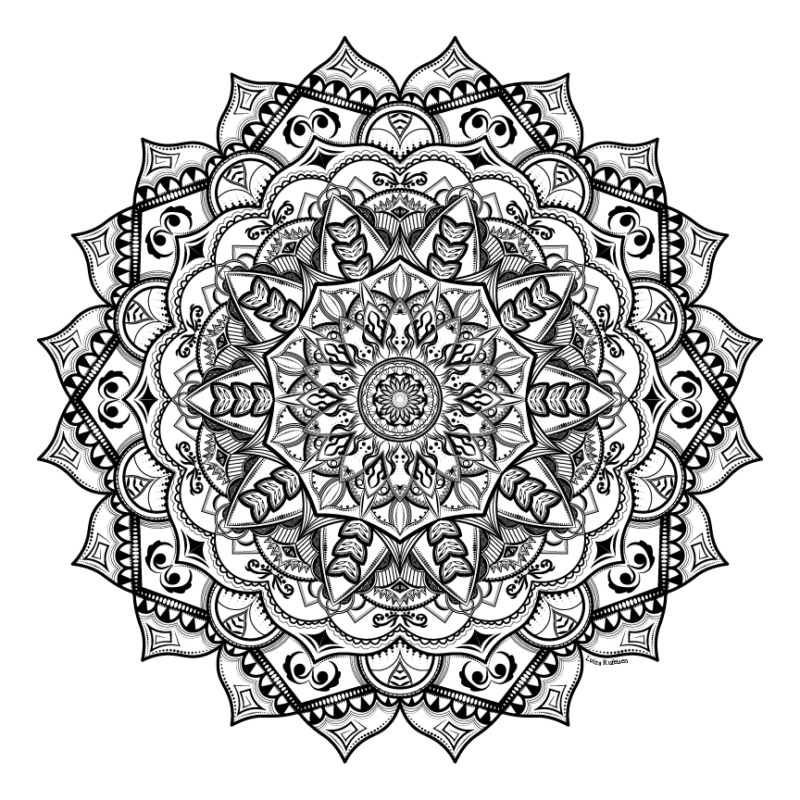
Mandala
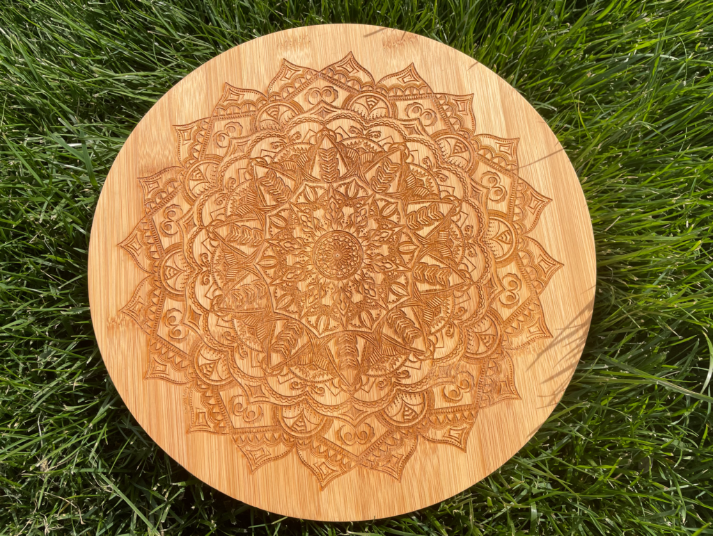
For the laser engraving of the mandala assignment, the last part, I chose to engrave my design onto a bamboo wood plank. I wanted to choose something with lighter wood that would reflect the feel of the design well.
For the laser engraving of the mandala assignment, the last part, I chose to engrave my design onto a bamboo wood plank. I wanted to choose something with lighter wood that would reflect the feel of the design well.
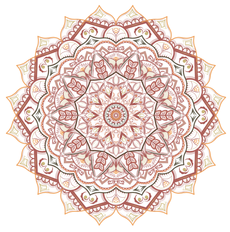
For the colored version of my mandala I wanted to include warm colors that appear in nature. I used variations of sage, rose, peach, mint and tangerine.
I shot a picture of my mandala keeping in mind the rule of thirds and leaving negative space for text. I brought out the curves in the piece in order to show detail. I also exposed the background to create higher contrast that would emphasize the mandala as well as the text.
I shot a picture of my mandala keeping in mind the rule of thirds and leaving negative space for text. I brought out the curves in the piece in order to show detail. I also exposed the background to create higher contrast that would emphasize the mandala as well as the text.
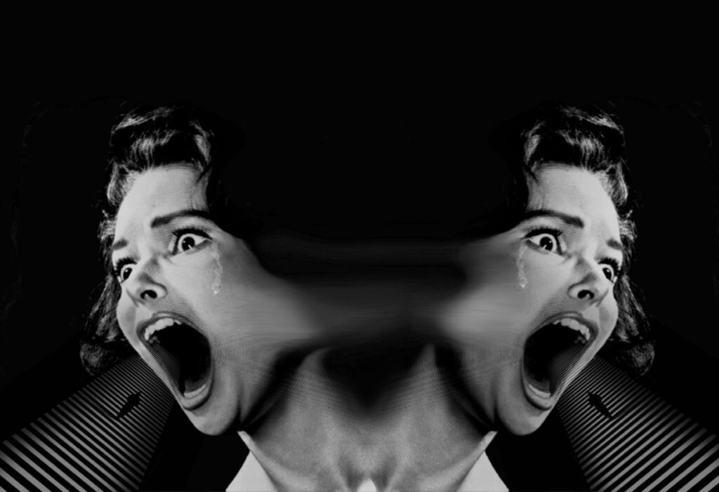
Narrative movie poster

My narrative story is entitled “Altered Realities.” The story follows a man named Alexander Muller, a man used to getting everything he could ever want, except a perfect family. His dad was arrested when Mueller was very young for commiting tax fraud, Muller forever resents his dad for climbing the corporate ladder the “dirty” way. This drives Muller’s passion for money and success by working hard the “clean” way. However, Muller is determined to do anything to reach the top, even if it means pushing people out of the way to get what he wants. Muller has a warped view of women since the only female figure in his life is his mother, who has been constantly sick with breast cancer ever since Muller was 5 years old. This causes Muller to view women as weak and helpless, a view that he carries with him throughout his life. He is married to Mia Muller, a perfect cookie cutter wife with a secret passion for art. She suppresses her passions in order to be a good wife to Muller. Muller finds his life turned upside down one day when all the women in his life begin acting like men. They make sexist remarks toward him, degrade him, devalue his work, and run the company he works at. He must learn to navigate life where he no longer obtains this power.
For my poster, I wanted it to be eye-catching and bright, so I chose a bright red background in an abstract style, utilizing Adobe Illustrator and Adobe Photoshop. I was inspired by Saul Bass, and his conceptual, abstract, and sketch heavy art. I chose to use a high heel and make it take up a lot of space to show how in the story, women hold the power. I then used the negative space of the red background to create a man that represented Alexander Muller, the protagonist of the story. To make the piece look more textured, I added in a wrinkled paper and overlaid it on top of my art. I had some challenges with this piece, as Saul Bass’s style is difficult to emulate. I wanted to make it look professional while still making it look fun. I am pretty content with this piece, next time I would add more texture and add in some scribble art to add to the sketch-feel.
PSA

In this PSA, the Statue of Liberty is depicted three times in the foreground of the piece, using red, blue, and gray, to represent the American flag. The top of the piece says “Hot Girls Vote.” The background is textured to represent the paper ballots. This piece is a satirical piece about the importance of voting. My PSA is about the younger generations’ voting absence, incorporating the younger generations’ humor. I added a commonly used phrase and replaced the ending with “Vote.”
Making this piece in Adobe Illustrator posed some challenges. I wanted to make it feel organic which called for precise use of the pen tool. I utilized the rule of threes in this piece to make it more interesting by balancing negative and positive space, while putting emphasis on the tagline. I also wanted to incorporate the use of contrast not only with color but with various uses of texture to emulate a voting ballet. Overall this piece is successful and portrays the message I wanted.
Multi-Layered Project
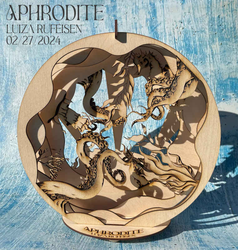
For this piece I was inspired my world building project entitled “Altered Realities.” I wanted to display the world of my story in a new light by portraying each character as a different sea creature that represented their personality. I chose the layered rings because I wanted my art to be in a circular form, emphasizing the middle. I chose to have each layer include a wavy background so I could make the outside look like different layers of the ocean. It was so exciting to see how the laser analyzed the illustrator document. I got to watch it transform my digital art into physical art and it was like magic. This project was difficult, because I had to keep each layer very organized or the laser would not be able to read it correctly. It was also time consuming because I tried to incorporate as much detail as I could. From this project I learned to organize my layers before I start working, and make sure to include dimension through different stroke widths.
Custom coffee brand

This piece is one that I worked very hard on, and I am proud of the outcome. This piece was an assignment for my design class; we were instructed to create a logo using Adobe Illustrator, then design a label for the logo, and then find three mockups to display our logo. As a Brazilian who drinks coffee every morning, I had to make a custom brand. I aimed to make a design different from the others I have previously made and challenge myself to use new design elements, colors, and shapes. I settled on making a retro-style logo utilizing a vintage font. For my main graphic, I wanted to make a whimsical coffee cup with cartoon-like features, and I ended up modifying the coffee cup’s appearance until I was happy with the result. I wanted to show the versatility of the logo by editing it on a mug, a sweatshirt, and a coffee bag. From this piece, I learned how to work hard and revise until I create an outcome I am happy with.
Blending and editing on photoshop- surreal composition
I used different layers and royalty free photography to layer and create a surreal composition.