

custom brand logo
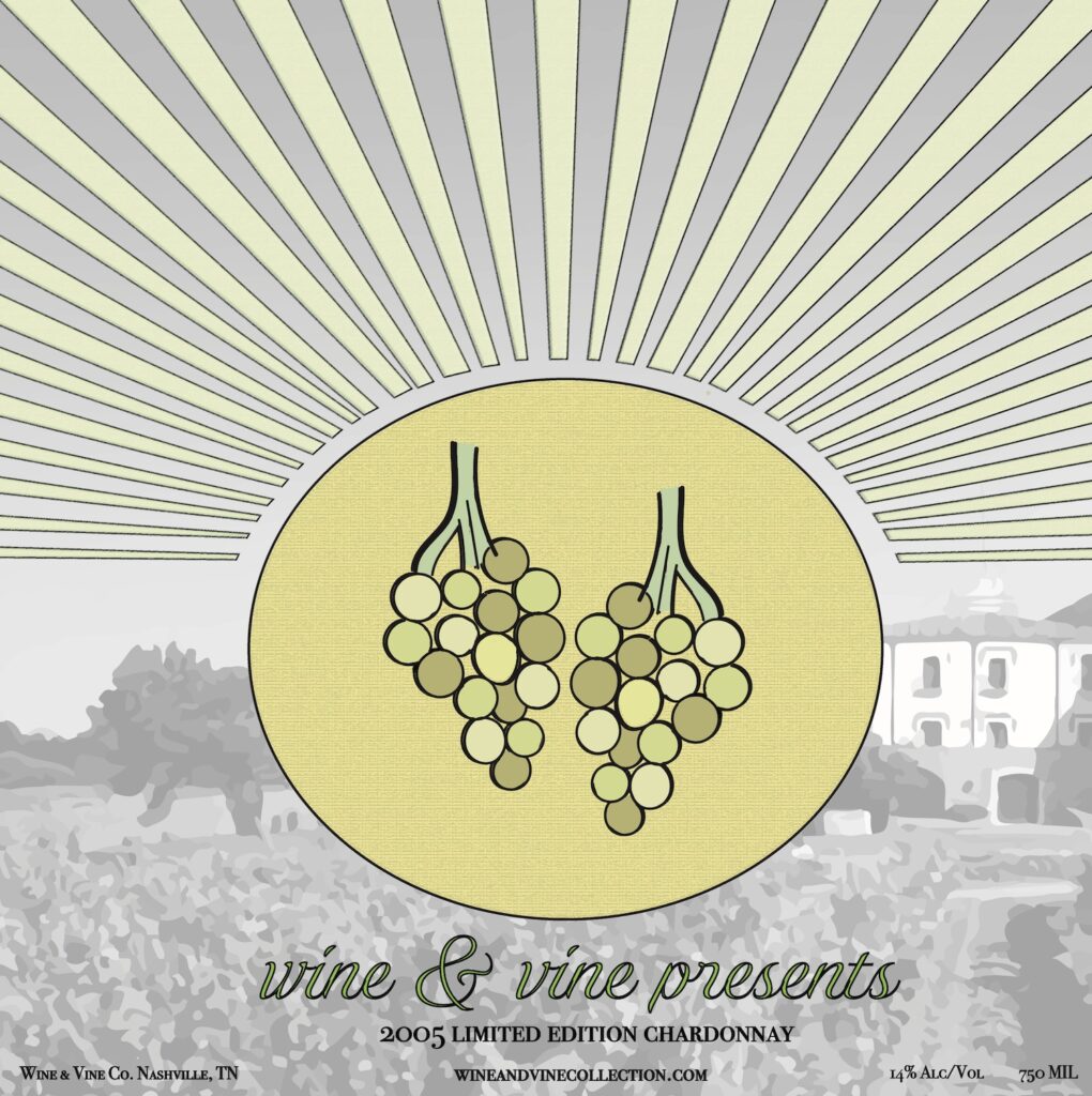
I used Adobe Illustrator to design an appealing logo for a fictitious company. In approaching this project, it was important to keep my target audience in mind, based on the product that I chose to market. I ended up designing a logo for a luxurious wine company selling Chardonnay, titled Wine & Vine. It’s target audience consisted of elite middle aged women, which also influenced my decision to use a pastel-inspired color palette of soft colors. As I created my logo, it was important to keep the design both simple and captivating. After executing several different ideas, I ended up placing a single bunch grapes, containing various shades of yellow and green, at the center of a golden sun with elongated, vibrant rays. I then experimented with placing my logo on the product, a bottle of wine, by creating three photo mockups as well as a short video.

magazine advertisement
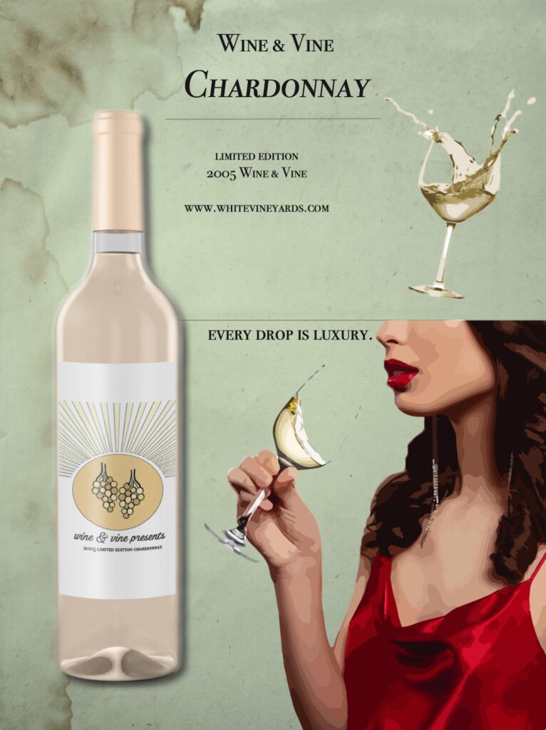
After designing my logo, I created a magazine advertisement for the product itself (Wine & Vine’s Chardonnay), which includes the product logo, a slogan, and other eye-catching elements that cater to my target audience. I maintained a vintage and elegant look as I incorporated an old paper texture and model wearing a bold red, atop softer shades of green and yellow associated with the wine. These variations in color, texture and size draw attention to the women drinking W&V Chardonnay, which ideally makes viewers want to pertain with such boldness and elegancy.
book jacket & movie poster

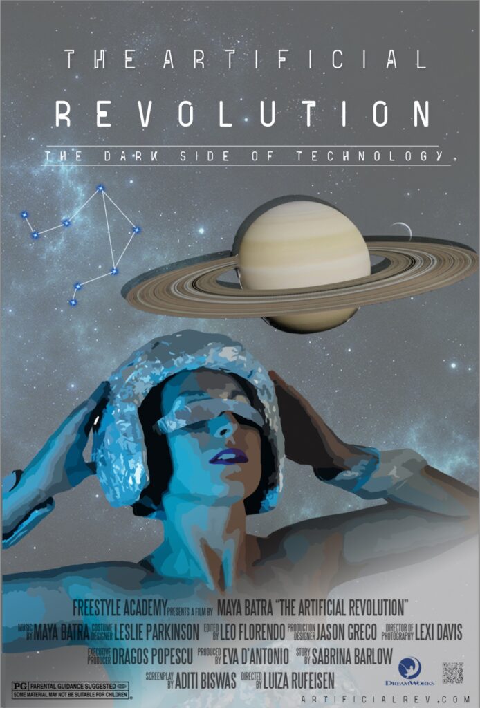
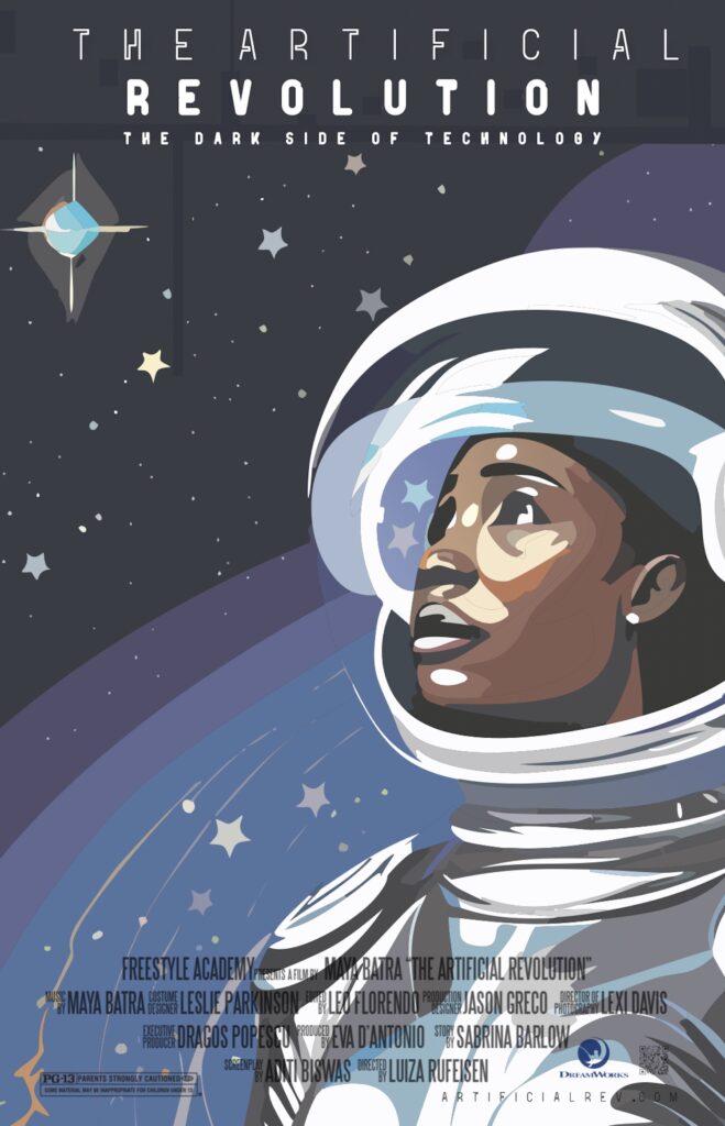
To compliment the narrative that I brought to life in my English world building project, titled The Artificial Revolution, I designed a book jacket and movie poster for a hypothetical book and movie that follow this storyline. I used Adobe InDesign for the layout of my book jacket, including separators for the front, back, spine, back flap, and front flap. I designed individual elements, such as background patterns, objects, and visual effects in Adobe Illustrator and Photoshop. My final book jacket conveys the themes of space and technology, containing numerous shades of blue and grey. The tech-infused glove reaching out to the brain represents the dangerous hold technology has on users, and circuit board pattern represents the takeover of increasingly advanced computers. Maintaining cohesion, my movie poster displays similar themes and colors, and a women blind to the needs of today due to her fixed gaze on a technology consumed future. I wanted my movie poster specifically to capture a merge of both realistic and illustrated visuals, inspired by the works of painter Aliza Razell. I then, ironically, experimented with the AI tool of Adobe Photoshop to recreate my movie poster design as an illustration. I then made slight adjustments my favorite result, which is displayed below.
watercolor name
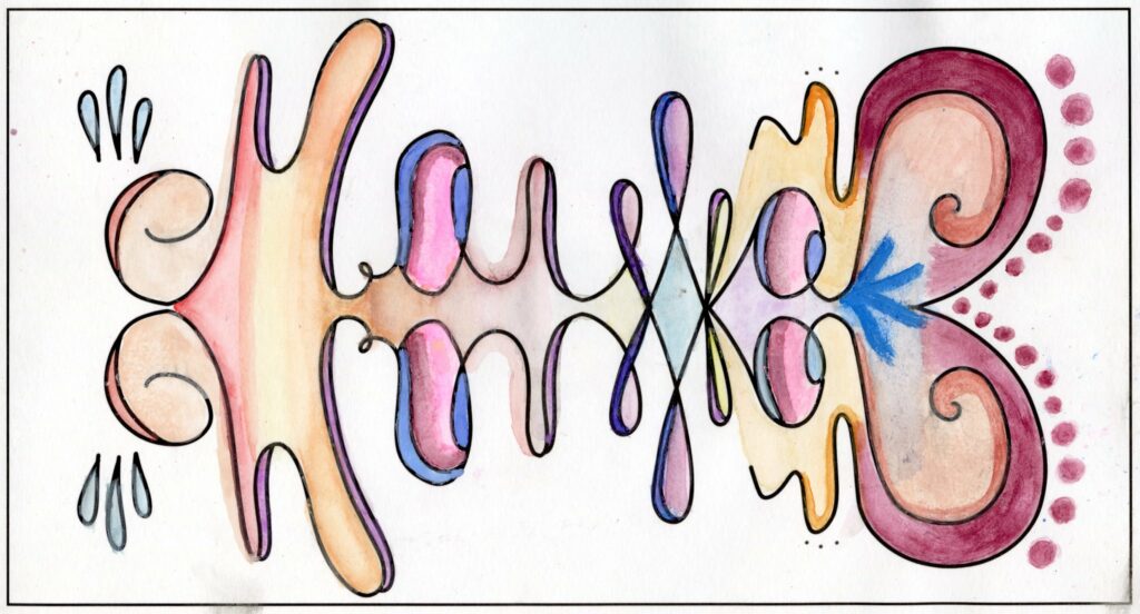
The watercolor name project is one of the first non-digital art projects that I completed in design. I began by using the symmetry tool in Adobe Photoshop to creativity pen my name, incorporating unique shapes and symbols, which was reflected across itself horizontally. I wanted the final pen marks to appear as a fish shape when viewed vertically. I then used a variety of water colors to fill in the individual shapes and symbols on watercolor paper, including spring-inspired shades of pink, orange, yellow, and light blue.