Intro Note
Hello! My name is Samantha Levy. I’m a Design student at Freestyle Academy. During my first year at Freestyle I was an Animation student, but over the last year I have created many unique design pieces here at Freestyle. In my own free time I have painted custom designs on shoes, created small figures out of polymer clay, experimented with different plastic based mediums, and more.
For my Senior Showcase, I am sharing a part of my larger Senior Zenith project as well as three collages I made earlier in the year. My entire Zenith project consisted of creating an online store and making the products to sell. I designed packaging, business cards, pins, and stickers. I created other physical products too, but I created most of those outside of class. In my Showcase, I would like to emphasize my design process for my pins and stickers. I didn’t use any templates for my stickers and pins, I designed every part them since the projects they were created for were so open ended. The collages I am showing are the exact opposite; indeed, the collage project had very strict guidelines. I struggled to create an end product I was happy with while meeting the other strict criteria of the physical collage project. The digital collage had almost the opposite problem where we could use any images off the Internet we wanted and create a theme. In the end, it was an interesting experience to compare the end products of projects with such different creative restraints.
When critiquing my work, please note colors and compositions and how they help the piece or could be improved. One of the main areas I struggle with in my personal graphic design work is marketability. I find myself aware of the flaws of the design and potential lack of visual appeal, but I tend to justify my strange design choices nonetheless. Any ideas about how to keep important core elements of my designs while improving marketability would be greatly appreciated.
Next year I will attend MICA. I plan to major in Illustration and minor in Graphic Design. After school, I hope to work in an artistic design firm or other collective of artists.
You can reach me at SamanthaL@freestyleacademy.rocks (before June 7)
Work

These images are a visual record of my process I undertook from the initial sketches to the final product of my original pins and stickers. I started with basic sketches so that I had a consistent style throughout the products. Before sketching the product designs I had already created the four charters that would be featured in the products. Those preexisting charter designs were the basis for the colors used when creating the products. I created the digital artwork in Illustrator since I knew I would want to scale the images and I didn’t want the quality to degrade when I used the images in many different ways. I then used Photoshop to mockup the products. I submitted the middle two images in my college application portfolio. I ordered one of each button design from an online site and printed my sticker designs on Office Depot sticker paper and cut the stickers out by hand. For my Zenith project I ordered more buttons from the same site and tried to use a Cricut machine to die cut my stickers. After dozens of attempts and days of trouble shooting I successfully die cut two sticker sheets. I cut the rest of the sticker prints I had by hand since I couldn’t replicate the successful results with the machine. I learned that I would need to revise the sticker design if I wanted to be able to die cut the stickers, but I was frustrated with the machine and I felt that I didn’t have enough time to redesign the sticker layout before Zenith ended. The packaging uses the same colors as are in the sticker set and are overlapping circles to mimic the circular shape of the pins. After looking at example packaging of stickers and pins online I decided on the minimalist packaging of plastic baggies and cardstock labels stapled on, but I wish the final result looked more professional.

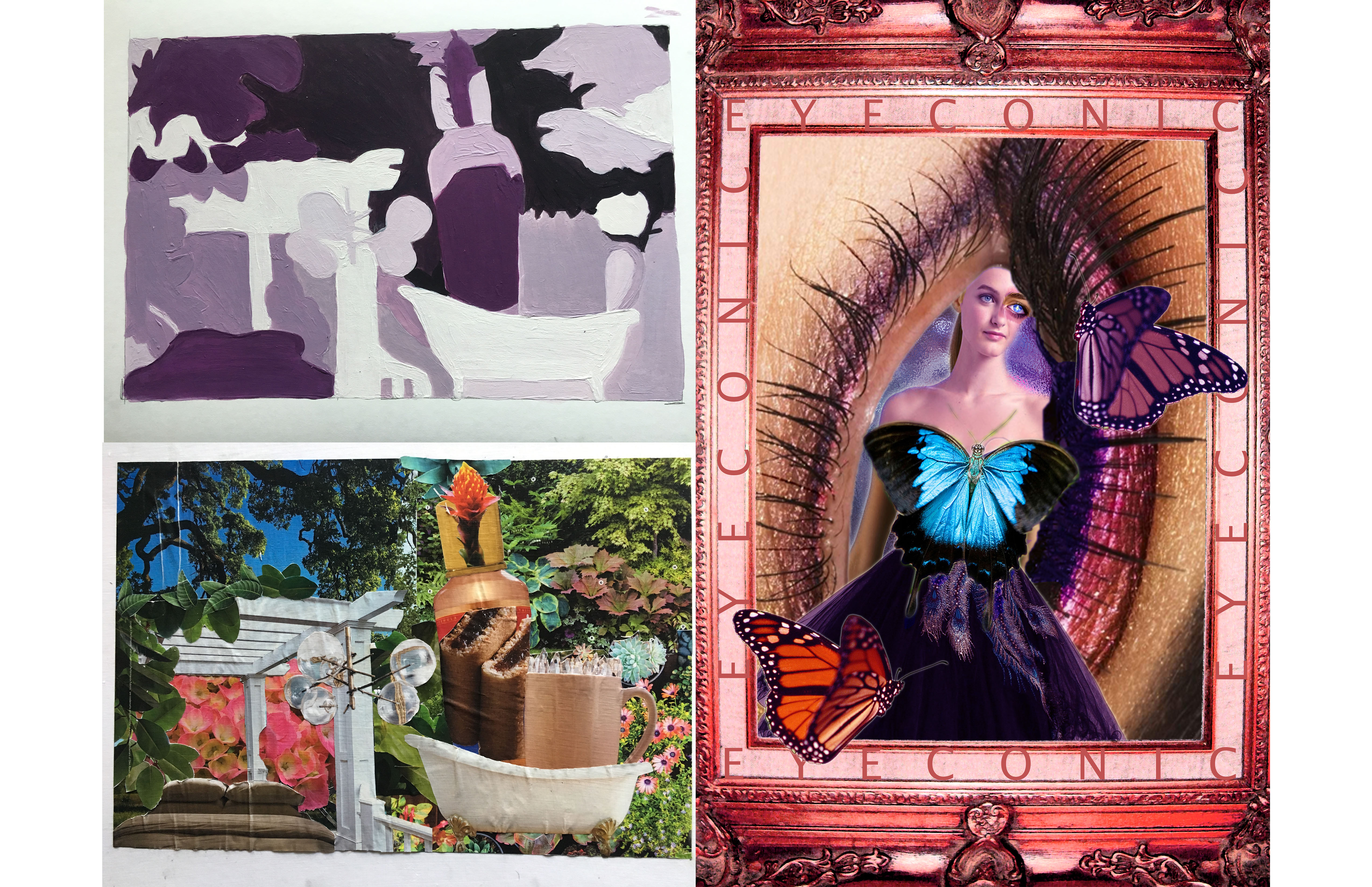
The first collage I created is the bottom left image with lots of plants. All the images were hand cut out of magazines and assembled without a plan. We weren’t allowed to sketch our design ahead of time. We were instructed to just collect images as we went. When assembling the collage we weren’t allowed to have edges of images showing. The purple top left image is a exercise in values. We made black and white copies of the collage and blocked in general shapes and painting the shapes in monotone so that only the values of the shapes were shown. The third collage, which is what I would like the critique to focus on, was created with the most freedom. We could use any images we found online all we needed to have were one word and a cohesive color scheme. The collage I ended up creating utilized traditionally female images to call into question how traditional female symbols can limit female expression. The butterflies, representing the female spirt, that could fly free are stuck to the fancy dress and makeup. The woman herself looks melancholy and is boxed in by an ornate pink frame and labels, even labels that sound supportive. The motif of eyes are a type of pun on the phrase “eyes are the window to the soul.” The eyes are all empty, covered, or altered showing how traditional female symbols can hide true female hopes and ambitions.