Who am I?
In this unit, we were challenged to explore our inner selves and discover what we hold close to us and what we hold pride in. In each class, we were challenged in different ways in finding ways we can explore ourselves. In English, we were given the opportunity to write essays about our close experiences, emotions, untold stories, and whatever we believed should be put on paper for everyone to see. In Digital Media, we were handed digital software to help create mandalas full of our inner personality and our true passions, which were then brought to life by having them engraved onto materials such as wooden planks, metal plates, etc. In Design, we were challenged to create a PSA and advertisement logos from our own preferences and choices. I discovered more about myself during this unit. I learned about my true passion for nature and the beauty of it, but I also learned about how important I prioritized mental health and how everyone should consider themselves.
Mandala Drawing
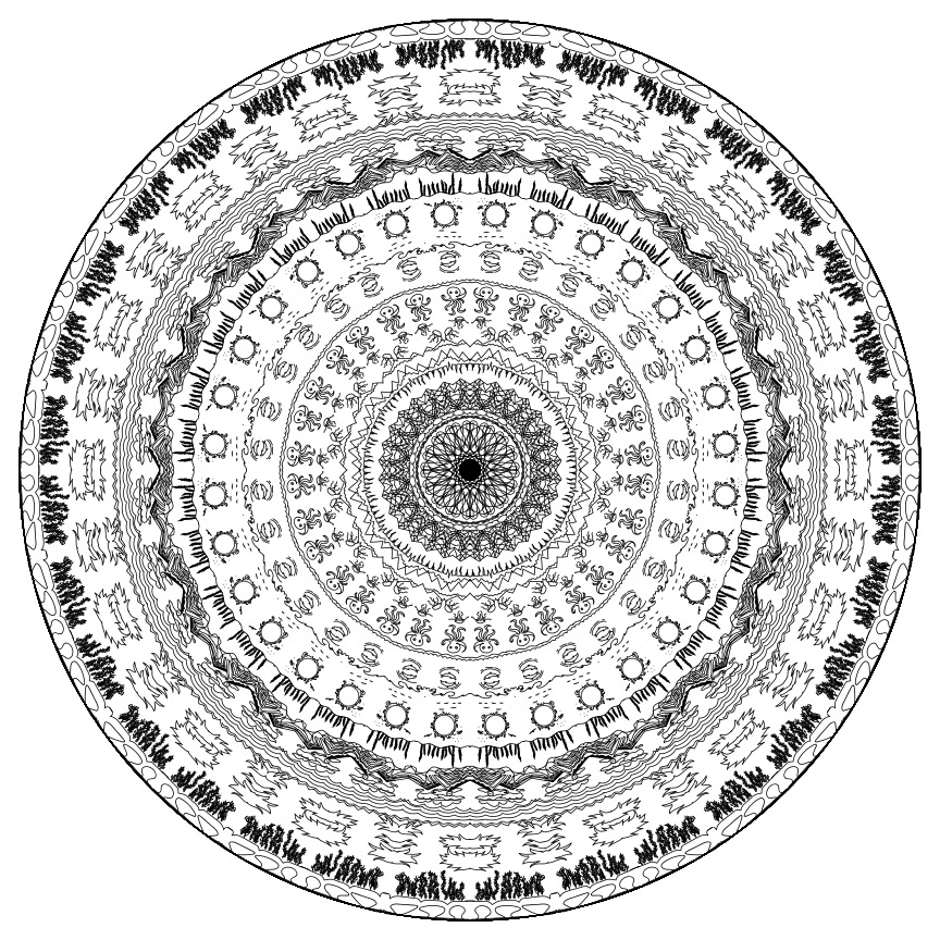
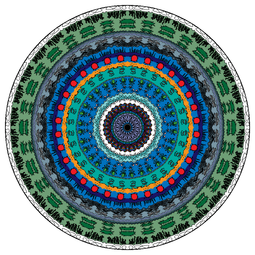
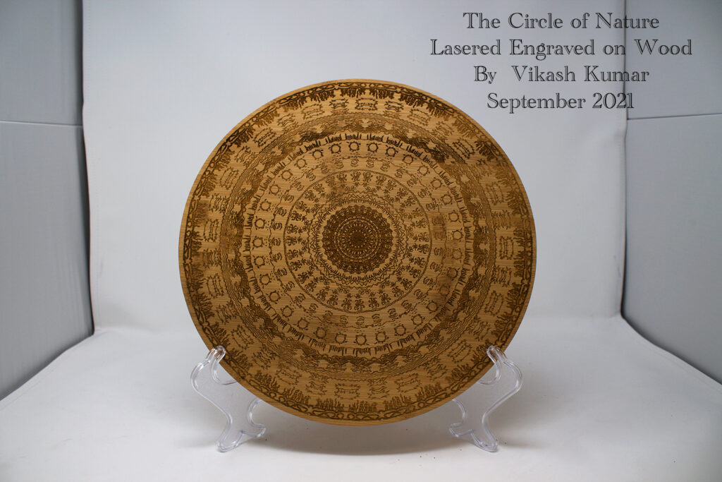
In the Mandala unit, we were tasked with drawing a mirrored drawing on Adobe Illustrator comprised of whatever design we chose. In this mandala, I created a nature-like image full of different types of nature such as jungle vines, the ocean, birds, mountains, and dolphins.
Mandala Build Reveal Video
Artist Statement
For my mandala project, I decided to create a product that revolved around all aspects of nature. Ranging from jungle leaves, pine trees, mountain ranges, and oceans. This included all aspects of different biomes in nature. I specifically designed it like this as I am fond of nature and the outdoors and wanted to show my appreciation for this natural beauty by drawing all aspects of it
Photoshop Art
During the Photoshop production unit of Digital Media, we were tasked with creating various styles of images such as pastel and watercolor paintings on Adobe Photoshop. Using filters, various brushes, and styles, we were able to create unique paintings that were different from each person.
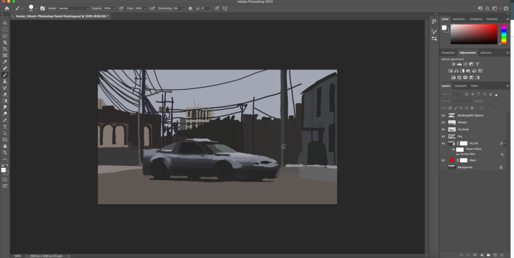
Artist Statement
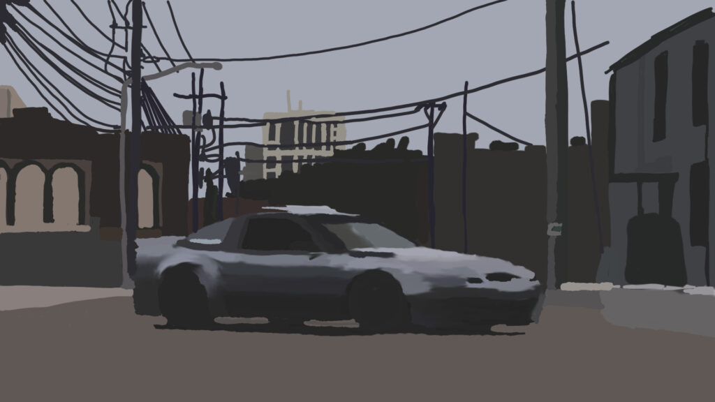
For my Pastel Painting project, I decided to paint a picture of a Nissan 240SX in front of city background. Painting in Adobe Photoshop was an overall great experience as it was easy to create a detailed painting. Compared to Adobe Illustrator, Adobe Photoshop has a more simple interface that makes it easy to navigate to find tools to help me in creating my photoshop painting. Overall, Adobe Photoshop is a great software to use for painting as I valued its simple layout while offering a variety of tools to use for pastel painting. The eyedropper tool was the most useful tool that I came across during this project as it gave me access to thousands of colors to help make my pastel painting more detailed and aesthetically pleasing. Painting in Adobe Photoshop has helped me grow as a digital artist as I learned new techniques and discovered new tools within the software as I progressed. After finishing this project, I grew as a digital artist as I can now apply more techniques to my future paintings.
Watercolor Painting
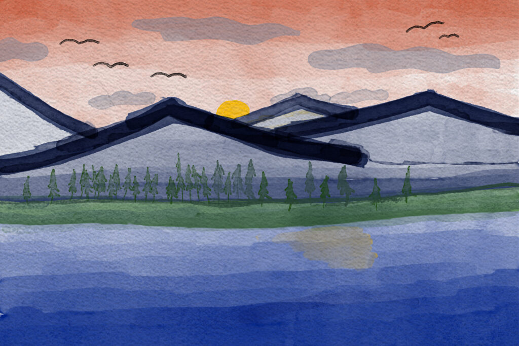
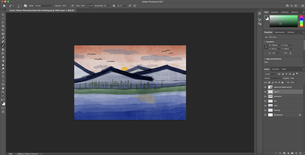
Artist Statement
In my watercolor painting, I painted a mountain range in front of a lake during sunset. The story behind this painting reflects my love for the outdoors and the vibrant colors that emerge during sunset. I painted the sky pink and painted the sun to be a golden yellow to give the impression that it is sunset. Nature is often my inspiration in every aspect of my life. Whether it is to find something to paint or even to find the motivation to do something. Nature has a way to evoke certain emotions with its natural beauty and scenery. A lot of my fondest memories were in nature, whether it was camping in the meadows of Truckee, hiking in the mountains of Saratoga, rock climbing in Yosemite, or swimming in the clear lakes of Tahoe. Creating this watercolor painting in Adobe Photoshop has made me value the process of painting, and the meditative state it brings you into while doing it. You lose track of time as you carefully paint each stroke and plan the next one. The color palettes helped bring a realistic sunset scenery.
Photoshop Composites
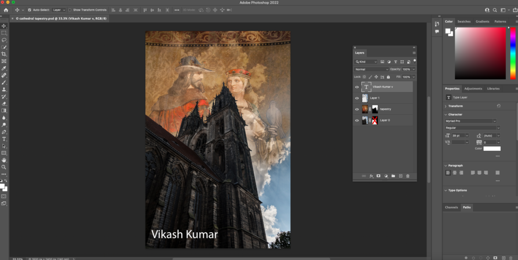
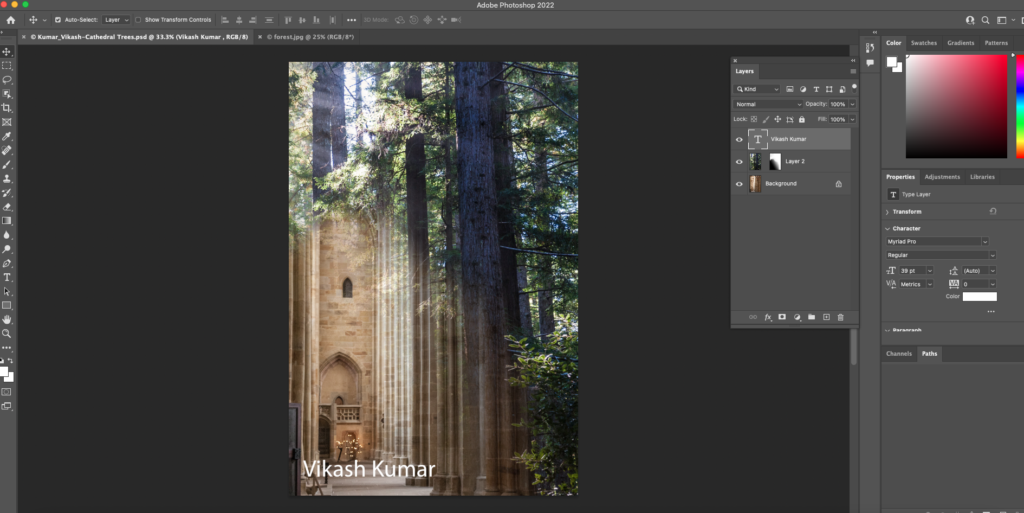
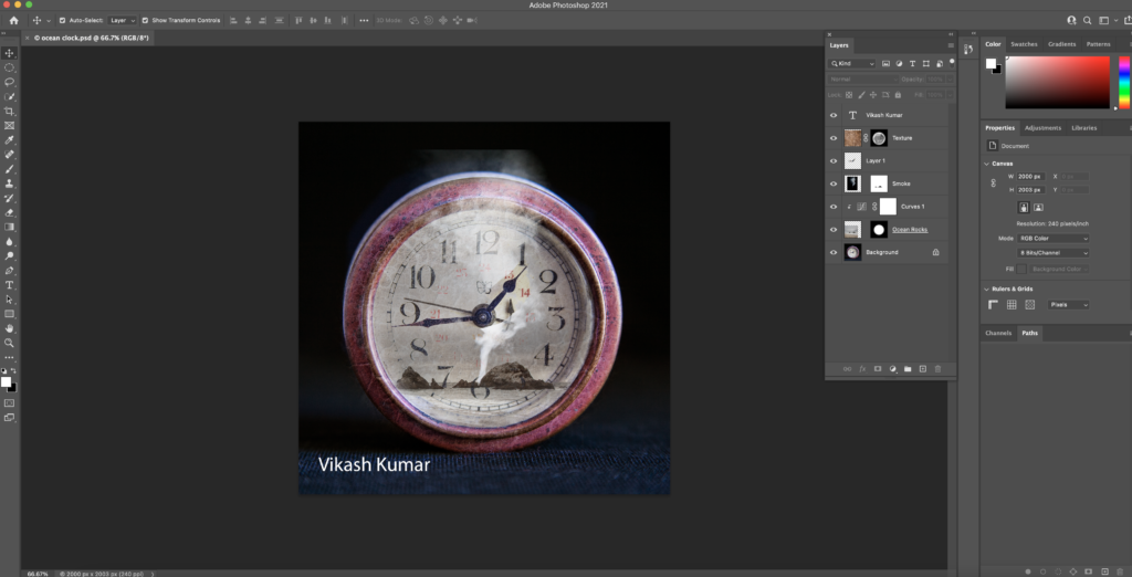
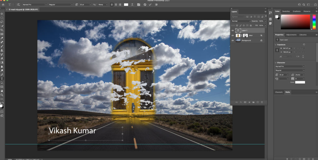
Photoshop Surrealism
Artist Statement
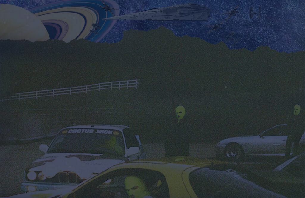
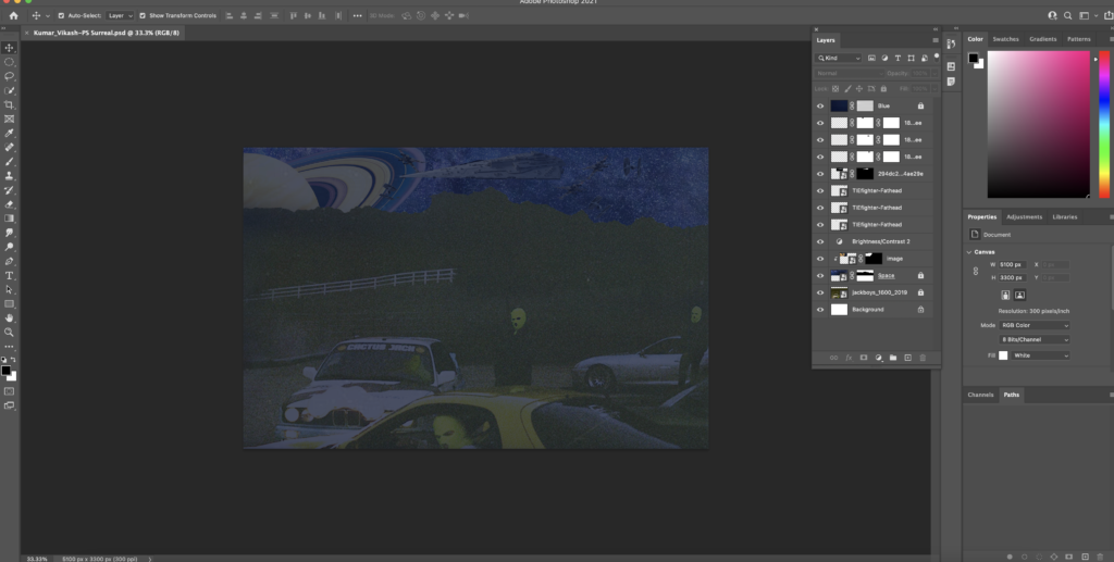
For my surreal project, I decided to create an image of people with ski masks on and in the background, a space/Star Wars theme. I was not trying to portray a real message with my surreal image, as it has no meaning to it. If there was a message, it would be to let your imagination flow freely and to not restrict everything you think of. I came into the project with no real idea of what to do, and instead, just came up with things along the way. Some of the techniques that I mainly focused on were clipping masks and masks to help add a filter. Using the image of the people in the ski masks, I clipped out the top section to give a feeling that they were silhouettes of trees. Then, I grabbed a picture of space and clipped it to line with the clipping of the first image, and created a space background. I also did this with the Star Wars ships in the background and as well as the planet. In my Preference, I like surreal compositions as you are able to explore freely with what you want to create because there is no set agenda. With surrealism, there is no uniformity, it can be completely random, which gives you the freedom to explore.
Design Productions
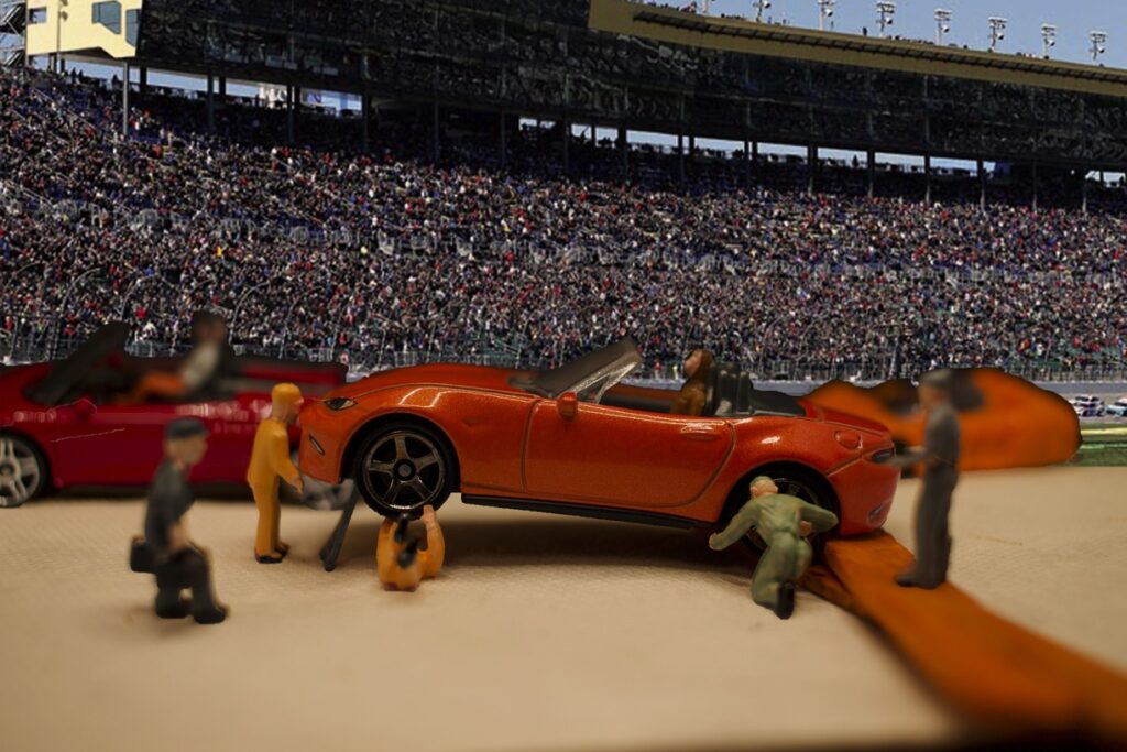
My micro scene is a replication of a pit stop you would usually see during Daytona 500 or NASCAR races. It includes a mini Mazda MX-5 having its tires replaced while mechanics surround the car, as well as other cars, drive-by in the background. To create this scene, I first started by collecting mini cars I collected in my house and picked out the car that has the most appealing colors and details to be my main car in the picture. Next, I collected mini figurines that looked like mechanics and construction workers to replicate mechanics. To set up the scene, I used a lightbox and used a miniature ladder to prop up the car to resemble it being repaired. Then, to assemble the scene, I used glue to embed the figures into the ground and had them focus on the car. After taking multiple photos adjusting ISO, aperture, and shutter speed, I then went into Adobe Photoshop and started editing my first adjusting the curves and applying a warm photo filter to give off the feeling it was a warm sunny day at the race track. Next, I clipped out the background, and using Pexels.com, I picked out a photo of a racing stadium to use as my background and then fitted the photo in. After adjusting the photo, I wanted to be more precise, so I zoomed in more to clip out any objects that seemed out of place.
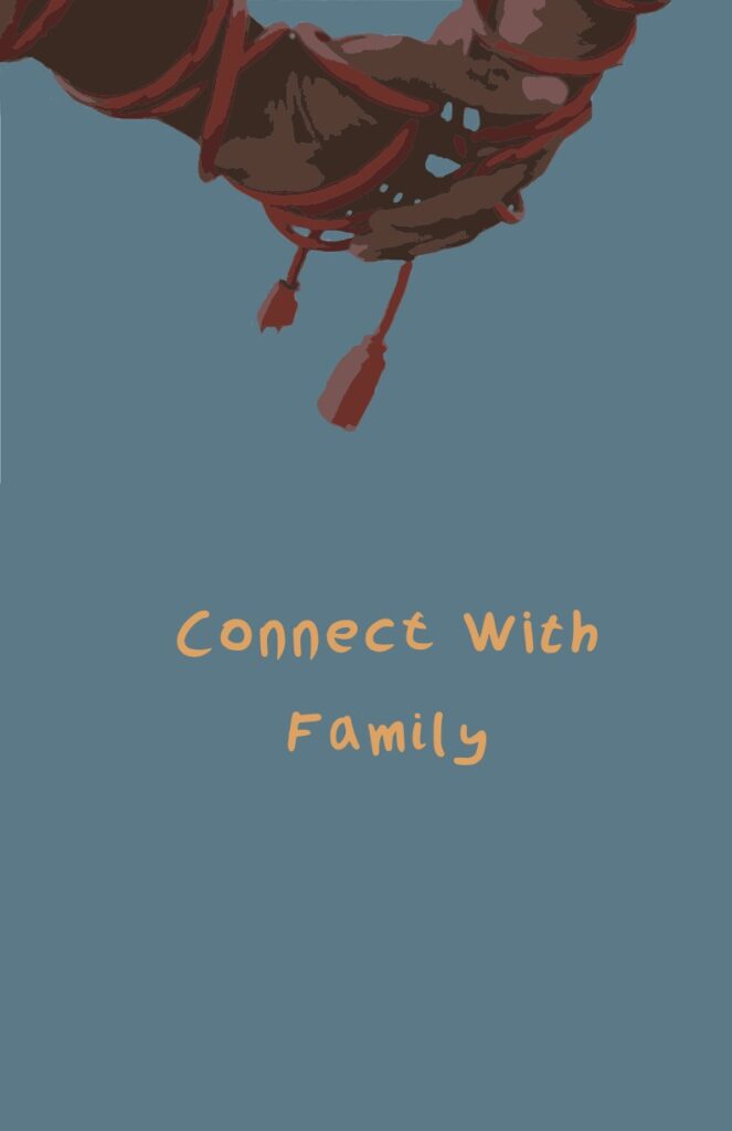
For my Public Service Announcement, I decided to focus on bringing awareness to mental health, and more specifically, emotionally connecting with your loved ones more often. In my PSA, there is an image of two people reaching for each other’s hands, with their arm and hand wrapped with a wire around it. The wires on each person’s arm are supposed to connect but don’t. My idea for the PSA is that we are often with people that we love and care for, but it doesn’t mean we are emotionally connected with them. The wires in the photo represent emotional connection, and not having them connect, gives the feeling that the two people aren’t emotionally connected. I hope to inspire people to be in touch with their friends and family more and to bring more connections between them. For the PSA, I chose the colors blue and orange as they are complementary colors and blue represents calmness and peace, while orange represents warmth and feelings. To start the PSA, I began by using an orange extension cord to wrap the two arms and hands starting from the forearm going down to the hand. The orange color contributed to the color scheme which made it easier when it came time to edit the photo. Next, I made my two subjects reach for each other’s hands but ensured that the two outlets weren’t connected to help push my message of the PSA even further. A problem I did encounter was attempting to fit the hands and the disconnected plugs all in one photo all while trying to only get a picture of the hands. It took multiple attempts, but I was able to get a good angle by lowering the height of the camera. Then, I opened the photo in Adobe Photoshop and cut out the image of the hands so I didn’t have to worry about the background. Then I opened the cut photo into Adobe Illustrator, which I then used my color schemes to create a solid teal blue background, and I image traced the photo to bring out the orange tones in the photo. For my tagline, I decided to neatly handwrite it as it would give it a more homemade feel it and could give me more choices to explore with the handwriting.
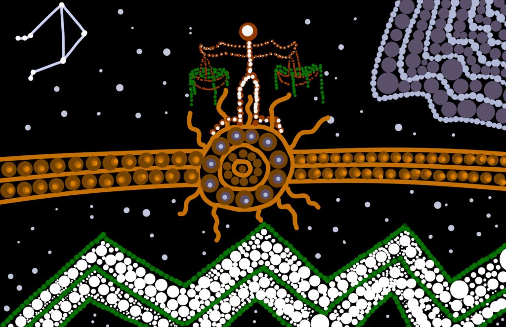
In my Aboriginal painting, I created a painting focusing on a resting place surrounded by nature. In the center of the painting is the symbol for a resting place, home. I have a big emphasis on home as it brings me comfort and warmth. Above the resting place is my zodiac sign of Libra, which is a scale that has leaves flowing out of them. Down below, is a mountain range, which represents my relationship with nature as I’m fond of the outdoors. In each corner, you will see my star symbol for a libra, and as well as the symbol for air as it is my element. I started this piece with the resting place at the center, and including multiple shades of brown to stay true to the aboriginal art style as they used rocks and plants to make paint. Next, I painted the mountain range dark green, however, it felt empty. To compensate for the negative space, I incorporated multiple sizes of white dots as white paint was also important in aboriginal painting. The first challenge I came across was deciding how to place my symbol. With its shape being hard to fit within my painting, I settled on placing it on top to give the painting more of an emphasis on the center. Another challenge I struggle with was figuring out how to place the air symbol within the painting. There aren’t many symbols for air, so I decided to create my own symbol based on the water symbol. I placed it in the corner with purple tones to represent the winds coming from above. Last was my star symbol. I place it in the other corner and then proceeded to paint white dots across the painting to represent the night sky.