Intro to Reflections
The Reflections unit focused on answering the question “Who am I?” by exploring ourselves through different projects. In Digital Media, we created mandalas incorporating symbols that reflected who we are as people. For this project, we explored software such as Adobe Illustrator, Photoshop, After Effects, Audition, and Visual Studio Code. In English, we drafted a College Essay describing ourselves and our experiences, and created a personal museum reflecting who we are and what we value as artists. In Design, in Photoshop, we created a collage for our experiences during the summer in three different ways, one of which we used real photos, the second we made a minimal version of the original, and lastly we made an AI version. Next, in Illustrator, we created a realistic Concert poster for a real band that reflected the time period they rose to fame. Finally, we illustrated our hero’s journey in the Aboriginal style.
During this unit, I learned about what I value most: empathy, creativity, and strength. It’s important that you don’t dismiss the people who are important to you; criticism only grows creativity, and it takes strength to be who you are in front of everybody. My essence objects: water, flowers, and aparently gears all helped me express my experiences and wants that make up who I am.
Art Curation for my Personal Museum
During our annual field trip to SF MoMA, we were tasked to create our own personal museum, with photos that we would include and exclude. I am drawn to art that provides visual interest, art that sparks curiosity. Art that ignites my imagination by using the elements of art seamlessly. By curating my own museum, I am describing my taste as an artist by compiling my values when creating art, which connects back to what I value as a person.
3 pieces I would ADD
to my Personal Museum

2 pieces I would EXCLUDE
to my Personal Museum

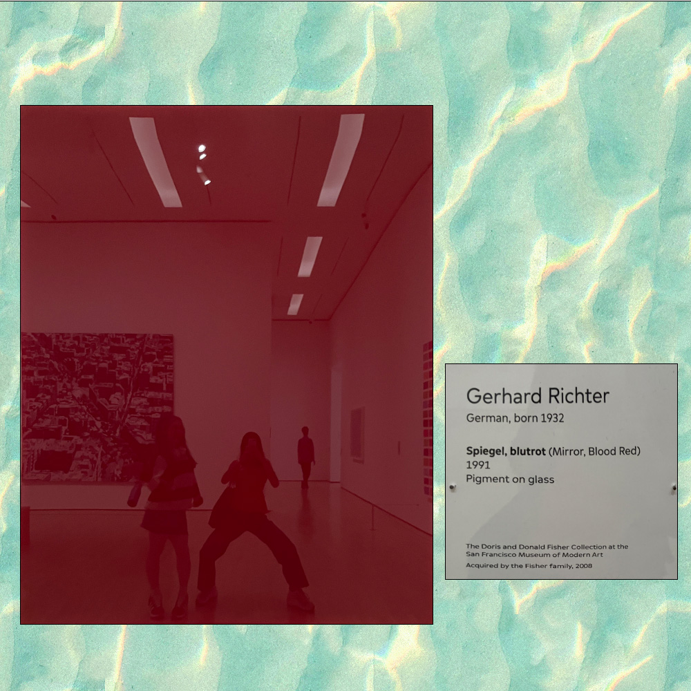
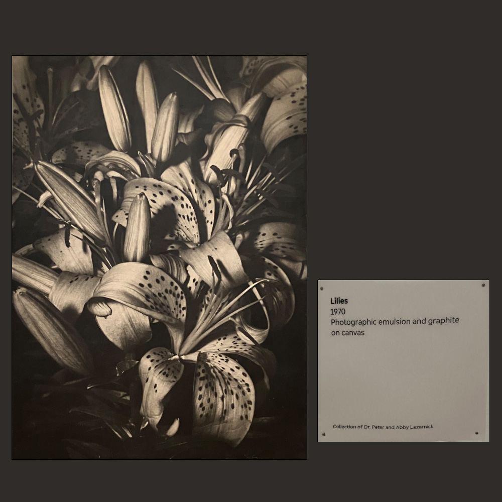
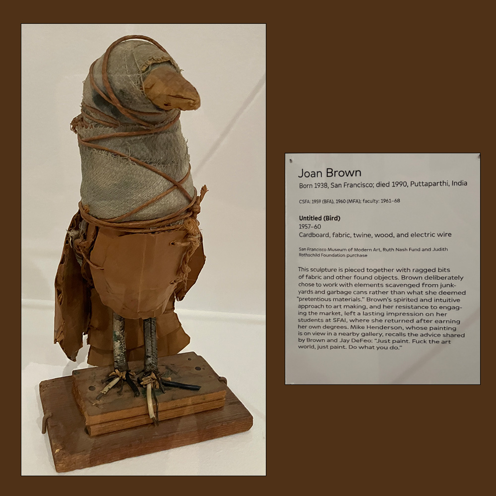
When creating my own work, I value form and the use of color, and I tend to use unconventional materials. The art of creating art using materials that already exist, just by arranging them, is how I like to create art, which is why both the bird figure and the Filipino cape were part of my personal curation. As an artist, I love including flowers because of their organic shapes in my works, as they provide more forgiveness, which is why I am drawn towards pieces like this. I chose to exclude pieces that had little visual interest, which felt very boring and rigid. Although these kinds of pieces allow endless thought, they don’t feel personal to the artist or me.
My Personal Mandalas
For this project, I had to create a Mandala that reflected parts of who I am. I included illustrations that reference water, as my love for synchronized swimming, which I unfortunately had to quit last year. Although I am really sad that I’m no longer competing with my teammates, I still wanted to celebrate the memories and friends I made there. Some other illustrations I added were flowers and butterflies, which I really love in general, and to symbolize growing as chapters of my life close now that I’m a senior.
If the images do not display below,
On a Mac, press Command + (plus) then press press Command – (minus)
On a PC, press the Ctrl + (plus) then press the Ctrl – (minus)
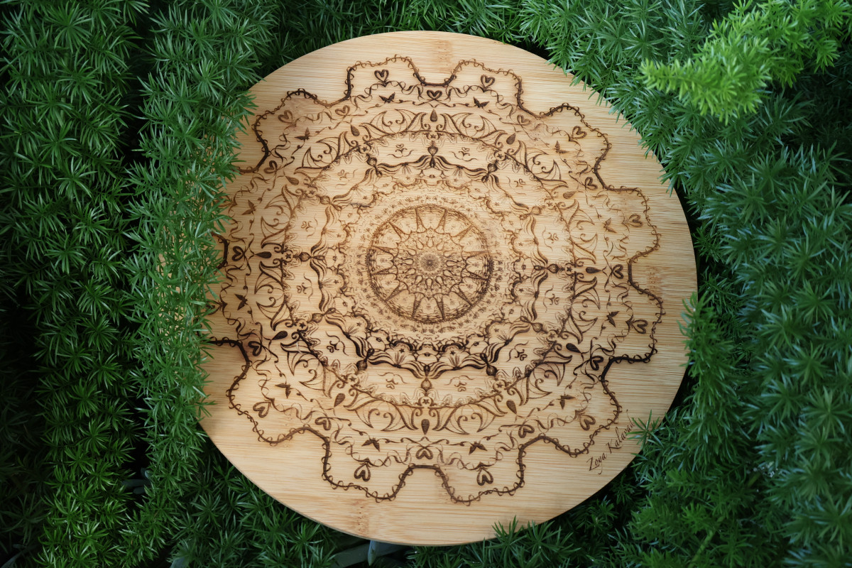
The Gears of Life


Some techniques I utilized throughout this project included creating depth in the different layers of the mandala by experimenting with the brush’s stroke size and the mandala boundaries to create unique shapes and designs. The tools that were provided during this project included a Wacom drawing tablet and pressure-sensitive brushes. The tablet helped me create more organic brush strokes that were really hard to create using a mouse. Since I’m in design, I normally use a large Wacom monitor, which works like an actual drawing tablet, whereas this tablet was a little harder to control and navigate. Unfortunately, I wasn’t able to take advantage of the pressure-sensitive brushes because I couldn’t get them to work; instead, I used calligraphy brushes to try and imitate this effect.
I really like how my mandala turned out; it was very much how I expected it to turn out compared to my digital version. However, the laser-engraved mandala showed less detail than I had anticipated. The inner circles of my mandala looked a lot more crowded on the bamboo compared to my digital version. Instead, I wished I spent more time on the outer circles rather than the innermost one. The look of wood is what I envisioned for this project, and I am not a fan of the visual and textures from the plastic leather or acrylic ones, so it was between bamboo and wood. But the wood wasn’t guaranteed to be circular, which I really wanted, because it would bother me since my mandala is symmetrical. I wanted the material to also be symmetrical, so I chose the bamboo one for a wooden circle. Looking at the final result, which I wanted burned on wood, I like how it turned out, but if I were to change anything, I would make the center less dense. Overall, the mandala’s border and the wave design are probably my favorite parts.
Colored Mandala
Flowering Sun
For the colored mandala, I decided to produce a new mandala, different from my black and white one. I used different elements like suns and flowers, but kept a lot of elements like the details. I really wanted to contrast the black and white mandala by using bright colors like yellow and pink.

During this project, we had the chance to be able to work with pressure-sensitive brushes; unfortunately, I wasn’t able to take advantage of them because I couldn’t get them to work; instead, I used calligraphy brushes to try to imitate this effect. My colored mandala is really bright and fun compared to the pervious which I really love, especially since it takes a turn on the word sunflower by inducing imagery of both. The ability to use gradients was game-changing and allowed me to add more depth and draw attention to certain elements of my mandala, but placing the angles of the gradients was very tricky. Working with color was a lot harder than working in black and white, but it was way more fun. The colors had to blend well, and the colors also had to match the movement of the shape, which slowed my process down.
Mandala Build Reveal Video
After we finished both the Black and White and the Colored Mandala we were tasked to create a build video from one of them in Adobe After Effects. I choose to do my Black and White Mandala. To do this I screen recorded turning the visiblity for all my layers. Then I chose a song to play over, added text with a custom at the begnning, uploaded my screen recording, and finally rendered it in Adobe Media Encoder.
The build reveal video was fun and disappointing at the same time because I love that it highlights all the layers that went into making my mandala. But it showed all of this in less than a minute, versus almost a week it really took. The time-lapse also doesn’t show the trial and error it took to get to my finished mandala.
Looking at the final result, I really like how both mandalas turned out. The mandala’s border design is probably my favorite part and what I’m most proud of. I really appreciate being able to define who you are through objects and symbols. I will use the concept of inserting symbols that represent who I am in my art in the future. This project made me think about how much and the way a person is represented in their own art, which puts more value on every piece of art.
Design
Collage Triptych

Concert Poster
Boney M.

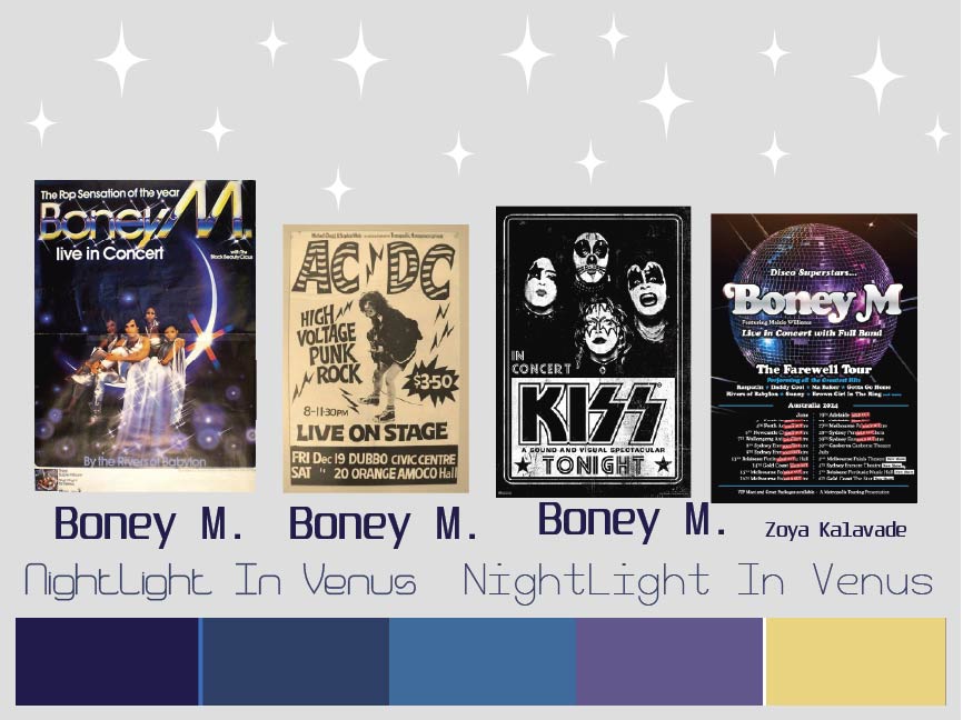
Boney M. formed in West Germany in 1974 by producer Frank Farian and rose to fame during the late 1970s. Liz Mitchell, Marcia Barret, Maizie Williams, and Bobby Farrell made up Boney M.. Their genre of music is disco with strong influence from Caribbean sounds, reggae, and funk lead them to international success. They are best known for hit songs such as “Rasputin,” “Daddy Cool,” “Ma Baker,” “Rivers of Babylon,” and “Belfast.”
Boney M. faced a lot of controversies through theory existence. Their song “Belfast” sparked debate for addressing political conflict in Northern Ireland, an uncommon and sensitive topic for disco music. Their biggest controversy that eventually led to their disbanding was because of their producer, Frank Farian. Farian secretly recorded the male vocals himself in the studio instead of Bobby Farrell, who was presented as the group’s male singer, which later caused public backlash over authenticity. Maizie Williams was also excluded from studio vocals, further fueling criticism. These events eventually led to the group’s disbanding in 1986.
For this assignment, we had to create an original, realistic concert poster from the artist we selected, created by hand in Adobe Illustrator. Before I created my poster, I had researched my band to eventually create a mood board where I decided on my color scheme, font, and imagery. When starting the poster, I decided on a disco setting with a disco floor and ball. I started with the floor, but really struggled with deciding which perspective looked the best, which took a lot of time to redraw again and again. Since a lot of my inspo posters contained the artist performing, I wanted to add a photo of them. Since I wasn’t allowed to use the photo directly, I got permission to image-trace it instead. After trying to draw a disco ball in the limited time we had, I also got permission to image trace that as well. The day before this project was due, I got advice from my teacher to add more dimension and movement to my poster. So I decided to slant the floor and have the disco ball in motion. Making these changes made my poster a lot more visually appealing, and I’m very glad I changed it. Going forward, I would like to ask for criticism more often and create more abstract perspectives.
Aboriginal
Wash Away Your Tears

For this project, I had to illustrate my hero’s journey in the Aboriginal style with some aborigine symbols, my astrological sign and constellation, and my spirit animal. I chose three aborigine symbols: a man, a child, and rain. I chose these symbols to represent my hero’s journey, which happened in India. When walking back to my grandparents’ house in the rain, I saw a man selling food with his crying baby daughter. I remember asking my dad if we could help them, but we were soaking and my brothers wanted to go home. I begged my dad as we crossed the street. Entering my grandparents’ home I couldn’t stop crying. The rain turned to thunder. I begged to go back and help them but it was too dangerous. The rain died down as I went to sleep. While I was sleeping my dad searched for them but couldn’t find them. This event made me hyper aware of the situations people around me and to help any way I can. The symbols I chose all represent key elements of my hero’s journey. As an Aquarius, I embody the qualities of the water bearer, but my sign represents the element of air. I selected a deer to represent my spirit animal because they represent compassion, vigilance, adaptability, and are highly sensitive, which are also qualities that represent me.
To create this piece, I first sketched a paper draft that depicted my symbols. Next, I went to Photoshop, which we exclusively used for this project, to create my color scheme and another draft in those colors. Then I started on my final draft by drawing my chosen symbols. I’m glad I did this because it allowed me to create a framework for my details. While going through the instructions, I mistakenly thought I was supposed to create an astrological symbol (the vase) instead of an astrological sign (zodiac sign). It took more time than I expected, but it’s probably my favorite part about this piece now. Originally started with a river concept that would fade into the background, but I spent too much time on it, only for it to create a horizon line, which isn’t an Aboriginal style. I still wanted a river, but I had to create it in a bird’s-eye perspective, which was really difficult. To add to my background, I decided to draw bushes, even though I created three different versions, unfortunately, none looked like they were in the bird’s eye view. If I were to go make and make edits, I would create a more obvious bird’s eye perspective, in order for it to be closer to what the aboriginals did. Still, I am very happy with how this turned out.