The Beauty of film is the Grain
Our illustrations were an assignment that we did in Design class. Using Adobe Illustrator, we created a vector graphic that shows our symbol used for our English Media Piece assignment. The difference between photos and our illustrations is that photos are raster based, meaning they use, where as our illustrations were vector based meaning that we used shapes that could be enlarged to mass proportions and never pixelate.Taking images offline or with cameras, we traced them using the pen tool and personalized them using our own selection of colors and the Gradient Mesh tool to provide smooth shading. We were also required to incorporate a drop shadow and simple gradient somewhere on it.
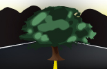
My Artist Statement
In my illustration, I use an oak tree to symbolize my statement. It has many qualities that relate to film, such as its grain. In a tree, its grain provides it strength and represents the trees age. Each year, a tree grows throughout the seasons. In the spring, its growth produces a lighter wood than when it does in the summer, that way when you cut open the trunk, the lines appear in alternating shades of the wood’s color. This creates the rings and lines when the wood is cut, showing us each spring and summer that the tree has endured. This connects with film, because film has a grain too. The grain in a tree provides strength like the grain in a photograph, where it heightens its meaning rather than gives it a physical strength. An oak tree also connects to my statement in that it represents age. Oak trees can live for hundreds of years, so I used this quality to represent film and its vintage stereotype vintage.
The process that I used to create this illustration was tracing images with Illustrator’s pen tool. This proved to be tedious because I had never used anything quite like it, but it is also very rewarding with the clean end results it provides. It was also challenging for me to stay organized with my layers. No matter how much I tried, I always would forget where one thing was or another. Another challenge was switching over to Adobe Illustrator from Photoshop because of the difference between raster and vector. While Photoshop uses pixels, Illustrator uses vectors to create shapes. Above all of that, creating my symbol in a way to represent my statement proved to be difficult.