Photoshop Painting
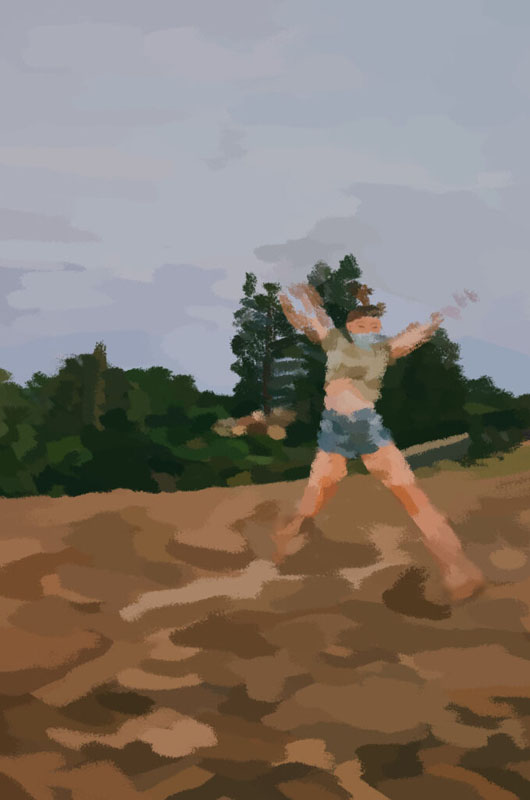
Artist Statement:
As someone who has an affinity for fine art and specifically painting, I found that transferring the medium to a digital format was quite difficult. At first, I was having trouble choosing where to go into detail on specific colors and where to do large chunks of colors. Since I used a photographic base, my tendency was to go a more realistic route, but artistically it made more sense to use implied strokes. After many false starts, I recognized that and began to paint freely.
I chose to paint a photo I took of my friend when we were watching the sunset. In the photo, she is jumping, and I wish I spent more time perfecting the way that motion was portrayed in the painting. I am most proud of, though, the details of the trees. I aimed to emphasize the various tones of green within each tree and made it as detailed as possible.
Though the process may have been difficult, I enjoyed overcoming obstacles throughout. I learned the significance of persistence in digital painting. If you spend more time on it, even if it looks wrong at first, it will eventually take the form you want it to. I will remember this for future digital paintings and even regular paintings I create.
Photoshop Surreal Composition
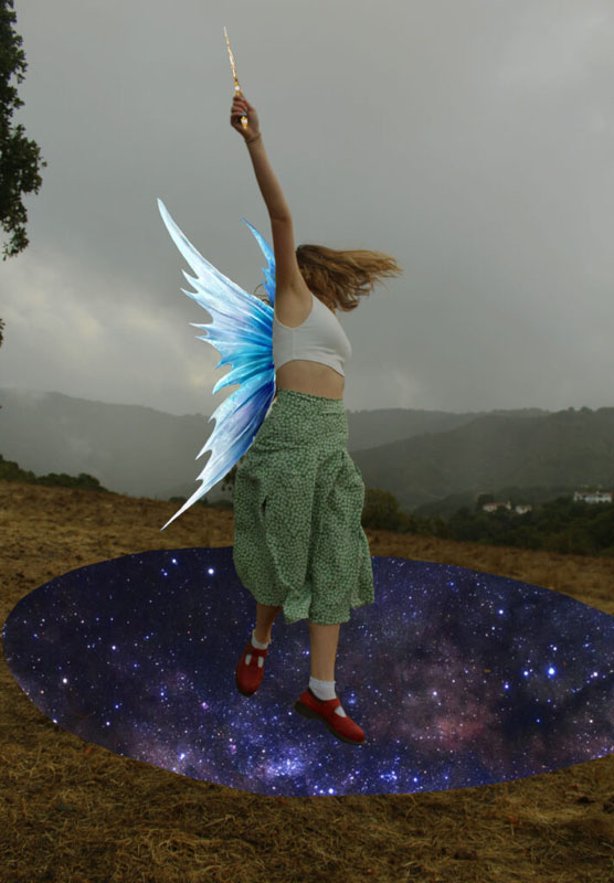
Artist Statement:
For my surreal project, I wanted to create a piece about feeling free from yourself. I started by pulling a base photo into Photoshop. This base photo came from a photoshoot I did about insecurities and the baggage it carries. I then brought in photos from the internet of the galaxy, fairy wings, and a wand. I specifically chose photos that had a more whimsical quality to them. This helped me portray my idea of embracing your insecurities and feeling free and happy by doing so.
It was hard for me to find a fitting color scheme, and I still feel as though I could have done a better job coordinating the colors. I also found it difficult to precisely uncover and trace the photos in Photoshop to make it look somewhat realistic and not sloppy, so this took me a long time. However, I am satisfied with my placement of the photos, because it looks like one cohesive image that tells the same story.
Photoshop 360
Photoshop Watercolor Painting-Sleepy Park (b&a comparison)
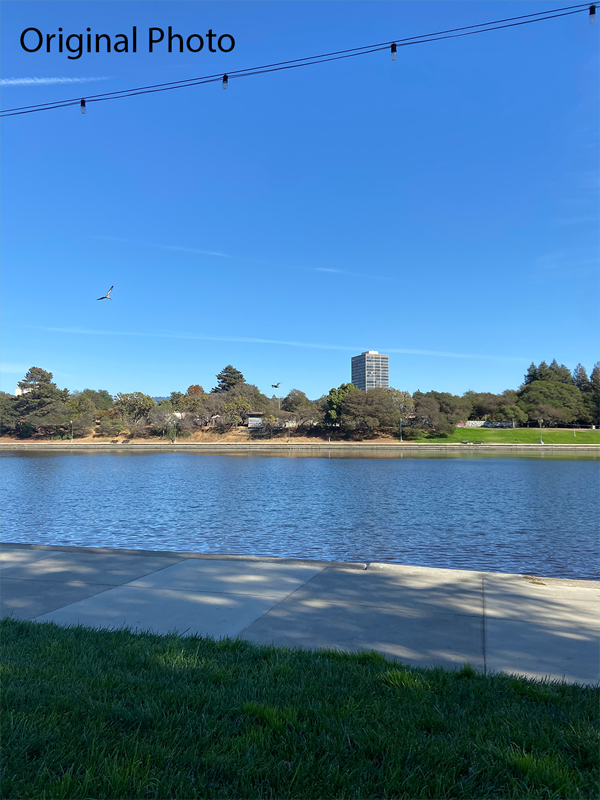
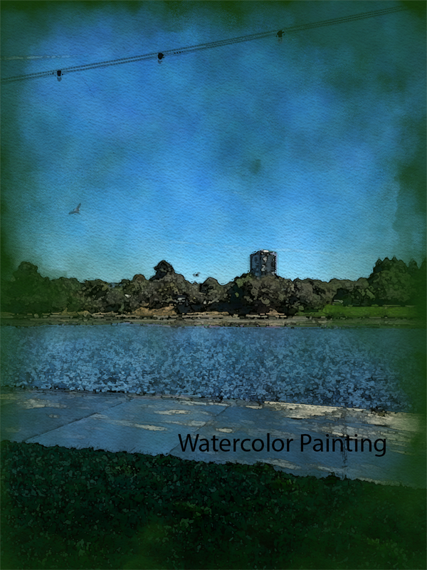
This is a watercolor painting of a landscape photo I took at a park in Oakland. With very little people around, the park felt extremely serene and “sleepy”. Most people who were there were just laying down and reading, the animals were pretty quiet and moving peacefully, and there was minimal movement in our surroundings. I created a watercolor painting using an effect in photoshop to capture the beauty of this sleepy park.
Photoshop Pastel Painting- Fez (b&a comparison)
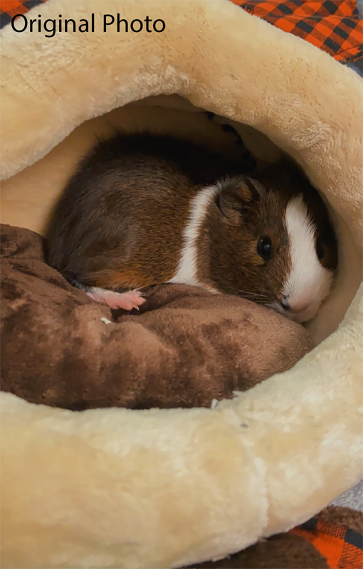
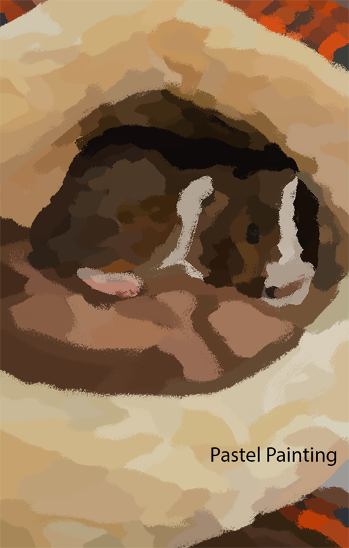
This is a pastel painting created from a photo I took of my new guinea pig, Fez! In the photo he is just hanging out in his bed. I wanted to create a painting of him because he’s my new best friend and I love him!