In the Narrative Unit for Design class, we had two major projects: a product design mockup and a movie poster. For my product design project, I created a brand of jelly called Fruitful Preserves. My movie poster was based on an action/comic-themed film called “Dimensions”. It’s about a small-town adventurous girl who travels through alternate dimensions and completes missions/tasks throughout.
Moodboards
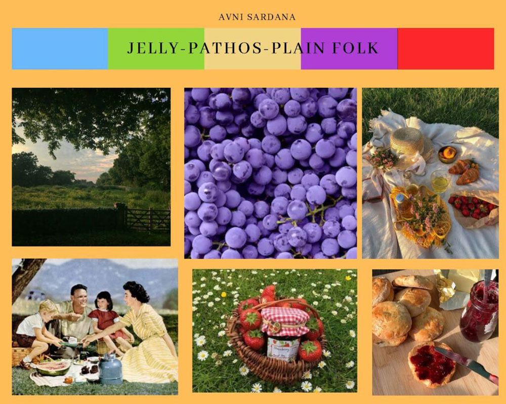
Before starting on the actual projects, we were tasked to create moodboards to outline our ideas/aesthetic for the final product. The following pictures are my original moodboards for the two projects. I ended up switching my idea for the Movie Poster, but it still fits the general outline of it.
Product Design Project
Artist Statement:
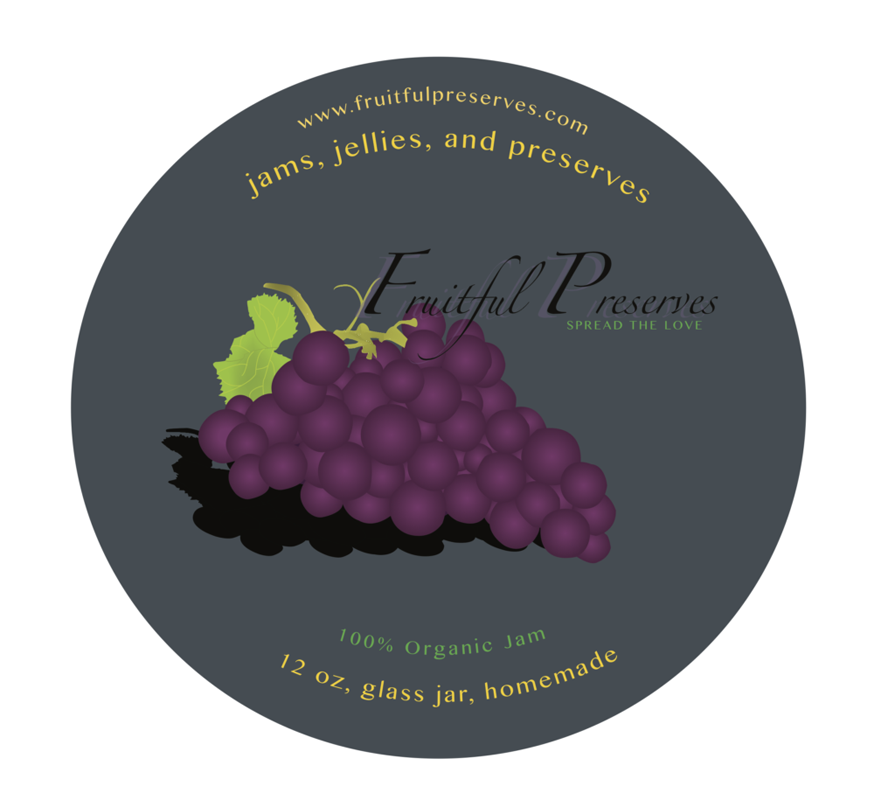
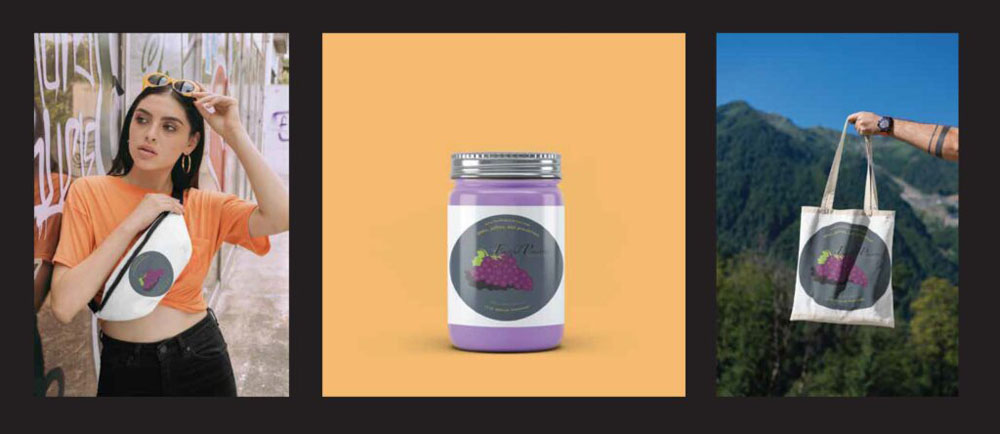
The product I am selling is a 100% organic jam from the fake company, Fruitful Preserves. The demographic I am appealing to is families, specifically parents. I wanted to create a sense of togetherness through the slogan and the potential magazine advertisement.
For the magazine advertisement, I would have used pathos and the plain folks advertising methods. My plan was to create a picnic to appeal to that idea of familial affection and spending quality time with one another.
When creating the label, my biggest focus was on color and shape. For the grapes, I aimed to illustrate depth using the gradient tool. I also made circles in various sizes to make them look more realistic. As for the stem and leaves, I used different tints as well as a gradient. Throughout the label, I used earthy tones to remind the audience of nature which makes the jam seem more natural and organic. My biggest challenge was finding the right colors for the grapes and figuring out what I wanted the gradients to look like. I went through a long trial and error phase testing out different colors and light sources, until I created the final version.
Movie Poster
Artist Statement:
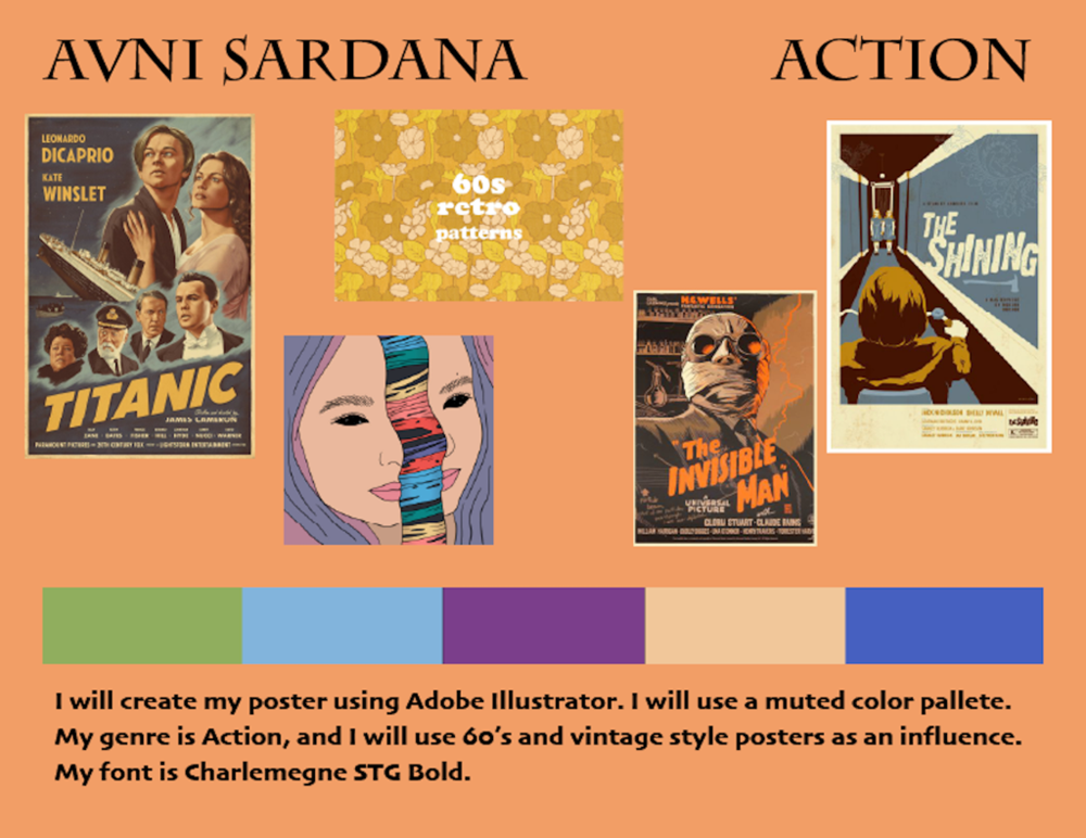
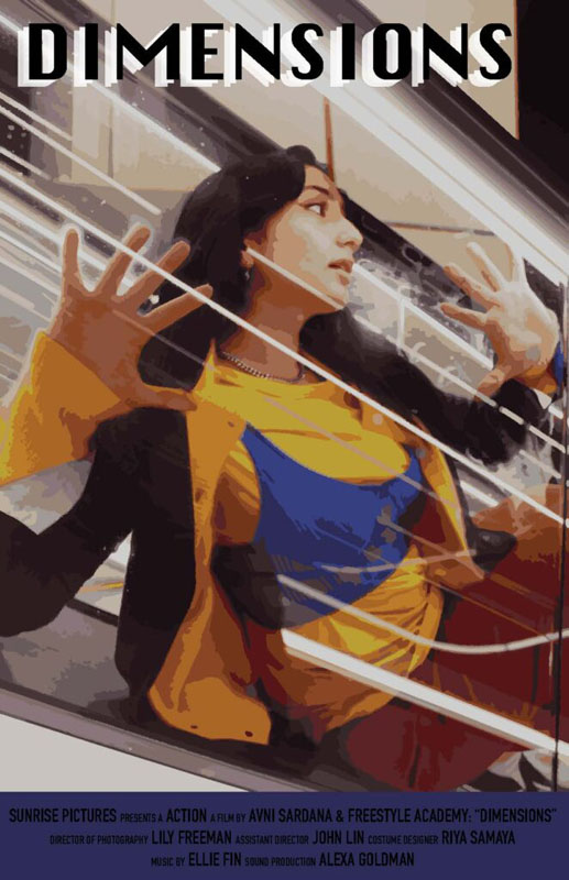
My movie poster is based on a comic action movie called “Dimensions”. The story is about an adventurous girl from a small town who accidentally stumbles upon a portal and finds herself travelling into alternate dimensions. In the poster, is a girl sitting in between two escalators, which is actually the portal that takes her to these universes. In every universe, she has to complete a set of missions and find the same portal in a time constraint. Some of the universes she ends up in looks completely different than the original world she came from. Hence, the comic book theme. The comic universe is the most important one in the story, as that is the one where she meets people she feels she can’t leave behind and has difficulty making it in time to the portal to take her back home.
I created this poster using a DSLR Camera, Adobe Illustrator, and Adobe Photoshop. I started off by doing a photoshoot with my DSLR Camera. I went with my friend, Hannah Estrada, to some lighted escalators at night. I had her sit in between two of the escalators for the “portal”. I specifically had her wear primary colors for her outfit to go with the pop-art, comic book theme in the film. After the photoshoot, I chose my favorite photos and edited them in Adobe Photoshop. I focused on emphasizing the motion of the light and the colors of her outfit. I did this using the curves and color balance tool. Additionally, I used the brightness/contrast tool, crop tool, and hue/saturation/darkness tool. Afterwards, I brought my favorite photo into Adobe Illustrator to create the actual poster. Using the image trace tool, I emulated the comic book effect on the photo. I added a blue space underneath where I put in the “film credits” and I chose a font for my title. On top of my title, I also added duplicates in white to create a more interesting effect.
Reflections
From the Narrative 2 Unit in Design, I learned a lot about my own design style. I valued being exposed to types of design I hadn’t ever ventured into. Through these projects, I saw my design aesthetic develop even more and saw how I could apply it to concepts that didn’t come very naturally to me.