Fly You Fools
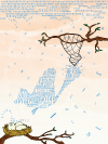
For this particular illustration, our assignment was to practice typography with Adobe Illustrator as our tool. What is typography, exactly? It's the art of using types. The goal was to incorporate types into the illustration in a creative way, and not just throw words/letters in random areas that had little or no meaning. It was important for us to use the types effectively to build our image and create a story.
Click for larger
image
There are always opportunities and chances waiting for you, and sometimes they are in your reach. With a small mistake, those can slip right through your grasp. The illustration focuses on three major symbols: the water cycle, the bird, and the net. All opportunities are represented through the water cycle, starting with the rain. Each raindrop is a possibility for yourself. As each one slips through the net holes, they symbolize your inability to capture that raindrop. Eventually, the drops begin to materialize and condense into the form of a divine, phoenix-like bird. A general symbol that a bird stands for is hope. Although you may be upset over the fact of being unable to capture a raindrop, you do well to remember that it’s part of a cycle, where that fallen raindrop will meet the ground, evaporate into the atmosphere, and eventually collect into another raincloud, shown through bird eggs and their rebirth. And so the cycle begins again and you will receive another chance.
With Adobe Illustrator as my tool for creating this piece, it proved to be both a challenge and pleasure. I began with a brush to create a rough outline of what I wanted my typography to form. I didn’t just want to incorporate words into my piece, I wanted the words to be the piece. Once I was satisfied, I decided to use fonts that were similar to one another to bring out a sense of togetherness in terms of opportunities, but each is different so I opted for a slight variation in the appearance of the words. I utilized being able to control the curves of lines and type tools to really bring out the shapes that the words were to form. In terms of color choices, I wanted to keep everything as realistic as possible, while also having an atmosphere of surrealism with the raindrops and sunset background.
I've always thought that a story can be made of words or a story is built from a simple picture. With this assignment, I realized that words and letters can physically be in a picture to create a unique story through combined efforts. Individually, it has its own story. Together, it has its own tale that can be up for an even more expanded interpretation.