Narrative Visual Perspective in Design
Product Logo
For this assignment, we were tasked with creating a product logo that will go along with a future mock-up of a fake product of our choosing. I decided to make a logo for a cherry vanilla creme soda, with a retro aesthetic.
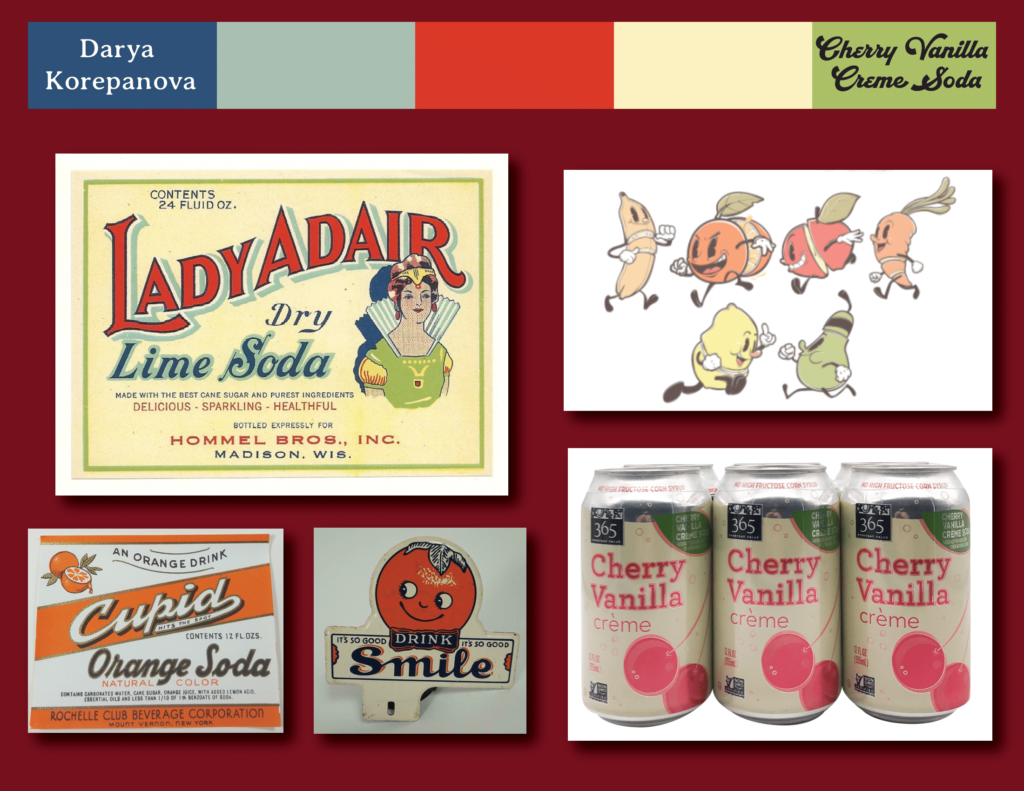
Mood board
A mood board is a collection of images, colors, and in general, inspirations that will be useful to an artist when starting a project. They are often used to brainstorm and visualize a final product, while also being used as a reference for the artist throughout the drawing process. For my mood board, I gathered inspirations from old soda labels that had the desired effect I was looking for. For my colors, I even used one of the labels I found as a reference.
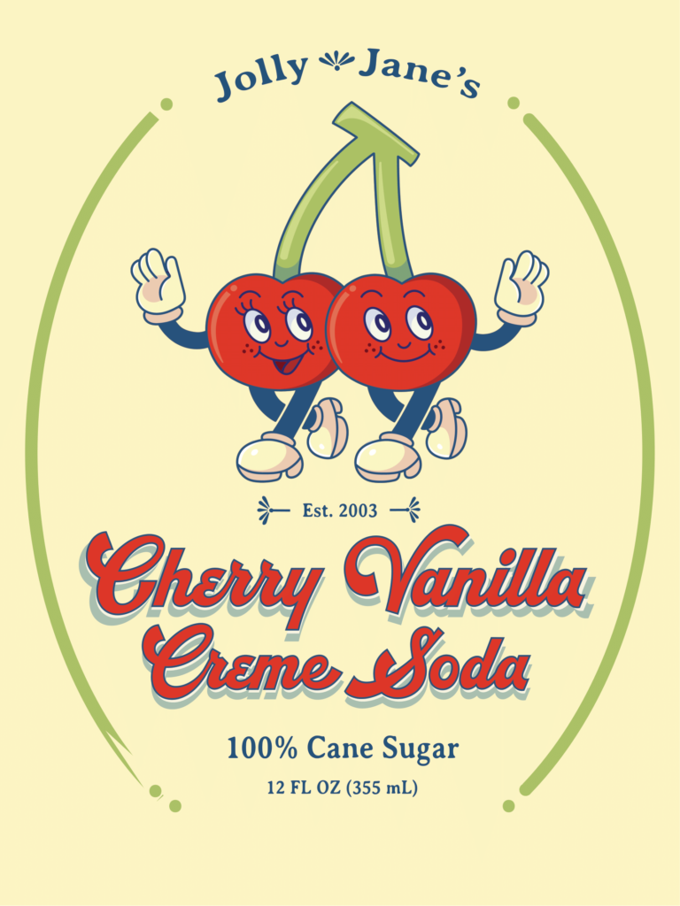
Final Product
For the final product, we had to use Illustrator to design our logo. I chose to go with these two cherries which were drawn in a rubber hose style. Rubber hose was used often in early hand-drawn animation, which gave the logo a more retro feel. I made sure to make the logo simple enough to be easily recognizable and detailed enough so it didn’t like unfinished.
Product Label
Along with our logo, we needed to design a label that would go onto our product. I had to choose the appropriate font and additional design details to draw the reader to the label using techniques we learned in class (you can read more about the technique I chose in my artist statement below).
Final Product
Artist Statement
For the product logo and design project, I chose to make a label for cherry vanilla creme soda. I wanted my audience to be both kids and maybe older adults who would enjoy the classic flavor.
If I were to make a magazine advertisement for this project, I would use the appeal of the color red and the persuasive technique of pathos. By using the color red extensively in my advertisement, I would be able to draw attention to my product. I would use pathos in order to get my audience of older adults to feel nostalgic. For kids, I would use bright colors and strong shapes in order to appeal to pathos as well, by making my product look fun and exciting.
Some techniques I used to create my logo were using lots of circles and rounded shapes to create a more inviting label. I also used a cartoon character as the logo in order to appeal to kids. I styled the logo to appear vintage by using desaturated colors and cursive text. Some of my challenges were to make the text have an outline and a shadow, along with a white outline “shadow”. I achieved this by copying the text and moving it down slightly, changing the color accordingly. I also had trouble with creating the green ellipse around the logo and text. Ideally, I would use a clipping mask on top of the green ellipse, but what I ended up doing instead was coloring the background color on top of the parts that I wanted to be “erased”.
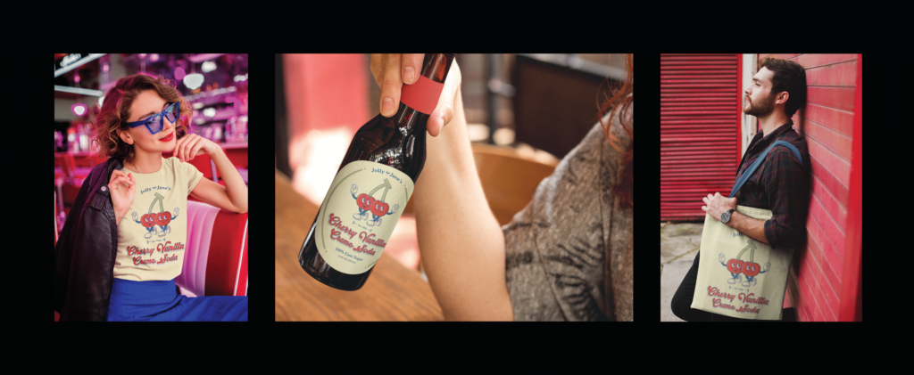
Product Triptych
For the product triptych, we had to take our previously made product logo and put it onto mockups which we chose from PlaceIt.com. After making our mockups, we created a triptych in Illustrator to showcase them all in one piece. For my products, I chose a shirt and a tote bag for the merch, and a beer bottle for the actual soda label. I decided to go with a beer bottle specifically because it had a retro soda bottle shape, which is what I was looking for.
Final Product
Artist Statement
In the triptych, the viewer is able to see an example of the Cherry Vanilla Creme Soda presented on a variety of objects. From left to right, the label is shown on a shirt, a soda bottle, and a tote. In the magazine ad, the viewer is able to see the main ingredients of the soda on the left-hand side of the spread (creme, vanilla, and cherries) while seeing a preview of the actual product (the soda) on the right. There is also a graphic design element of swirling warm-toned colors behind the ‘ingredients’ and soda, giving it a retro look.
For the triptych, I first created a label in Illustrator. I then went onto the website “PlaceIt” where I was able to put my label onto different mockups. I made sure to choose mockups that had a similar color scheme and/or looked good next to one another. I then downloaded these mockups and arranged them into a pleasing configuration in Photoshop. I made sure all the margins were equal and that the background was black so the mockups stood out against it. For the magazine ad, I first sketched out a composition idea in my sketchbook. I then made the background element by overlaying and compositing together different images in Photoshop. I made sure to use adjustment layers and multiply layers to give the illusion of shadows and cohesion. After that, I used Illustrator to great my graphic design element, by using the pen tool to create smooth clean lines. Finally, I exported both of these and layered them on top of each other in InDesign. In InDesign, I also made sure to add text and other small graphic design elements to bring the magazine spread together.
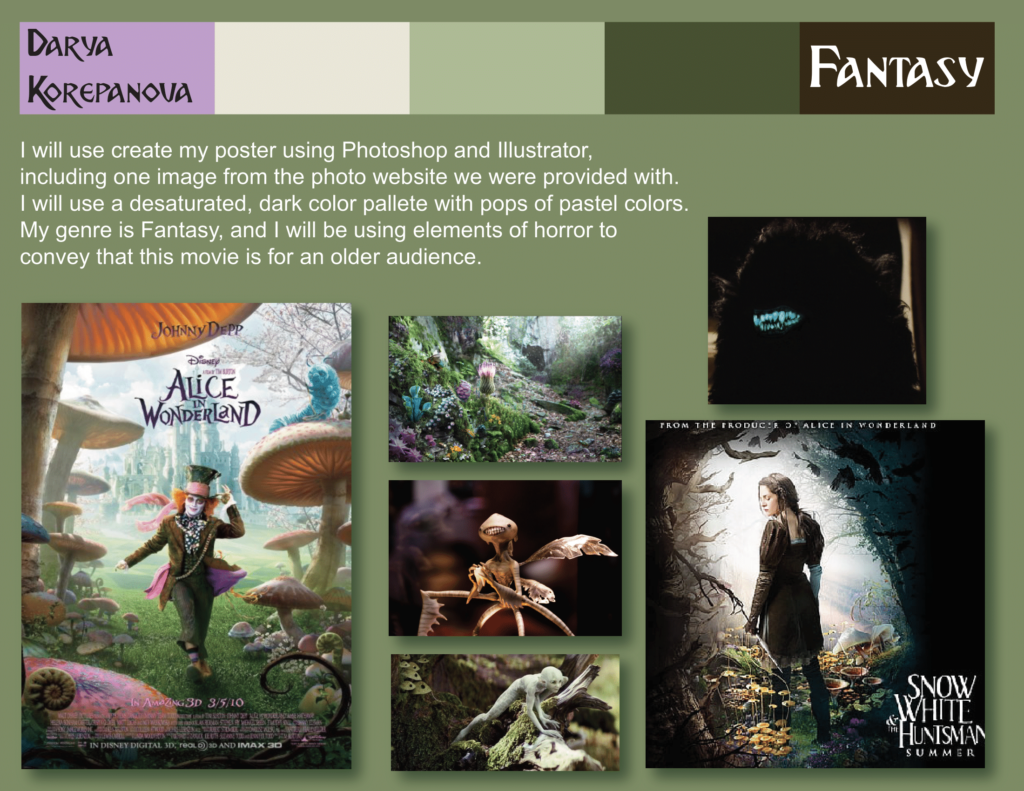
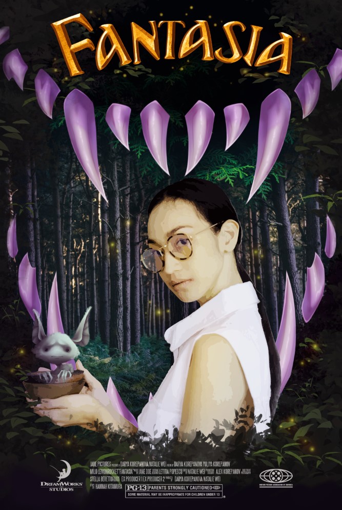
Movie Poster
For the movie poster project, we had to make a poster for a fictional movie. For my movie, I decided to make a poster for a dark fantasy story of a young woman who recently moved out of her house to live on her own, and discovered a race of fairies that need her help.
Moodboard
Final Product
Artist Statement
“Fantasia” is a story of a young adult girl who has finally grown up old enough to live on her own. However in the backyard of her new home, she discovers a civilization of fairy creatures who need her help to fight off The Shade. Along her journey she learns to keep in touch with her child side and the value of helping others close to you.
To begin making my poster I first created a sketch in my notebook. Then, I gathered photos that I would need off of Pexels, the copyright free website for photos. After gathering my needed photos (the main character, forest background and leaf textures) I put them through illustrator to create high fidelity photos, which allowed me to make them look more cohesive with the drawn elements of the poster. After masking the photos to get the parts I wanted, I illustrated the purple teeth and sidekick fairy character in Photoshop. I then used Illustrator to create the “Fantasia” title by creating 3D shapes and bezeling the text. After inserting the title into the Photoshop document, I added the logos and credit text for the movie at the bottom of the poster. Finally, I added small embellishments in Photoshop throughout the poster to increase the contrast, harmonize the colors and finish the poster.
Reflection
Overall, throughout all of these assignments, I learned how to be a better artist and how to better use the tools in front of me. I also learned how to have fun with my work, and how to make a successful product that people would be interested in. I also greatly value the skills I learned and will take away from these projects, specifically how to use Illustrator to make interesting text and InDesign for creating posters and spreads.