Photoshop Pastel Painting
We had an assignment where we experimented and practiced with pastel brushes in Photoshop using a Wacom tablet. Students chose a photo and drew over it to make it look like a pastel painting. I chose this picture because it is for the most part simple, but also put forward a challenge when matching the shades of green and pink for the rose.

Photoshop Watercolor Painting
For this assignment we experimented with watercolor brushes in Photoshop and used a watercolor paper texture to simulate painting on actual paper. My drawing was not based on a photo and I focused more on playing around with shading and which brushes were best for what.

Photoshop Painting
After practicing we pursued our own painting project. I was drawn to watercolor and chose to use an old photo I took as reference. My work went through numerous revisions and didn’t come out the way I anticipated, but by the end I was content with the final product.

This experience taught me how to paint in Photoshop using a tablet which is something I had never done before. Learning how to specifically use the pastel and watercolor brushes has shown me the potential Photoshop has to offer. This experience has also opened new paths for me whether it’s at Freestyle, college, or in a career. A struggle I encountered was trying to copy a picture and recreate it. For my painting, I based it on a picture I had taken and found replicating it to be challenging. After an hour or so I began to deviate from the photo and added features and colors to the painting that were not in the original. This helped me creatively for I no longer felt restricted by the photo and it also decreased my stress level since it did not have to be a carbon copy.
If I could make adjustments, I would change my texture and shading. I would take more time to understand the various brushes and see which would better replicate the grass, trees, sky, etc. For shading I would reassess the painting and determine where the primary light source is and adjust the landscape accordingly. What I am most proud of is how my layout is similar yet different compared to the original photo. I have tried to draw the same photo using pencil and paper and I couldn’t seem to get the proportions right. While using Photoshop I was able to experiment more and was able to create a landscape I was satisfied with.
I will definitely use the technical skills I have learned from this project in the future. Before I didn’t know how to draw in Photoshop using pastel or watercolor brushes. This is a useful skill that I intend to continue to hone and build off of in the future. Before when I saw digital drawings I didn’t know how people did it or the work they had to do to get there. After going through a shortened version of the process myself, I now look at digital paintings and acknowledge what the artist has done and further respect the technique and time they used to get there.
Surreal Composition
Transitioning away from drawing, we delved into photo editing, specifically putting them together to make a single composition. I thought it was cool how one is able to make their own world and take pieces from other photos and edit them together.
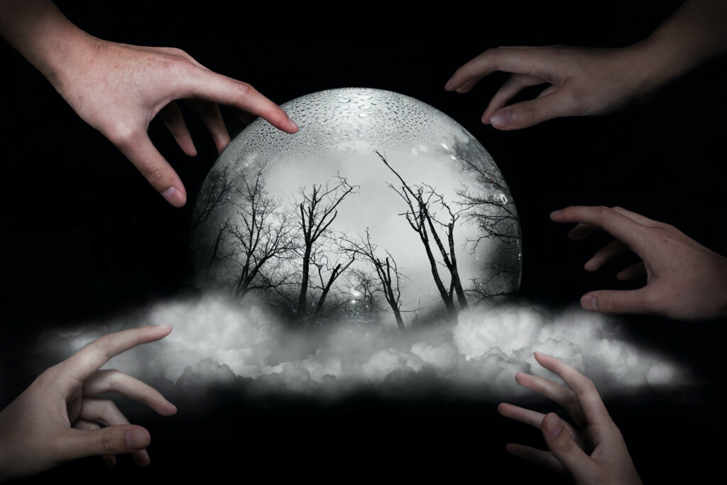
My message in my Surreal Project is how humanity seems to be reaching for the next best thing, even if it is not what they thought it would be. The hands are reaching for a glowing orb, the only object giving off light in the desolate space. But inside are dead, colorless trees, a far cry from many people’s ideal world. I feel that humans have many desires, so many that when something has the potential to fill a desire, we go for it. There are pros and cons to this method. On one hand one may feel exuberant that they have reached their goal, hence I made the hand touching the orb at 100% opacity. Although, they may not be aware of what they have gotten themselves into.
The main struggle I encountered was what to do. I simultaneously had numerous ideas yet none at all. To get over this hurdle, I initially scrolled through old pictures to look and see if anything sparked my interest. I was able to combine and blend a few that worked for a short period of time, but later I felt that they were not cohesive and felt too separate. I wanted the viewer to be able to look at my piece, ponder it, then make their own interpretation rather than look at a jumble of random pictures. To overcome this block I focused on one aspect of the photo, the glass ball, and built my photo around it instead of trying to fit unnecessary components in.
I am most proud of the concept and idea behind the picture. I have thought of humanity and its desires for a while but didn’t think I could portray it in a picture. I will definitely use the skills I learned from this project in the future. Before I saw Photoshop as a bit daunting, but after learning about some of its tools and their applications I feel more at ease in the workspace.
VR 360° Gallery
We had usually used Photoshop for two dimensional projects, but for this assignment we made a 2D gallery then made look like a room. I found it really interesting how when flat, the walls appeared curved, but when converted the walls look like the rectangular walls of a building.

Before & After
Reality v.s. Reality
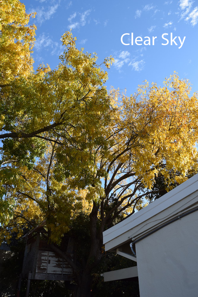
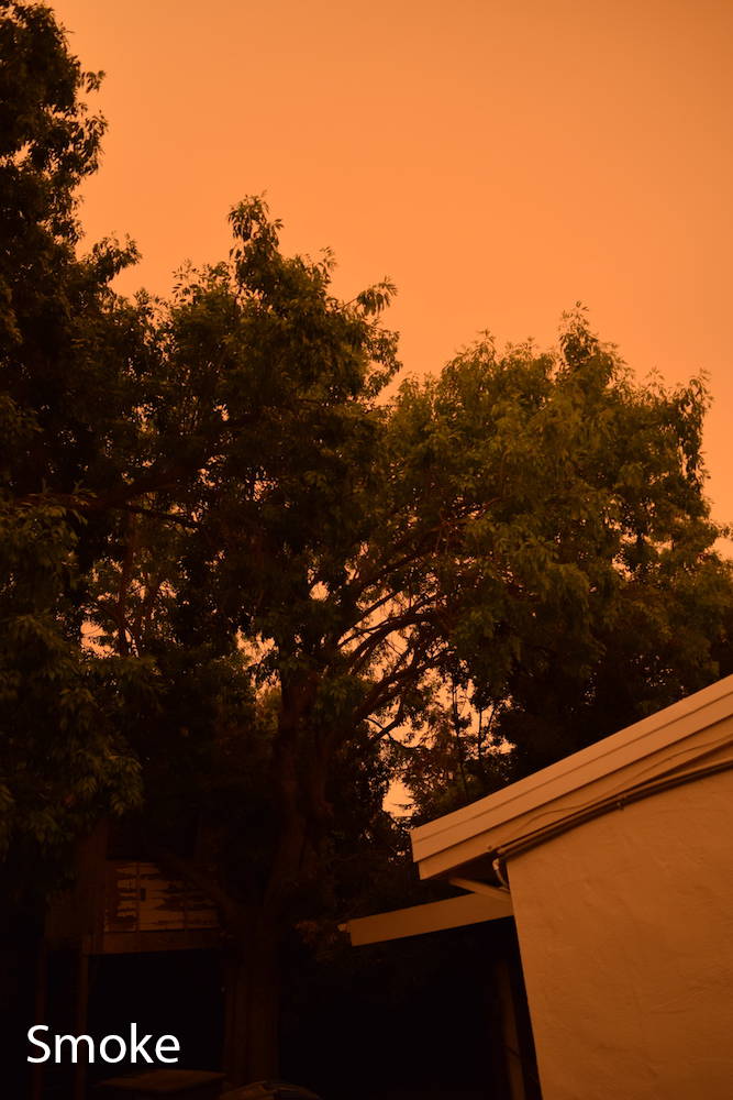
The “Clear Sky” picture was taken in November and the “Smoke” photo in September. This comparison is supposed to show how the smoke of nearby wildfires had an undeniable presence in Silicon Valley compared to the blue skies we have now. The fires and smoke really taught me to appreciate things I usually don’t take time to appreciate, such as a clear sky and fresh air. Directly comparing the two images makes me think that the orange tinted sky belongs to another world. Although it serves as a reminder to not forget that this our world.
Watercolor Meets the Sky


This comparison is between a photo I took and a watercolor painting I made based on it. I did not aim to follow the original exactly, but used it more as a reference and used features for guidance.
* If images do not appear, resize browser window
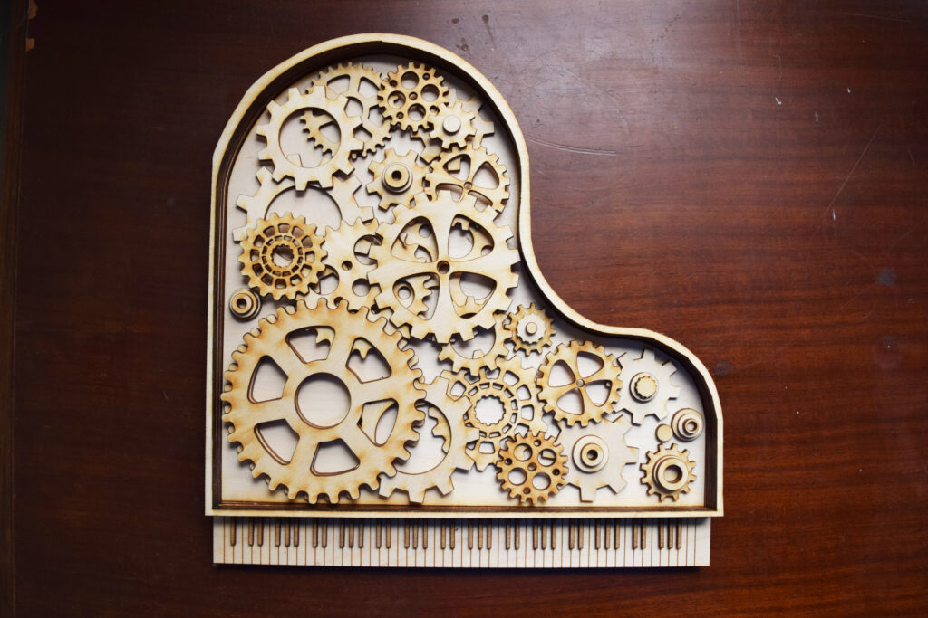
Multi-Layered Art Project
For this project we could choose to make stacked wood art, wooden rings or a light box. I initially teamed up with a friend, they made wooden rings and I did stacked wood art. We realized we both enjoyed music and decided to make our overarching theme music. Personally, I feel attached to the piano since I have enjoyed playing it for years so I made it the foundation of my piece.
We started with a rough sketch, needless to say mine’s was quite rough.

Once we had an idea, we then transitioned to Adobe Illustrator where we primarily used the pen tool. The lines and shapes I made were to be cut out on wood so I had to plan accordingly and make sure the correct holes were cut out. At times it would get confusing which gear was on which layer, but it all turned out okay in the end.

Once I completed my Illustrator drawing, it was then laser cut into individual pieces for me to glue together.
I really enjoyed this part because I was able to see this wooden project in the real world after seeing it only on a screen for weeks.
While I was putting the final project together, I took pictures as I went to make a time lapse once I completed it. I found the process to be calming and as I mentioned earlier, rewarding to see everything come together.
We also created a three dimensional video in After Effect using a 3D camera.

My inspiration for the project came from another Freestyle student I started working with. We originally planned for both our projects to have a common theme and were brainstorming ideas together. We quickly realized we both enjoyed and had a passion for music so we decided to orient our projects around different kinds of music. I went with the piano because it’s one of my favorite instruments and I really enjoy playing it. I incorporated the gears because I wanted to show how there’s more to music then how it sounds, but the work behind how the sound gets created and the effort it takes for the musician to bring it to life.
Struggles I encountered were at the beginning of the project. At first I had no idea what to do and even when I did find a trail to go down, I was at a loss on how to execute it. Once I sketched out an idea, growing comfortable with the pen tool was also a challenge in itself. Although as I continued to play around with the tools in Adobe Illustrator, I was able to make more progress and found my idea crystalizing as I worked. If I could change it, I would try to find ways to make the piano have more depth. When I was constructing it. the main thing I tried to adjust was how flat it appeared. To change it I could add more layers and make the outline of the piano body taller. I could also do something with the bottom to elevate it more than I did.
I am most proud of how I came up with an idea, worked on it in Illustrator then glued the pieces together and brought it to life. I am proud of the fact that I got it done and it came out more or less how I wanted it to. It would have been easy to make the design simpler but I was set on my idea and am glad I followed through it.