Citizen
In the citizen project, we interviewed someone with a unique social identity, meaning some facet of their identity affecting their social life. I chose a military kid, and interviewed her about the culture on her home base, and how her family being in the military affected her life. I used my interview with her to write a lyrical essay about her life.
The Essay
Here live “THE FEDS.” Tens of fatherly fathers and their daughterly daughters. And you, “AS SEEN ON TV”, are the ground from which the pillars rise. The pillars of the house. The pillars of “THE NATION” And yet everything seems so big, except you. Big white cream house. One big dad. One small wife. One small child. Three robberies. Three moves. But the best things always seem to come in twos. Two-pronged tongue in the Mississippi sun. Two friendly strangers in Montana winter. Two friends at first. Moving away from the small friendly town, to the big new one. You are not there anymore, but are not where you are either. In a valley away from the new valley. “2 much 2 handle.”
Everything here is so big, so monumentally mammoth, that when it sank into the harbor, the tsunami knocked the manners out of people. They climbed to the top of the internet towers, to howl their garbled nonsense into the watery aether. “2 M 2 H.” You, your valley in between one life and the other, flooded.
The kids here are different.
“THE FEDS” bring the “THE HEAT” but the California kids bring the “Y E E T.” whatever that means. You’re from one small town, where everything is slower, and the tops are cropped lower.
The style lapped over from the great big West, and while the beach babes were beached somewhere on the great big coast, the trends keep trickling by, into the little sanctuary town.
“AS SEEN ON TV” The man of the house. He’s America’s daddy. The American ideal, like the beach babes who buy the sea’s breeze from their nearest bath and body works. “A E S T H E T I C.” It’s all just too big. The man of the country. The man on base who has had more homes than you. He is your father, America’s daddy, but acts like your drill sergeant.
Here lie “THE FEDS” it was never like as seen as TV. You were not a prop, and we were all people, just like them. Are you pushing, or being pushed, army brat? Nice little prop. Do something about it. Obedient little prop. Wow, that’s so cool. Lovely little prop. Three moves. Invisible little prop. They won’t even look at you. Fake little prop. Odd little prop. Bad little prop. No little prop. American Sniper baby. “2 Much 2 Handle.”
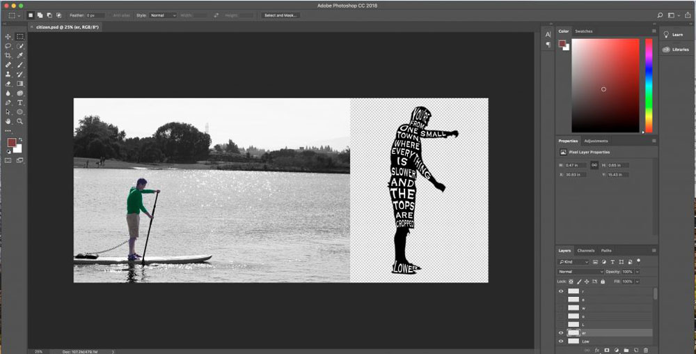
Citizen Image
This is the image I used to represent my lyrical essay.
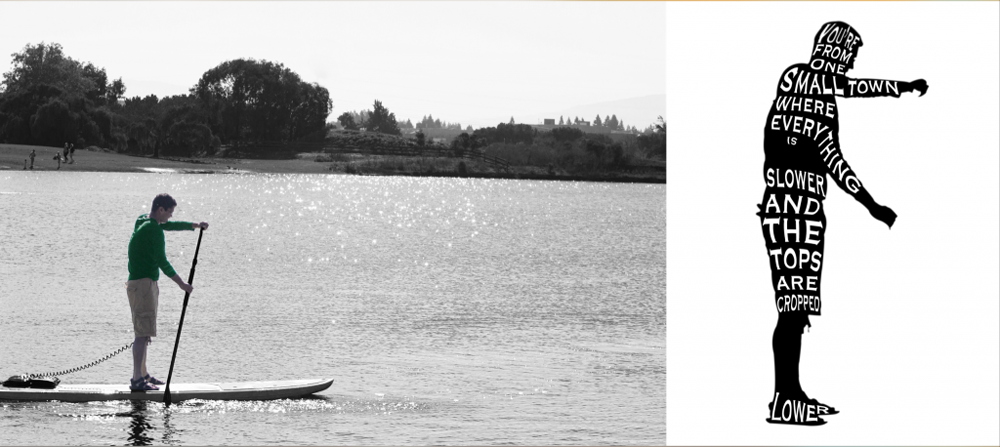
I chose this photo, because the man on the paddle boat is clearly not an aquatic creature, but still finds a way to exist in the water. This is meant to represent my interviewee feeling like she is in a culture she is not adapted to, and having to find her own way. In my silhouette, I put the quote “You’re from one small town, where everything is slower, and the tops are cropped lower.” because it expresses the clashing cultures between my interviewee’s hometown, and where she lives now. It also shows how overwhelming the sheer amount of people in Silicon Valley can be, which I represented with the vast expanse of water beneath the paddleboat.
When editing the photo, I boosted the contrast in the background, and also edited the light levels with a curves layer. I did this to enhance the details, and also create more darkness and shadows. I also enhanced the brightness and saturation on the man, to make him stand out, and make him less shadowy and more clear. I chose to turn the shirt of the man in the photo green, so that he would stand out on the black and white background, and also because green a the color commonly associated with the military. I used the font Copperplate, because it has an old fashioned official look to it, which seemed appropriate for someone who was stationed in a small town. In the silhouette, I placed the word “cropped” at the hem of the shorts, since the word cropped was meant to refer to where clothing ends. I also put the word “lower” at the lowest point in the silhouette, to emphasize it.
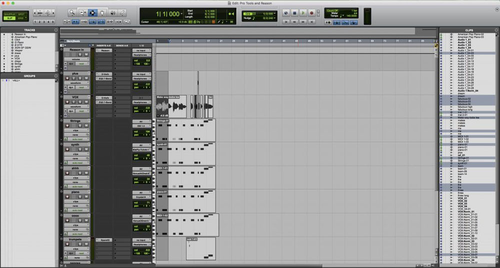
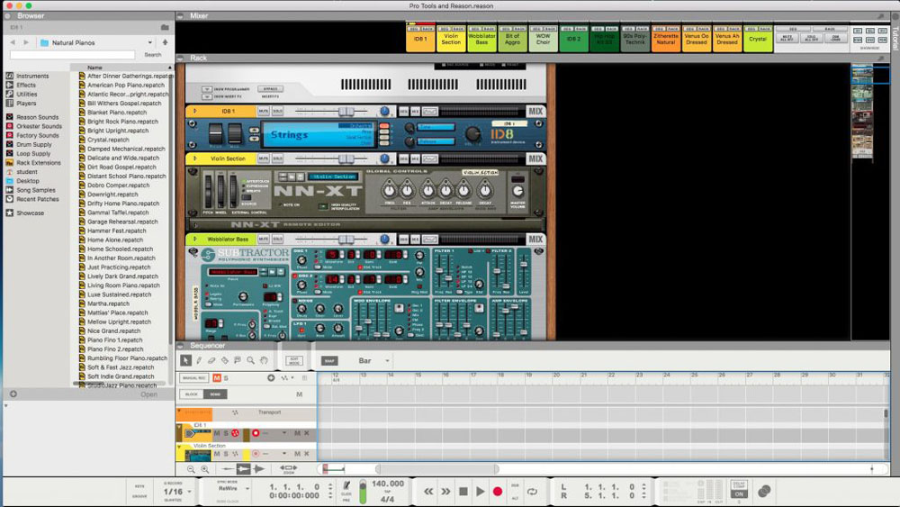
Musical Production
In this project, we used Reason and Pro Tools to create an original song. I decided to write an ode to my friend group, who I call “The Dream Team.” Pro Tools and Reason are both extremely useful audio programs, so getting some practice with them was an important experience
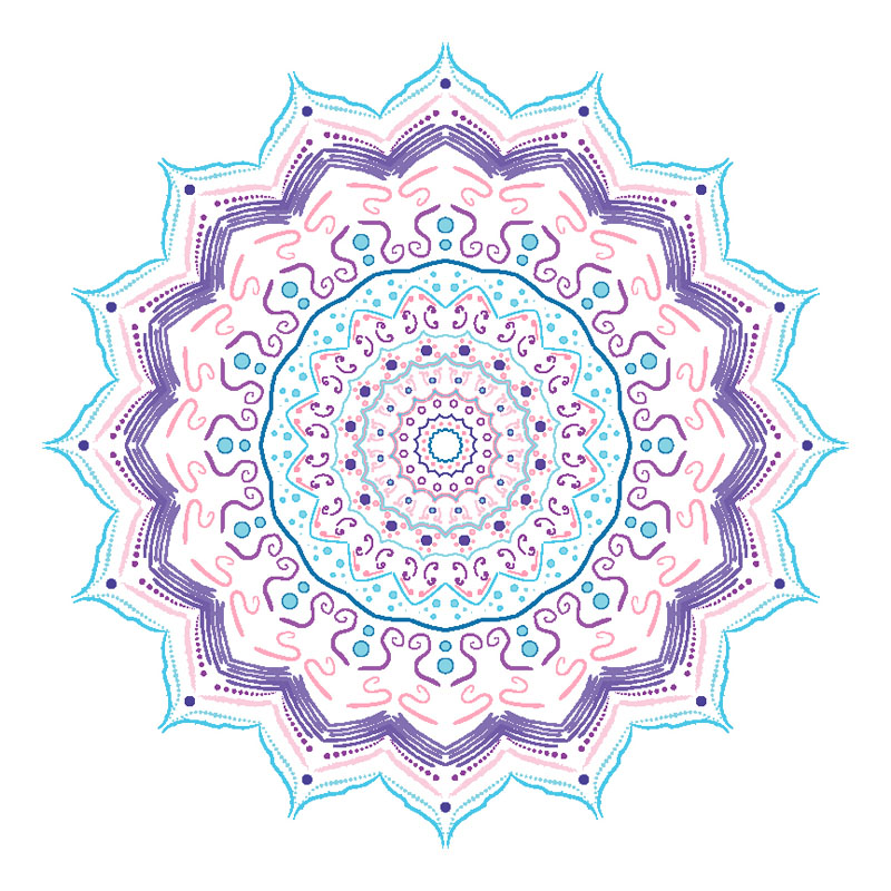
Mandalas
In this project, we used Adobe Illustrator to draw perfectly symmetrical mandalas. We made a black and white one, that we then had engraved, and a color one which stays digital. I have always loved geometric shapes, but I have a huge problem telling when things are even, so when I try to draw things like mandalas by hand, they always end up looking off. So, I greatly valued learning how to create beautiful symmetrical geometric shapes in Illustrator. I also loved the opportunity to explore and learn about brushes, trying out new ones, and experimenting with pressure sensitive brushes was very interesting.
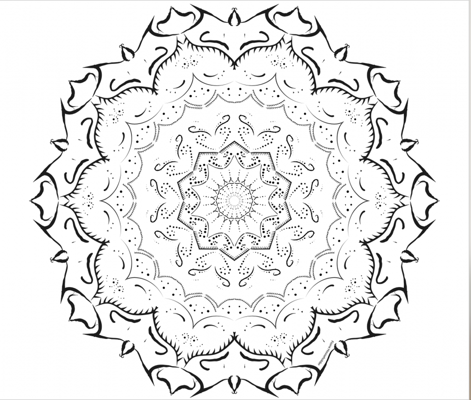
Here is my wooden engraved Mandala.
Mandala Video
Mandala Video
Here is a video of all of the elements of my black and white Mandala.
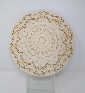
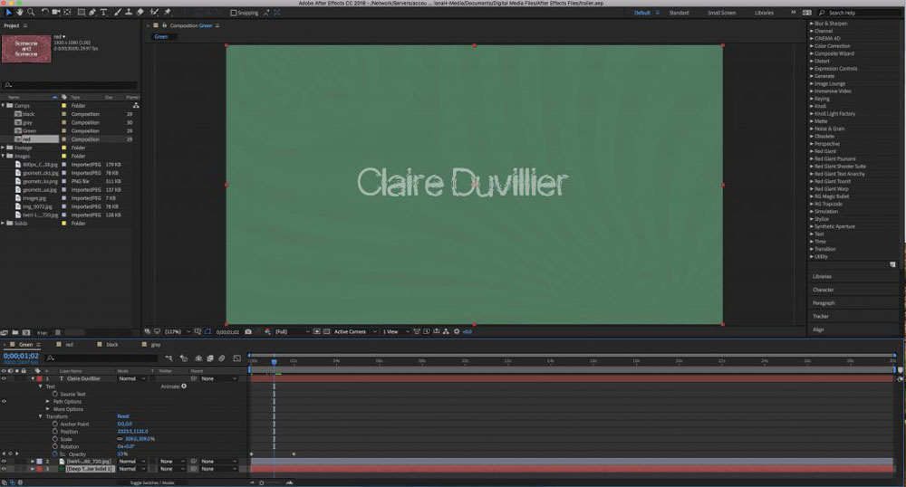
Freedom Project
For my freedom project, I chose to help my friend Nina create a trailer and a movie poster for her narrative film. I used After Effects for title cards in trailer, and photoshop and Illustrator for the poster. Creating art based on someone else’s work, and working together with someone was an interesting experience. I learned a little bit about Nina, and her creative mind, and it was fun to be a part of the “behind the scenes” part of someone else’s creative process.
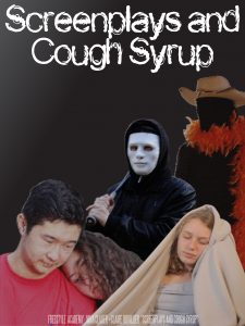 Here is the finished movie poster
ARVE error: Mode: lazyload not available (ARVE Pro not active?), switching to normal mode
Here is the finished trailer
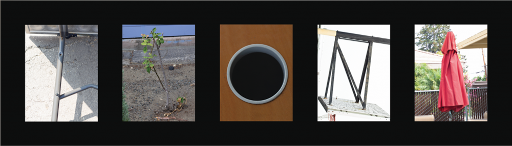
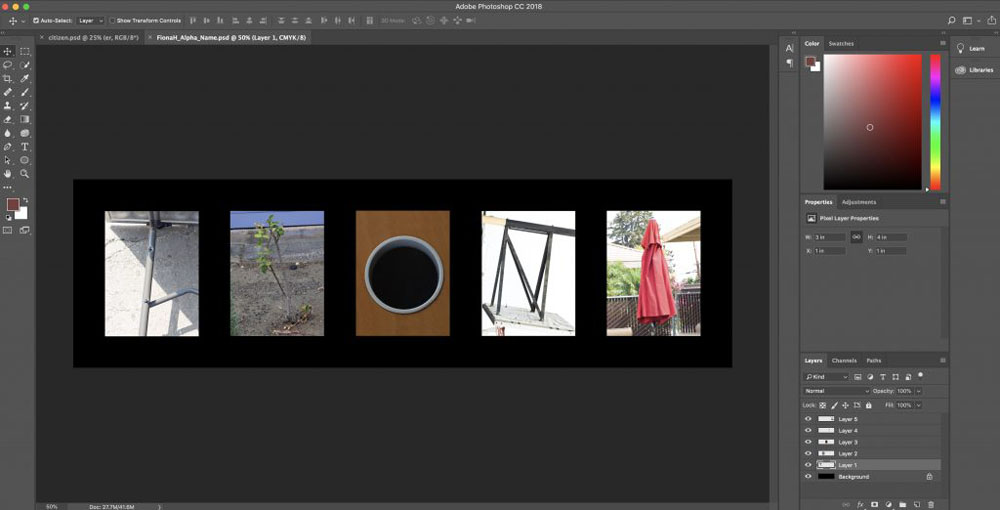
Alphabet Name Photography
In this assignment, we took photos of objects around campus that resembled letters, and made them into our name. It was a fun little exercise in shape and photography.
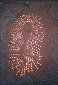
Aboriginal
In this assignment, we used dots to create “implied lines” in an aboriginal art style. The medium was paint, and we were tasked with picking an animal, and a color scheme that matched the animal.
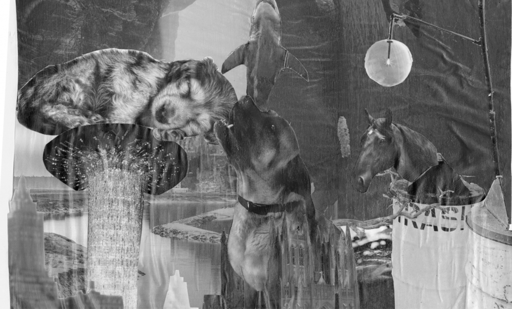
Shape Form Space Magazine Collage
In this project, we used X-ACTO knives to cut figures out of magazines, and create a scene with an effective color scheme, and movement. This was an exercise in composition, and our ability to utilize the principles of design.
Monochromatic Shape Painting
This project built off of the Magazine Collage. We traced the silhouettes of the various shapes included in our magazine collage, and then used a single hue to fill each individual shape. A hue is a color in its brightest most saturated form. So, we could use the original hue, or tints, tones, and shades of it. A tint is a hue plus white, a tone is a hue plus gray, and a shade is a hue plus black. Hence, a variety of colors, but only one hue. This was meant to be an exercise in color, and I found it very effective. I didn’t imagine that a single hue could be so varied, and afterwards I began to recognize that the world is actually full of tints tones and shades.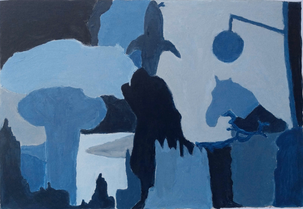
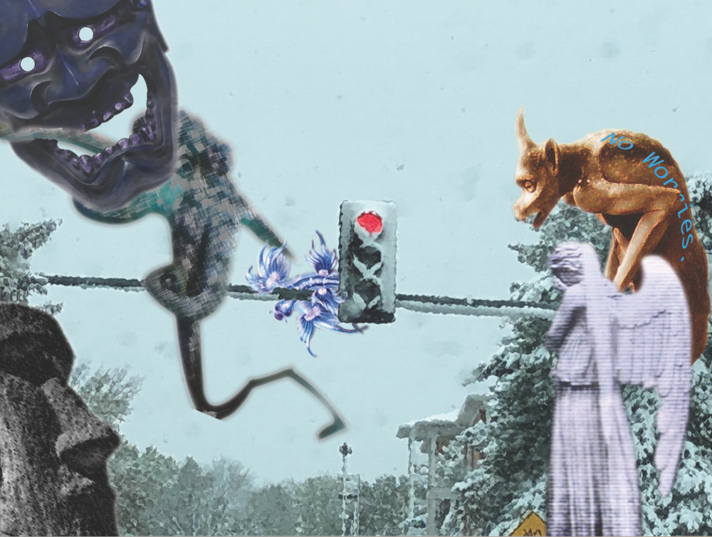
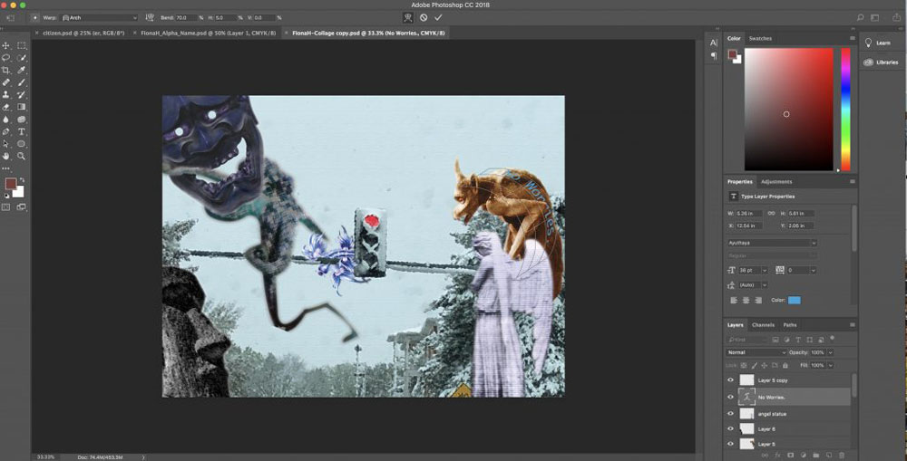
Photoshop Collage
In this project, we used various images to create a collage. However, we had to apply a strict color scheme, by using Photoshop color editing to change the color of the various objects in our collage. This was useful Photoshop practice, because it helped me explore the color editing options available in photoshop, and how to make something look as natural as possible using those options. We also had to add a phrase into our collage, and I chose “No Worries” because that’s something I say to people a lot, and to me each object in the collage represents a different kind of person.
Street Photography
Street Photography was the method we used to take our citizen photos. It is meant to be a candid shot of someone in a public area, capturing everyday life and emotions. To achieve this, we used a telephoto lense, which allowed us to take photos from far away, that still looked clear. I appreciate that in Freestyle academy, we learn a variety of skills, and I think that that is a great thing. However, I will personally never photograph another stranger without their permission again.
Citizen Photography Project
In our Design class, we used one of the street photos we took as our image for our Lyrical essay. I loved learning about text manipulation (which we used to put our quote inside our figure), I personally find it very fun, and useful, I will definitely use it in future design projects.
Japanese Stab-binding Book
This was by far the most complex project this semester. It contained four elements. Ink kanji, watercolor images, Japanese style illustrations, and quotes from our lyrical essays. The watercolor appearance was actually a Photoshop effect applied to photos I had taken, and the quotes were formatted using Indesign. However, the cover, back cover, frames, beadwork, kanji, illustrations, drilling and binding were all done by hand. Learning how to make the individual components of this project helped me learn and practice skills that I can use when I am working with paper in the future. Also, learning to do an intricate book bind was very interesting.
ARVE error: Mode: lazyload not available (ARVE Pro not active?), switching to normal mode
Movie Package Minimalist Project
In this project, we brainstormed a movie, in which we were the protagonist, and then designed promotional material for it, including a poster, with a title font of our own design, tickets, and packaging. My movie idea was that I, in this fantasy world, am a witch who decided to go into cooking instead of witchcraft. However, I accidentally add magical herbs instead of cooking herbs to a dish that is going to be served to the king, and I must figure out how to turn him back. In this project, since the poster was going to be minimalist, we had to learn how to boil something down to a single, simplified image. So, it was a useful exercise in symbolism and visual story telling.
 Here is me woking on my ticket in Illustrator
 Here is me woking on my packaging in Illustrator
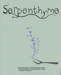 Here is my finished movie poster
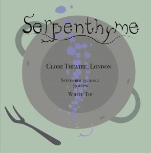 Here is my finished movie ticket
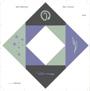 Here is my finished movie packaging