Hello, and welcome to my website! My name is Fiona Householder O’Neill, and I am a Design student. Outside of Freestyle I use my design skills to make things such as cards and profile pictures for my friends and myself. I love to explore and learn, and I have a special place in my heart for fantasy and role-playing games.
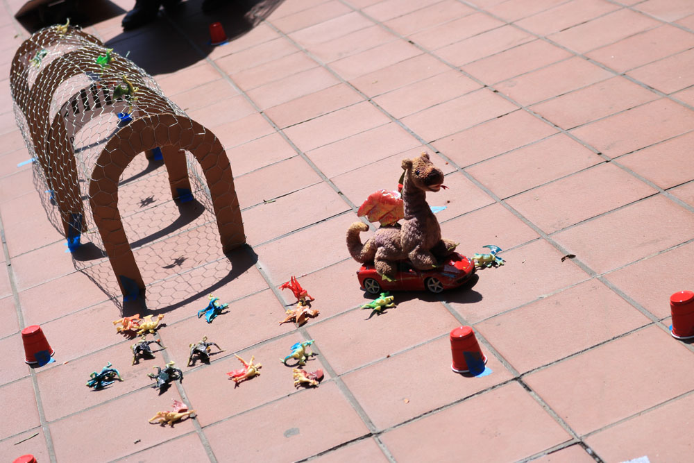
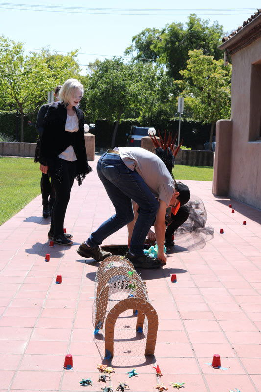
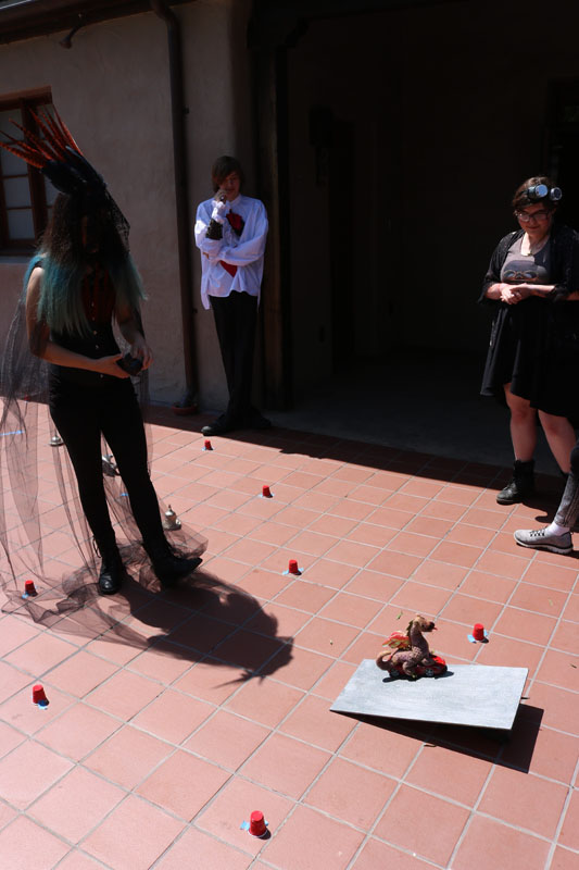
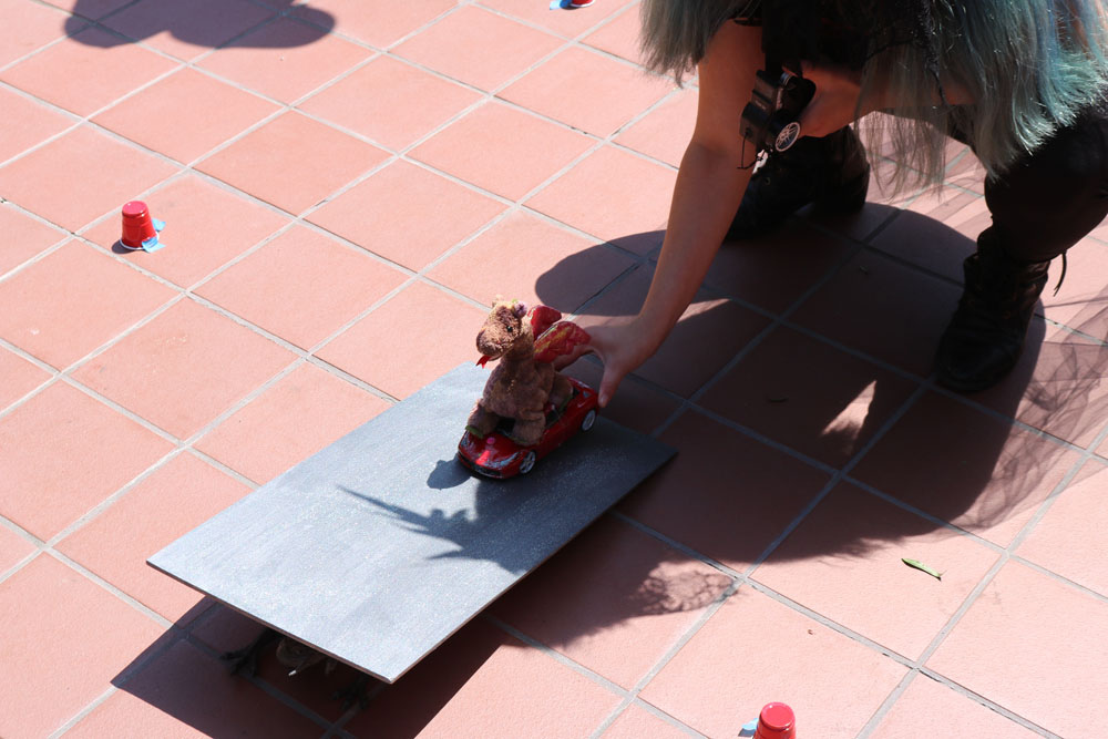
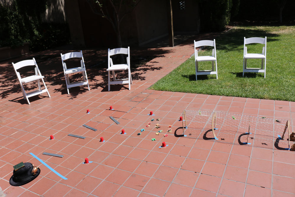
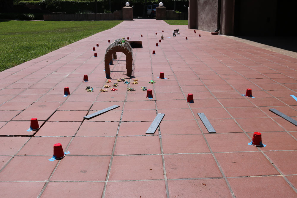
I chose two design projects based on what I call “the art of presentation.” Meaning, using design elements as an inviting package for what I am presenting. In my Documentary project, I present my thoughts on tea. My goal was to package my thoughts in a way that makes tea seem appetizing, colorful and fun. I really liked the outcome of the book, because it takes something that most people think of as mundane and turns it into something more lively. Finding fun in the mundane is something I think is very important, which is why design matters to me; it can elevate almost anything to a new, amusing level. For my Zenith, which was an event, I took the individual parts, and packaged them according to a cohesive and appealing theme. I didn’t just want a race course; I wanted a dragon race course. I didn’t just want drinks, but fantasy drinks. I think my Zenith was successful, because in my mind, the theme and packaging made the event and activities more exciting to my guests.
I would like advice on how to make my “packages” more interesting and appealing. How can I grab people’s attention more effectively? How can I make them feel engaged? How can I make what I am presenting seem more desirable to potential consumers of my product?
To expand my eye-catching presentation skills, I am going to intern as a social media manager at Quanta Therapies (I already photograph for them, but I plan to become more involved in their advertising). I am also going to get a job as a barista, so I can learn to make coffee and tea look even more beautiful.
You can contact me at: fiona.oneill14@gmail.com.
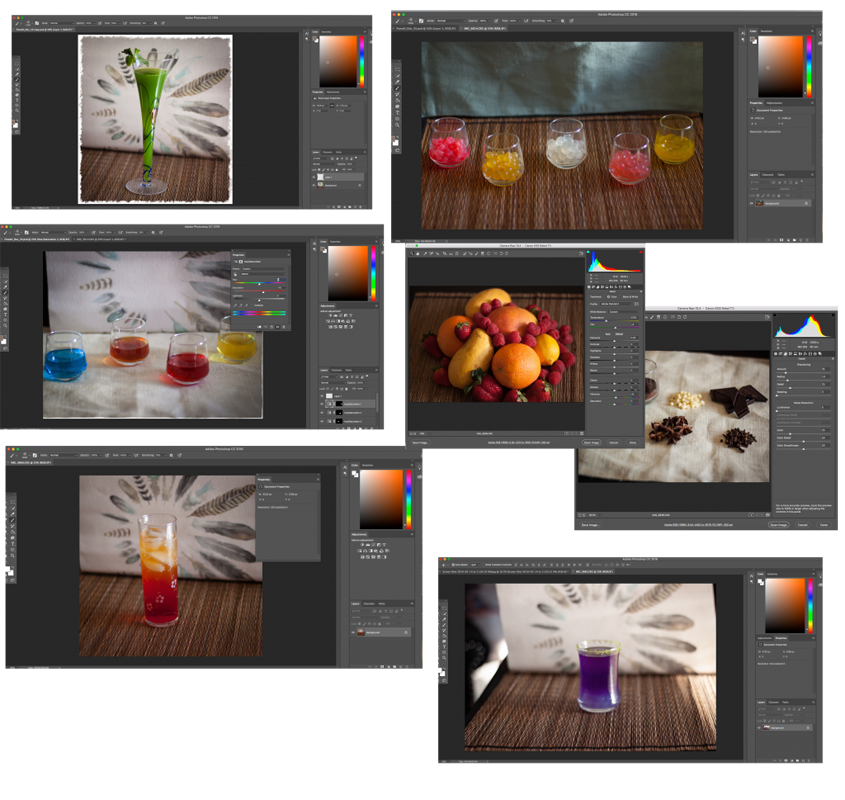
Documentary
For my documentary project, I was really getting in to my local tea culture, which would expand into cafe and coffee culture. I really appreciated the aesthetic of food and drinks which is something I carried with me into my Zenith. I especially love to experiment with different presentations for food and drinks because I love to have dinner parties and murder mystery parties where the aesthetic of the refreshments feeds the overall atmosphere.
https://issuu.com/freestyleacademy/docs/book-by-fiona-householder?mode=window&pageNumber=1
Editing Photos in Photoshop
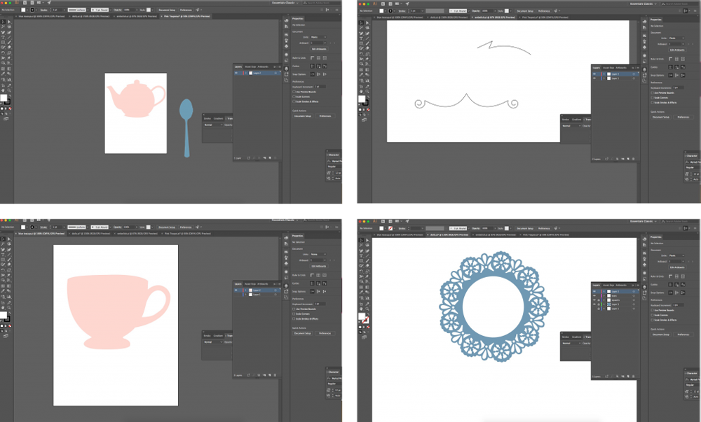
Making and Experimenting With Embellishments in Illustrator
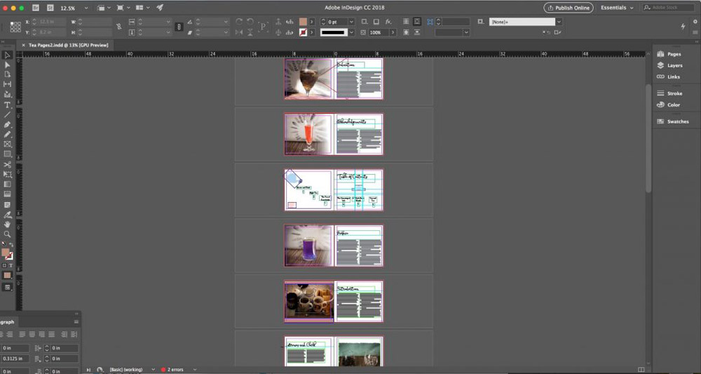
Assembling Book
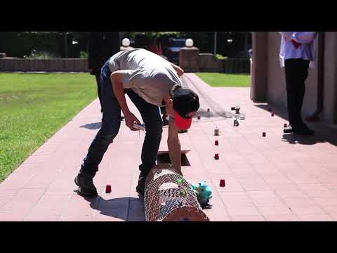
Zenith
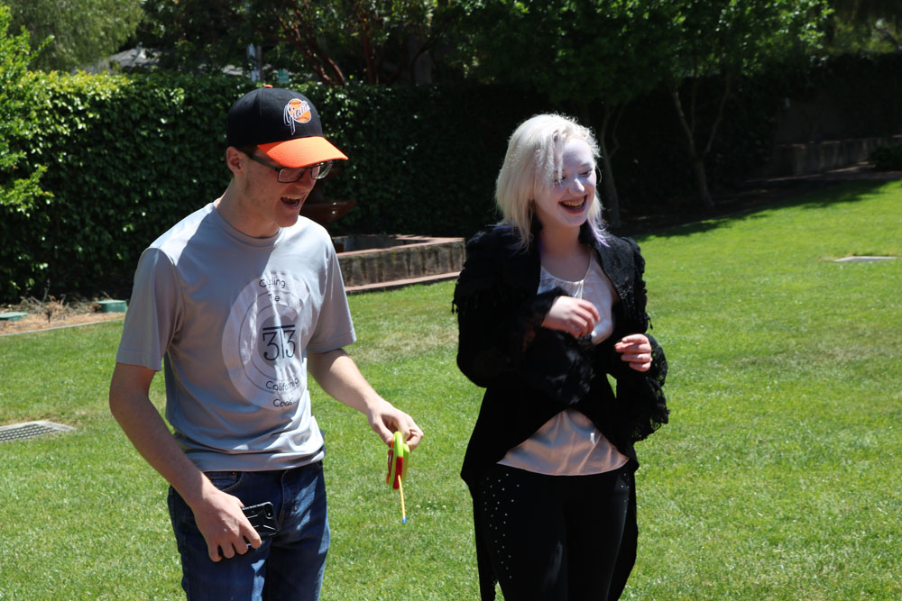
I decided to make my Zenith project an event, so that I could tie in multiple skills. I made drink recipes, costume pieces, decorations, games, and promotional materials, so I could explore my skills in digital arts, physical art, barista-ing, and event planning of course.
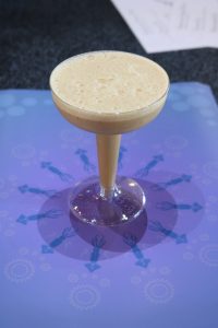
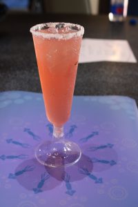
Drink Recipes
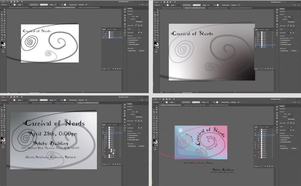
Invitation Style #1
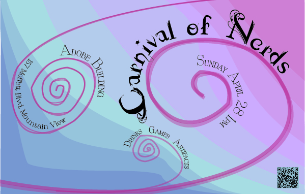
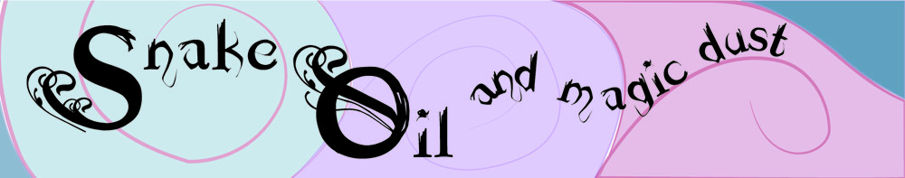
This was the first invitation I made. It was the basis for most of the other material I made. I decided to make the swirls a constant theme, and the color scheme became the color scheme of the event. I also used the two fonts on this invitation for everything, and emulated the wrapping text effect.
It took me a while to perfect it. My old versions lacked balance, had emphasis problems due to everything being in the same font, and the color scheme needed another bright color. After fixing all of that, I made my second invitation style.
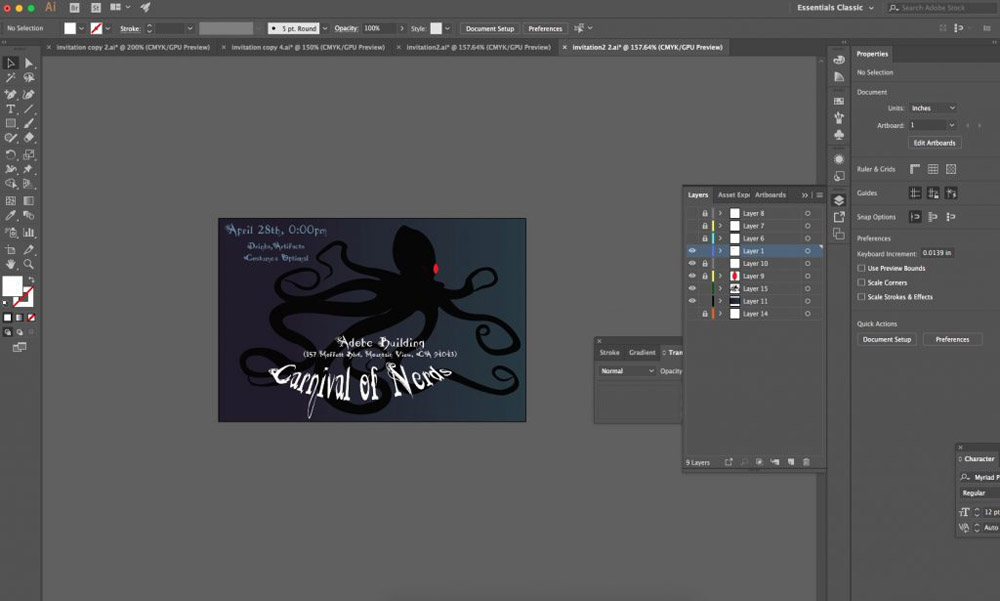
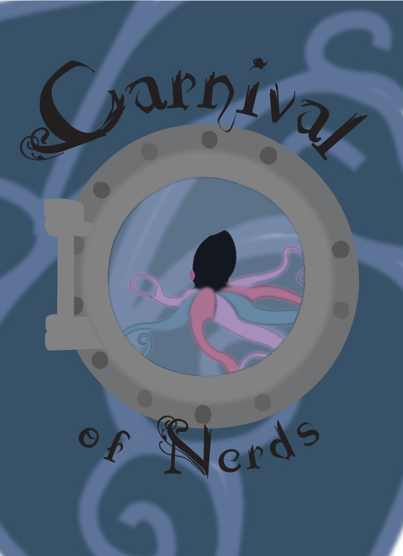
Invitation Style #2
I used the same swirls, but less opaque and less saturated, so the octopus stood out more. Originally I designed the octopus for an invitation style that just didn’t look right, so I didn’t bother working on it.
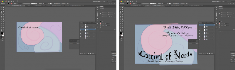
After I finished my first invitation style, I decided to make another version with the octopus in it, with the same colors and designs. Here was my first draft.
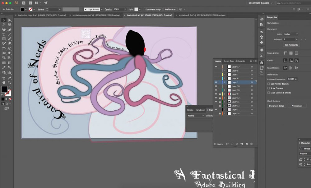
I liked the glowing tentacle effect, but there were some major issues. The spacing was no good on this one, the positioning of the octopus was off, and I had the same issue with the font. So I added my new font, and put the information on the tentacles to improve the spacing. I also flipped the octopus, so that the design was more balanced, with the title on the left, and the tentacles on the right. I also changed the black and the red to colors from my color scheme.
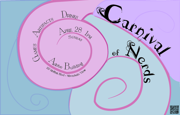
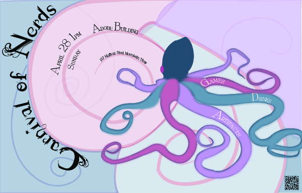
Invitation Style #3
This was my last invitation style, which I made from a failed black and white style. After adjusting the spirals so they were more balanced, adding the text wrap effect, adding the new font, and adding my color scheme, it looked a lot better.
Poster I Made for the Event
After making the invitations, I had all of the elements I needed for the poster. I used the color scheme, the octopus, and the spirals. Since I was using the darker colors from the color scheme, I made the octopus black on the poster.
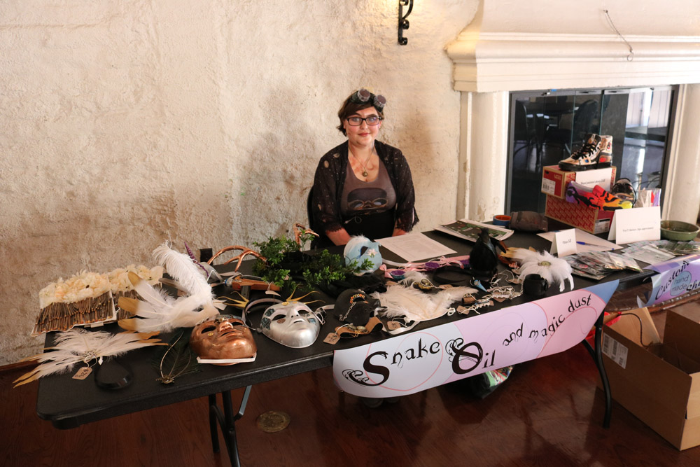
Merchandise Sign
I also got all of the elements I needed for the merchandise sign from the invitations. I got the color scheme, spirals, and the idea to make the text snake around, and wrap the spiral from the invitations.
After that, I designed placemats based on the designs and color scheme of all of the other materials I had designed. However, I only ended up using the last one, because it was the only one I was proud enough of to print.
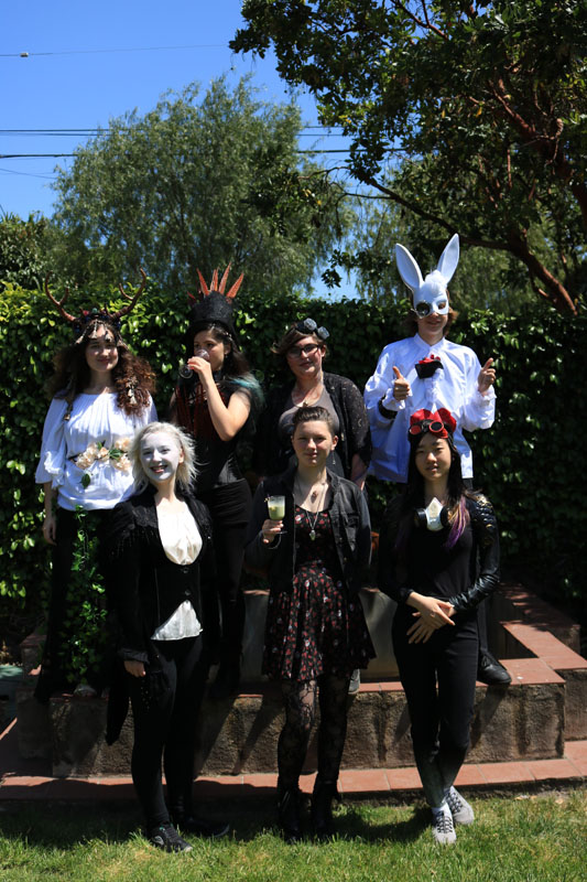
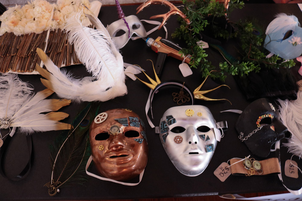
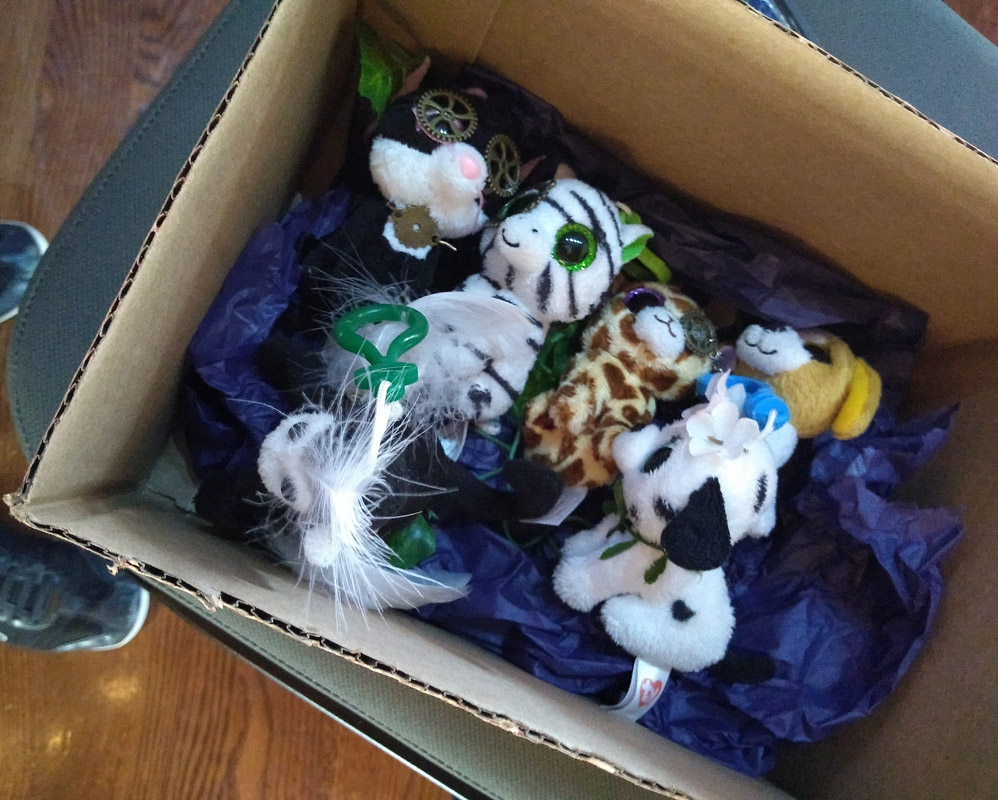
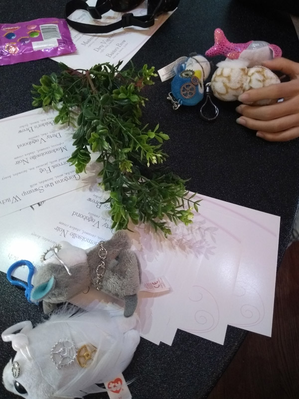
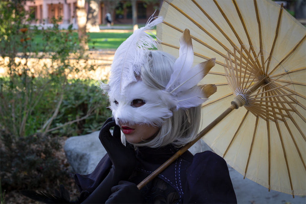
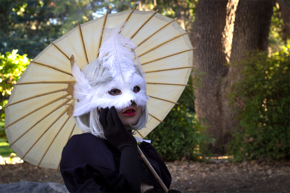
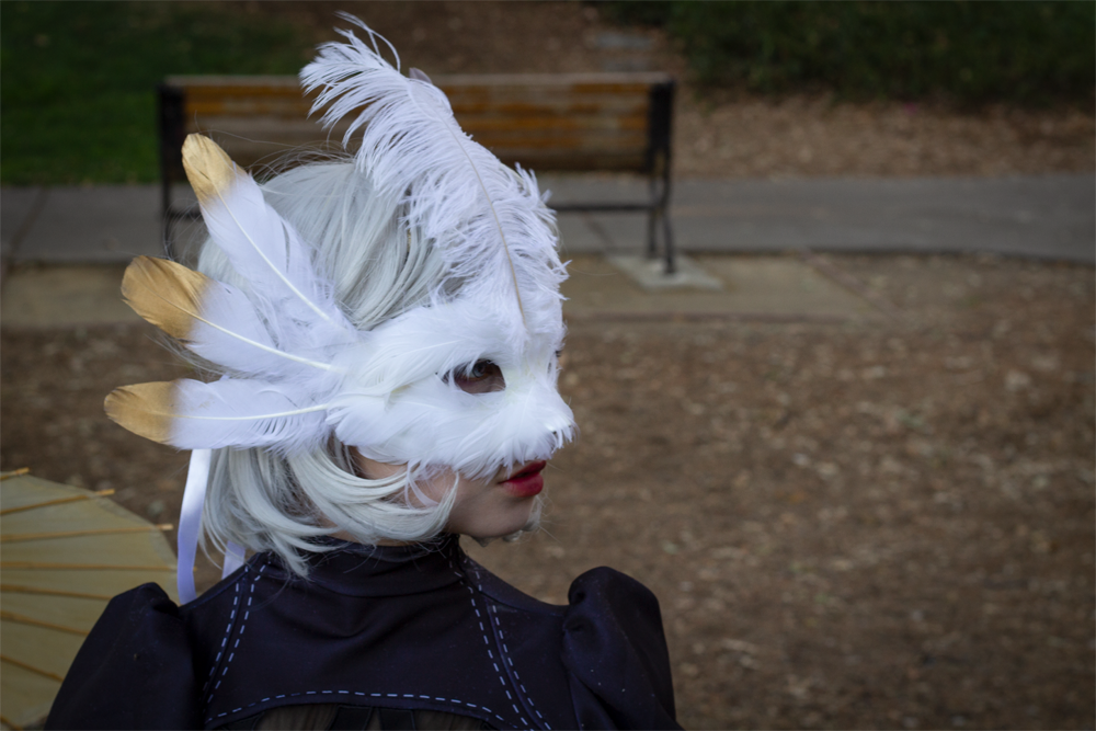
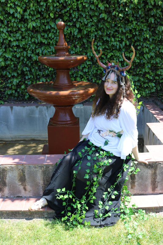
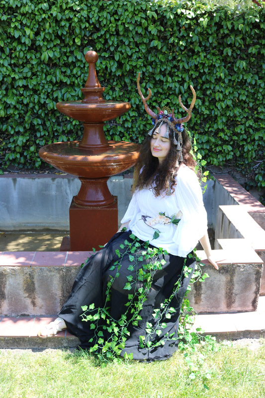
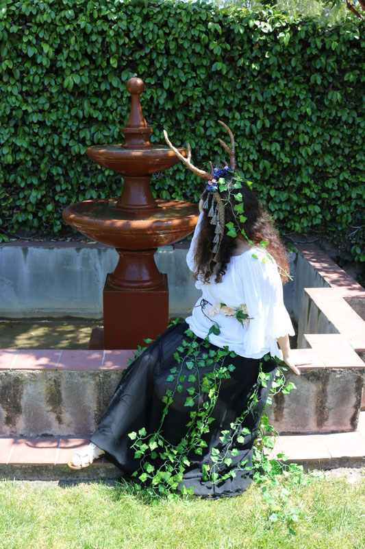
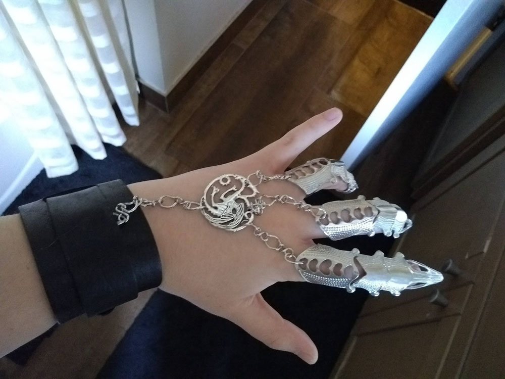
I always loved the hand made costume items that people sold at conventions and fairs, so I decided to make my own costume pieces. I made pieces that fit into ensambles, or complete costumes, as well as individual pieces.
Rabbit Ensamble


Punk Card Soldier Ensamble


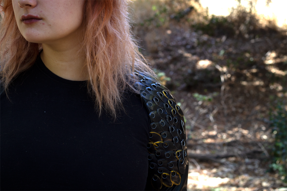
Pheasant Feather Ensamble


Other Things I Made
Games
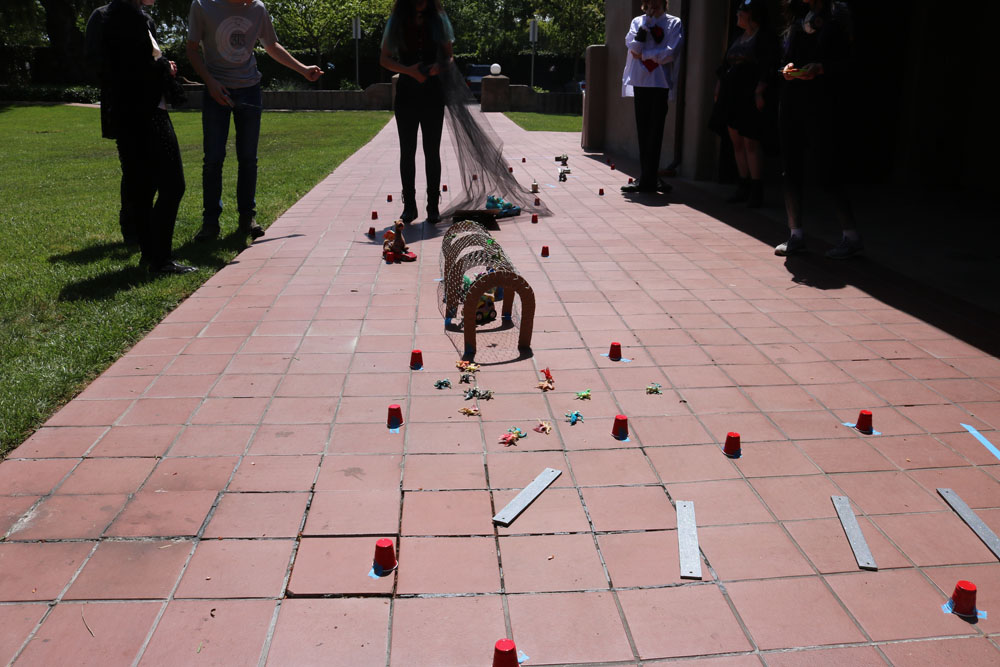
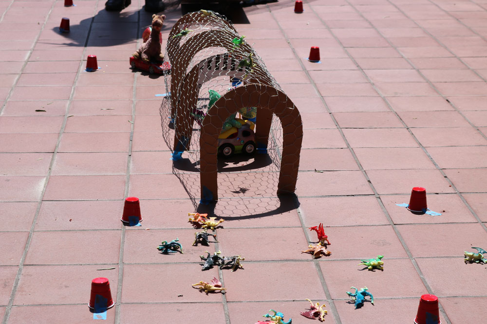
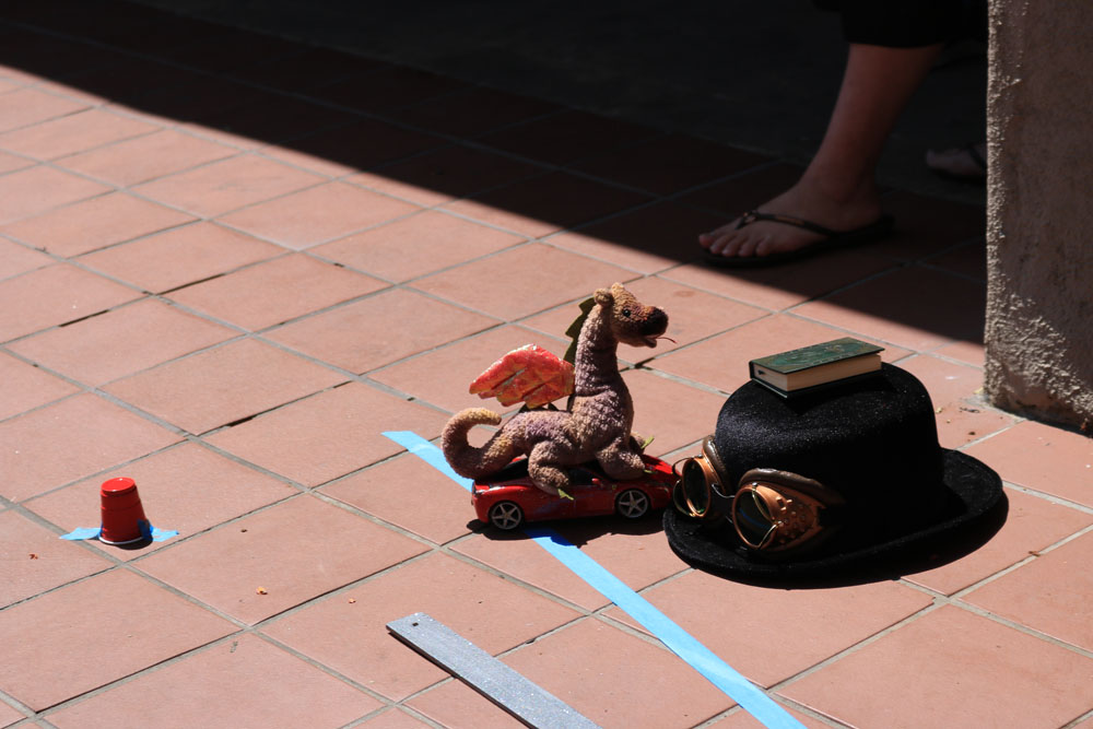
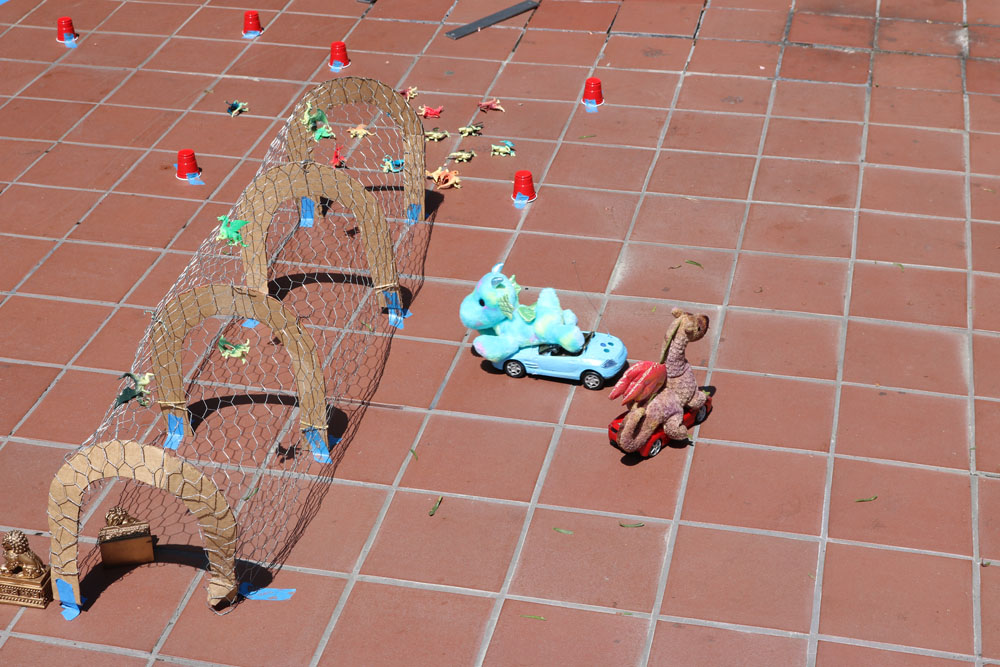
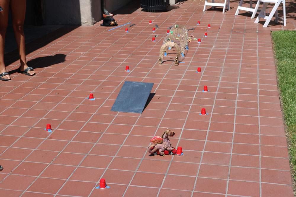
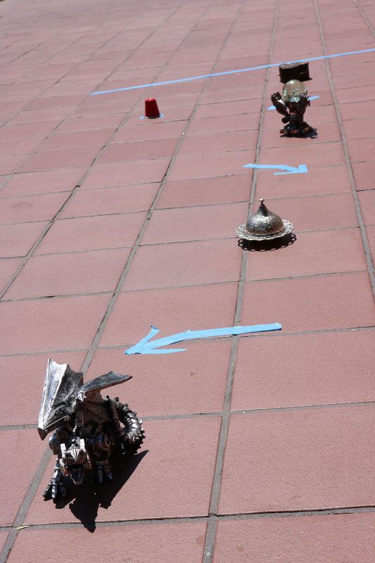
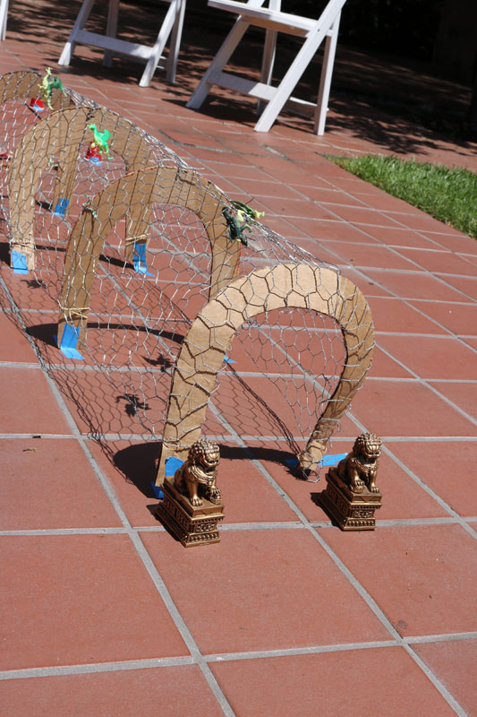
I made a dragon themed race course with dragon cars, that my guests could race.
I also made a trivia game. If two or more of the players or teams could not answer the question, they would have the option of competing for a point by doing one of the mini games on the wheel.