Movie Poster
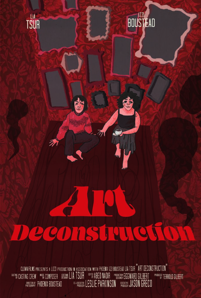
In the movie that I came up with, Isidore and Leia are two struggling artists who move into a very old apartment building in Portland, only to find out that it’s inhabited with ghosts from all throughout the history of the building and the area. At first, they don’t get along with these ghosts, but eventually they become closer with some of them and build a friendship. When the building is purchased by a development firm to demolish and rebuild into a modern office building, Isidore, Leia, and the ghosts have to team up to save their home. For the poster, I decided to illustrate the main characters and the ghosts in the apartment.
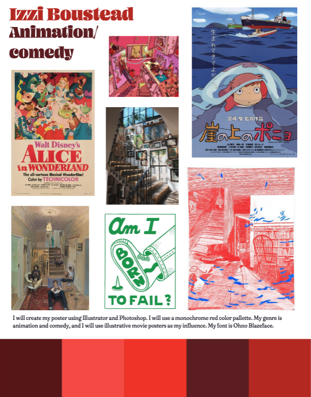
I created my poster predominantly in Photoshop, starting with a pencil sketch that I did and painted over it digitally. I used a stock photo of antique wallpaper and the warp tool to make wallpaper that fit the walls of the room which is in the poster. I also added screen layers with scanned paper textures to add noise and texture to the poster. I also set up my credits block by inserting my own names and information. In Illustrator, I added my title in the font Ohno Blazeface, adjusting the type settings to make it fit well and look appealing. I then used the warp mesh tool to change the shape of the letters and make them fit the poster better.
Product Design
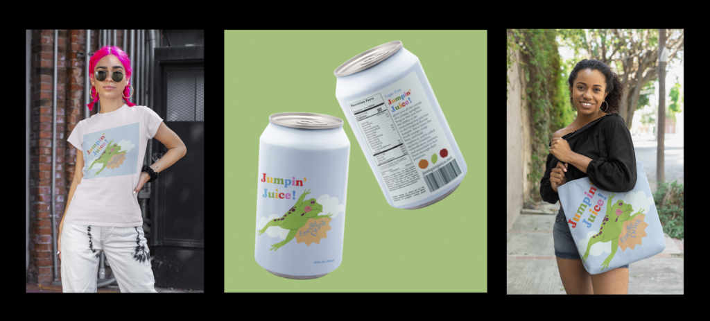
The product I created is Jumpin’ Juice energy drink, which is marketed to teenagers and young adults. I accomplished this by using bright colors and simple, cute design to attract my target demographic.
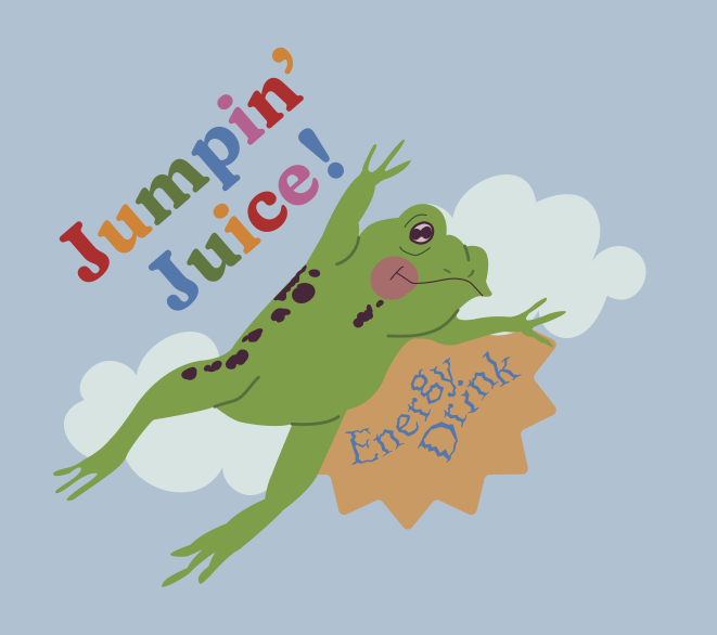
If I were to create a magazine advertisement for this product, I would use the appeal of pathos, and the persuasive techniques of anti-bandwagon and association, to make the drink seem more appealing and trendy.
To get inspiration, first I made a moodboard and a Pinterest board, where I collected ideas for the color, style, and typefaces of my logo and label. I started my logo with a sketch, which I refined into a more neat drawing before I placed it in Illustrator to trace with the pen tool. I made sure to create all of my elements before I began the coloring process, as this technique works best for me. I also used Photoshop filters to add texture. To create the back of my label, I found examples of nutrition fact labels online and changed the font to match my brand. I copied all of the facts and ingredients from other brands of energy drink, and inserted some copy I wrote about the product. I then exported my front and back label and put them on the PlaceIt website to create my mockups on a transparent background, before placing them in Photoshop so that I could arrange them to my liking.
