Introduction
We’re back with my second and last year of freestyle. The first project that we did when we came back was the Reflections Unit where in Digital Media, we had to make our personal mandala. Along with making the mandalas, we also wrote our personal essays in english and did some surreal collages in Design. We also did some art curation in english where we went on a field trip to the SF MOMA where we were able to go around and look at different pieces of art work.
My Personal Mandalas
First project we did for Digital Media this year was creating our personal mandala where we had to make a repeating design around the center. This project was an introduction to our first unit which was the reflection unit where we had to look into our personality and identity and create something that represent that identity.
The first part of the project was to create the Black and White version of the Mandala and we did this in Adobe Illustrator. Since I was in design, this part was really easy and I could turn off my brain and just chill and work. We used a repeating pattern feature in Illustrator meaning that I only needed to draw 1/12 of the actual mandala, Once that was done, we then laser printed the mandala (photo below)
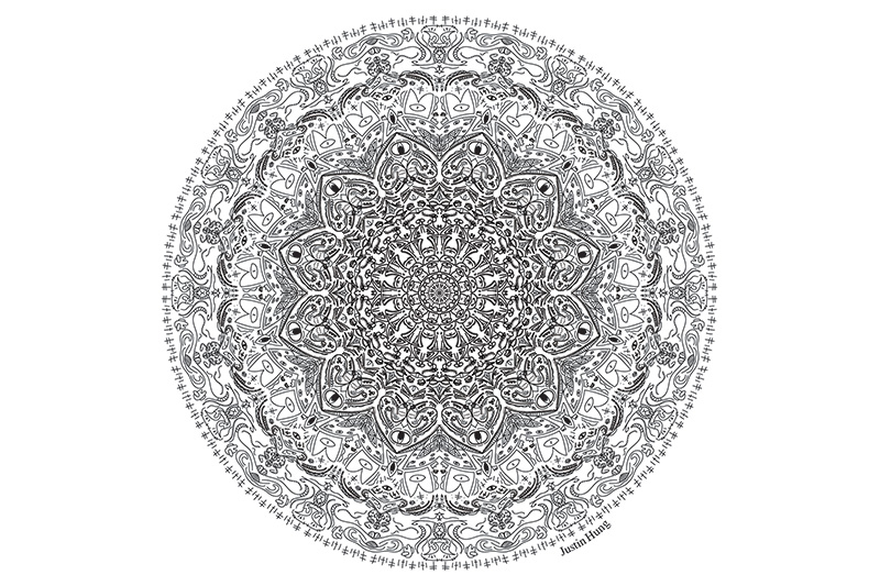
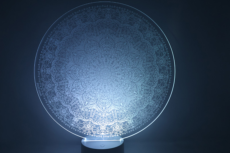
The first project of my senior year at freestyle was the Mandala project that we did in Digital Media. It was part of our reflection unit where we had to create a mandala where we reflected about our time here in freestyle and what represents us. In this case, I decided to make a mandala with random doodles of stuff because I’m very random and spontaneous where I would do stuff on the dime. I also wanted to have some sort of eye in my design for some creepy or unsettling effect.
In order to make this project, I had to learn how to make a clipping masking in Adobe Illustrator where if I drew inside the clipping mask, it would duplicate and rotate the design across the entire mandala which would save so much time instead of doing everything twelve times. I used mostly the brush tool in order to draw out the design. Some stuff in the mandala that reflected me was in the very middle, it has a character and that was one of my first character creations ever. His name is Tom the Mushroom and I believe I made him back in first grade. I would always doodle on the margins of my papers and one of the first things I would doodle was Tom the Mushroom. I also wanted to incorporate eyes in the design because good insight is very beneficial to have for a person because with that good insight, you can find and address an issue quickly and it’s overall helpful to have in the real world. There are also other little “easter eggs” scattered throughout the mandala, like an Among Us here and there. Why? I thought it would be funny to have them in the design.
We also had to learn how to use the tablets and pressure sensitive brush in this project. Since in design we already used the tablets, I was very comfortable with the tablets. However I felt that compared to a mouse, the tablet definitely gave me less control over where I was drawing and doing the small details was so much harder. The pressure sensitive brushes were cool however I did not like the look of them and decided to lean more into the uniformed brushes. Looking back at this, I feel like if I did use some more sensitive brushes, the design would have looked more textures compared to more flat. However, I still believed that I did pick the right choice in using the more uniform brush. I think my favorite or best part of my mandala would definitely be the eyes that are in the design because I feel like those are very good vocal points where it draws the eye of the on looker. I also made sure to have “Rings” around the mandala where some parts are more detailed than others to create some sort of barrier around certain parts.
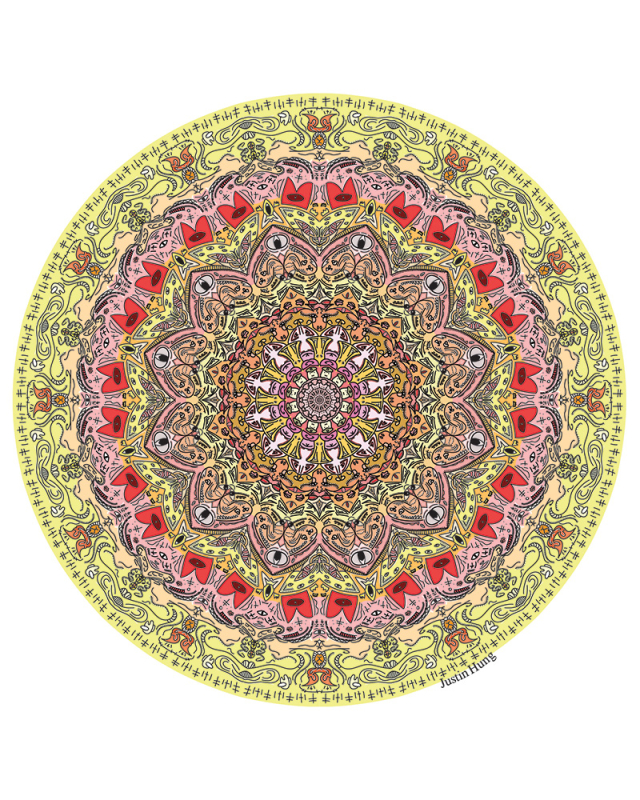
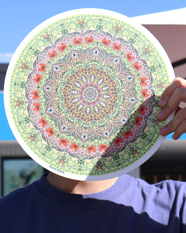
After creating the first mandala, we then started the colored version of the mandala. This was different compared to the black and white one because now there was color and I had to make sure the colors made sense with each other and I also had to divide the space in the mandala in different colors. Upon seeing the printed colored version, I was first amazed and also a bit disappointed because the colors that were printed were a little bit more mute compared to when it was on the computer screen, but other than that, I was really proud about my mandala and it turned out.
My intention for the color scheme was to make a simple color scheme so I didn’t need to worry about highlighting or shadow colors. This is because the way I made my mandala, there weren't a lot of closed shapes, it was more lines and dots flowing into each other meaning I could use the Live Paint bucket tool to color in my mandala. So I had to make sure my color scheme was simple enough where I would go over parts of the mandala with color that made sense. The coloring really made me think where to separate object to object, I had to make sure that the colors weren’t bleeding into each other and making sure to not over use one color over the other given it was an analogous color scheme.
Overall, I’m really happy with the mandala and how it turned out with all of the colors and also the design overall. I think the best part about this colored version of the mandala was the outer ring because the colors divided up the space really well and gave certain parts of the mandala some more focus compared to the others.
Art Curation for Personal Museum
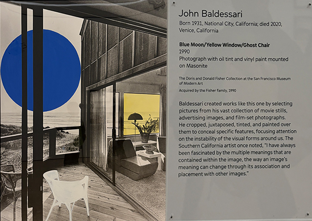
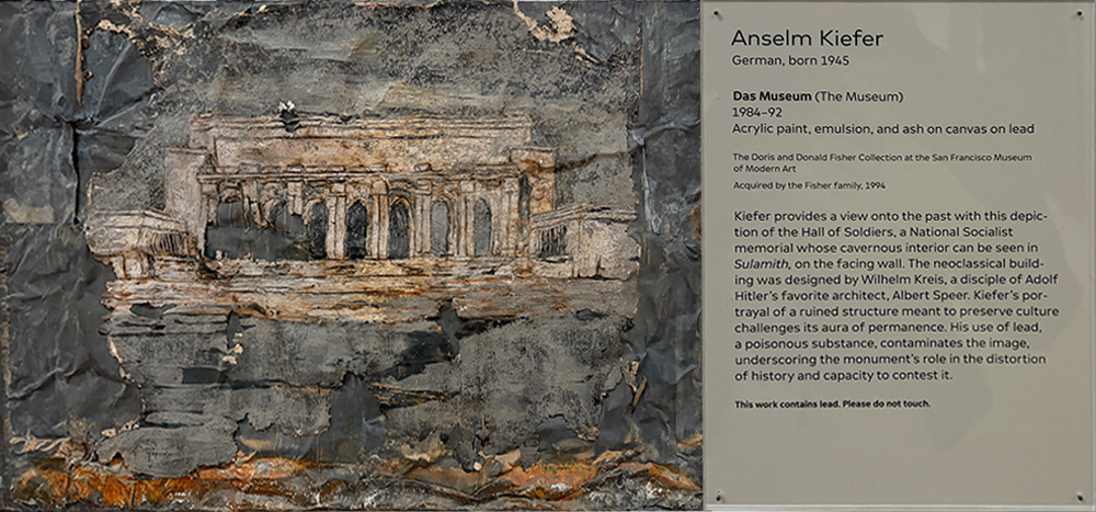
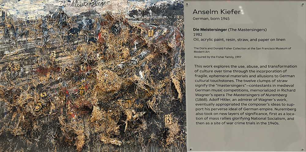
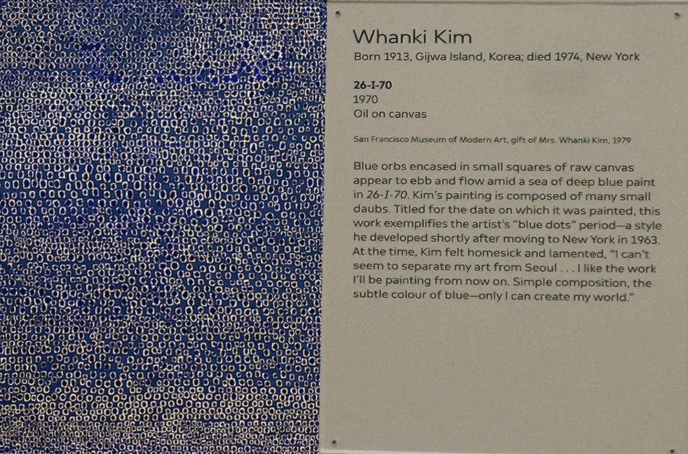
One part of the reflection unit was actually an assignment from English where we went to the SF MOMA for the second and last time of my high school career and we were tasked in finding different pieces of artwork that we could include/exclude from our person museum (if we had one). My process in this project was me going around with a group of friends looking at different artworks seeing if any of them either spoken to us or disgusted. Frontally, there were more of the former than the latter. Some of the artworks I choose either looked really interesting to me or very different or creative than what I saw before. The pieces in the added columns were my favorite out of all of the painting I took photos of and the photos on the excluded side… those… those were either not my taste or just creep the crap out of me. (see the blue painting for context).
3 art pieces I would ADD to my Personal Museum

2 art pieces I would EXCLUDE from my Personal Museum
Below are my reasoning between why I would keep it and why I wouldn’t:
Blue Moon/Yellow Window/Ghost Chair: I would like to add this to my Personal Museum Curation because I liked how the only real colors in this painting are blue, white and yellow. It makes sure that the focus is on those objects where it draws the line first to the Blue circle then to the yellow window then to the white chair. Compared to the other paintings, it’s very mellow and neutral. The colors are also in a triad which makes it not overpowering the other. In the information it also states that the artist wanted to contain different meanings and I can see where he’s coming from because there are so many ways to interpret it. My interpretation is that the blue circle is the sun and the white chair is a seat to look into the yellow window.
Das Museum: I would add this as well to my Museum Curation because it seems so interesting in the way it was painted. It gives some sort of old/destroyed feeling to it because there are bits of it tearing and ripping away from the painting and it also gives it an ancient feeling too because I could see this being a place in Athens or Greece where it was some sort of hall or temple. Also the fact it contains lead to represent how history can sometimes poison the view or role of something/someone is also very well represented in this painting
No.24: It’s Rothko? I feel like the analysis for Rothko we did in Junior year really made me look deeper into his paintings and for some reason, it’s a very calming painting. It’s not all completely red but it has different colors like the brownish hue, the blue and the black. It’s also very interesting to see how the ratios of the different colors complement each other. (also I feel like if I didn’t include Rothko, he would rise from his grave to smite me)
26-I-70: I’m sure that there was some deep meaning behind this painting but when I see it, I just see dots and eyes. There is the fear of small repeating dots (trypophobia) and I think I might have this. It just makes me feel uncomfortable and I’m not sure for some reason. BUT I know I’m not adding this to my Curation because I would not want to be seeing this ever again (I’m currently cringing as I’m writing this because I’m looking at the painting)
Die Meistersinger: I don’t really like this piece because of the texture and also how it looked. There seems to be some sort of hay or straw on the painting and it looked like a murder scene. However I felt really uncomfortable looking at this painting and due to not only the texture but also the color scheme with the different grays and red highlights, I would exclude this painting from my Personal Museum Curations.
DESIGN
Now, we can’t forget about Design. For the Reflection unit, we first started with something a little bit more abstract. Creating a collage of what we did or things we saw during our summer break. This project was broken up into three parts. The first part was the actual creation of the collage where we use Adobe Photoshop to edit and combine photos to make this abstract surreal image. During my summer, I went to Indonesia and also Malaysia, so in my collage, some of those Asian aspects were added. For example, I had some building that I saw in Kuala Lumpur where they were wrap creating leading lines. I also remember eating a lot of watermelon Asia so I had to include watermelon into my collage. After coming back from Asia, I then went to the US taekwondo Nationals where I was coaching some of my students. The way I represented that was a feet kicking, and the last part was the turtle car where I saw some turtles and I thought it would be cool to incorporate it with traffic and what’s in traffic, cars.
After creating the first collage, we then went to the second part of the project, instead of adding a lot of detail, we had to make our collage with as little detail as possible. So in this case I decided to use cubism into order to get blocks of colors and outlines of the stuff I created in the first collage. This greatly decrease the amount of detail but it was still interesting to look at as each color contrasted with the other.
The third and last part of the project was to use AI. I know, using AI for art? Well, this was our time to experiment with the AI art where we had to tell the AI what we made and see what it created. This was by far the most difficult and most annoying part of the project because there was a word limit to the AI generation text box and if you didn’t described well in those 150 words then the outcome would be very different that what you expected. So this part took the most time out of the entire project, more time than the actual collage.

The next project after the Collage was the Aboriginal artwork. This was inspired by the Natives of Australia. We had to use dots and lines in order to create an animal that represented us. As well as different symbols from the Natives and also our astrological sign. Below is my artwork and artist statement.

One of the first projects we're doing in Design this semester is the Aboriginal Artpiece which is inspired by the Aboriginal Artwork that the native people of Australia created using a combination of dots and lines to create artwork of animals and different symbols, such as astrological signs. The animal I chose for this project was the Mongoose, this is because the Mongoose is one of my favorite animals because not only it looks really cute, but the name was very funny to seven year old Justin. So the mongoose stuck as one of my favorite animals. Not only we had to include an animal but we also had to include different symbols, two of the symbols coming from our astrological signs and three coming from the Australian tribes. Since my astrological sign is Virgo, I included the Virgo sign as well as the constellation correlating to Virgo. Alongside that, I include the person symbol, spear symbol and the boomerang. I included the person and spear symbol because I felt like they represented my personality of being a people-person and being fierce when needed. I added the boomerang because I liked how it looked and it looked great in combination with the person symbol and the spear.
So in order to create this piece of artwork, I used Photoshop and its brush tool in order to get the dots and lines. I created a color scheme of mostly earthly tones of yellow and brown. I later added some orange to the mix for the Mongoose so it could pop out more clearly from the background. I also added the symbols with each having a circle or oval dot border around it. One part I found really hard to do was the border of the artwork, I didn’t want it to be so overpowering that it took the focal point away from the Mongoose but I also didn’t want it to be so empty that it looked like the mongoose was floating in a void. But thankfully I was able to find a balance between the Mongoose and the border. This project was very chill and I zoned out a lot during this project which was very helpful to get through placing dots and lines. Very fun and chill project and I had a lot of fun just placing dots down.
The last project we had in Design for the reflection unit was the Concert poster. We choose different music genre and researched on the bands or singers who most reflected that music genre. the music genre that I chose was Punk Rock which was very popular in the 90s. One of the prominent bands during this time was Nirvana which was known for their rock music. So I picked Nirvana to be my focus of my Concert poster.

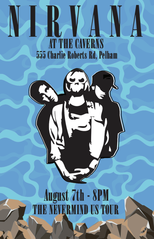
The band I picked to do this project was the band Nirvana that was active between the years 1990 and 1994. They were a punk alternative and grunge rock band that was known for “Smells like Teen Spirit” and their nevermind album. The 1990s were filled with rock bands and other punk alternative and Nirvana was one of the bands that stood out the most during this generation. They had only three albums but they were renowned for their shift away from the usual type of rock music and for the lyrics of their songs. Unfortunately, the lead singer, Kurt Cobain died in April of 1994 which ended Nirvana’s run and led to their new songs never being played or released.
I chose to do punk alternative rock and specifically grunge rock because it sounded so interesting to me and how it was so much different compared to the music that I listen to normally in everyday life.
Once I figured out the band and genre, I started to research different grunge rock bands and the different concert posters that they had. I noticed that most of them had the main band members in black and white with them posing somewhat menacingly. I figured that I should make the band’s concert poster based off their Nevermind Tour where they toured all over the world playing songs from their second album. The Nevermind album cover was based on a baby in a pool and I wanted to incorporate the water and the ripple effect in the poster. So first I had to create the water effect where I used the clip masking in order to get that water effect and I later added more layers to get that mist effect. I then put text in where I put in the date and also the venue of the event that they were playing at. I picked the cavern as my location because they were a rock band and I thought it would be funny to have them perform in a cave because there are a lot of rocks in a cave. I later added rocks to the bottom of the posters in order to add more effect to reflect not only the rocks in the cave but also the rock music genre. I had a lot of fun with this project because I got to listen to music during this project and I could zone out. I also really enjoyed the process of making the rocks and I was really happy how the water effect turned out. Overall, the project was really fun and I felt like I was able to add everything I wanted to add onto my poster.