In Design, we used the Narrative 2 unit to create a lot of different things. We first started off with creating logos, and then we moved on to making labels, designing a product, making a movie poster, and then making a book jacket to go along with it. Through this process I learned a ton about design, and how to make things look professional and realistic. We used a lot of Adobe Illustrator and also Adobe Indesign.
Product Design
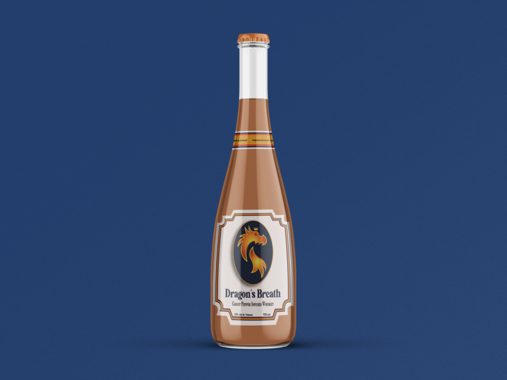
For my product, I decided to make a Ghost Pepper Infused Whiskey. I chose to create this because I wanted to design something that included spice and alcohol. I also really wanted to challenge myself to create a logo with a dragon in it. While brainstorming, I enjoyed deciding how to shape the dragon, and I ended up coming up with three different logos. I then narrowed it down to my final logo. In doing this, I also decided on the name Dragon’s Breath Whiskey because I wanted it to have an intimidating name similar to what the taste of the Whiskey would be.
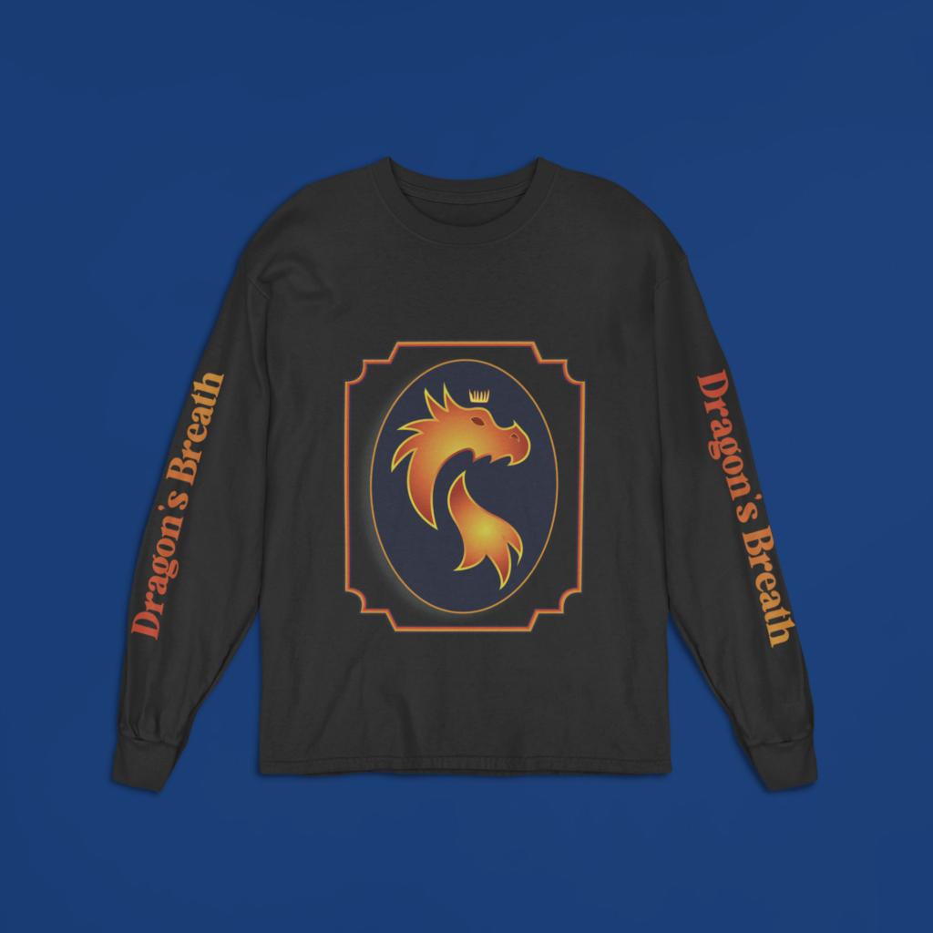
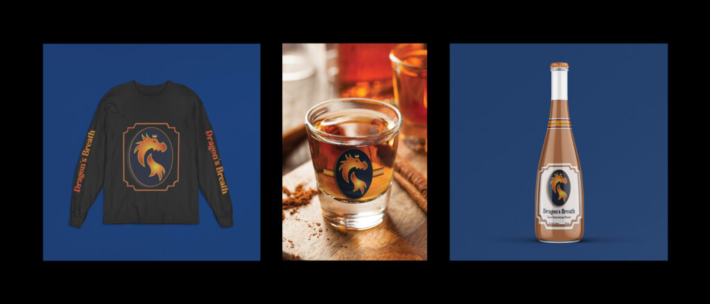
I created my logo with Adobe Illustrator, specifically experimenting with the colors and strokes on my design. After I was happy, I started making the labels according to the sizes of the images I chose. I did the bottle first and then decided to put it on a long sleeve T-shirt and a shot glass. I had a tough time finding the different images to put it on since I could not find a bottle shape that resembled what I imagined it to be. After looking at many images, I decided on the one that I wanted. When looking for my second product, I found the image of the shot glass and wanted the colors in the backgrounds to complement the colors in my logo. I got inspired after finding this image and then decided on the shirt being my third product. Finally, I put the labels on the images and had to continually work on resizing them to fit well. For the triptych, I put together all of my products while keeping in mind balancing the colors and sizes of the images.
After creating this logo, I moved on to create this label. I designed this in Adobe Illustrator and the placed in on a Mock-Up. For this project, we also had to create 3 different examples of the logo and the label on everyday objects that it would be used with. For this, I decided to make a bottle, a long sleeve shirt, and a shot glass.
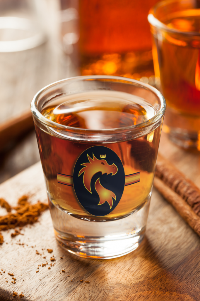
Finally, after creating these three, I compiled all of them into a triptych. I decided to place the shot glass in the center because it had a different background color compared to the rest of them. I am very proud of how this turned out and I really enjoyed this project because we were able to take so much freedoms and creative liberty. I ran into a ton of issues during this project but the all really helped me learn and become a better designer.
Movie Poster
For the next project, we were tasked with creating a movie poster. This project was created in conjunction with the World Building unit in English and Digital media. In English, we created a Narrative story and so in Design I created a Movie Poster and a Book Jacket to go along with it.
Here is the Moodboard that I created prior to designing the poster:
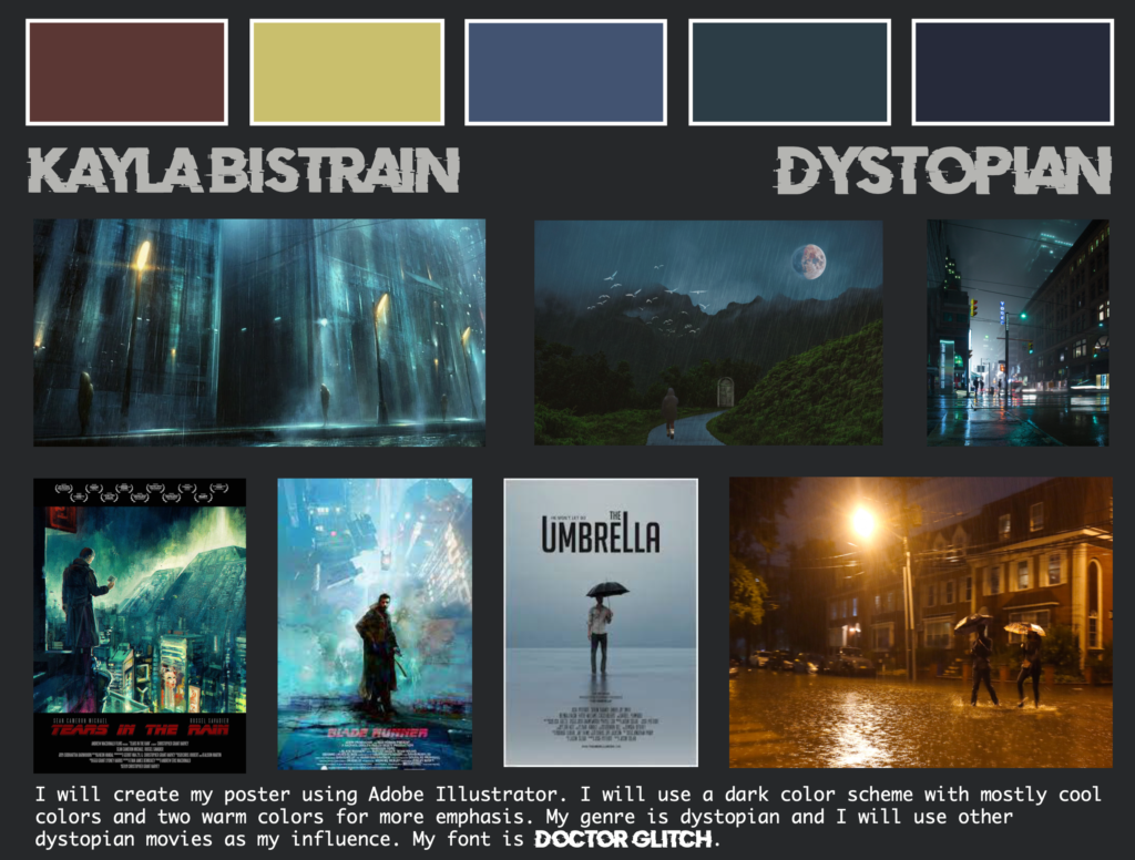
My movie poster was based off of a story that we wrote in our English class. My narrative was about a couple driving to visit his parents. They arrive in the town to discover it is pouring rain, which is very unusual for this town. They interact with his parents, and they notice that they are acting very aggressive and strange. Upset with how this interaction went, they try to leave the town. On the way out, their car breaks down and they are forced to stay the night with strangers. While inside, they investigate more and find out that the rain is being used to manipulate voters with unforeseen side effects. They must navigate the rain, avoiding getting wet so that they can save the town from going mad without going crazy themselves. This involves an expedition to find the source of the rain, with the efforts to stop who is behind it.
I created my movie poster using Adobe Illustrator. I first started with my color scheme, and I decided that I wanted to use dark blues with small amounts of red, white, and yellow for emphasis. Then, I designed the city in the back. I also decided to make the whole scene dark to be more ominous, and so that the lights and the signs stuck out more. Then, I added another layer on top with lots of blues with a low opacity so that everything looked blue toned and rainy. Additionally, I added the figure in the front in black, and a layer behind it in red to create emphasis. Then, I made both of those images look glitchy to match how I made the title. Following this, I added the credit block and the tagline to the poster. This made it look a lot more professional and I also liked how the white text balanced out the title.
Book Jacket
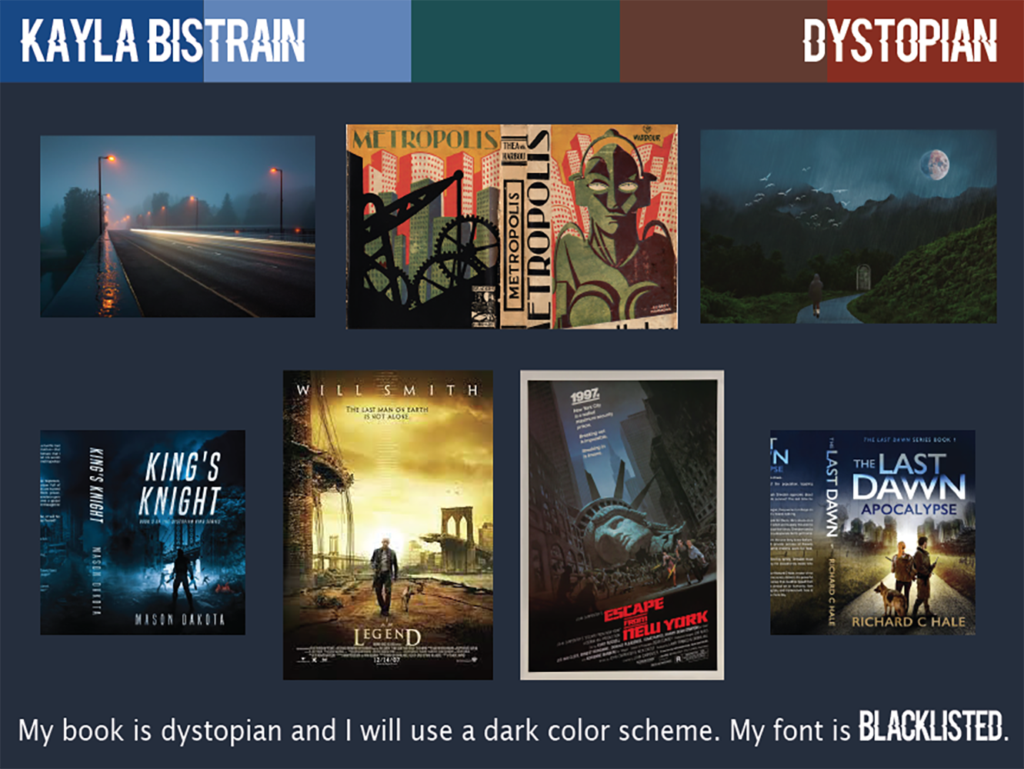
After finishing this project, I started the design on the book jacket. Here is my Moodboard for it:
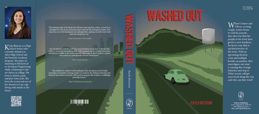
For the final Book Jacket, I was very proud and excited for how it turned out. I really love how professional it looks with the publisher information on it, and how the changes in color line up and ended up in the right places on the physical book. Overall, i am very happy with how it turned out and I really enjoyed the process!
What did I value from the specific processes and productions in Design?
I valued how much we learned to use different tools to get our story to come along visually as well as the importance of color choices. I especially loved all the work that we did on Adobe Illustrator, because it is one of my favorite applications. I learned so much about good design, working through problems, and making good use of all of the tools on the applications that we use.