Our reflections unit was all about exploring ourselves and answering the question “Who am I?”. In Digital Media, we created a Mandala that is meant to reflect ourselves, as well as many other watercolor paintings. In English, we wrote a Personal Essay, and in Design we created a Public Service Announcement based on the subject of that essay. In Design, we also created a Collage based on our summer, and Aboriginal art. In all of these classes, we tried to capture ourselves in everything we created. While brainstorming for our English essay, we had to come up with different Essence Objects which are supposed to show who you are. Some of the things I came up with was my sheep and lama mini stuffed animal, the little shoe on my keychain, and the mini amethyst that I have.
Mandala Project
For our Mandala Project, we had to create a mandala in Adobe Illustrator that reflects us. We first learned how to set up the document and then go to creating. We started with a black and white Mandala, and then later created one that is in color. Finally, we had one of them laser printed, and I chose to have mine printed on wood. We also created a Mandala Reveal Build video, where we broke down the process of how we created all the small details.
Black and White/Colored Mandala
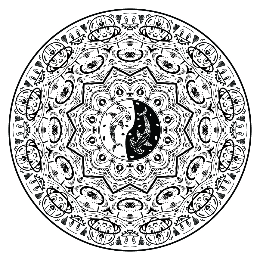
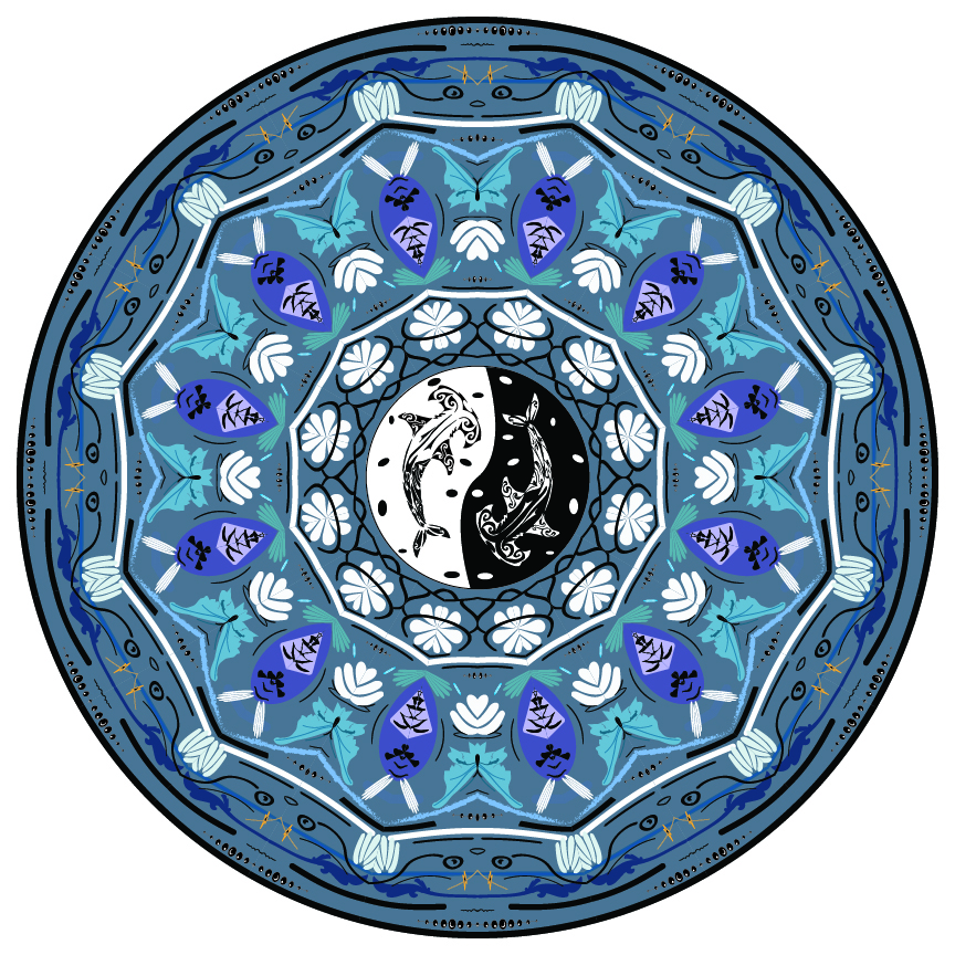
For this project, we had to use Adobe Illustrator and create a Mandala. This project was so fun and I really enjoyed the creative process that we went through. I loved how open this project was, and I took my time in making a lot of details. I chose to make little faces all around the project, so that if you look for them you can really see them clearly. I think they show emotion as well as being fun to look for and see. I also tried to make this not too complex to look at, and I was pleased with how I planned out my space. Then, in the center I chose to include two hammerhead sharks. I love sharks and in the future I want to create and design some sort of tattoo involving one, so I wanted to include that in it. I also like using a hammerhead shark as a representation of myself and so I think it was very fitting. I am very proud of this project and in the future I will know how to recreate this and how to use different variations of this to create cool art. After we finished the black and white Mandala, we then took those same skills to create a colored Mandala. I chose to make this different than my original, but I kept the same center, which brings them together.
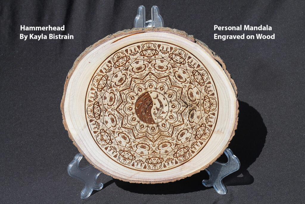
We had our Mandalas engraved into wood, metal, or glass, and I chose to have mine engraved into wood. I liked the rustic feeling of it, and I am so happy I chose to do it because it feels cohesive and there is a lot of contrast from the design on the wood. My inspiration for this project was to make it have a lot of details and feel like you had to look to find stuff. If you look closely, you can see a lot of different details and faces, all around the piece. I am very proud of this and I will consider creating project like this in the future.
Here is a video that I put together of how I created my black and white Mandala. I think this video is very interesting because it shows you a lot of the behind the scenes that usually does not get seen. I also think it is interesting watching it all come together and the details being added.
Photoshop Art
This semester, we had to learn a lot more about Adobe Photoshop, and learned plenty of skills in order to progress our art through it. We created paintings, watercolor like texture, and even different composites of multiple images. We used different overlays and other special effects in order to achieve the desired effect. These projects have made me a lot more comfortable with Adobe Photoshop, and I now feel fully confident in using it whenever I need it.
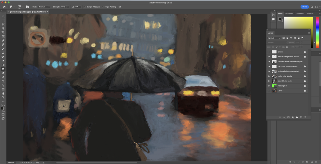
Photoshop Pastel Painting
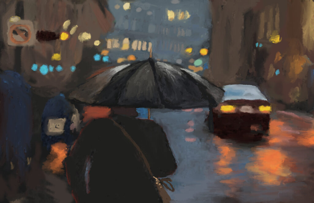
The Photoshop Pastel Painting project was a project where we used Photoshop and all the brushes available to create a painting. This is very different from traditional painting, however I also enjoyed the process of it. It made it very easy to find and mix colors, create interesting styles and textures, and explore. My inspiration for this project was a city on a rainy night, where the background all sort of blends together. There aren’t a lot of specific details, however I wanted the general focus to be on the colors. Through this project, I grew a lot and learned a ton about the different brushes. I found around 3 main ones that I loved, and used them to blend and apply the colors. I struggled with including a lot of details, because my reference picture didn’t have many details. This left me to not include a lot of details. I am most proud of the style I created and I love the street and car and how that section of the painting looks.
Here is an image of the behind the scenes and my layers for this project.
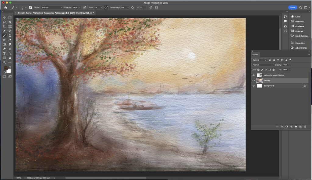
Photoshop Watercolor Painting
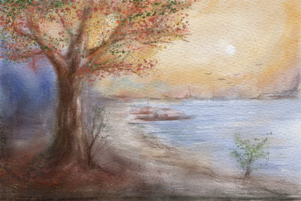
My inspiration for this project was a fall tree with a nice sunset background. With this project, I learned a ton about the different brushes in Photoshop, and how to create the watercolor style. I struggled with the leaves on the tree, and I ended up having to find a brush that had the right texture so that I could get the desired effect. It isn’t as vibrant as I want it to be, but it ended up all the same sort of soft style, which I like. If I was to do this project again, I would probably put more detail into the background, but overall I am pretty happy with the result of this project.
Here is my behind the scenes of the layers going for this project. There weren’t many for this project because I just painted directly on the one layer, similar to how you would in a painting on paper.
Watercolor Painting Effect
After learning how to paint and get the watercolor effect, we then learned a shortcut on how to create that effect from a photo. For this, we chose 3 different pictures and then turned all 3 into watercolor paintings.
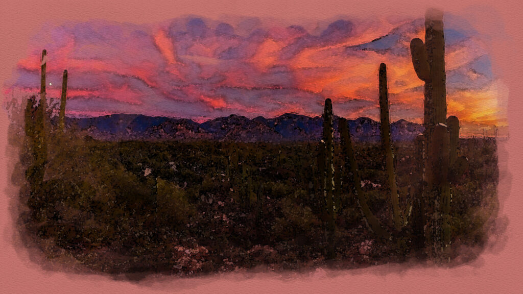
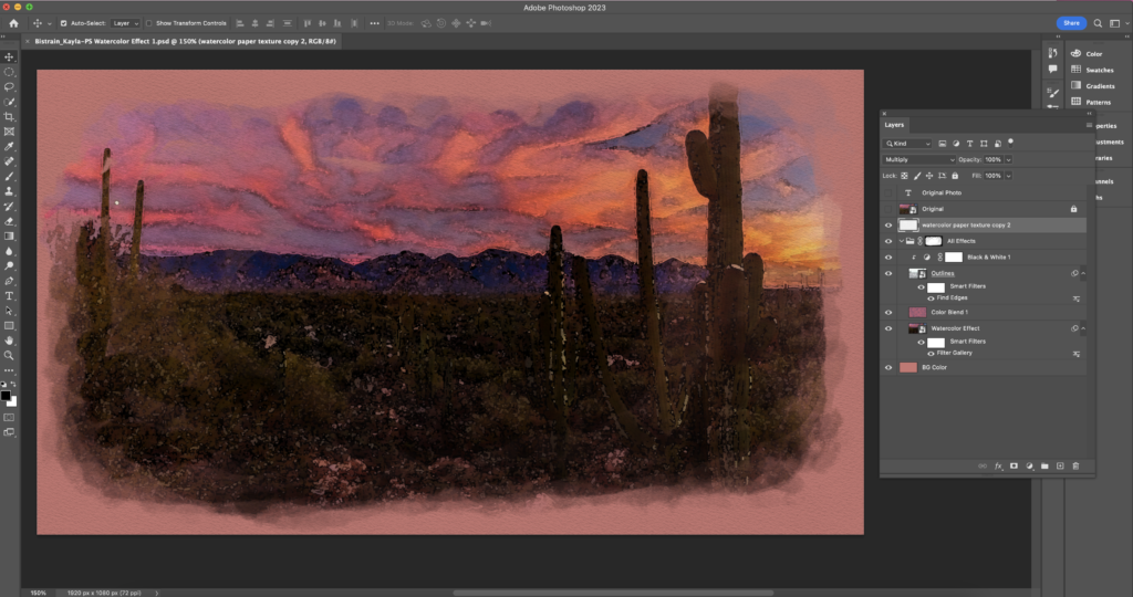
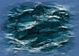
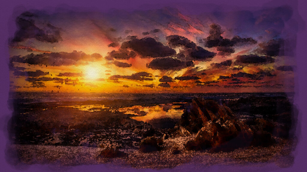
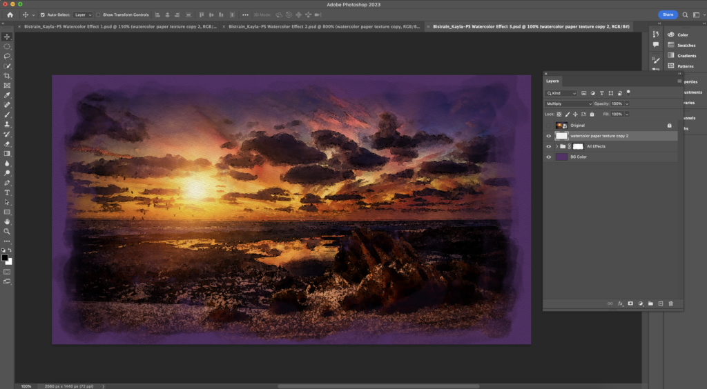
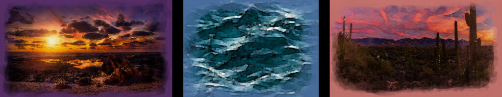
My inspiration for this project was the world around me. For this project, I decided to use two photos of a sunset, and then one photo of the ocean to balance the bright colors on the outside and bring contrast. I grew with this project because I learned so much about Adobe Photoshop and how to create this effect, as well as troubleshooting problems. I had struggles with getting the edges to blend into the background colors, but I just had to experiment with different brushes and opacities. I am very happy with the result and I would not change anything if I did it again.
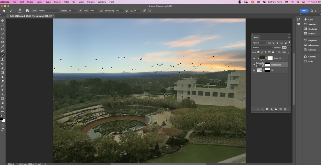
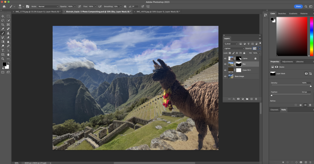
Photoshop Compositing
Along with learning how to paint in photoshop, we also learned how to composite photos together. For these projects, we used photos and composited them together to create one final image.
Photoshop Surreal Art
Finally, to create a final product with our skills, we created Surreal Art in photoshop, related to the narrative we were creating in English. I chose to create a rainy scene to complement my story.
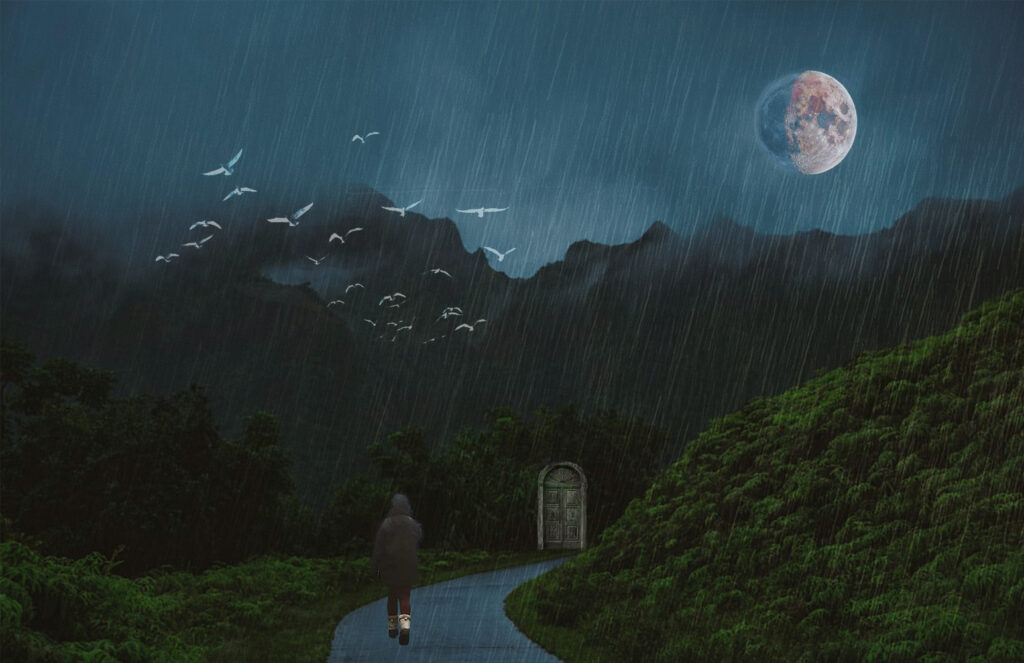
My inspiration for this project was my world building project. Our plan for the project is to be a story about a town where the government is using the rain to control the population. The main characters find out and go out on a journey trying to stop it. This represents that idea, and I wanted to include a darker feel to the image. I learned a ton about Adobe Photoshop, specifically the different ways to blend images together. I also struggled to make everything look cohesive, however by the end I think I did a good job doing so. I am most proud of how everything fits together and the feeling you get when looking at it. I am also proud of the different images I combined. I used two different moon images, an image to show the rain, birds, the door, the background, and the person walking. All of these images came together nicely into one final image. I know I will use my skills with Adobe Photoshop later on and this was very cool for me to learn all about it.

My Design Work
In Design Class, we also continued learning new skills and creating new projects with all that we have learned. We mainly focused on Adobe Photoshop and Adobe Illustrator, and we used these interfaces to reflect who we are.
PS and IL Collage Project
I chose to create my collage to represent what I did at the end of summer. I went to Peru at the start of the school year and I hiked the Machu Picchu Marathon. I chose to represent what I did and got out of this experience with this project. This is a photoshop collage of images that represent my time spent there.
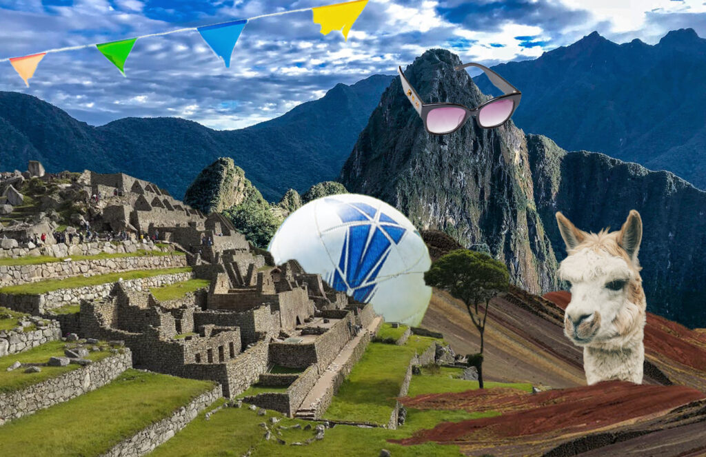
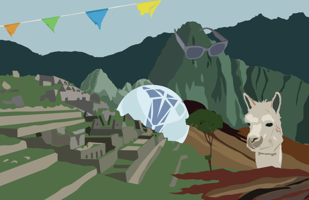
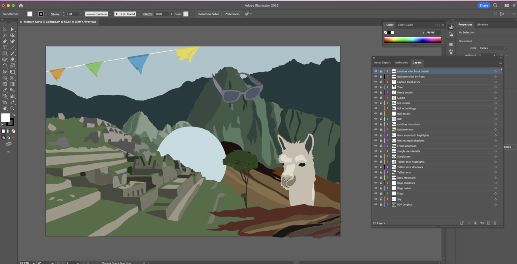
After creating this, we then converted our Photoshop Collages into Adobe Illustrator. We chose to not include much details, so that it could represent the shapes more than the objects. I really enjoyed this process and especially creating the ruins on the left, because I could add detail so that it is recognizable, but not a ton of detail.
Aboriginal Art
For this project, we had to research and look at multiple aboriginal artworks, and then we created our own. This art was done on Adobe Photoshop, with the brush tool. I placed thousands of dots in order to create my final image. We had to add a spirit animal, our star sign, some aboriginal symbols, and your star signs constellation.
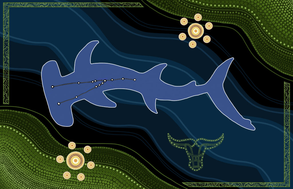
In aboriginal art, there are many different symbols to represent different ideas or locations, and in this piece I incorporated many symbols to represent my origin story. The first one is the stars, and I included this symbol because I love learning about the stars and space, and I want to go into aerospace engineering in college. I then also included the aboriginal sign for water, which is the blue flowing sections in the back going diagonally to the right side. I included this because I love the water and it is a big part of my life with my sports and activities. In the middle, is my spirit animal, a hammerhead shark. It is my favorite animal and I feel that they represent me as well as creating a cool dynamic shape in the center. I also included a bull in the lower right corner, because my astrological sign is a Taurus. I put the constellation for that into the center of the hammerhead shark. Also, on the edges of the piece there are green sections, which represent the Earth, because Tauruses are earth signs.
I created this piece with Photoshop, and when I began it was very hard to plan out where to put everything. Slowly but surely, I worked it out and balanced the composition the best I could. I started with the shark in the middle and I tried to balance everything around it. I also had some troubles with the color choices for the stars, but eventually I worked it out by trying different things. At the end, I was able to find what I wanted for this piece and I am happy with my final product.
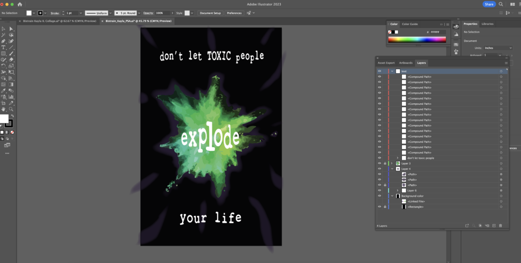
Public Service Announcement
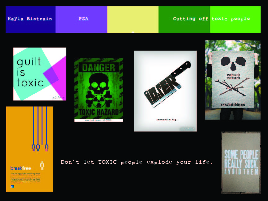
For this project, we were tasked with creating a public service announcement based off of our essay in English. I chose to create this PSA, to teach people that they can fill their lives with good people and let go of the toxic ones.
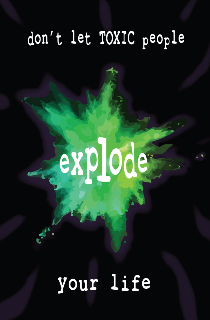
My PSA depicts a green explosion with a black background and blurry purple splotches. The words say, “don’t let TOXIC people explode your life.” The idea behind this PSA was to tell people that it is okay to let go of toxic people in their life, in order to keep their well being safe. Being around people who are bad for you can be very harmful so it is important that people have the courage to put themselves first. I’m hoping to reach anyone that has any toxic friends, family, or relationships that are unhealthy. I hope to encourage them to take care of themselves. I used the bright green color to try and mirror the well known green radioactive sign. I also wanted to use the color purple, (part of a triadic color scheme) for extra interest. The green explosion represents how negatively a person could be affected by someone who is unhealthy for them.
I made this PSA poster on Adobe Illustrator, and I used the feather tool as well as experimenting with colors and interesting shapes to create the main explosion. I then turned the text and the font I chose into shapes and I changed the size and position of them to make it look like the letters are getting bigger as they are closer to the center of the explosion. I struggled a lot with the purple in the background and wanting it to be visible, but not take over any of the words or emphasis. Overall, I am very proud of the final product and I really enjoyed making it.
Overall, from Digital Media, Design, and English, I learned a ton about Adobe Photoshop and Illustrator, along with furthering my skills in them. I enjoyed this unit a lot and it definitely helped me learn more about myself. I also enjoyed creating all of these different projects, and being able to chose whatever I wanted with them.