Photo by: Mahika Gupta
Artist Statement
I am exploring the feeling of disgust through the act of speaking up.
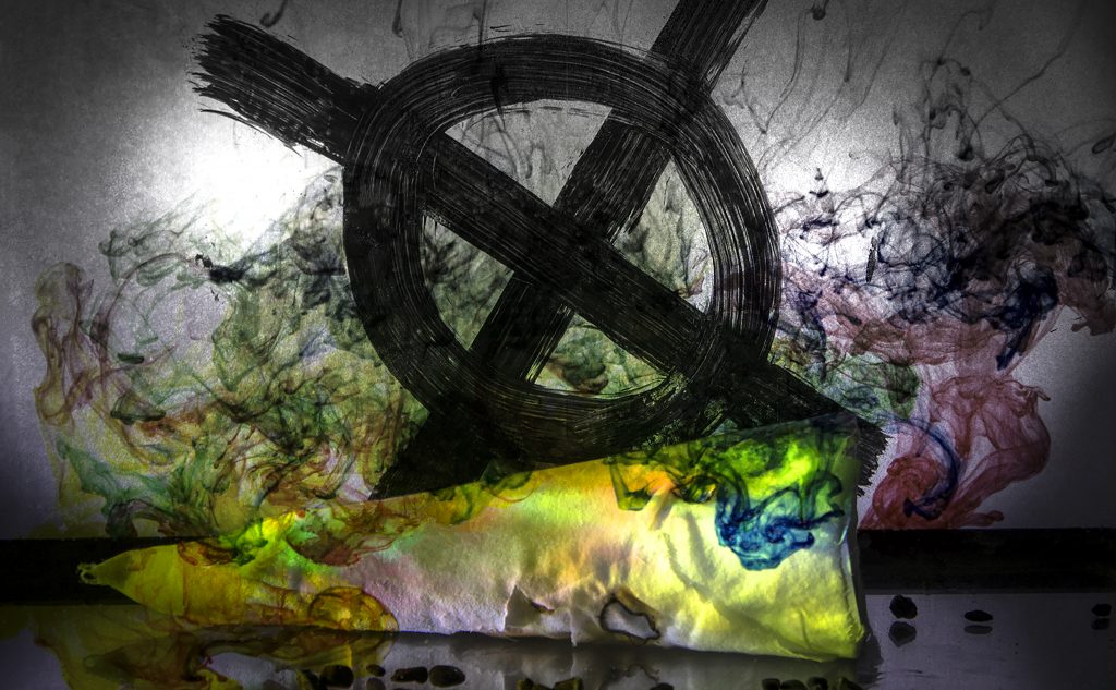
My photo consists of a worn out KKK hat, a white supremacist symbol, and several colored dyes. The KKK hat was placed in a fish tank filled with water while the symbol was painted on a piece of trace paper in the background. The KKK hat and symbol both represent white supremacy, and the idea of this photo is that the color dropped into the tank drowns out the hat and overtakes the symbol. I decided to shoot in complete darkness with only artificial light to get a bright, white, spotlight effect. This helps to support my concept because the idea of the photo is drowning out white supremacy with color and so I wanted the only color to be coming from the dye dropped in and to have the background remain a pure white.
This photo also ties into the concept statement disgust through the act of speaking up. In this image, “disgust” is symbolized by the KKK hat and white supremacist symbol and the ideals on which they are based on, especially the one where only white Christian males hold power. The “speaking up” is brought out by the colors that are drowning out the hat showing unity of the rest of the world against the radical white minority. This photo shows that white supremacy is not something that can be tolerated and it will be fought against by a multicolored myriad of voices drowning out the tyranny it spreads.
The biggest problem I ran into with my photo was that the KKK hat was not noticeable enough. Using Photoshop, I went in and made a selection of my hat and proceeded to attempting to increase exposure, saturation, and brightness to try and make it stand out. When that didn’t work, I used a color gradient, going from black and white at the top to colored in the bottom. This was more effective as the problem was all the color in the background was drowning out the hat. Therefore, after applying the gradient, the hat became more distinguishable.
Red Expression by Oksana Mas Analysis
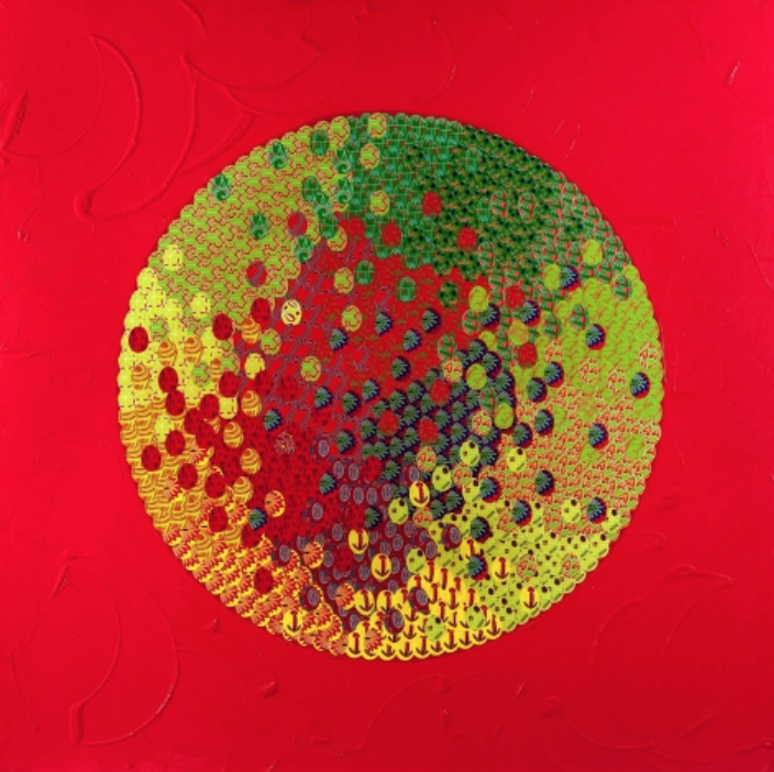
I am studying one of the paintings in Oksana Mas’ collection entitled Red Expression. This piece was created in 2012.
Red Expression is a collection of paintings by Oksana Mas which was made with the purpose of reading like a diary. Each piece was designed to represent some simplistic aspect of daily life but zoomed in as to truly explore the intents and purposes of the actions. The painting I chose was of two women, one looking down on the other. This piece was designed in a way so that it has the texture of a patchwork quilt– like someone sewed together a pile of red scrap fabric that were all different shapes and sizes. Mas’ purpose of this was probably to capture the intimacy of these little moments in life and immortalize them, just like the sentimental do in scrapbooks and quilts. Mas utilizes more demure colors such as blue and black that despite their low vibrance individually pop against the intensity of the red. Her color choices were very strategic– using the different hues of blue that strongly contrast against the red to signify the heat of the system around us, there for us to absorb. The perspective Mas creates by positioning the two women creates a nice leading line to something mysterious, unknown, shrouded in hues of blues.
I love this piece because it feels very lyrical to me. The women standing up seems to be like a mentor, watching her student venture out into the unknown. The blue shrouding her that matches up the hues of the unknown figure in front of the second woman represents mystery. It shows that once the second woman goes into the unknown, she will finally figure out that mystery and become a part of it. I like this painting because it is enigmatic. I am not able to figure out what the mass of blue is but it seems like a metaphor for the unknown. I also love the perspective the artist put us in so that we are looking at the second woman from the viewpoint of the first one, which makes her look worried as she is looking back at the first woman. The second woman is also shrouded in black, which is different from the rest of the color scheme going on. The blue could also represent water, which she needs to purify herself from the darkness surrounding her. Whatever the meaning of that blue structure, the patchwork quilt of red makes it a memory worth preserving. This speaks to me personally because while I love mystery, I often overthink everything I do so I would think five times before embarking on a journey like this. It does not seem like the second woman has a choice and yet part of her is hoping she will not have to go. I like this piece because I think it is amazing how many different interpretations can be made about its meaning, especially what that blue figure at the back is.
I feel like the author’s concept is conveyed. Mas’ purpose for creating the Red Expressions was to capture the small, important moments in everyday life. There are so many places in our life where we have to make that transition from what we were into someone expected to be more efficient, productive, and responsible. Despite the all the controversy that the world holds (anger, passion, desire– all represented by the color red) we are all expected to find our place and melt into cool, calm blue, wise with the knowledge of what the world holds but content with your position in it. I think that the artist efficiently gets this message across.
Oksana Mas