During this unit in Design, we worked on two main projects that each had many pieces that formed a cohesive whole. We used various techniques and programs to explore each project, which was cool because we got to see how one concept could be put into multiple pieces that all fit together. We started with a product logo and then worked on designing elements for the worldbuilding project. This was such a fun unit, and I got to learn and practice a lot of different skills.
Product Logo
In Design, we created a product that we would then design a logo for. I wanted to create very strong branding with a specific aesthetic, so that it would be easily recognizable in the many different forms that our brand would take and places that it would show up.
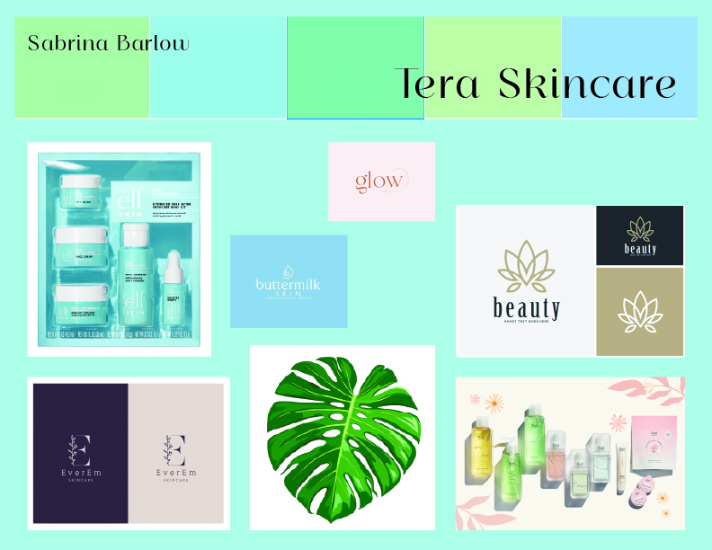
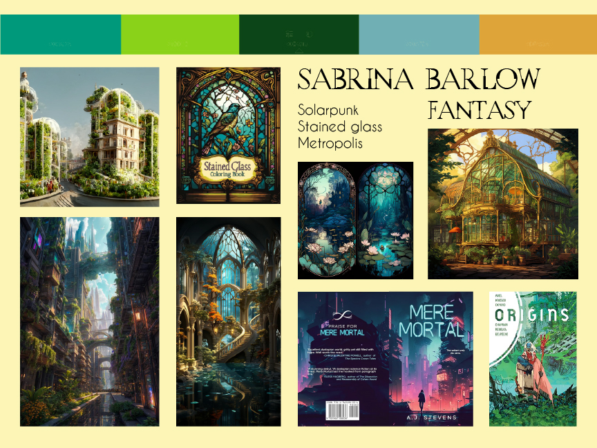
I began by creating a mood board (to the right), which is an exercise where you figure out your fonts, color schemes, vibes, and general ideas for your project. You place different photos that will serve as your inspiration as you work through the design process. We start each project in Design by making a mood board, and it helps me to get a clearer idea of what I’ll be doing.

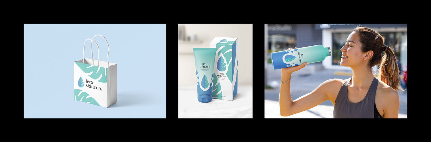
The brand I created for this project is Tera Skincare, which is a line of plant-based skincare products. I chose this product because I had the strongest concept for the logo, a combination of a water droplet and a monstera leaf. The monstera leaf is associated with nature and freshness, and the water droplet illustrates the hydration which is a focus of this skincare line. I kept my branding to a simple dual color scheme and these two ideas to create consistency with my product and my merch. I used the water droplet idea to create the splash on the product label, the packaging, and the merch water bottle. I used the monstera leaves to decorate the gift bag as my other merch.
After many concept sketches, I created the Tera logo in Adobe Illustrator. I took an image of a monstera leaf that I liked as my inspiration and simplified it multiple times to create a simple but effective logo. I then took my logo and brainstormed a lot of different label designs until I settled with the ones that became what you see in the triptych. For the merch, I chose things I thought would go with my hydrating skincare brand, a water bottle and a gift bag, and kept the designs consistent with my branding to create a cohesive whole.
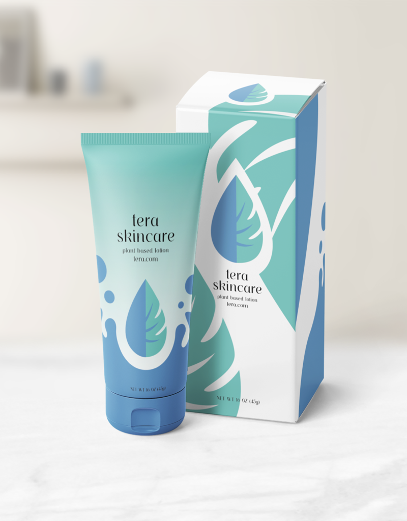
Once we had a logo, we designed labels for the product that our brand would produce. In my case, it is a small tube of skincare. I continued the themes of monstera leaf and water drop to help inspire the product label and keep the branding consistent.
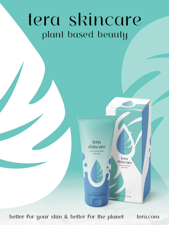
We also designed a one-page magazine ad for our product in InDesign. The overall feel of my product’s branding is clean and fresh, so I wanted to keep my ad simple while still prominently displaying the product and communicating clear branding.
Finally, we designed two items of merch for our brand to create a tripych, as you can see below, that displays the product and brand. I created a gift bag and a water bottle, since the brand is all about hydration. I liked seeing how the same motifs that I had designed translated well into multiple different formats and products.
Overall, I really enjoyed this project, and how we got to design a series of items that all went together under the logo I had designed.
Worldbuilding Book & Movie
The worldbuilding project was so much fun in English. Meanwhile, in Design, we designed a book cover and a movie poster to go with the story we were creating in English.
In the story we created, Lucia Burano is the child of a prestigious glassmaking family in the solarpunk city of Eldoria, which is in a world where magic is done through the process of doing art/creating something. On the day of Lucia’s debut ceremony when she will become a full-fledged glassmaker in the Guild, there is a glass-shattering attack by angry blacksmiths because of the injustice that has been going on towards the blacksmiths because of an event in the past. Lucia is kidnapped during this attack and taken to the rebel camp, where through many different adventures she learns to get over her prejudice, harness her powers and strengths, and reveals secrets about her past intertwined with the Guilds that are currently at war and the corruption that has been going on. Lucia and her newfound friends must face off the head of this corruption, Chairman Hyde, the “elected” leader of Eldoria, and his destructive magic, which threatens the world as they know it.
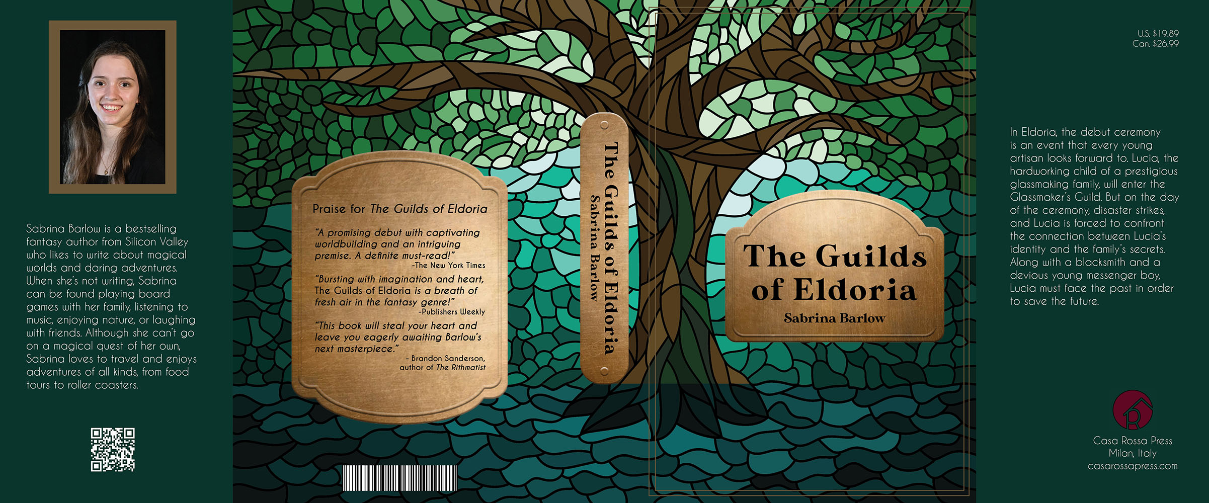
For my book cover, I wanted to create a contrast between glass and metal, which are the two symbolic rivals in this story. I drew the stained glass window in Adobe Illustrator and created the beveled metal plates in Photoshop. It was fun to learn about the different conventions of a book cover, like the price, publisher, and barcode. I got to create these elements for my book cover, like the inside cover, the author’s bio, and the reviews on the back. The book cover below is the whole sleeve in its laid-out form, but we also got to print them out and put them on a real book to see what it would look like, which was really cool.
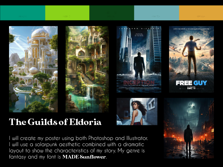
Next, we created a movie poster as if the book had been made into a movie. Neither the book nor the movie exist (yet), but we designed these for a hypothetical published work. Both the book cover and the movie poster were new mediums, and it was a fun challenge to figure out what works well in each format.
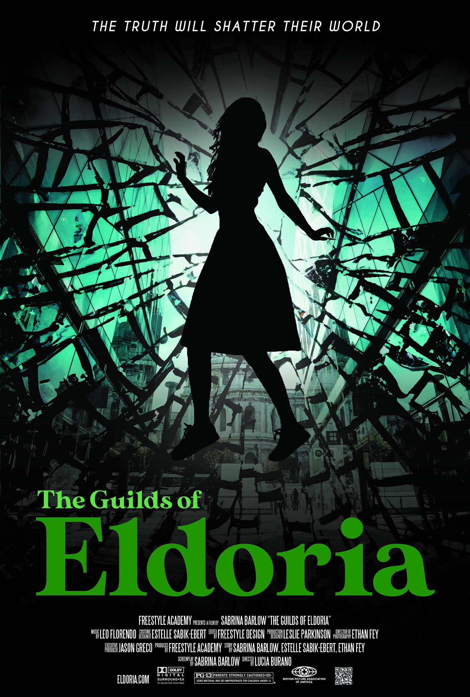
For this movie poster, I wanted to create a dramatic scene to capture the viewer’s attention. I took a photo of a city and used Photoshop to overlay the shattered glass over it, so it looked like the city was shattering. The photo of the girl was missing legs, so I used generative fill to give her legs. I put her silhouette in the center of the poster, in a dramatic pose, to show how the city is shattering around the main character. I used the same color scheme as my book cover, but slightly inverse, with the greens and teals as the more prominent colors. They both have the elements of glass, which I think ties them together. I edited each photo in Photoshop and then assembled them in Illustrator, where I had more control over the layout and added the text.
It was fun to work with the format for a movie poster, including the conventions for the credit block. I had to change the orientation of the title to make it look more like a movie poster, so that instead of “The Guilds of Eldoria,” the word Eldoria was emphasized. I kept the glass motif to tie it in with the book cover, but the movie would probably be a little more focused on the drama and the shattering glass instead of the stained glass window.
The whole worldbuilding project was really fun and rewarding, even though writing a 14-page narrative treatment was a lot of work. It is really rewarding to have a completed story with a book cover and movie poster to match. It was also very valuable to learn new skills and widen my horizons in terms of what I design in different mediums and different styles. In the future, I would love to further explore the ideas we came up with in this world called Eldoria.
Watercolor Name Art
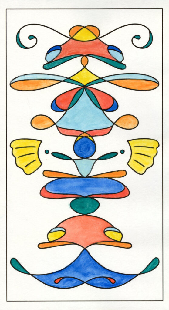
Another product we did briefly during the year was the watercolor project. In Photoshop, with a special reflection setting, we lettered our name. This made a fun symmetrical shape that we then printed out and painted with watercolors. We colored in the spaces in between the lines we had drawn, which was an interesting challenge as we had to work around and experiment with white space. I was inspired by koi fish while doing this project, which resulted in my fish detailing and my color scheme of oranges and blues. I love lettering, so this was a great challenge to think about how my letters interact when they are reflected like that. I had to figure out what would look good not only in one direction, but both. This was a fun project because we were able to loosen up with watercolors, but it was still good practice with a good result. It looks like an abstract fish, and if you turn your head to the side, you can see my name.