Mandalas
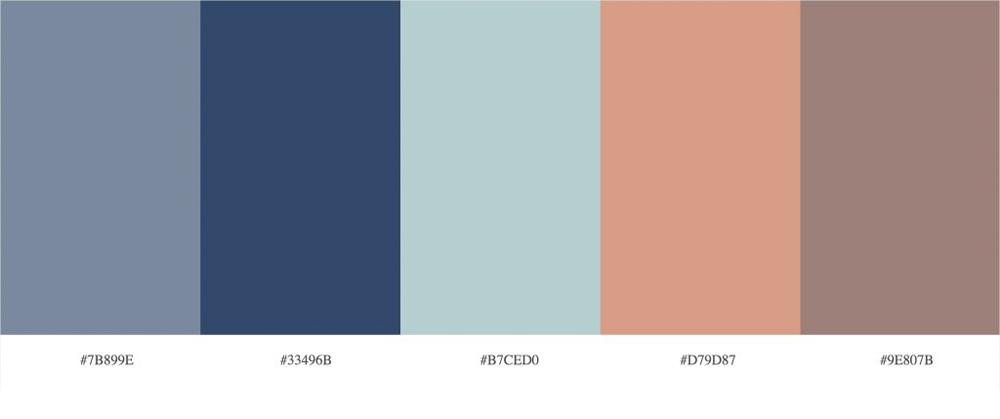
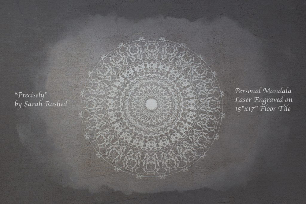
THE MANDALA PROJECT involved creating perfectly symmetrical mandalas in Adobe Illustrator to demonstrate both technical abilities in the program along with abilities for creative expression. The designs and brush strokes were completely stylized to reflect my personality and character as an individual. I created a black and white mandala, which was later used to laser engrave a 15″x17″ floor tile, and a colored one. I used color.adobe.com to create a color scheme that I later implemented in my design.
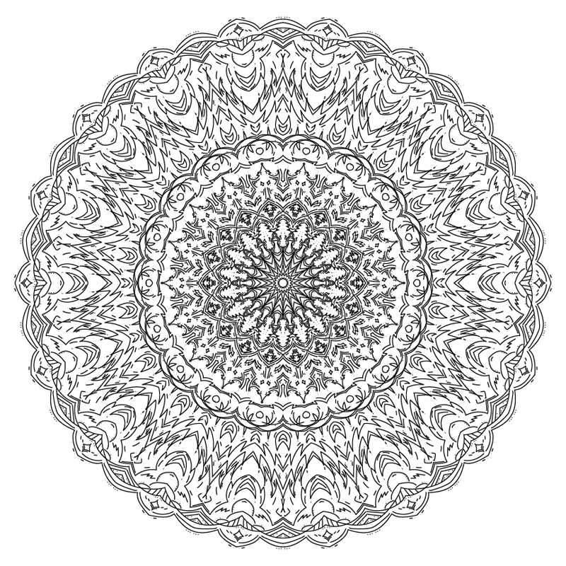
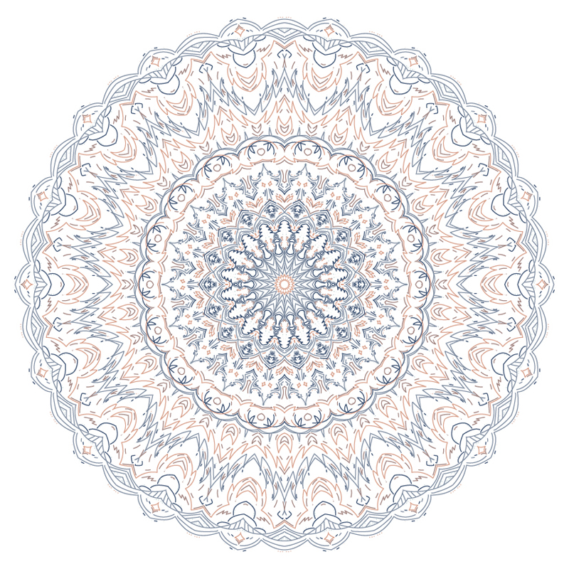
Mandala Artist Statement
Sarah Rashed
Throughout creating personal mandalas, both black/white and colored, I valued getting to use Illustrator again and getting to tinker with the various tools in the application. I spent a lot of time messing with different brush strokes, namely those which looked more scraggly and aggressive. The grungy look appealed to me most since it looked quite abstract with an abundance of seemingly unintentional strokes. I initially thought it represented me well since it held a certain degree of solemnity, but because the nature of a mandala is to be symmetrical it also looked beautiful. The strokes on their own stand to be irrational and insistent, but when brought together look unified and intentional. In the end I chose not to use these kinds of strokes since the overall image didn’t appeal to me as it first had, and I used the default brush stroke instead. I added in the aggressive nature of the previous stroke with sharp angles in the lines as well as various sporadic lines that appear throughout the mandala. My colored mandala brought out the grim part of my personality since I used a color scheme with many earthy tones, but I included lighter and more pastel ones because I am also lighthearted with things like comedy and the like.
The process of exploring brush strokes and colors for my mandalas led me to understand who I am as a person, though not in a super deep and meaningful way. I merely got to understand that although I am one to enjoy dark and grim topics, I do also like lighter sides of things. It’s a mix of the two that appeals to me the most. For example, I like to read and watch dark comedies and I often write short stories or screenplays about lighthearted things that end with a dark twist or vice versa. My mandala has a lot of sharp strokes and angles throughout it along with sporadic marks, but the way it’s replicated all around the piece gives off a sense of placidity and lightheartedness. The same goes for my color scheme; dark and earthy with a touch of pastel goodness. My interests and personality parallel the theme of my mandalas from the look of the brush strokes and the colors I use. There’s nothing super profound in this “revelation”, it’s just interesting to see how I naturally replicate those ideas in my work.