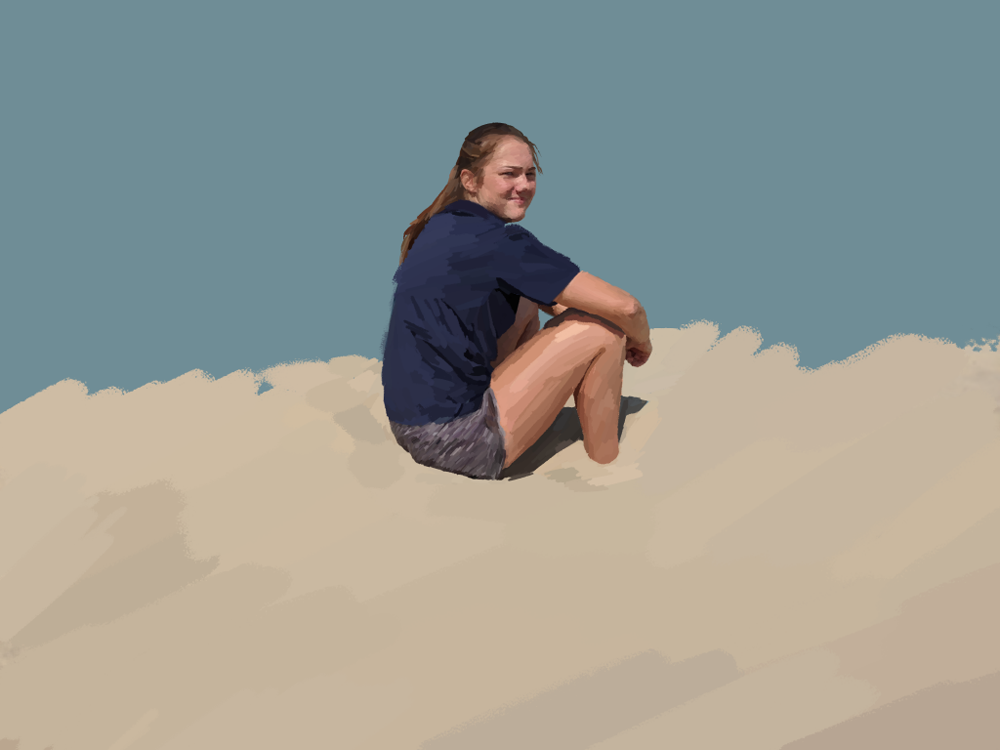
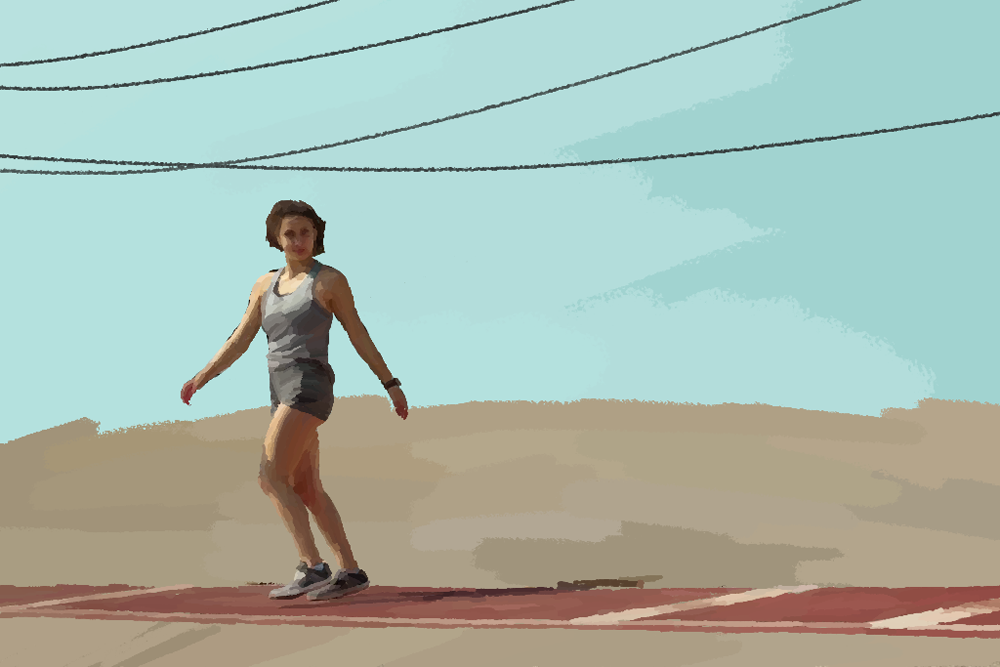
Photoshop Paintings
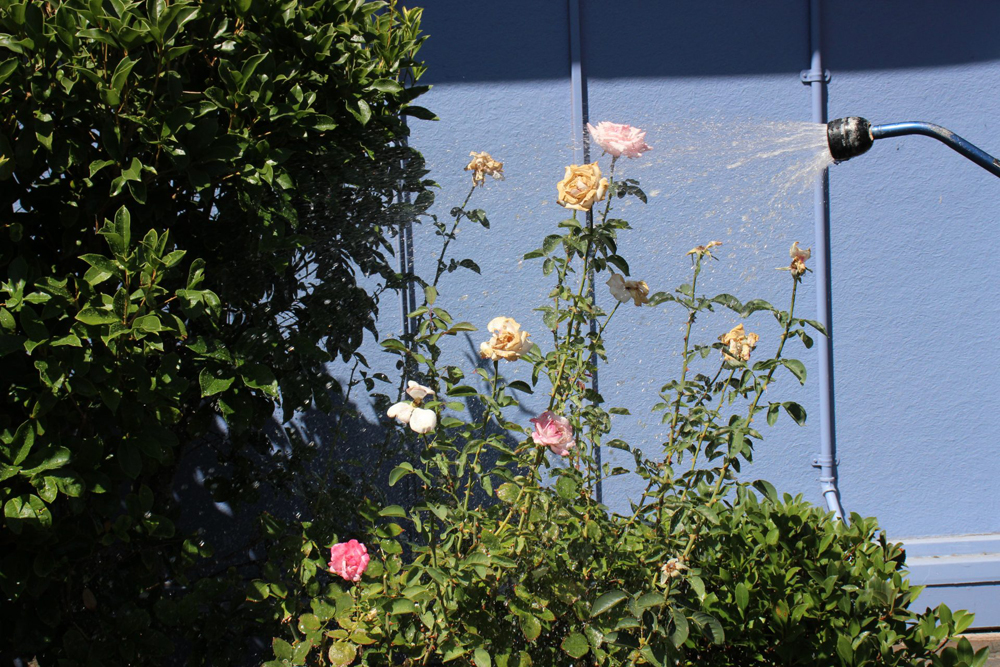
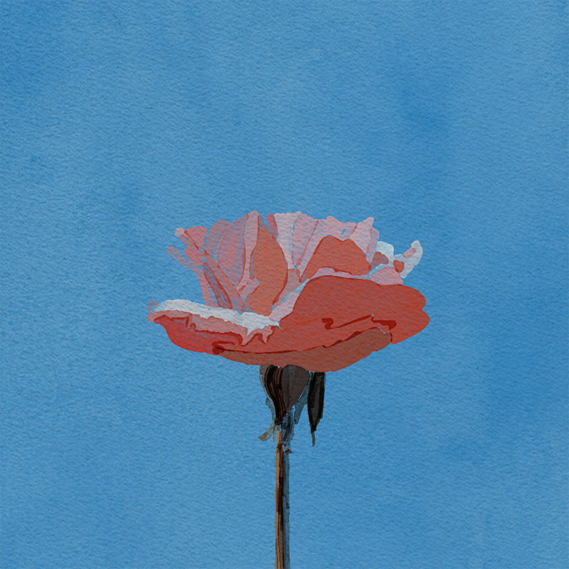
I WAS INTRODUCED to Photoshop paintings in digital media where I worked on emulating a series of photos to experiment with brushes and textures. The first painting Tessa is Stuck was the first one I tackled where I used the pastel brush and the eyedropper tool to pick out colors in the original photo and I used the brush tool to fill in the respective section. In the next painting Flower Pastel Power, this technique didn’t work as well with watercolor, since layering strokes deepened the color and it didn’t look great. The transparent quality of watercolor made painting difficult as well, so I stuck with pastels. The last painting Struttin’ was done in the same manner as Tessa is Stuck. I have a fourth painting in the works currently that I’m using to experiment with brush sizes to give the illusion of depth within the image.
Photoshop Painting Artist Statement - Struttin'
Sarah Rashed
        During the process of creating my photoshop painting, I developed my painting skills by experimenting with brushes, the eyedropper tool, and brush sizes. I initially had problems with organization. On my practice document, I went all in and used a single layer to paint based off of a picture. When the brush strokes began accumulating and I couldn’t keep track of the sections of my painting, I began having trouble with the image structure. I spent some time trying to erase parts and fixing gaps because of this and my workflow was– for lack of a better word– wack. On my final photoshop document (the one that you see here), I used multiple layers and organized folders of different parts so I could easily identify them and make changes accordingly. This also made shifting parts to be above or below each other much easier.
        Looking back on my project, I think I would change how I did the background of the girl. It’s quite plain, which I’m not entirely mad at, but it feels a little detached from the girl. I’d like to add some trees or other structures to make the overall painting mesh better together. I am really proud of the way I painted the girl. I think the colors I used on her shirt and shorts especially make her look 3 dimensional, giving the painting a palpable quality. In the future, I’d like to refine my use of brush sizes in regards to painting the foreground, midground, and background because I think tinkering with that would give the painting more of a 3 dimensional quality. I think my setting in this painting lacks that quality, so I’d like to master that in the future.