Narrative Visual Perspective in Design
Food Label Project
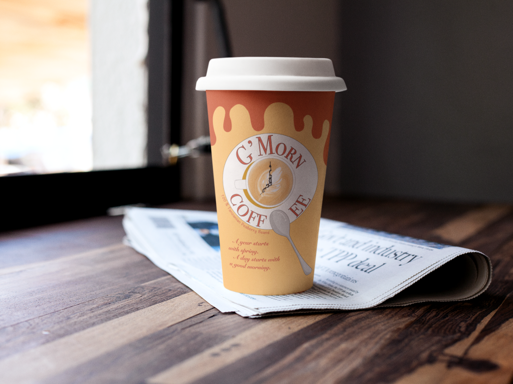
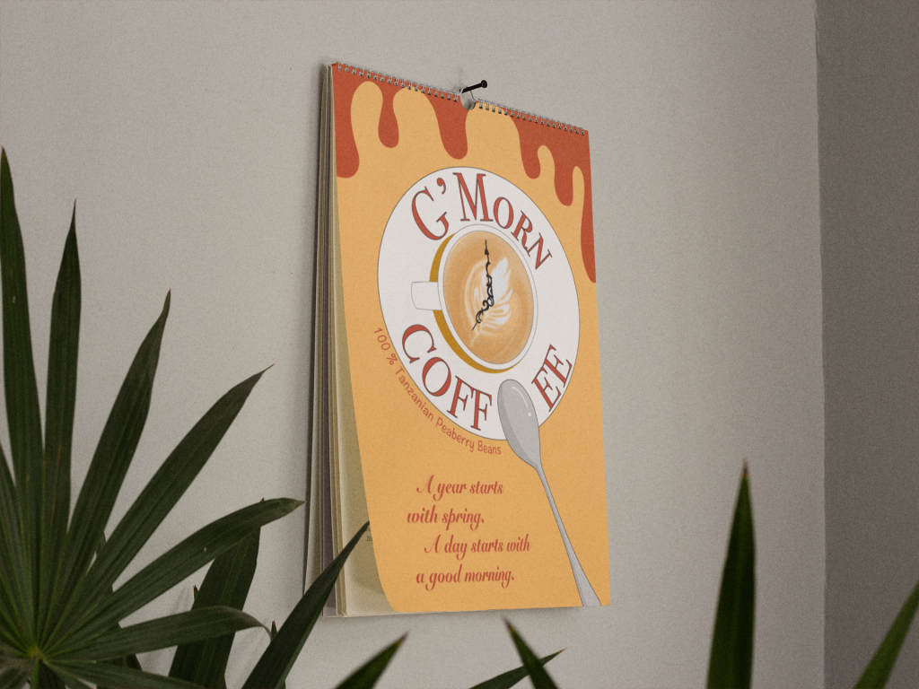
I started thinking about the function of coffee since I had chosen to design it. Coffee is very common in everyone’s life, the aroma of coffee is floating in the air everywhere. I see many people drink coffee in the morning to refresh their brain, which inspiring me for the company’s name–G’ Morn Coffee, which means “good morning”. Since it is a coffee logo, the main component on the label is a cup of coffee with a spoon put on a saucer. On the surface of the coffee, there is a clock showing 7 o’clock, meaning it is in the morning. I chose the color scheme of yellow and red because these two colors make people feel warm and comfortable and I hope they can remind people about sunrise. I chose a simple font because I want an easy and organized morning. You don’t need to worry about the heavy task of a day as soon as you wake up.
I created my label with Illustrator for the whole process. The biggest challenge I faced was that I couldn’t use the brush to draw a latte and make it a gradient. At first, I tried to use different brushes, such as the brushes with watercolor effect, to solve this problem, but it didn’t work well. Then I used the blur tool, the coffee looked better but it was still not natural. I finally overcame this problem by finding a picture of latte art online and making a clipping mask of this pattern.
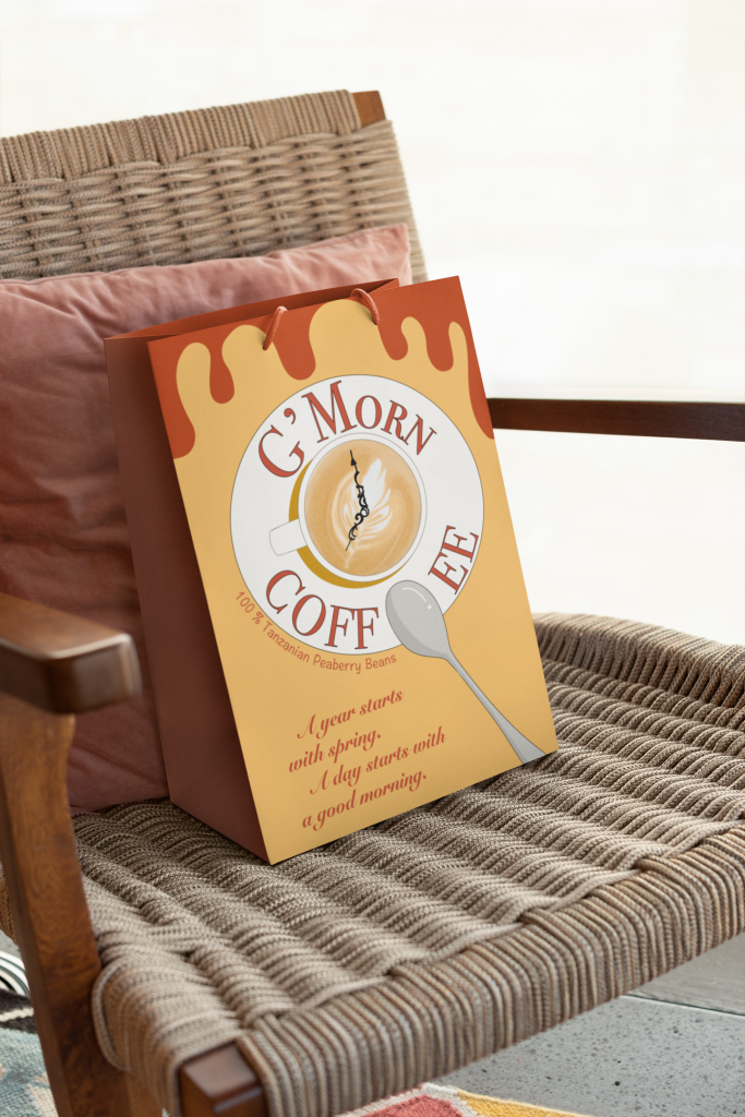
I learned about marketing and label creation that you have to make your label memorable for customers while it represents the characteristic of your goods. For the additional merchandise items, I chose a bag and a calendar because people use bags and calendars every day as common as they drink coffee.