Our Conceptual unit challenged us to think outside of the box and utilize creative skills to express ourselves. We took risks through many art forms such as poetry, art, web production, and especially photography. Through this we were able to create a personal style or aesthetic for our work. We also began learning how to use many types of professional equipment to do things like record and edit sound and video, use DSLR cameras, Photoshop pictures, and even create websites through WordPress such as this one.
Through this unit I have learned many things about technology and art. Never in my life would I have guessed that I would be using the tools and creating the projects that I have so far. I have also pushed my creative boundaries further than ever before. I love being able to integrate English into my art, because being a songwriter this is a skill that I enjoy and need. As a bonus, I have acquired quite a few time management and organization skills. When using such specific technology, you really have to keep track of your own work and progress because nobody else can do it for you. While this may have been hard to adjust to at first, I know that these skills will be helpful throughout my lifetime in many fields.
Alphabet Name Photo
At the very beginning of the year when we were learning how to use our DSLR cameras, we went outside on the Freestyle campus and photographed natural occurrences of the letters of our names. We then edited these photos in Photoshop and arranged them in order to spell out our name. We eventually printed and mounted this project on foam boards to present at our final exhibition.
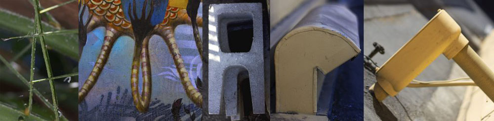
This project while minor was integral in learning the basics of Photoshop and DSLR cameras. We also learned with the final version of this photo how to properly cut, glue, and mount printed works.
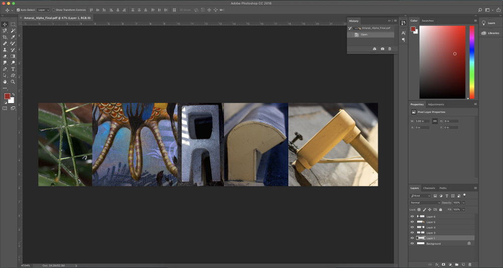
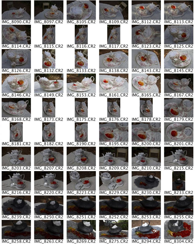
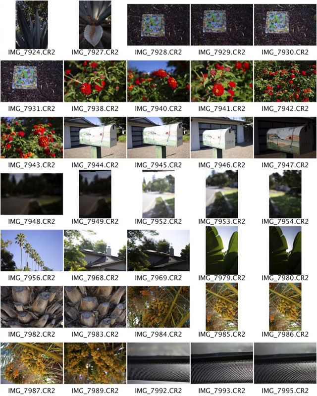
We were also introduced to contact sheets, a collection of possible photos that a photographer gives to the project coordinator, allowing them to see the best photos taken as well as choose the final one(s).
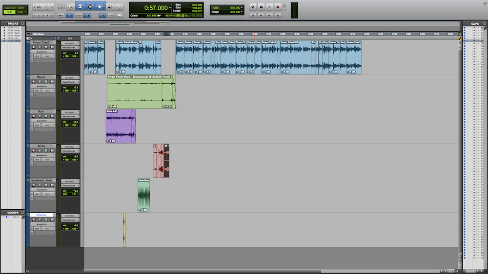
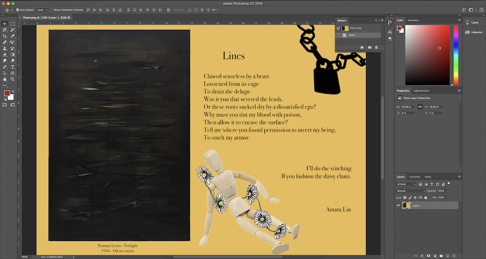
Poetry
The Poetry unit has definitely been one of my favorites so far. This unit allowed us to expand our poetic knowledge and experience, and then add visuals or audio to further intensify certain emotions or feelings that we wanted to portray. These expansions could also spark different ideas to further advance our poetry.
Ekphrastic Poem
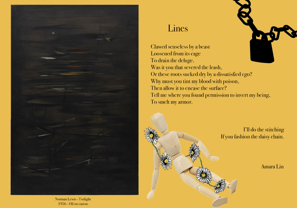
For this assignment I chose to analyze a piece of art. This is called ekphrastic poetry, a term I had never heard of before this unit. I was able to connect my own interpretation and meaning to the piece through a story of my own. Through expressing this poetry using many different formats and tools we were able to further create a picture or scene in the audience’s mind. Specifically we were able to add certain elements of to add a mood without using words. For example, one could add storming noises to represent a sense of fear or danger.
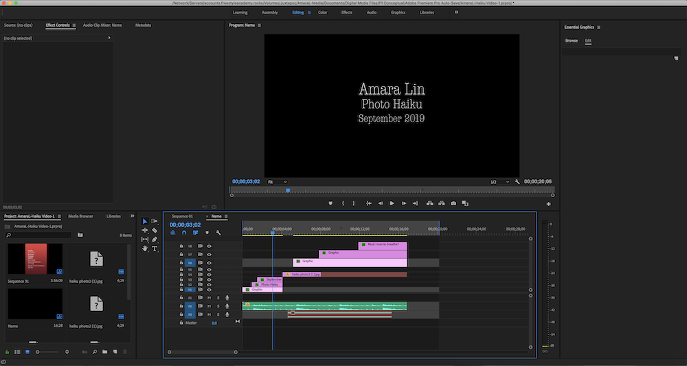
Haiku Poem
In this unit we blindly picked a feeling word along with an action out of a bag, and were challenged to write a haiku representing the scenario. Following this, we made a video with moving text, audio, etc to further represent the concept statement.
I am exploring the feeling of impatience through the experience of standing up for myself.
This unit while valuable, mostly taught me how things at Freestyle were going to work. Coming in to a new program, while exciting, was a little scary at first. This project definitely was a learning curve for many students who had never done this type of thing before. It taught us lessons about how perfectionism is unnecessary when your goal is to learn.
Conceptual Photo
For the major Conceptual project in Design we used the same concept statements given to us in English class and represented it using photography. After researching and learning about Conceptual art, we carefully chose two objects and a background to express our statement. To wrap up the assignment we wrote an Artist Statement to further explain our choices within the photo.
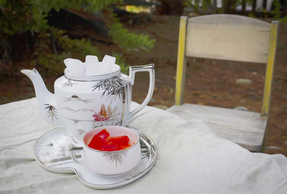
My photograph is of a teapot of normal ice next to a teacup filled with red and yellow ice. They are set up on a tray in a garden as if someone were hosting a tea party. The lighting in my photo displays a cold and overcast feel. This shows how when standing up for yourself you can often feel uncomfortable and scared. In the background a wooden chair can be seen next to the table, inviting someone to join them . I also chose this to represent the feeling of loneliness that can occur when standing up for yourself.
The teapot represents impatience by relating it to the literal purpose of a teapot. Like the saying “a watched pot never boils,” when waiting for something to happen the anticipation can make the situation feel very slow, representing impatience. Connecting to the ice, a teapot full of ice will never boil. In terms of the colored ice, red is known to portray power and determination, and yellow represents clarity and remembrance. I chose to color the ice because the bright colors exhibit the boldness of the action. Also, the color would theoretically stain. When standing up for yourself, the other person’s memory of you is stained and they most likely won’t forget the incident.
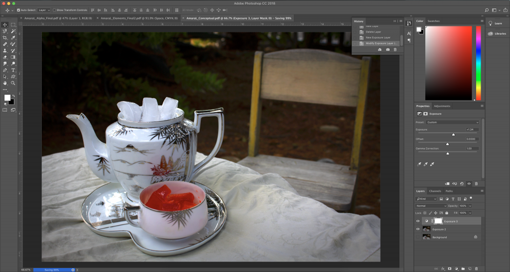
Through this project, I learned that sometimes Photoshop in smaller amounts can be more effective than in large amounts. I added subtle differences in light such as darkening the background and changing the exposure. These changes direct the audience’s focus towards the tea set more so than the background. I also learned how to use vignette to do so. Finally, I slightly exaggerated the saturation of the ice, making the color pop and adding more contrast to the photo.
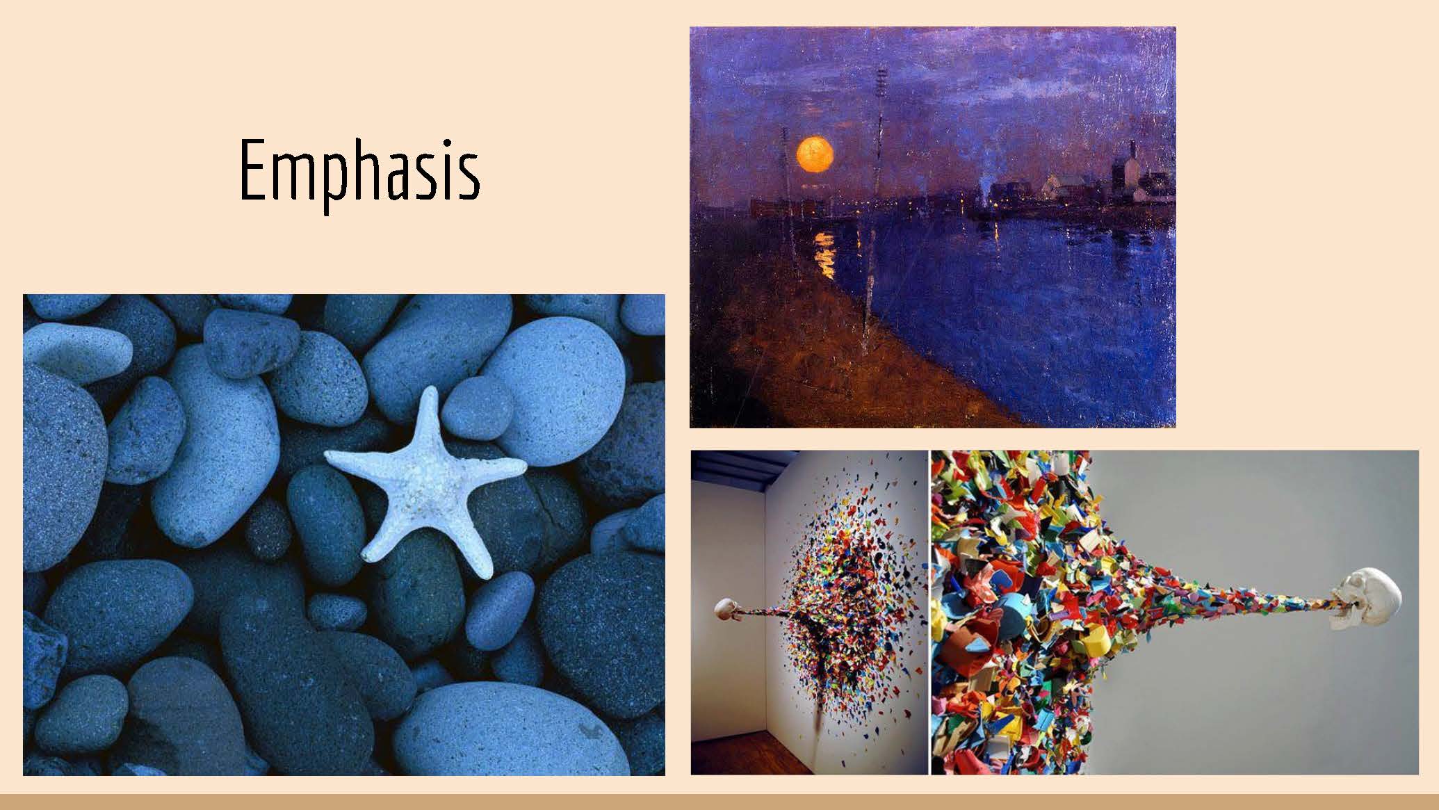
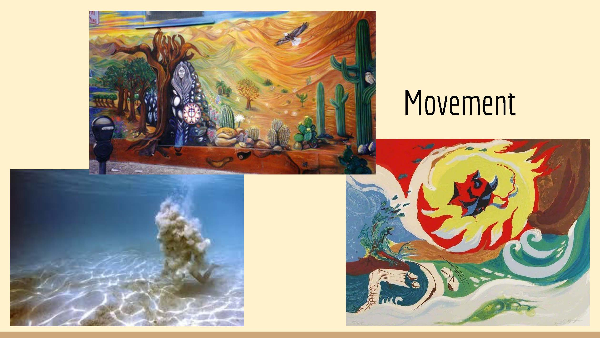
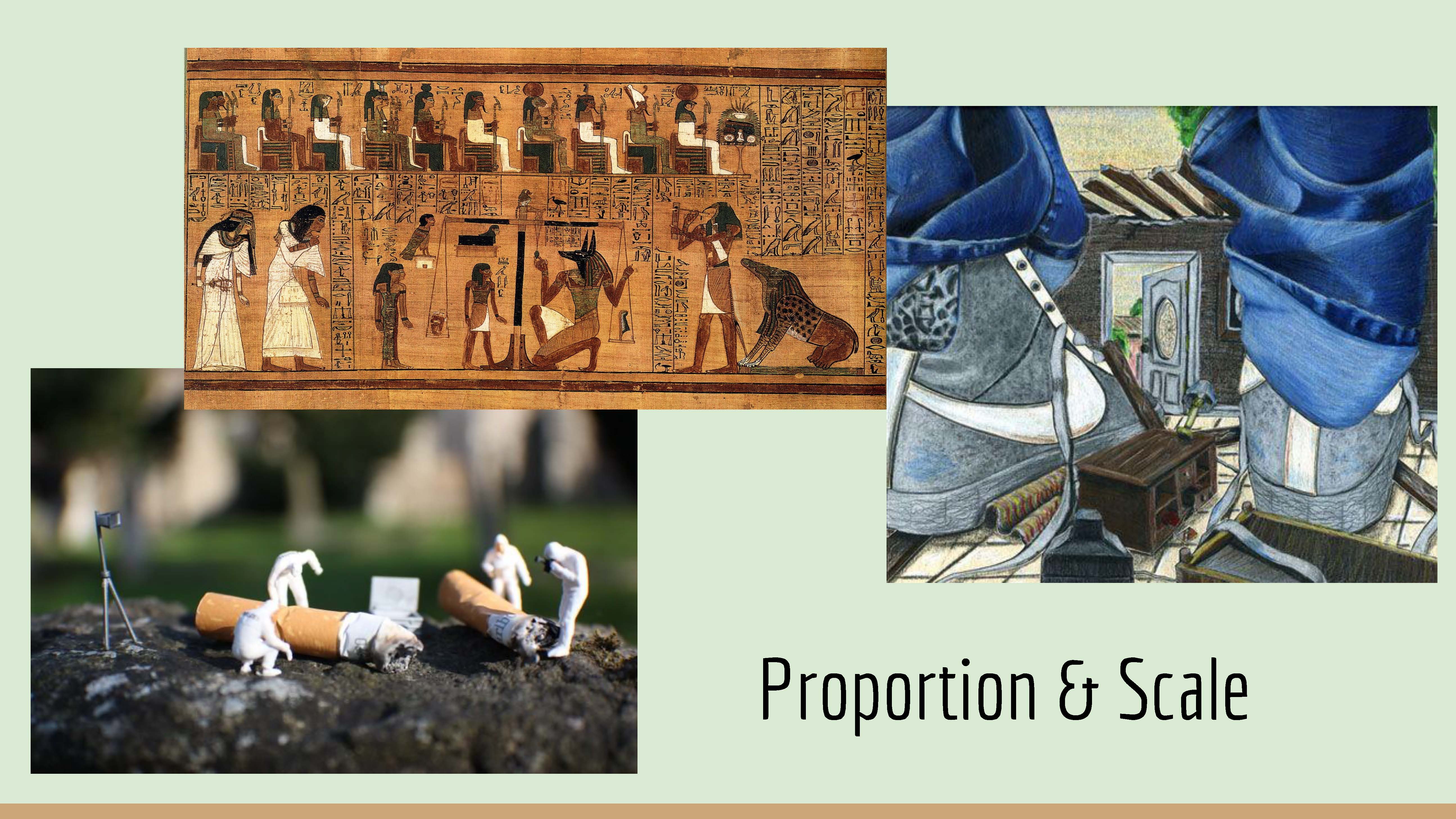
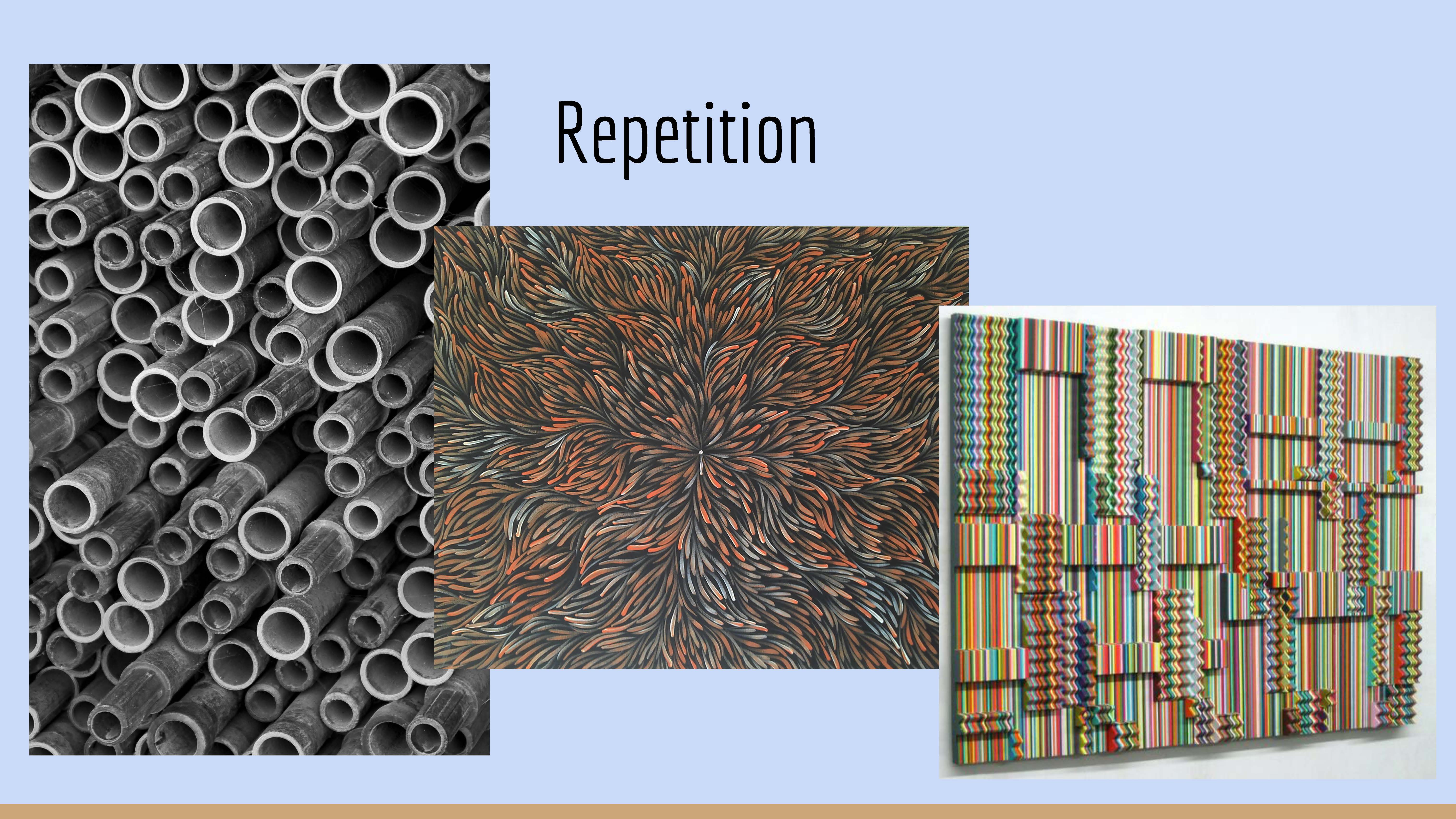
Elements & Principles of Art
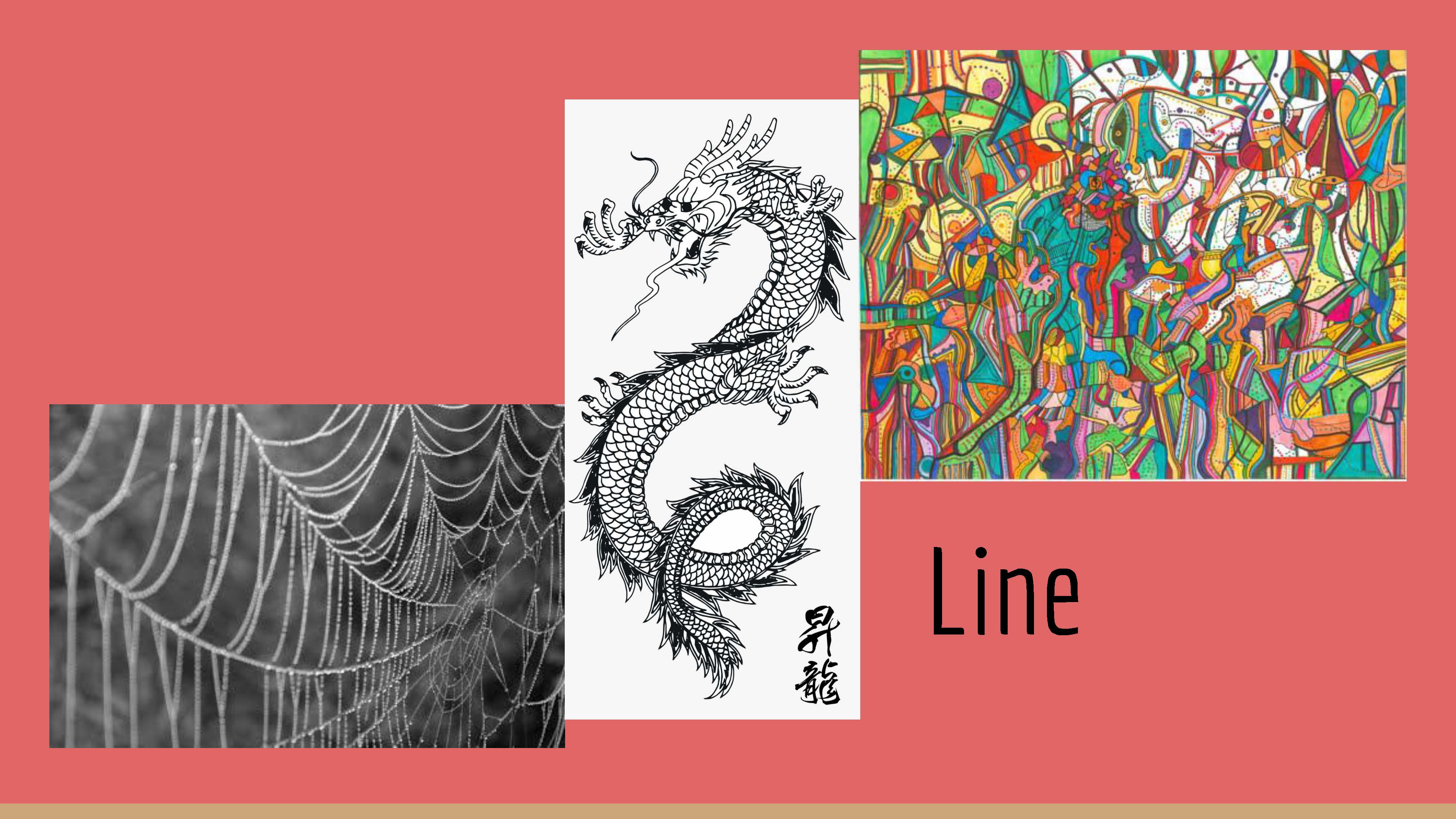
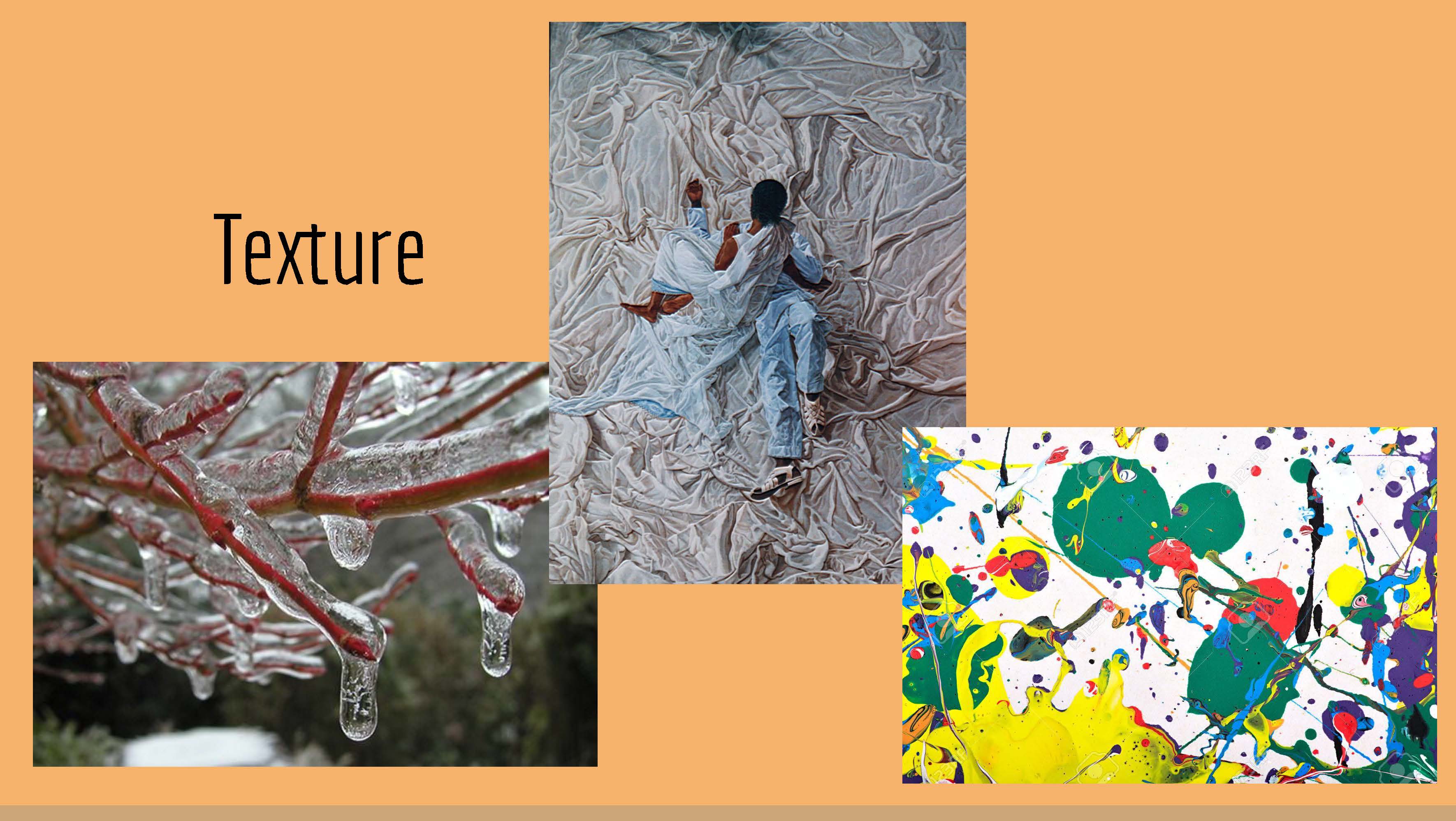
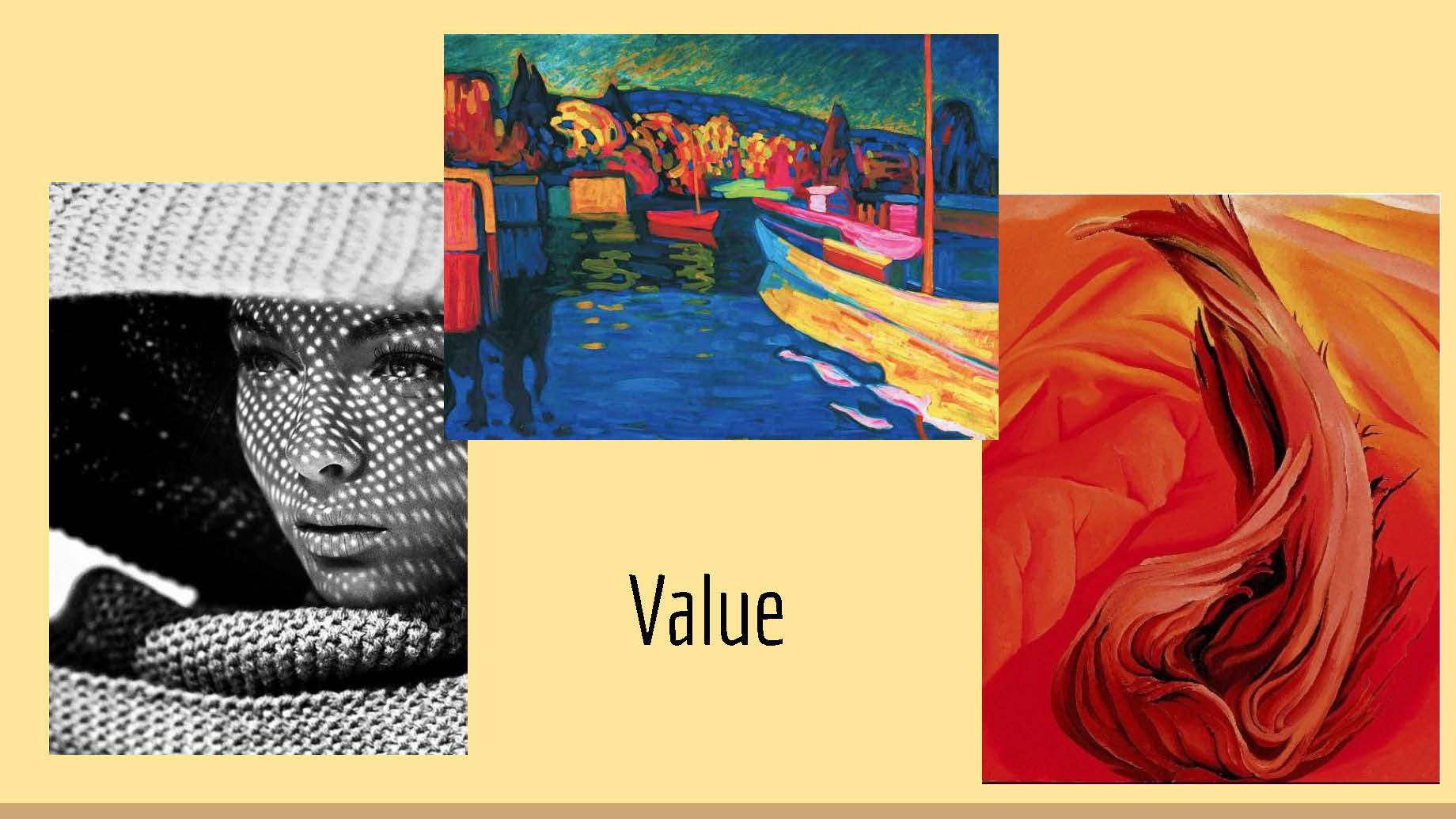
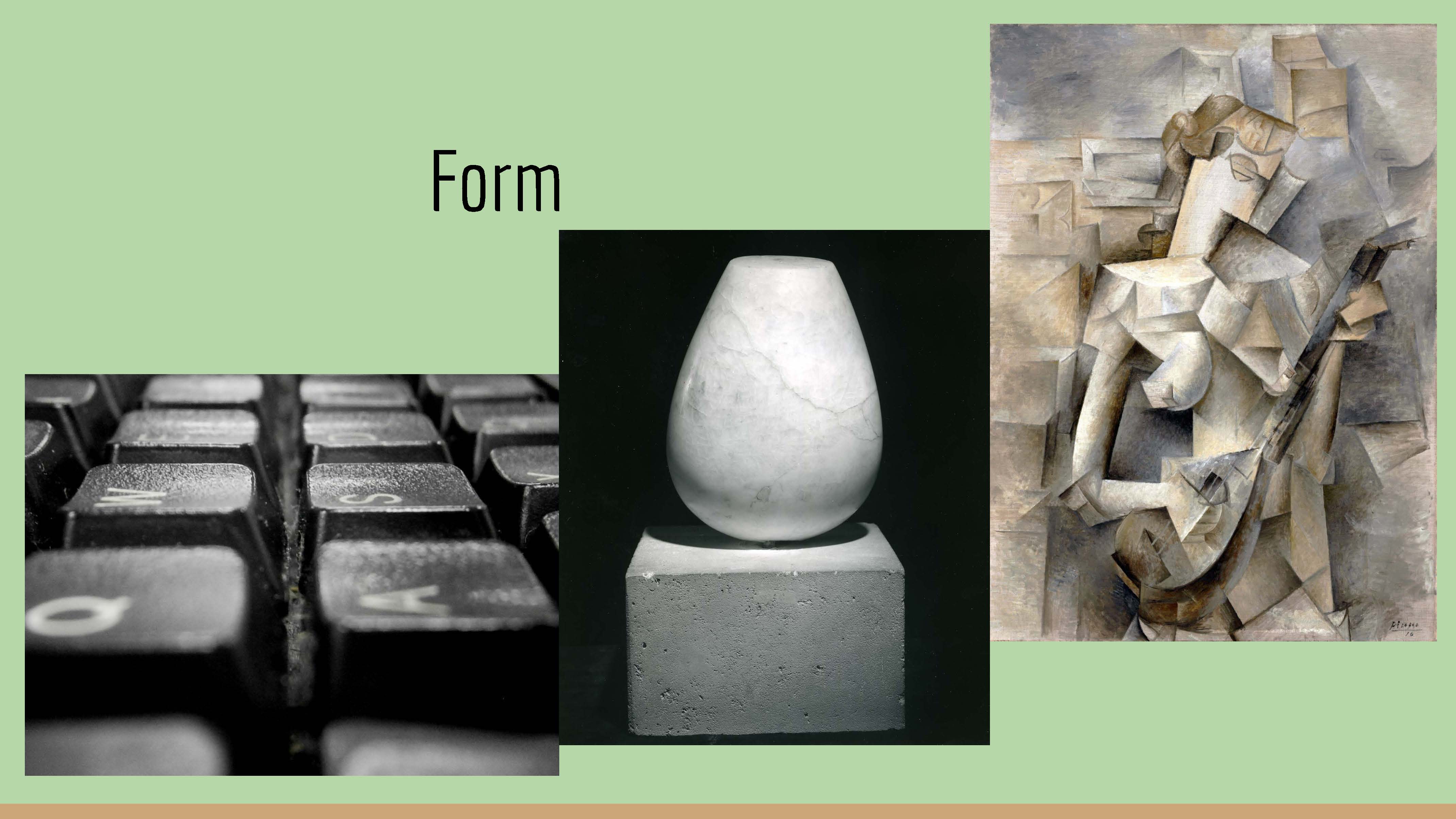
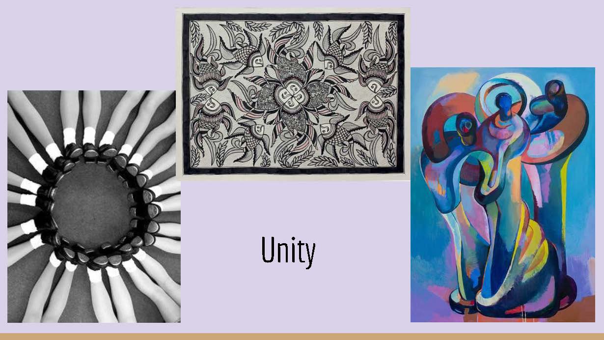
This small unit taught us some of the basics of art and design. We learned about and found examples on the internet of the 7 elements and the 6 principles of art. These rules and skills will are extremely important when it comes to these types of projects.
Digital Media
In Digital Media we researched 3 examples of each element/principle of art; one photography example, one traditional art example, and one modern art example. We then grouped them into a slideshow which can be viewed below.
Design
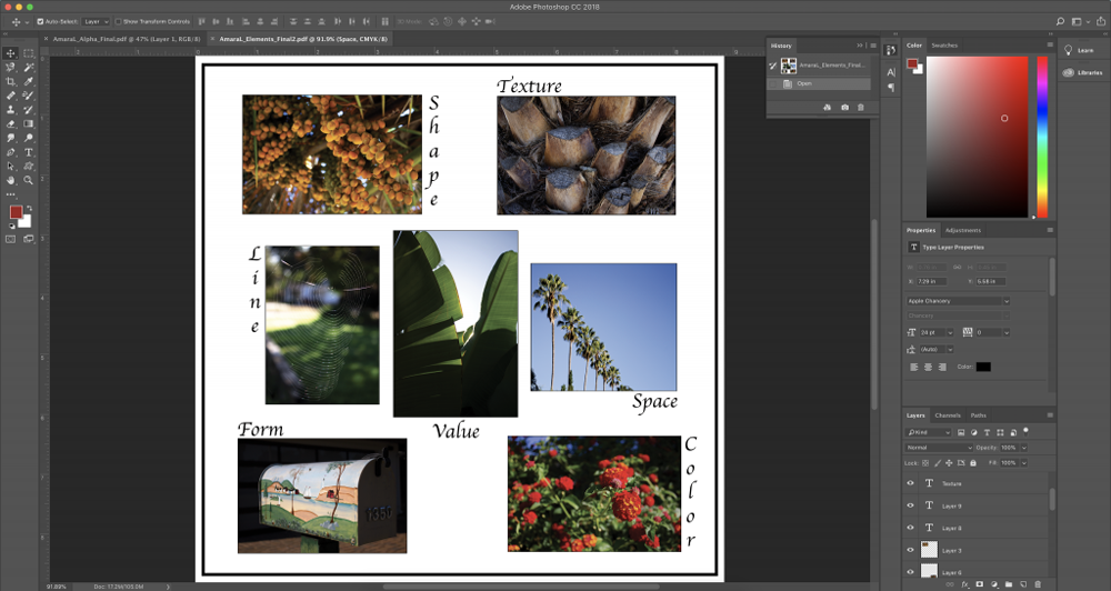
In addition to our research in Digital Media about the elements and principles, we also covered the topic in Design. We were then challenged to come up with our own examples of the 7 elements through photography, and format them onto one page.
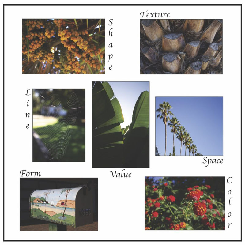
In Design, the elements can make or break your project. Not only did we apply all of the elements to the objects in our photos, but also used them while editing and arranging the photos as well as the text. We were also introduced to the idea of white space, used to ensure that our collage was legible and organized.