Reflections
Introduction
The overarching goal of this unit for was to learn new techniques and softwares. This is showcased throughout my projects, representing my growth in using these programs as I progress through my classes. In English, we focused on learning how to reflect on our own selves. Though no new software was learned, I did learn a lot about myself and different writing techniques, a personal favorite of mine being the lyrical essay. In Digital Media, I learned photoshop compositing and shortcuts in order to tie together images quickly. I learned many shortcuts that I am certain I will continue to use in my professional work. In Design I learned how to incorporate art elements in illustrator. Originally illustrator was a very frustrating program for me to learn, but overtime I’ve come to work with it rather than against it. All my projects showcased a bit of me, wether if it was my lyrical essay showing my love of stationary, my Digital Media pastel painting showing my love of Halloween, or my Design aboriginal representing what who I am as a person, all my projects had my interests as the spotlight. My projects always had something I was interested in or fascinated by, and I made sure to represent that as best as I could.
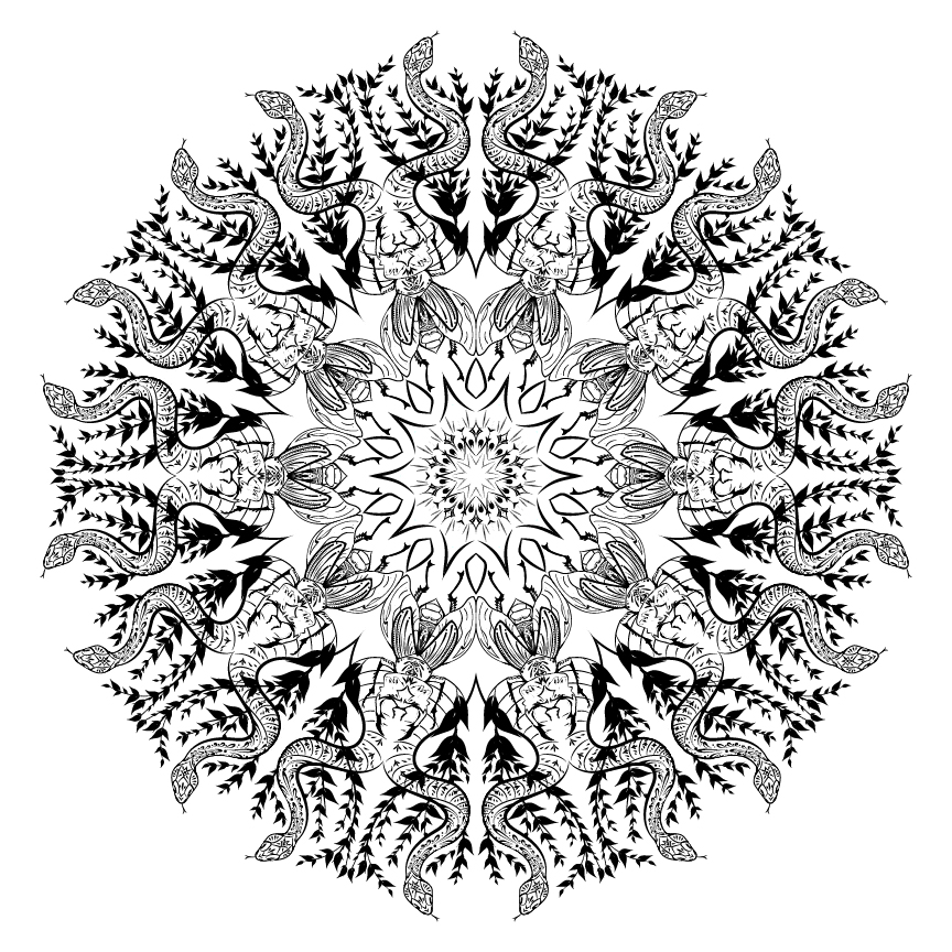
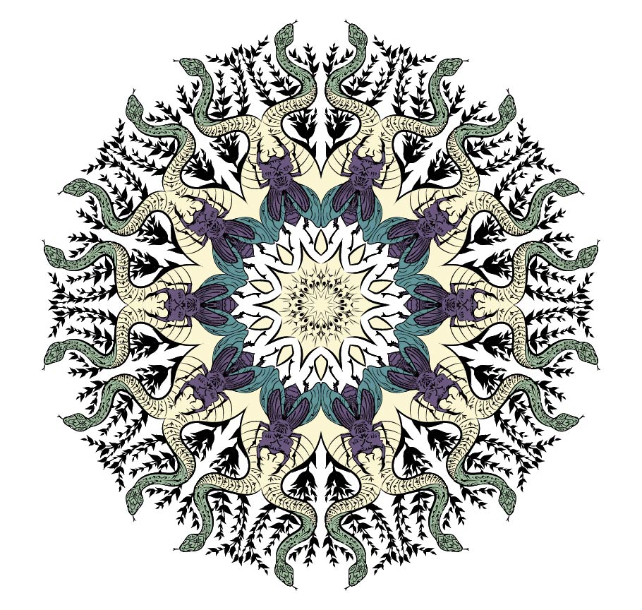
Personal Mandala
The Mandala Project was the first project were I had to use illustrator in. Throughout creating my mandala, I constantly felt frustrated. It didn’t feel as intuitive as Photoshop did, and I found it easy to quickly cause large amounts of lag due to me not combining my strokes. On top of that, I couldn’t do as much as I would’ve liked (such as gradients throughout my colored design). This project id however, introduce me to a program that I would quickly learn to love. Even if Illustrator was tough to get the hang of, I did appreciate the versatility and neatness it offered to my work.
Artist Statement
For my mandala projects, I would do a couple of things differently. For starters, I would add more detail to the black and white mandala. For the colored mandala, I would also like to add more colors so details can stand out better. Finally, for my mandala video, I would like to add more zoomed-in shots in order to make the video more interesting.
In the mandala project, I greatly valued the opportunity it gave me to work with new programs. It was interesting to try different shortcuts and tools in the given programs to learn new ways to make art. I have also never made a mandala before, and it was calming to slowly go through and add details. Overall, this project helped me try out new digital programs and helped me break out of my comfort zone with art.
When doing this mandala project, I learned how hard it is to be patient. Due to the high amount of detail in my mandala, it would take nearly 5 seconds to render a single stroke, so a lot of my working time was spent waiting. As I reflect on this project I realize how I could’ve fixed it, but at the time I had to learn to wait and be prepared to spend a lot of time on what seemed like a fairly straightforward and easy project.
Photoshop Art
After workin on these projects, I learned to further appreciate what an amazing tool photoshop is. I learned many techniques and used for the program. I am eager to learn further how to implement this tool in my artworks and projects. My favorite artwork made with photoshop by far is the photoshop composition. I learned how to combine photos in a way that allowed me to make anything I want. I am excited to continue learning about how Photoshop can be used.
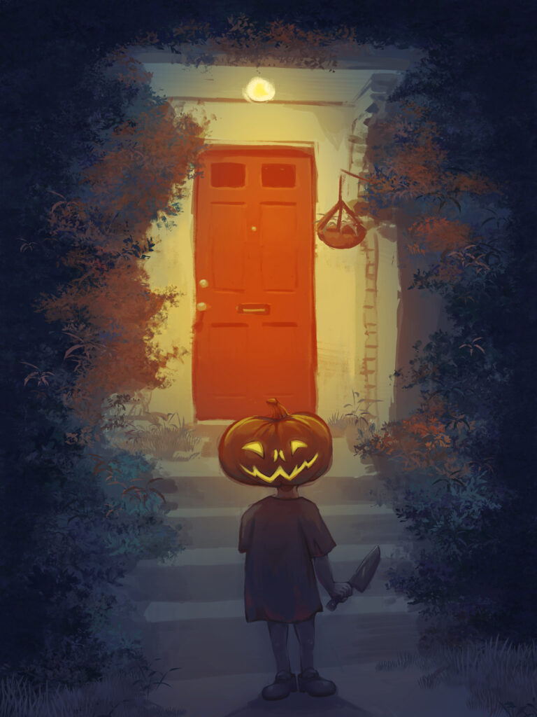
Photoshop Pastel Painting
Artist statement
Creating a Photoshop Pastel Painting was overall a very rewarding and enjoyable experience. After getting the initial sketch done it was very calming to space out and render the shapes without much thought. It was very therapeutic to make lots of tiny strokes, and to use different brushes in order to create a variety of textures.
What I value about creating a Photoshop Pastel Painting is getting to use Adobe’s various brushes. In this painting for example, I got to use the dry media brushes and summer 2021 brushes in order to create different textures. Using the foliage brushes was especially nice because it created variety in the values and colors of the leaves without me needing to do anything. On top of that, using different adjustment layers and layer modes was also really nice because I got to easily make my painting more effective.
What I learned about myself throughout this process is that I tend to be pretty lazy, which isn’t a bad thing. I really didn’t want to render and draw every leaf on the bushes, and so instead I got to experience new interesting brushes. I also learned that I really enjoy painting as a whole, especially backgrounds. Drawing backgrounds has always been daunting but this project helped me realize that it isn’t that scary.
Photoshop Watercolor Painting
Artist Statement
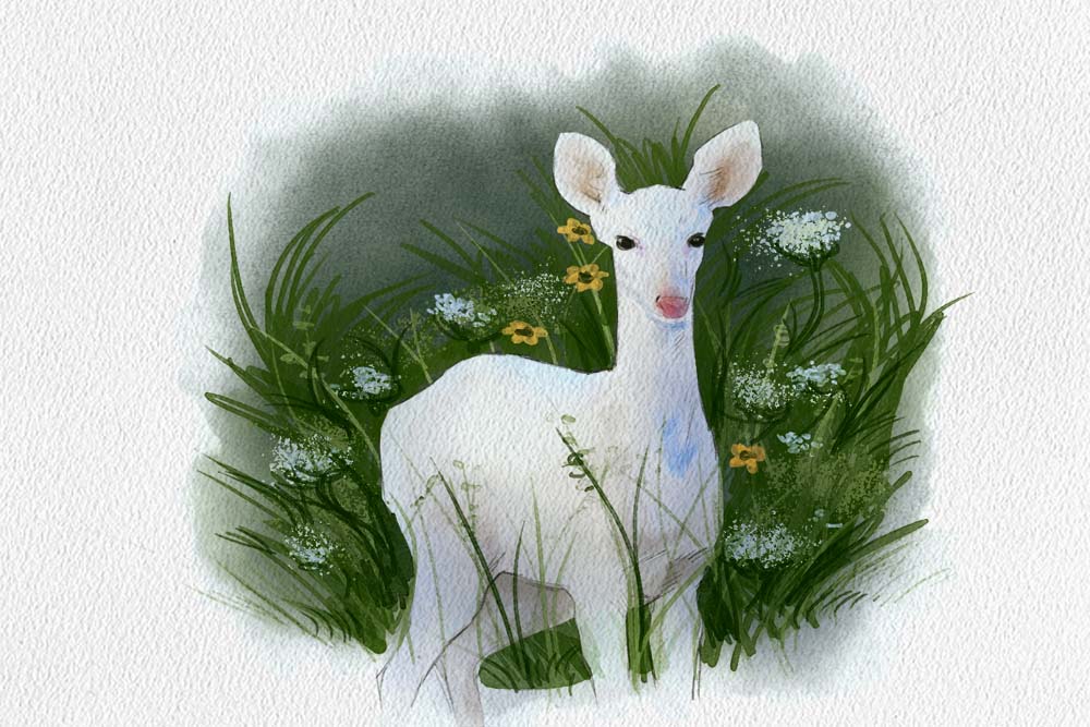
My painting is meant to represent and pay homage to one of my favorite things: nature. I originally wanted something peaceful and calming to paint, so I settled on an albino deer in a field of green grass and flowers. To me, the deer looked very elegant and stood out well against the dark greens, and would make for a good painting. I’ve always enjoyed walking in the forest and finding deer walking through leaves would always be a pleasant surprise. I’ve also always been fascinated by albino deer specifically since they look like mythical creatures come to life. In general, I wanted to create a painting that felt comforting and captured a few of my interests.
One meaningful connection I have with the articles and my art is that creating art is about the journey, not the final product. Even though this artwork didn’t have an outcome that I was necessarily proud of, I still enjoyed the process. Looking through and trying all the different watercolor brushes was a really fun experience. Another meaningful connection I found was painting something that held a memory. As a kid, I would go hiking often, and seeing deer always felt magical. This painting was inspired by that childhood memory, and I tried to convey the same feeling through the colors and subject matter. The final meaningful connection I had with this painting and its process was it inspiring a new painting. I want to try more watercolor painting, maybe in real life instead of digitally. I miss using real materials to create images, especially paintings.
In my opinion watercolor painting was less enjoyable for me than pastel painting. The watercolor brushes were hard to control, and colors would often not come out right due to transparency. Personally, I prefer analog when making watercolor paintings and digital when making other, more opaque paintings. This is because I find the process easier for watercolor painting in real life than digitally.
Photoshop Watercolor Painting Effect
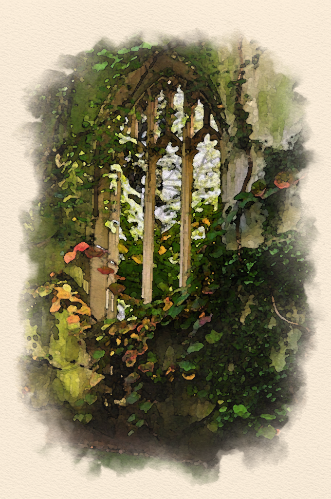
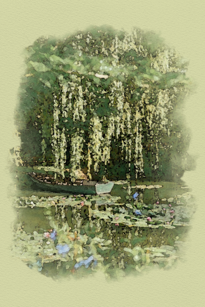
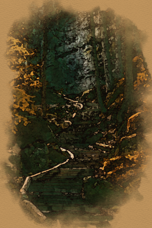
Artist Statement
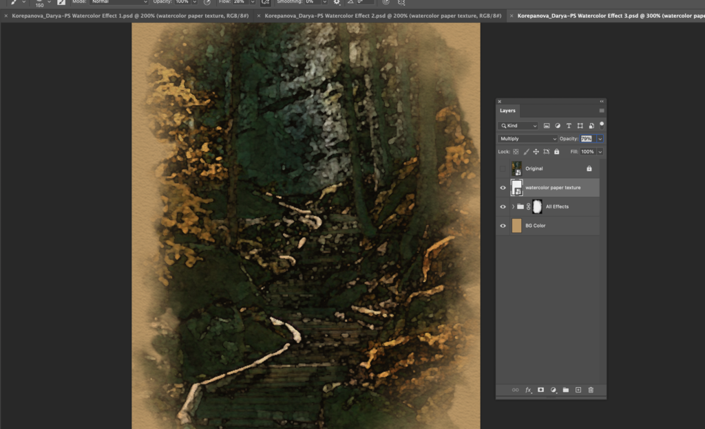
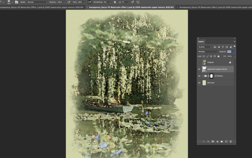
All of the subjects for my watercolor photos were of landscapes. Due to me being overloaded with work from school and with the global pandemic, I am forced to stay indoors. It has been hard finding a way to get out into nature again and experience it, specifically plants and trees. In all my pictures plants are prominent, which may be because I am yearning to get back outdoors.
Using filters is a lot faster and easier than actually painting using brushes. However, I think it takes control away from the creator. In certain photos while I was editing, it was hard to come to terms with the fact that some parts of the picture didn’t look like I would’ve intended. In my opinion you can also tell when a “painting” had actually been painted or had a filter applied to it, and personally I prefer the “painting” method better. I also find painting very therapeutic and enjoyable, so if I had the time I would rather paint these landscapes than use a filter.
I will probably use this in the future with graphic design. I can see this being helpful if I want to apply a certain style or aesthetic to my picture. It could also be fun personally, in order to make my digital drawings and sketches look more realistic. Overall I think that learning this technique was very useful, and I am certain that I will apply it to many other photos in the future.
Photoshop Composites
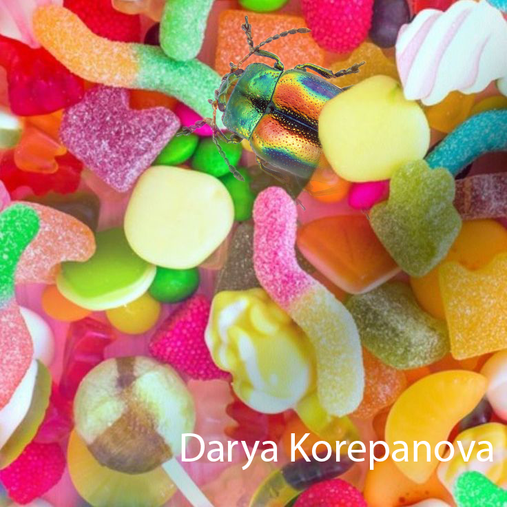
2 image photo composite. 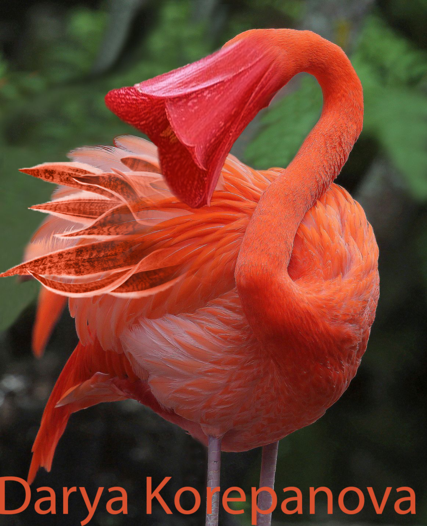
3 image photo composite.
Photoshop Surreal Art
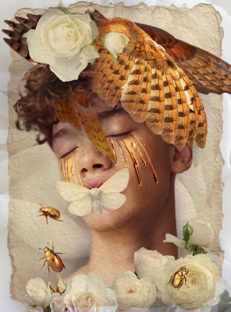
Artist Statement
I originally created this artwork when I was feeling upset and unwell, but had to go to school anyway. It was meant to represent how I felt having to get ready and dressed in order to appear “ok” when in reality I was having a bad day. From this original idea I began branching out into a more storytelling aspect with this. Maybe this person had recently died, but their death was seen as beautiful rather than tragic. Maybe this piece has some deeper connection to feeling out of place, or maybe even had a deeper meaning tied to wealth. In all honesty, although I started out with an initial idea, my piece eventually morphed into something that even I don’t know the interpretation of.
For this composition what I found most useful was the masking tool. Sometimes the selection tool, even the refined selection tool, didn’t give me exactly what I wanted. This is where the masking tool came in handy, as I could take away and put back parts of an image as I pleased. I could also make the image blend better into the piece. Overall I used the masking tool as the primary technique when it came to compositing my images.
In my opinion, Surreal Compositions are a lot more fun. Of course Realistic Compositions have their own place in the world, and can be useful when needing to put together family photos or creating a magazine ad. However Surreal Compositions come with a lot more freedom. It’s a lot more interesting to start off with a small initial idea and build upon it and grow it as much as you like, without necessarily having an end goal. Unlike Realistic Compositions, in Surreal Compositions I focused more on just making what I liked, something that had all my favorite colors and looked pretty and elegant towards the end. In general I enjoyed the artistic freedom I got with Surreal Composition over the practicality of Realistic Composition.
Design Productions
Introduction
In design class I mainly focused on sharpening my design and artistic skills through learning new software. Throughout these projects you can see my improvements with the programs, with my projects becoming more cohesive and detailed over the course of the first semester. These projects also helped me learn more about the design process in the professional world.
Micro Macro Miniature
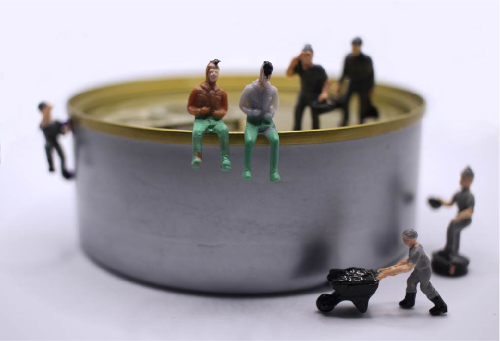
Artist Statement
Ever since industrial jobs have become essential to everyday life, many have had to move to cities. Most industrial jobs are located in cities with few trees and many metal structures and buildings as a consequence of a dense population. My photo conveys the idea of how people have grown to adapt in such difficult environments by showing industrial workers on top of a sardine can, representing both the overpopulation in such areas and the artificial environment many people have had to grow accustomed to.
For my photo, I used a sardine can without a label and 7 miniature statues of industrial workers. I set up the scene in a lightbox with an overhead LED light and shot pictures with my Canon EOS Rebel T5 camera and macro lens. After getting a photo I was satisfied with, I put the image into photoshop. I cropped the image to get rid of the unnecessary background and to frame the focus of my photo (the two sitting people). I then used a curves adjustment layer to adjust the contrast, a blue photo filter to give the image a cooler tone, a hue/saturation adjustment layer to make certain colors more saturated, and a layer of white on top of the image to ‘erase’ any undesirable background that was left after cropping. I continued going back and forth through certain adjustment layers to further change the colors, contrast, and mood of the image.
Public Service Announcement
Artist Statement
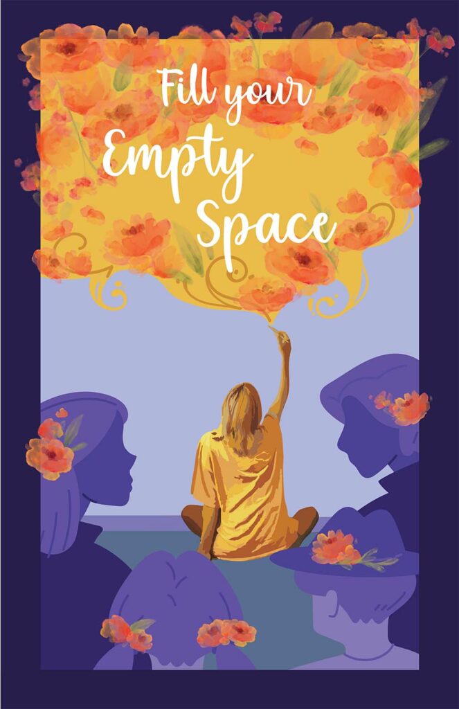
In my PSA we see a figure sitting on the floor cross-legged with their back towards us, their hand reaching up to draw on the wall in front of them. They appear to be drawing flowers and yellow swirls on the wall, and we can see a group of illustrated people surrounding the subject on the floor. They have watercolor flowers on their heads or in their hair. The group of people are illustrated in purples and blue tones, the background is blue tones, while the subject on the floor and the watercolor flowers are yellows and oranges. The text “Fill your Empty Space” is written within the drawn watercolor flowers on the wall. My idea for my PSA was inspired by the reason I began to draw, which is detailed in my personal essay. I originally began to draw when I became bored while sitting in waiting rooms, and slowly people would gather around me and comment on how they enjoyed my work. I tried to portray this by having the figure sitting on the floor represent me, and the group of people represent those who were watching me draw. The watercolor flowers were meant to represent my art, and the cool toned figures have the same watercolor flowers in their hair to represent how my art has affected them. I also made myself and my art be represented with warm tones in order to show my passion for creation. The audience I’m hoping to reach with this poster is other people who want to begin drawing. You don’t need to be good at art to create art, what’s more important is to create what you want to create because in the end no one is going to make the same piece as you do. You’re an individual, and using art as a way to express yourself and influence others is important.
I made this by combining images I created using Photoshop, photos I took with my DSLR camera, and additional illustrations and finishing touches added in Illustrator. I first began with sketching my idea in order to create a guideline for myself. I then illustrated the blue toned group of people and created a dark border and blue background. I then used watercolor brushes I downloaded from the Adobe website in order to create a sheet of watercolor flowers which I then copy and pasted into the Illustrator document. I used these flowers to overlap them and create a sense of art being drawn on the wall. I then used a picture that I had taken of myself in order to create the subject in the middle. I did this by using the “image trace” function in Illustrator. I then recolored my image traced photo to make the photo have cooler tones. I added final details in order to finish the piece. The main issue I faced was getting the watercolor flowers to look good. I needed the flowers to have a transparent background, so I had to one by one crop these flowers and take away their background so I can individually move them on the Illustrator canvas. It was also hard to get the flowers to look right because they were transparent and had a lot of texture, but I think I managed to get it looking alright in the end.
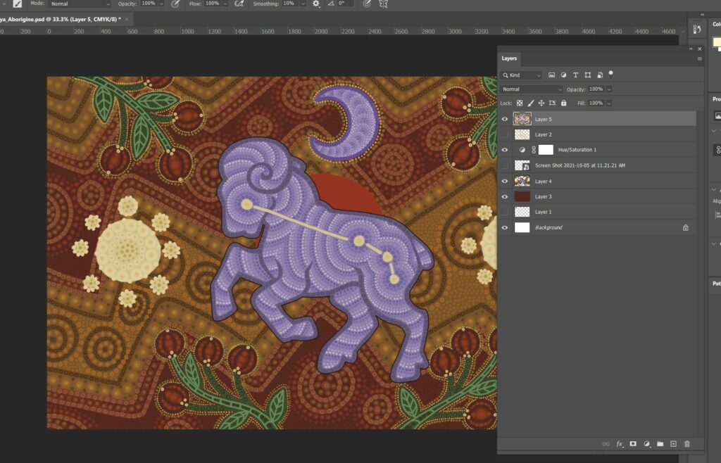
Aboriginal Art
Artist Statement
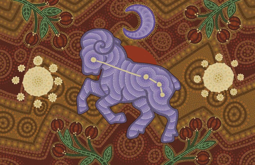
In my aboriginal I used 3 primary symbols: Stars, Moon, and Bush Berry. The star and the moon symbols are meant to represent a journey and signify that this piece is attributed to my origin. I also really enjoy stargazing and observing moon cycles, making these symbols more significant to my piece. I used the Bush Berry symbol to represent my interest in foraging and the outdoors in general, especially the forests. I have distinct memories of going to the forest and picking berries with my mom in the summer, so I wanted to include that in some way. In the background of my piece I also used red zig-zags to represent fire, because my zodiac sign (Aries) is a fire sign.
I created this piece by first creating a sketch. Over the sketch, I blocked in my basic shapes in the color scheme I wanted to use. The rest was pretty straightforward, I added dots, where I thought, was necessary and added more dots, either lighter or darker, on top of those dots. I also outlined the sheep and added white dot outlines on the ram in the middle and the Bush Berry symbols in order to make them contrast against the maroon background. The most significant problem I encountered in this project was trying to convey contrast and using color effectively. My hand would also often hurt from the repeated motion of placing dots, so if I had more time I would take it slow and try to rest my hand more often.