
Cursive Name Art Scan
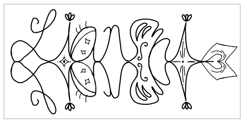
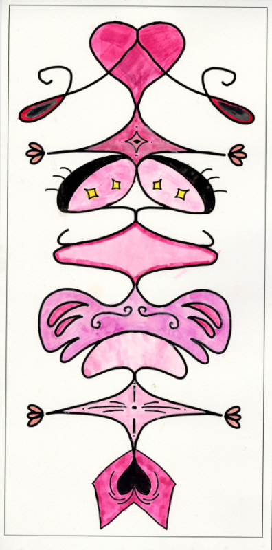
For Senior Narrative in Design, we created unique productions with a lots of new and creative ideas. First production that we made is a Cursive Name Art scan.
Here is my sketches before coloring:
Product Logo and Label
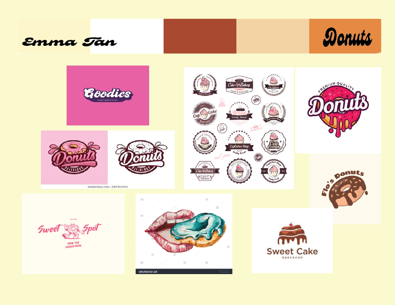
In this project, based on my favorite rough sketch from the previous assignment, rework that idea into a final logo sketch. Before we actually design things, we are make a board that get inspiration from multiple images and this is called “Mood Board”. For my Product Logo, I made a mood board to brainstorm what I want to make with my logo. Here is my Mood Board and my final Logo.

Label
In this project, We were expected to create a label with your original logo that you made previous. Using the label on actually products.
Triptych
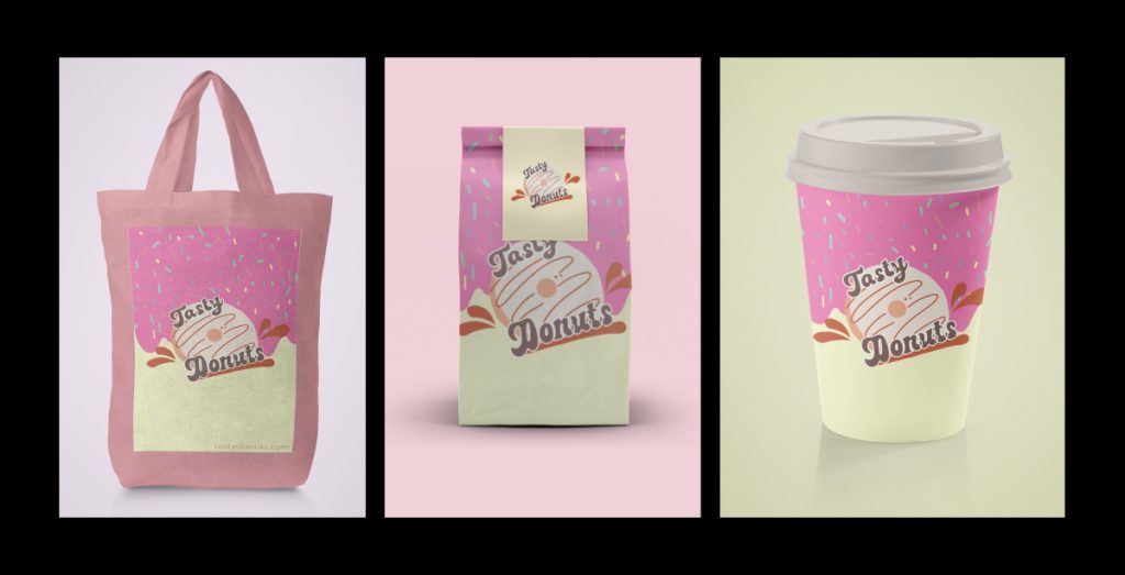
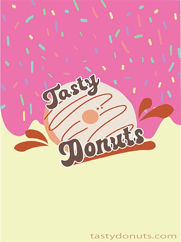
Don’t miss the breakfast at the “Tasty Donuts” shop!!!
I chose the donut shop for this logo project because I personally enjoy eating food, especially donuts, and they are a popular treat to share with loved ones in the United States. I had a lot of fun creating the product, logo, and label featuring donuts. I designed the donuts with caramel dips to make the viewer’s craving for the treat trul “thrive” when they look at my logo. Paired with my original store name, “Tasty Donuts”. For the packaging, I selected a paper bag to make the logo stand out. I chose this product because it is practical for carrying donuts on the go, and the bag features a sticker with my donut logo in light yellow to complement the label’s color. I designed the label with girly, cute, pink-colored dips on the donuts’ background, placing my logo at the center.
I created the logo and products, and triptych using Adobe Illustrator and Photoshop. I mainly used Illustrator to design the logo and label, working with the pen tool and brushes. In Photoshop, I created the triptych for the product display. I thoroughly enjoyed making these designs and the entire creative process. One challenge I faced was selecting the background color for my products. With three different items in the triptych, it was difficult to choose a color that would complement the overall look.
World Building Project
Movie Poster
We did design a movie poster using either Photoshop or Illustrator or a combination of both. We created our movie poster base my poster on the world building assignment we did in English. Before we got start on movie poster, we created a color scheme which matches the mood of your movie plot which became on my mood board. Creating my own version of color scheme with the same components.

Book Jacket
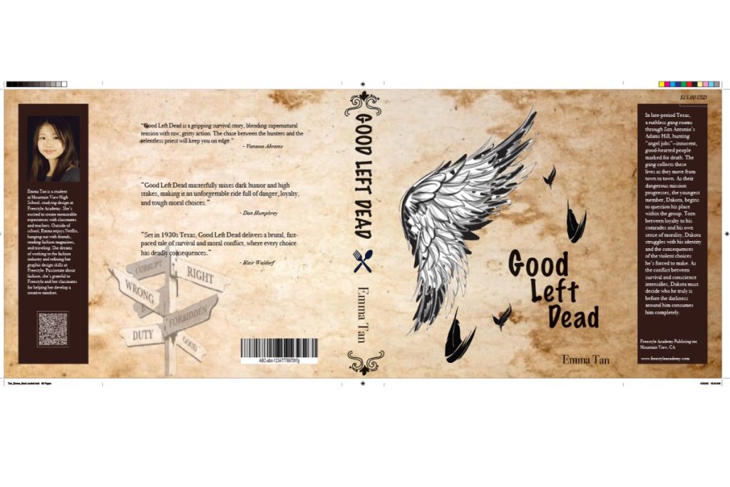
We created a book jacket base your concept of your story in English. For my group, our theme was “How to kill An Angel” which is fantasy and fiction story. The main story take places in Texas with main character named “Dokota” who is the youngest member in the gang which is the main focus on later story.

Good left dead
In late-period Texas, a ruthless gang roams through San Antonio’s Adms Hill, hunting “angel jobs”- innocent, good-herated people marked for death. The gang collects these lives as they move from town to town. As their dangerous mission progresses, the youngest member, Dakota, begins to question his place within the group. Torn between loyalty to his comrades and his own sense of morality, Dakota struggles with his identity and the consequences of the violent choices he’s forced to make. As the conflict between survival and conscience intensifies, Dakota must decide who he truly is before the darkness around him consumes him completely.
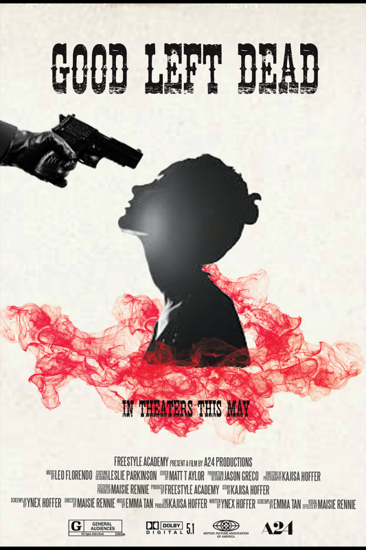
I created my movie poster by using Illustrator and Photoshop. I wanted to make the poster look like something that gives audiences spectacular, mysterious and criminal vibes from the poster. One of the notable parts is red smoke around Dakota’s body. It represents people’s blood that is caused by the gang killing innocent citizens and angels. Overall, I kept in mind to make simple as much as I can, so the poster look stylish and be attracts to audacious.
I think I learned Adobe techiches through the poster making process. It was overwhelming for me to do these projects because there were lots of things that I still don’t know the techniques about. However, in the end I am able to understand the basic skills in Adobe and enjoyed the process.
Reflection
Overall, I learned many Adobe skills through several project in Design class. I really enjoyed to work on these amazing project. As I processed the project, I also get to know more about myself because there were many production that relate to individual concept and each productions reflect their interests.