The Reflections unit has various components in each class, but in brief, it’s what it sounds like. Finding the reflection of yourself through your own art, and partially, figuring out who you want to be and how you want to present that person to the world. This unit involved projects like the Black and White & Colored Mandalas, as well as the Core Values animation in Digital Media, the Why I [Write] essay in english class, and the Cursive Name Watercolor in Design. Each of these is an impactful project about expressing yourself and putting your own image into your art.
I personally didn’t find much personal development through this unit. I would say I know who I want to be already, so this unit was more about expressing my core values and my personal mission.
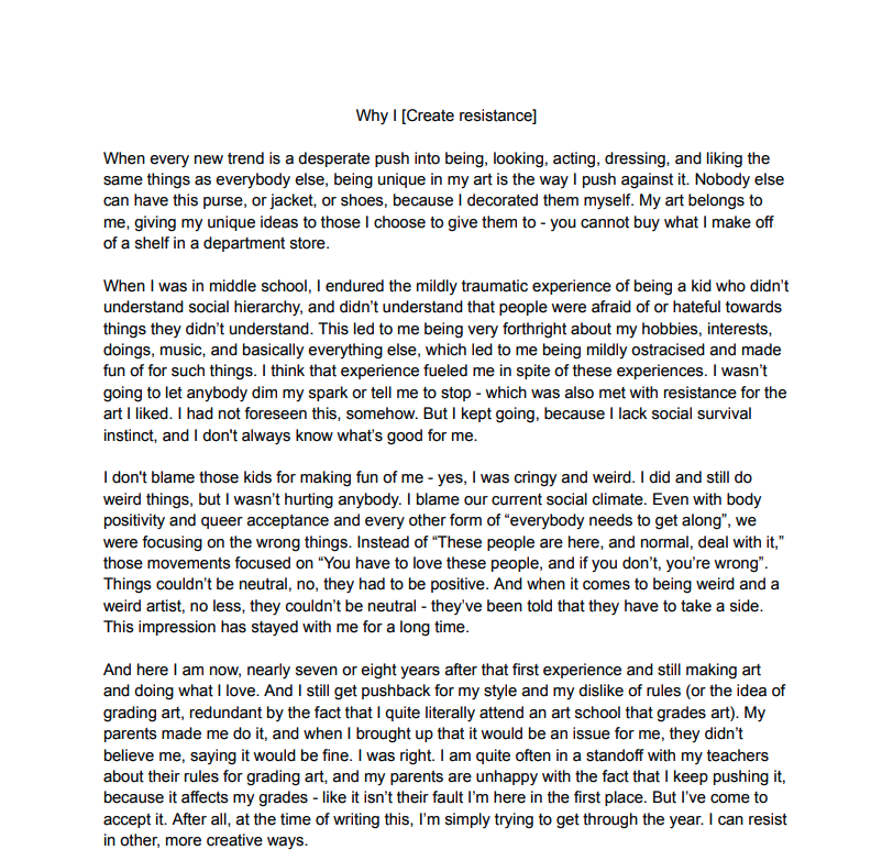
Why I [Create Resistance] Essay
This essay was personally challenging for myself, as a person who greatly prefers speaking to writing. I also tend to be tangential in my writing because I feel the need to fully explain every single aspect of the topic I’m exploring, which is difficult when there is a word limit and it has to be graded, and set for a specific audience. There’s an inherent paradox in art school, to tell people to create art and then punish them in terms of grading for not adhering to certain rule sets or simply requiring them to. Now, I’m not saying you can let anything fly, there can be standards, but they cannot be arbitrary and constraining. The whole point of art is to counter expectations and to create something new. But I digress, I’m fighting un uphill battle that I’ll never win, and I know that quite well.
I think I answered the question of “Who am I?” quite well. This essay encompasses much of my personal experience as someone who makes art and sticks out like a sore thumb in many places I’m in. It was a bit painful to write, in all honesty – I don’t like revisiting my younger years. I wouldn’t wish what I experienced upon my worst enemy – I’m still suffering socially because I can’t figure out what I seem to being doing “wrong”.
I think writing this essay really helped me deconstruct exactly where I am in life and see how much progress I’ve actually made since my initial years of being an artist.
My personal Mandalas
If the images do not display below,
On a Mac, press Command + (plus) then press press Command – (minus)
On a PC, press the Ctrl + (plus) then press the Ctrl – (minus)
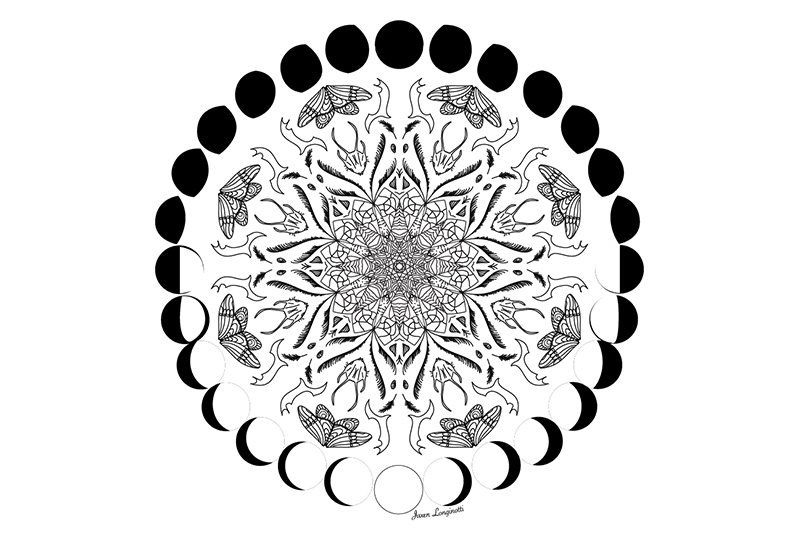
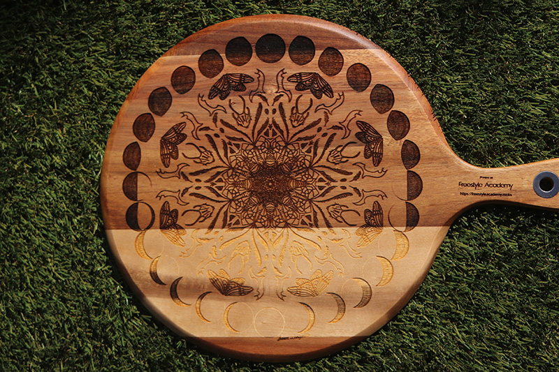
I really like my laser engraved Mandala. At first, I was apprehensive about the lighter strip of wood, feeling it threw off the look, but now I like it. It’s a funny contrast to the perfectly symmetrical mandala. I feel it truly does capture how I wanted it to look engraved and digitally. The detail gets a bit lost in the middle, but I’m alright with that, I knew it was a possibility. It still has that semi-hypnotic quality of the original mandala.
I chose the Pizza board for one reason – functionality. I like functional pieces of art, something I’ll actually use, something that I’ll be able to look at and think “I made that, and now it gets to be a part of my life” every time I use it. It will most likely be used as a cheeseboard in my house, which also means I get to show it off to guests.If I’ll be honest, I liked the BW mandala the best. I work quite well in negative space, and I’ll still learning how to use color the way I want to to properly convey my vision. I wasn’t a big fan of the pressure sensitive brushes, I find they distract me from getting the clean lines I want, and they just aren’t really congruent with the look I’m going for. The rest, I’m pretty proud of. The color mandala is good progress in my learning, and the build reveal video was fun to play with. I truly am the most proud of the BW Mandala and Laser engraving.
In the future, I can continue to develop the skills I’ve used in this project, and hopefully apply them to my other art – especially the use of color and determining how much detail I want to commit to. My color mandala struggled with both. I think interacting with my peers as they also completed this project was especially interesting – It really showed me the importance of not comparing yourself to others. Many of my classmates have very defined art styles that they’ve spent much time developing, and it’s important to me to remind myself that it’s okay that I’m not quite at that level yet.
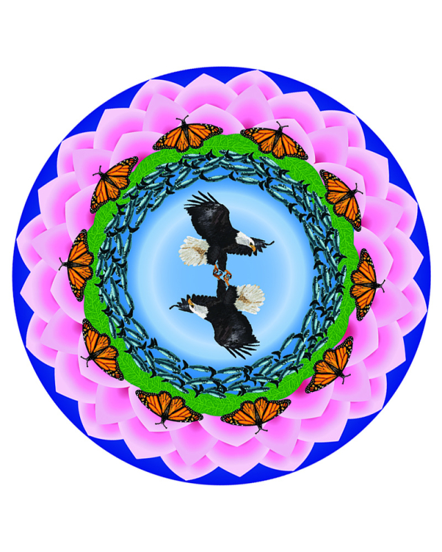
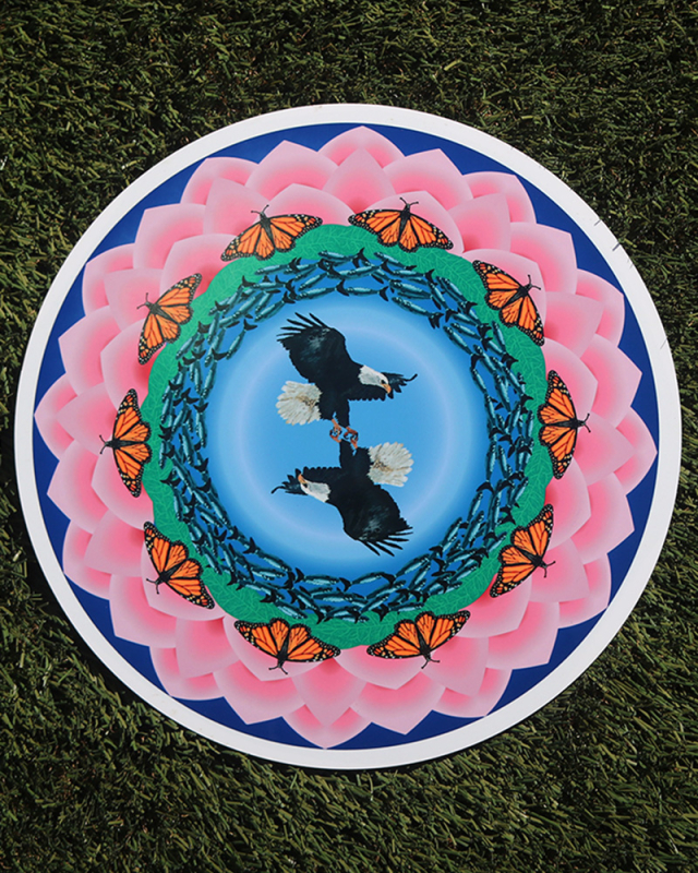
My Colored mandala is a completely different piece. My mandalas have one similarity, and that is both being animal/nature themed, which is where much of my inspiration comes from. My colored mandala also has more dimension. With color, it’s easier to get the idea of depth across, whereas with just black and white, there’s more focus on contrast rather than depth. This one draws connection from the circular nature of animal behaviour, humans being animals, and how it isn’t always negative. When the clock returns to midnight, it’s a brand new day. The many petals of the Nenuphar flower around it are complete, repetitive, and just a little bit messed up. Never perfect. In the middle are a pair of eagles. The “Death spiral” behavior that eagles exhibit is a Courtship ritual between mated pairs (researchers believe it builds trust and their bond as a pair), but the same behavior is used in territorial combat over nests or hunting zones, and also done by juvenile eagles to play or test strength.
The color scheme is a bit all over the place, but I used it to try and exemplify the beauty and range of nature’s colors. The concentric circles of color are again a nod to the cyclical nature of life. It was a lot more difficult to work in color. Finding the right colors (~30 shades) for the eagles was difficult. As I got further from the center, the colors and the design simplified a bit more, being less in variety and more focused on simply creating form rather than exact reproduction of my intended vision – but it also lost the stippled artstyle I was going for. What stands out most to me is the eagles in the middle, it’s just what stands out the most, and my favorite part of the mandala. I don’t love the leaves, but frankly, I didn’t have the patience to make something I liked much better.
Mandala Build reveal Video
For this video, I’m simply step-by-step revealing my black and white mandala mandala design. I used Adobe AfterEffects to edit it, and found music that i liked to set this to.
I really like my laser engraved Mandala. At first, I was apprehensive about the lighter strip of wood, feeling it threw off the look, but now I like it. It’s a funny contrast to the perfectly symmetrical mandala. I feel it truly does capture how I wanted it to look engraved and digitally. The detail gets a bit lost in the middle, but I’m alright with that, I knew it was a possibility. It still has that semi-hypnotic quality of the original mandala.
I chose the Pizza board for one reason – functionality. I like functional pieces of art, something I’ll actually use, something that I’ll be able to look at and think “I made that, and now it gets to be a part of my life” every time I use it. It will most likely be used as a cheeseboard in my house, which also means I get to show it off to guests. If I’ll be honest, I liked the BW mandala the best. I work quite well in negative space, and I’ll still learning how to use color the way I want to to properly convey my vision. I wasn’t a big fan of the pressure sensitive brushes, I find they distract me from getting the clean lines I want, and they just aren’t really congruent with the look I’m going for. The rest, I’m pretty proud of. The color mandala is good progress in my learning, and the build reveal video was fun to play with. I truly am the most proud of the BW Mandala and Laser engraving.
In the future, I can continue to develop the skills I’ve used in this project, and hopefully apply them to my other art – especially the use of color and determining how much detail I want to commit to. My color mandala struggled with both. I think interacting with my peers as they also completed this project was especially interesting – It really showed me the importance of not comparing yourself to others. Many of my classmates have very defined art styles that they’ve spent much time developing, and it’s important to me to remind myself that it’s okay that I’m not quite at that level yet.
Design
Concert poster:
For the concert poster assignment, we choose a band and create a fictional concert poster for them. I chose Run-DMC because it’s band that’s been on my playlist for a long time, and I could really lean into a vintage style for them.
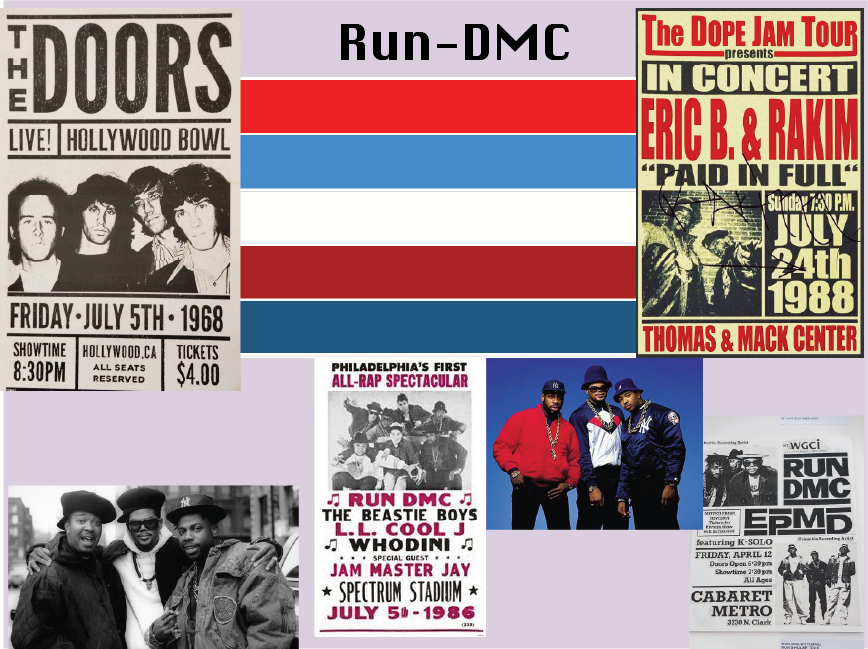
My moodboard is fairly simplistic. Concert posters at this time wear easily readable & recognizable.
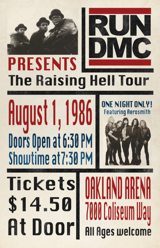
The 1980s is often considered one of the best eras for music. While this can be attributed minorly to the nostalgia of current generations, it’s also due to the range. From Micheal Jackson, to Guns ‘n Roses to the Beastie Boys, there was something for everyone.
Hip-Hop culture thrived with many branches in the 80’s. In 1984, Run- DMC became the first Hip-Hop group to be awarded a golden record (for the Album that shares their name). This was followed by the certified Platinum record for their album King of Rock. Their cover of Walk This Way featuring Aerosmith, of the album Raising Hell, charted higher on the Billboard Hot 100 than Aerosmith’s original song. They were also the first Hip-Hop group to have their music broadcast on MTV, perform at Live Aid, and be nominated for a Grammy award. I based this poster off of their Raising Hell album, as it’s my favorite of theirs. But – the real Raising Hell Tour was marred by violence between street gangs in places like Los Angeles. While their lyrics tended to be loud and confrontational, the group denounced violence and ignorance, but were still blamed by the media. Run-DMC called for a day of peace between gangs in LA after the tour.
To create this poster, I did research on 80’s Rap and Hip-Hop Concert posters. They tended to be very utilitarian, with two or three photos of the group or Artist, and the rest of the poster consisting of informational text – very different from more recent concert posters due to the format – you didn’t buy tickets online. From his process, I learned a lot for formatting, and the proper “vibe” I was going for, the worn, vintage look, was difficult to figure out. I ended up having to find texture and make a clipping mask with my letters, and having to recreate their logo by hand. If I could change anything, it would definitely be the photos. They don’t blend great, but I couldn’t figure out how to make them look the way I wanted.
Aboriginal/Dot art
This art is mean to pay homage to Australian aboriginal art in it’s style.
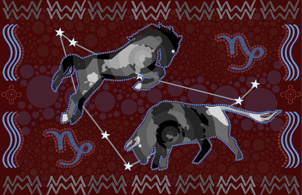
Let’s start with the “frame”. Along the top and bottom are symbols representing mountains. The lighter red in the background also echoes the mountains. The blue down the sides represents water, but also smoke. Where there’s smoke, there’s fire. Between the two blue waves is the symbol representing “seated women”. In the center are the Horse and Bull. The Horse, when threatened, rears up, pulling back, preparing to run. The bull, when threatened, bears down and prepares to charge in headfirst. They are made up of layered circles, the energy centering in the chest, at the heart. They are surrounded by marquis lights. With the seated women watching, the Horse and the Bull fight in the field of a lush valley, the stars above and the earth below them, give performance for their audience. The Horse is fast, impulsive, light on its feet, jumping above and nearing the heavens. The Bull lowers itself to the ground and steadies itself with the earth. They are locked as equals and opposites in battle. They represent the two warring instincts of the heart. Dive in headfirst, get your hands dirty, or run from the issue until it is inevitable.
I didn’t have many ideas for this project initially, so I kind of just threw everything at the wall and saw what stuck. Originally, I was going to draw the Horse and Bull with tiny little dots, but it felt too disconnected and decentralized. For the background, I created the frame to contain them first, creating my setting, my arena of sorts, and then added the Horse and Bull. I struggled with getting the background to look how I wanted it to, and to be honest, I’m still not totally pleased with it, but it was the best I could come up with. I think this just isn’t my style, but I tried the best I could to make it cohesive.
Cursive Name
This project is fairly simple. You write your name is cursive, overlap them in the center, fill the loops with “zentangle” drawings, fill those in with color, and display the work as desired. Here’s my try at this.
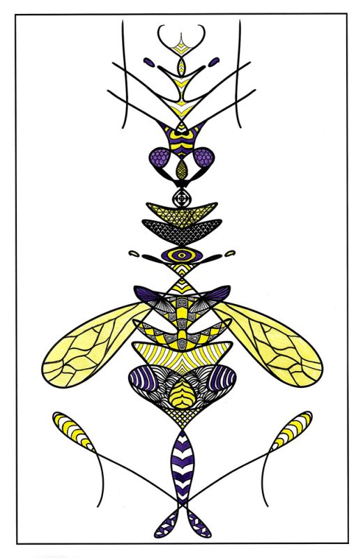
I valued the many different design methods used in this unit. Lots of pre-concepting instead of a “one-and-done” mentality. Lots of moodboards help me to truly document my vision so I don’t loose it in the process. We also did a bit less digital work, which I love to give the art more life and consideration. It also creates more human error, which I believe is a core part of artistry.