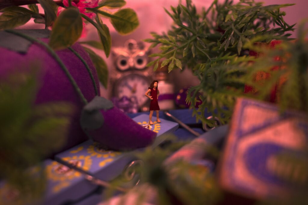
For my Design projects, I explored an abundance of topics. For my first piece, I took inspiration from one of my favorite animated films titled, “The Secret World of Arrietty” which is inspired by the story, “The Borrowers.” I figured this would be perfect since it suits the macro theme with the people being miniature in the story.
Macro Photo Artist Statement:
For my Macro photography project scene, I took inspiration from the Studio Ghibli movie, “The Secret World of Arrietty”. This movie is a take on the book, “The Borrowers” and both stories follow miniature people living in the normal human-sized world. Arrietty is a curious character and I wanted to display her curiosity using a scene where she is in her bedroom full of human-sized knick-knacks she has collected along with numerous plants. Her bedroom has always been something I wanted to recreate and I’m glad I got to take inspiration from it for this project.
In order to capture the cozy essence of her bedroom, I collected miniature objects in my house that could be utilized as furniture, decor, and more. I began my brainstorm by listing small things I own such as an owl clock pendant, clothespins, and a pincushion. Another important part of her bedroom was the nature incorporated with the space so I collected leaves and used fake plants to encompass the jungle-like feel in her room. For the surface of the room, I lay down cloth which I stacked my knick-knacks on top of. I used one of the miniature swimmers as the focal point of my piece. I also used a thin layer of pink tissue paper and covered the LED light ring with it to provide a pink hue in the room. After I finished taking my pictures, I imported my best shot into Adobe Photoshop. Using Photoshop, I cleaned up small markings throughout the photo that distracted the viewer from the main subject. One of the most time-consuming edits was adding on the dress. I used the clone tool and repeated the pattern from the swimsuit on the figurine to recreate Arrietty’s default outfit. I also used several layers such as exposure and curves which helped me the most to achieve the correct lighting. Overall, I really loved making this miniature scene and incorporating one of my favorite animated movies into an art project.
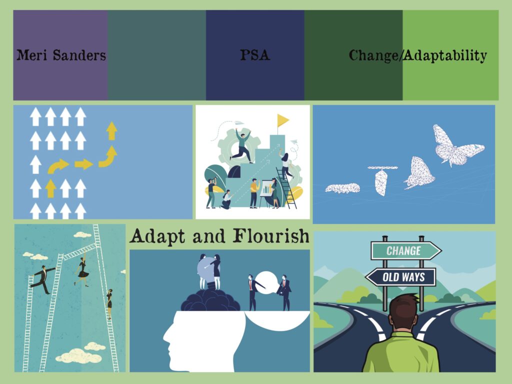
Though it changed a lot, this was my initial mood board for my PSA. Using Adobe Illustrator, I put together pictures of inspiration along with the font and color scheme to set a. tone for my project. This helped guide me to where I wanted to go, and in the end, there is more emphasis on purple and yellow.
PSA Artist Statement:
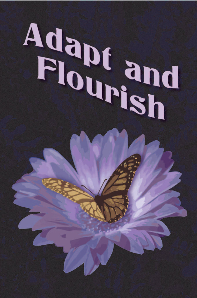
My PSA consists of a butterfly contrasted against a purple flower and background with text that reads, “ Adapt and Flourish” along the top. The butterfly is drawn with various yellows and browns, similar to the original coloring of the butterfly. In order for the butterfly to stand out, I use several muted shades of purple to make the main focus be the butterfly and the text. The message behind my piece is based on my personal essay. In my essay, I focus on the importance of learning to grow and adapt even when life gets hard. This message is reflected in my piece by using the butterfly to represent how I am constantly changing and adapting. The phrase, “Adapt and Flourish” is meant to bring hope and light to the idea of change rather than seeing it as an intimidating thing. I hope to invite people to the idea of change being a good thing through my PSA.
Using Adobe Illustrator, I completed my PSA. I first began by taking reference pictures of Gerbera daisies at my local nursery. I then chose the best image and used Image Trace in Illustrator to make it appear to be a drawing. I recolored the daisy to be various shades of violet to fit my color scheme. Using the font “Titania” I wrote out “Adapt and Flourish” for the message of my PSA. I used a soft purple to stand out against the background and included a drop shadow for the text. I also used Image Trace for the background as it is a recolored image I took of a fern. Finally, I drew the butterfly and used elements of Image Trace in order for it to look as realistic as possible. I also recolored the butterfly to make sure the yellows were soft and not harsh. Finally, I applied a layer of grain to the background for a textured effect. Some areas I struggled with included making sure the coloring of the background was right. I wanted the pattern to be noticeable but not take away from the focus of the piece. In the end, I achieved the perfect balance of purples. Overall, I am really happy with how my PSA turned out and I think my message is both clear and visually appealing.
Aboriginal Artist Statement:
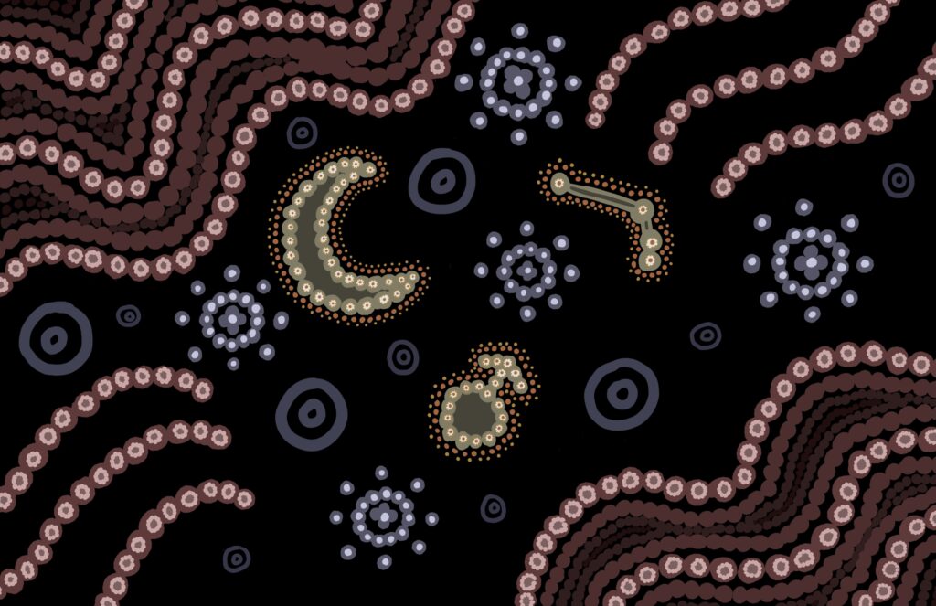
Throughout my Aborigine art piece, I have included several symbols to represent my story. To start, I was born in April and my star sign is Aries so I chose to relate part of my work to that. I included the constellation as well as the symbol for the planet Mars. As for Aboriginal symbols, I chose to use four different ones in my piece. To go along with the focal point of the planet symbol and constellation I used a moon. I also used the fire symbol since Aries is a fire sign. Finally, I included stars and clouds to represent myself, my friends, and my family.
I started this piece by sketching out how I wanted to create the layout for my design. I initially wanted to focus on just the constellation but I really liked the moon and Mars symbol so I chose to incorporate them into the focal point as well. After I sketched out my rough outline I began to choose my colors. Since Aboriginal art is typically very earthy I went with earth-toned versions of the primary colors. In order for the moon, constellation, and Mars symbols to stand out, I used a secondary color, orange, to create emphasis. One problem I had throughout the piece was making sure I didn’t cluster too many dots in one place. When I first started my piece I thought I would fill in all the fire symbols in their centers but I ended up only filling in two so it wouldn’t be overwhelming. Another problem I ran into was making sure my focal point truly stood out. Though I used a brighter color for the three symbols, I still feel as though it wasn’t enough. If I were to change anything I would redo the colors because they seem a bit dull and I could’ve brought more life to the piece.