Hello! My name is Meri Sanders and I am a Senior Design student at Freestyle Academy. Throughout my two years at Freestyle, I have produced a number of projects that showcase my skills in graphic design, photography, writing, fine arts, etc., and my pieces often relate to personal stories as well as my interests. At Los Altos High School, I am an AP Studio Art student where I have continued to develop my fine art skills. I am also the co-founder, President, and Senior Art Director of Savvy Zine, an all-inclusive digital magazine made to support and uplift student art and writing in and beyond the Bay Area.
For my Senior Showcase, I am excited to share with you my Movie Poster, my Product Design Project which I further developed outside of class, and my Magazine Advertisement for my product. I chose these projects because I feel that they best represent my current skillset in Adobe Illustrator, Photoshop, and InDesign. They also are my favorite projects because I feel that my personality and design style are showcased in a way that if you only saw these pieces, you would know a lot about me!
In terms of feedback for the pieces I am sharing with you, generally speaking, I would like input on how every element within each individual piece work together. For the movie poster, is the composition too busy? Is there enough emphasis on the main subject? For my product design project, are my intentions of emphasis on sustainability and unity present in the design? Does the placement of the logo and label make sense with resembling a letter/package? For my magazine advertisement, I would love to know the same, does the design make sense with the purpose of my brand?
This Fall I will be starting my freshman year at the Rhode Island School of Design where I plan to pursue Graphic Design. I am extremely excited to live and grow as an artist and student in Providence, Rhode Island, and I cannot wait to see where this incredible opportunity takes me.
Thank you so much for taking the time to look at my work and give me feedback! I look forward to seeing you next week.
You can reach me at meris@freestyleacademy.rocks or merisanders7@gmail.com
Below is the moodboard I designed before creating my final product which shows my sources of inspiration, font, and color scheme.
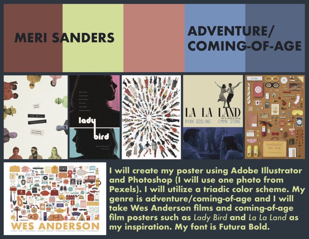
My make-believe movie takes inspiration from my personal interest in becoming a production designer for film and television in the future. The main character is a girl who wants to grow up to be a production designer and she has a journal where she always draws or writes own her ideas. One morning she wakes up and her journal is missing, only to find that her ideas have become a reality. She must go on a journey alongside her friends and her dog to find her journal in order for her to restore the universe.
For my movie poster, I used Adobe Illustrator where I designed every individual object and recolored them according to my color scheme to show a sense of balance and unity. I chose to illustrate an array of objects floating around her because production designers are responsible for designing the sets and overall production of the movie in order for the environment to properly showcase the mood or character, which is what I did here.
The title of the movie, Cyclorama, is a term used in the film industry to describe a panoramic image used as a backdrop to create the illusion of a certain setting which I found is fitting considering the theme of my movie.
Below is the moodboard I designed before creating my final product which shows my sources of inspiration, font, and color scheme.
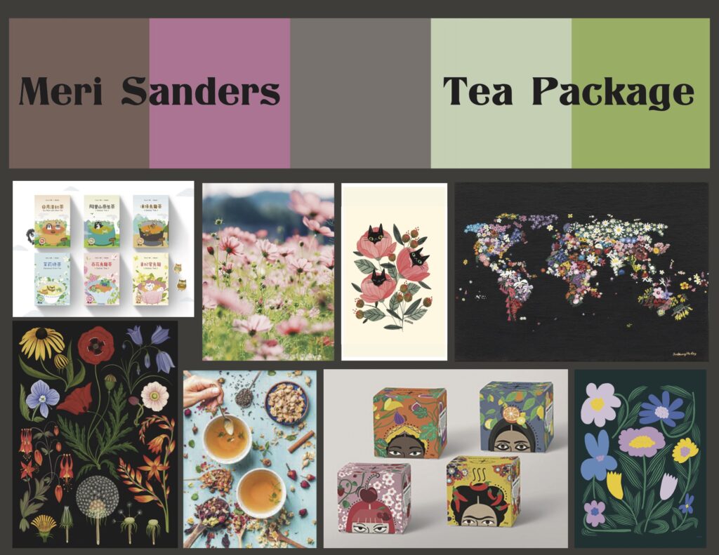
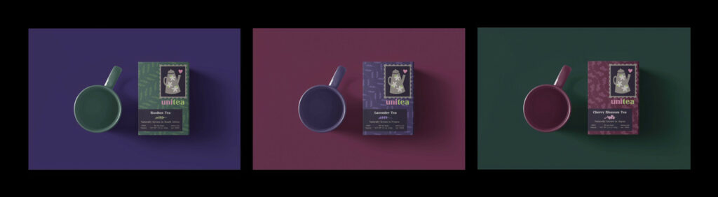
For this project, the prompt was to design a fake brand for a food-related item and I chose to create a Tea brand titled Unitea. Though the initial prompt was to only make one product, I challenged myself to make two more kinds of tea all within the same brand since I wanted to further develop this project for my college portfolio.
The purpose of my brand is to unite the world by celebrating the unique plants grown all throughout the globe. The three different types of tea I created designs for are all naturally grown from different countries which shows the emphasis on unity and sustainability.
I began by designing my logo in Adobe Illustrator which is supposed to resemble a stamp you would find on a letter. I then moved on to the pattern design for each individual box where I created a simple illustration of each plant and repeated it several times to display a sense of unity within the package itself. I finally added the labels which each state the tea type and where it comes from and then I edited it all together using a mockup website.
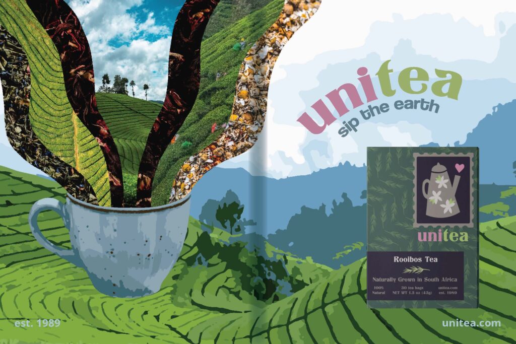
In addition to my triptych, I designed a Magazine Advertisement for Unitea. While I was unable to take all of the photos myself, I relied on Pexels, a website with free downloadable images to use. I utilized Adobe Illustrator, Photoshop, and InDesign for this project.
The base of the background, as well as the teacup, were made using Photoshop which I then brought into InDesign for layout purposes. I then used Adobe Illustrator to make the text and edit the images flowing out of the teacup. Finally, I used grids and rulers to make sure all of the elements were placed evenly and added the center shadow to help visualize how this piece would look in a magazine.