Geometric Light Cover
In Digital Media, we used Adobe Illustrator for a variety of projects. The first item we made was the Geometric Light Cover, which you may see at tonight’s event (they are in a darker room for better viewing). To make the light cover, we created two different faces for a dodecahedral structure, making six of each, and combining the twelve total faces to build these light covers.
Geometric Light Cover Artist’s Statement
Time in a Dodecahedron
The aptly named “Geometric Light Cover” I created in Adobe Illustrator I decided to name Time in a Dodecahedron. The first half focuses on time, as the name suggests. As a student, time is very important towards managing my day – from homework, to clubs, to time for relaxation. As an audiophile, I altered musician Jim Croce’s song Time in a Bottle, although the topic of the song varies greatly from my piece. As a horophile, I created the dial of a well known pocket watch on each face of the dodecahedron.
The message I convey with this piece is the importance of time. However, I came across multiple problems, which may have slightly altered the end result. First, the laser cutter wasn’t as fine as I had wished, so the minute marks of the watch dial had to be removed. As well, the entire watch face, including the hands and hour symbols, had to be simplified so as to retain structural integrity during the laser cutting process. The second half of the dodecahedron was related to hobbies. My love of vehicles obviously influenced this half, yet once again I could not create as detailed an image as I had hoped, thanks to the laser cutter. As well, making the steering wheel was an arduous process, and my cutting of corners in making said symbol caused a worse-than-hoped-for result. There is much less of a message for this part of the Geometric Light Cover, yet it does present one of my interests. One thing that I valued from the creation and process of this project was a first-time interaction with Adobe Illustrator. Working with Illustrator gave me the chance to say that I have added another ability to my “Freestyle repertoire”—the culminations of various things I learned here at Freestyle.
Illustrator Project
For the Illustrator Project, we were to chose from a variety of mediums and make something for it—whether it was a t-shirt, sticker or patch, to name a few. I chose to make stickers in Illustrator, as I like stickers in general and wouldn’t mind having some of my own.
Illustrator Project Artist’s Statement
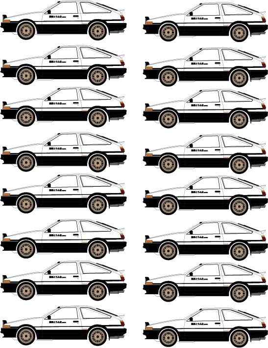
Drive! by Nicholas Schein
The message that I am trying to convey with this Illustrator Project is about my hobbies—namely, anime and cars. Those who watch anime may be familiar with the car from Initial D—the infamous Toyota Corolla Sprinter Trueno GT-APEX, with the phrase, “Fujiwara Tofu-Ten (Private Use)” written on the side. However, this one has been adapted to share certain parts with the Black Limited edition, such as the gold-colored wheels. Through this attention to detail, I also show my passion for cars. Had I had more time, I may have created more vehicles from the anime, or even a design or two of my own (I often create vehicles under fake manufacturer names in my notebook during my spare time).
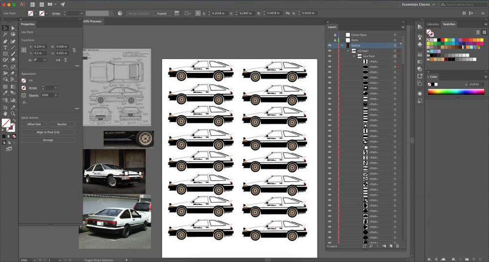
I learned a valuable lesson about trying to cut corners during this Illustrator project. Having not had much practice with the Pen tool at the beginning of this project, I attempted to use the Brush tool, causing the file to freeze relatively quickly into the process. After giving up on using the pen tool (and at the cajoling of my fellow classmates who take Design), I switched over to the Pen tool, which with practice not only keep frame rate high but also works better. I learned how to import images from the web and onto Illustrator to use as reference images. As well, I learned how hard it is to make realistic art in Illustrator—as one can see, my lack of shadows in the image cause the vehicle to look very flat and “2-D”. I also forgot to add windows, which should have a semi-translucent aquamarine color. One aspect of the project which was most troubling for me was creating the gold wheels. If one looks closely enough, there is a noticeable asymmetry of the wheels, and a true car enthusiast would recognize that the wheels do not truly match that of the Black Limited hachi-roku.