Introduction
As we got to work on our Narrative 2 unit which included projects where we got to use many apps such as Adobe Illustrator and Adobe After Effects. We also got to create and write a lyrical essay, and create product logos using Adobe Photoshop we later placed our logos onto different products and put together an ad to promote our product.
English
For english this year our unit was on Listener Lyric we were instructed to create and write our own lyrical essay. A lyrical essay for those who don’t know is a literary hybrid that combines elements of poetry, essay, and memoir. The lyric essay is a pretty new form of writing that is creative and nonfictional.
Lyrical Essay Project:
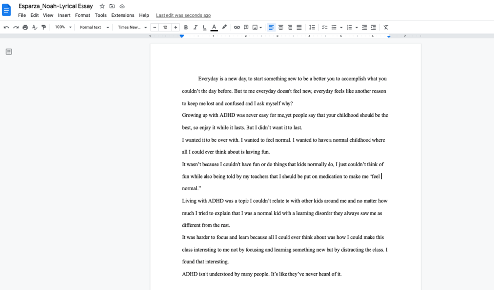
Everyday is a new day, to start something new to be a better you to accomplish what you couldn’t the day before. But to me everyday doesn’t feel new, everyday feels like another reason to keep me lost and confused and I ask myself why?
Growing up with ADHD was never easy for me,yet people say that your childhood should be the best, so enjoy it while it lasts. But I didn’t want it to last.
I wanted it to be over with. I wanted to feel normal. I wanted to have a normal childhood where all I could ever think about is having fun.
It wasn’t because I couldn’t have fun or do things that kids normally do, I just couldn’t think of fun while also being told by my teachers that I should be put on medication to make me “feel normal.”
Living with ADHD was a topic I couldn’t relate to with other kids around me and no matter how much I tried to explain that I was a normal kid with a learning disorder they always saw me as different from the rest.
It was harder to focus and learn because all I could ever think about was how I could make this class interesting to me not by focusing and learning something new but by distracting the class. I found that interesting.
ADHD isn’t understood by many people. It’s like they’ve never heard of it.
Reflection:
My experience with this project was very eye opening for myself personally. I never thought that I would’ve found it in myself to speak up about my disorder and what it’s like living with ADHD. Many people don’t understand how ADHD affects everyday living. Some may see it as an excuse and not as serious as it sounds but it’s very from that. I wanted to open other eyes into getting a better understand of ADHD and what it’s like for me which I enjoyed very much.
Digital Media
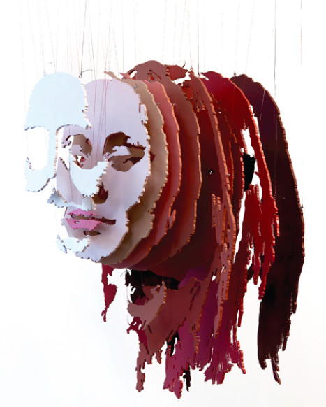
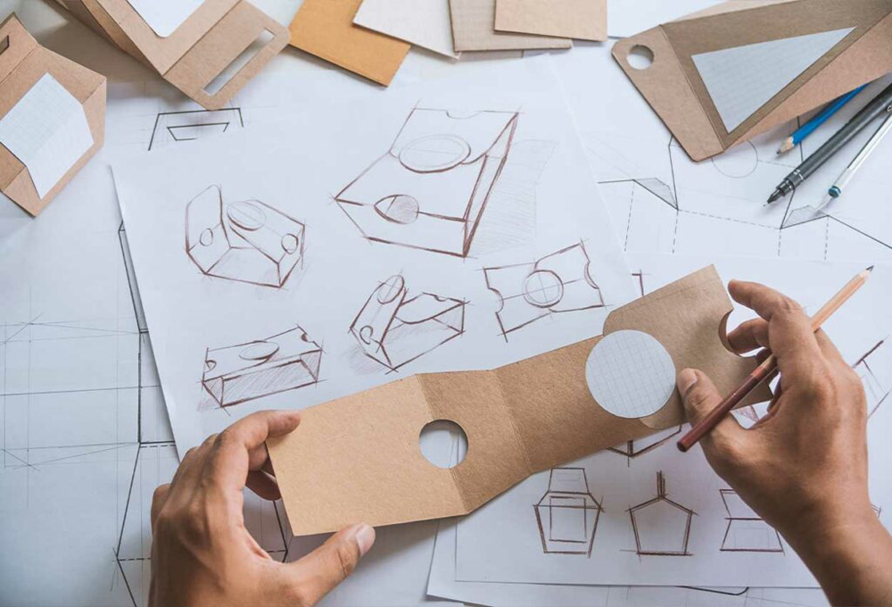
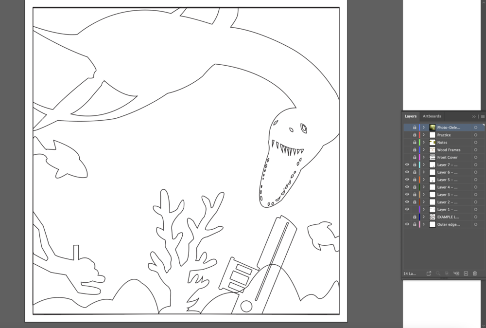
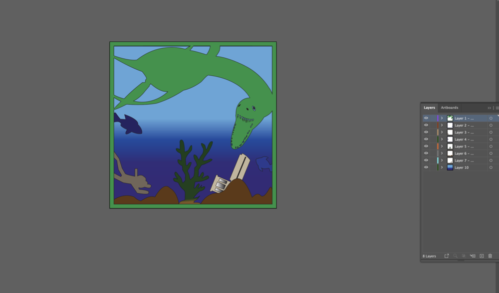
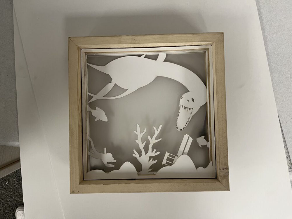
For Digital Media this year we were instructed to work on a project on Multi-Layer Art. This project allowed us to use multiple Adobe apps such as Adobe Illustrator and Adobe After Effects. But to get to the digital process of this project we first had to create sketches of our many different art layers that would later be put into these Adobe apps to be digitalized and then would finally be laser engraved and glued together. For those who don’t know Multi-Layer Art is the process in which we created different layers of art work that would be cut out and placed on top of each other creating a scene that we had sketched out earlier on.
Multi-Layer Art Project Process
Multi-Layer Art Sketches:

All of my Multi-Layer Art Project Sketches Link:
https://docs.google.com/document/d/1VMJAdeusFQVF8xPixWu4jBjboYgstYNTNt85ReTlz2o/edit?usp=sharing
Adobe Illustrator Multi-Layer light box Art Process:
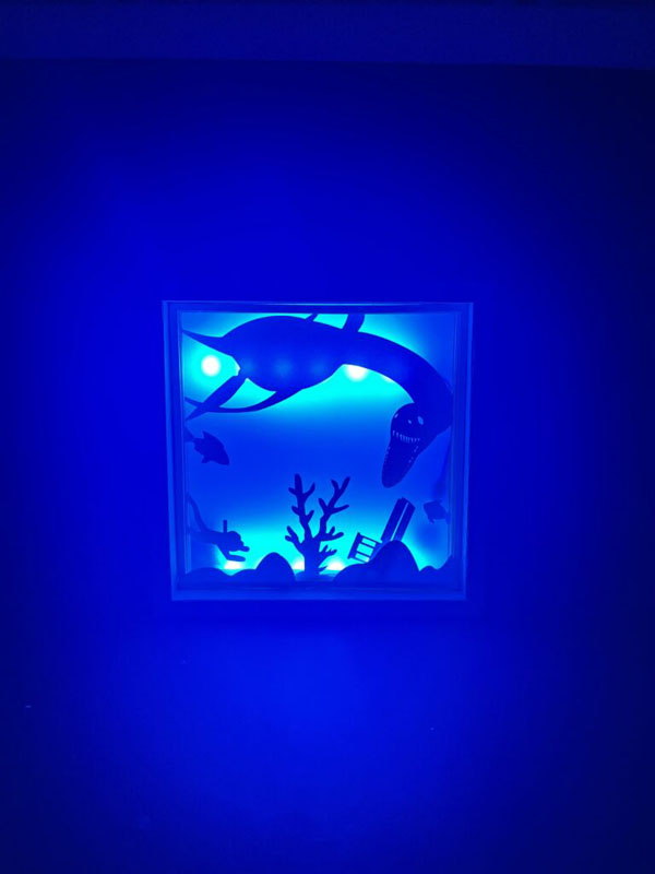
Finished Multi-Layer light box Art:
Video process of My Multi-Layer Art Project:
Digital Video Process of My Multi-Layer Art Project:
My Multi-Layer Art Project Artist Statement:
My inspiration for this project was that growing up I have always loved the ocean and always wondered what lived in the deeper parts of the ocean? I would create imaginations in my head of huge monsters, sunken ships, and lots of life down in the deepest parts of the ocean. This inspiration grew more as I remembered these childhood thoughts. I thought it would be a great idea to use for this project. I wanted to create a scene just like how I thought it would be as a kid if I went down to see the deep sea. I also have a love for drawing random monsters and other creatures so the inspiration for me grew, even more, when I saw I got the chance to draw a creepy ocean monster and create a scene that was fun and creative. While creating this project I did run into a few problems. To start I couldn’t figure out how I wanted to connect certain sketches to the frame so that it would hold up and not be flimsy or weak when I had to put it all together. I eventually overcame this with the help of Mr.Flo I learned how to connect the sketches to the frames in Adobe Illustrator without ruining the scene or creating frame connections that blocked the other sketches. But this was just the start of my problems. While putting together my multi-layer art I ran into an issue of having too much foam stick out from the laser cut pieces which blocked my multi-layer art from fighting into my frame. I wasn’t sure how I was gonna fix this due to all my layers already being glued together and secured. I wanted to try cutting it but it was just too thick for me to do that. So I came up with the idea to use sandpaper and sand down the whole outside of my project so that it would fit into the frame. Using a rough piece of sandpaper I was able to shorten the outside of my project which allowed it to now fit into my wooden frame and was ready for the lighting now. If I could change one thing about my project it would be to add a few more sketches and to have created a laser cut frame for my wooden frame box. I would’ve sketched more little monsters, sunken ships, and people floating in the water. I then would put these sketches into Adobe Illustrator and start connecting them to the frame after that I would’ve created an even cooler scene that showed the monsters fighting in the deep sea with ships all around them. I also would have created a frame for my wooden frame box. I would’ve made it look like the scene was being looked at through a cave with moss and other life around it. I am very proud of how the finalized project fully put together came out. The LED lights made the scene really pop and gave an even better look adding shadows and light in certain areas to make my sketches pop out in different ways. I am also very proud of how creative I got with this project. It means a lot to me since I based it off my childhood and seeing it come to life is a great feeling and I am very proud of the finalized version. I had a ton of fun with this project and learned a lot about multi-layer art and the different skills you can use in Adobe Illustrator to create this kind of project it opened my skills and creativeness while creating this project and allowed me to learn how to use these different skills in not only multi-layer art projects but also other projects that will include these skills later on down the line. This project allowed me to open my eyes to see that it takes time to come up with an idea and the process is much longer than I expected. I took a look at other student’s projects and saw that creativity and talent are very important when creating these kinds of projects. I love seeing the use of creativeness and this project definitely opened my eyes to that.
Design
Finally this year for Design we were instructed to use Adobe Illustrator to create a logo that would be put onto different products of our choice. For those that are curious what a product logo is, A product logo is specially created for that specific product. The designers focuses on the key features of a product and its usefulness for customers. All those features and company’s brand image should reflect form a product logo design. When businesses evolve, they have an array of products under their brand. Once we finished creating our logos and found the products we felt fit our aesthetic we started using many different Adobe Apps like Adobe Illustrator and Adobe Photoshop which allowed us to then began creating ads that featured our logos on top of many products.
Product Design Project Process
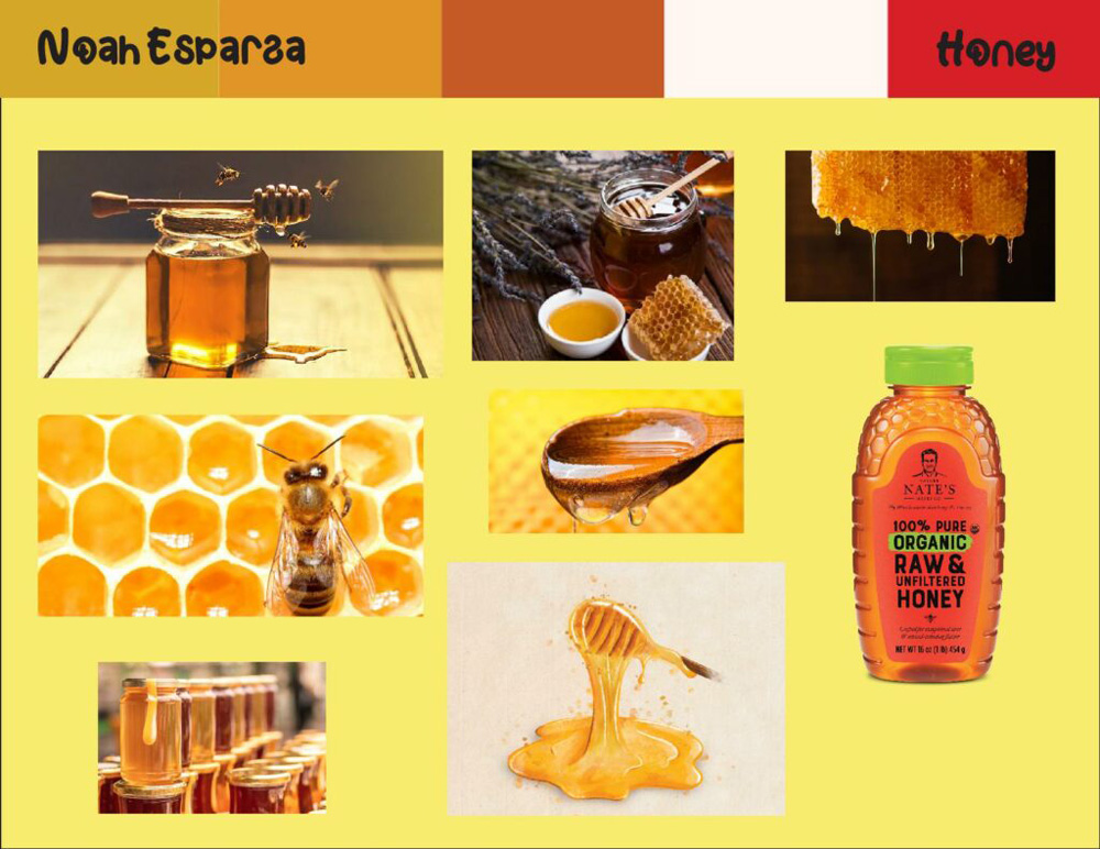
Product Mood Board:
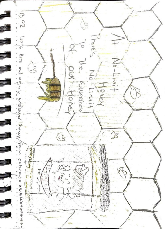
Product Logo Sketches:
Product Logo Process:
Product Label Process
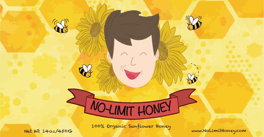
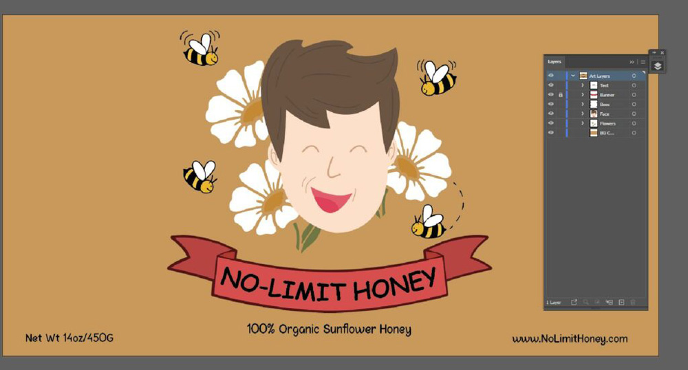
Product Label Creation:
Product Label Artist Statement:
Noah Esparza
Product Logo and Label Project
For our Product Label project, I created a homemade honey brand made in Colorado called “No-Limit Honey”. At No-Limit Honey there’s no limit to the sweetness and purity of our organic homemade honey. My brand No-Limit Honey strives to create a healthier honey product that is 100% raw and organic honey. The target market is specifically people who prefer a more natural honey product. The demographic that No-Limit Honey appeals to is healthy lifestyles such as people who pick products that are much more organic for a healthier lifestyle.
With the creation of No-LImit Honey the appeal I would use would attract consumers who prefer more organic products. To show this appeal through using bold text showing the pureness of our honey. I gave it that look of a true homemade brand through the use of a cartoonish logo with an older look of text. I also made sure that my logo had a bright and unique look that most honey brands wouldn’t use. I would then finish it off by giving a fun look to the magazine ad itself through cartoon text and little bears eating the honey as well as a cartoon of a farm to show that sense of homemade/all organic honey even more.
Throughout this process of creating my logo I had many techniques that helped me very much. When I started to create my logo I used other honey brands that were organic and looked for a similarity between them all. Understanding my color also allowed me to better my logo. The only trouble I ran into was with my background and being able to stick to one. I fixed this by adding honeycombs that weren’t too crazy to still give it that basic/unique look.
Product Triptych Process
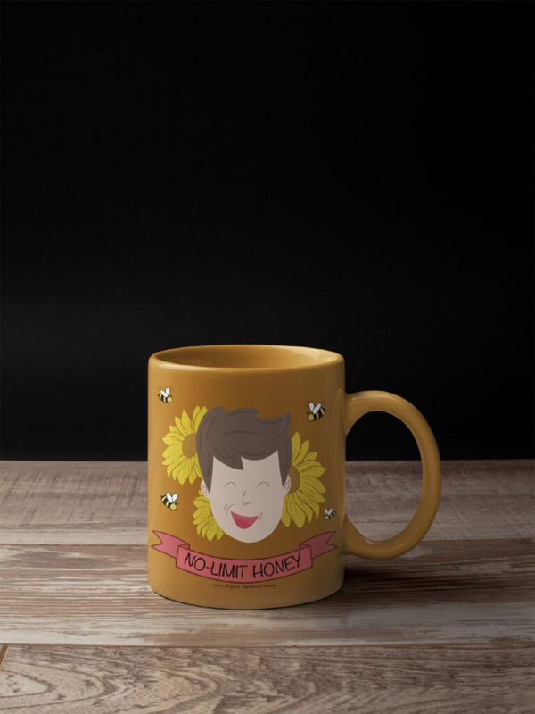
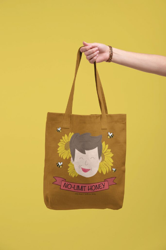
Product Mockups:
After creating our product label it was now time to use it and place it on to different products to see which ones we felt fit the best for our brand and label. All product mockups were made in placeit.com.
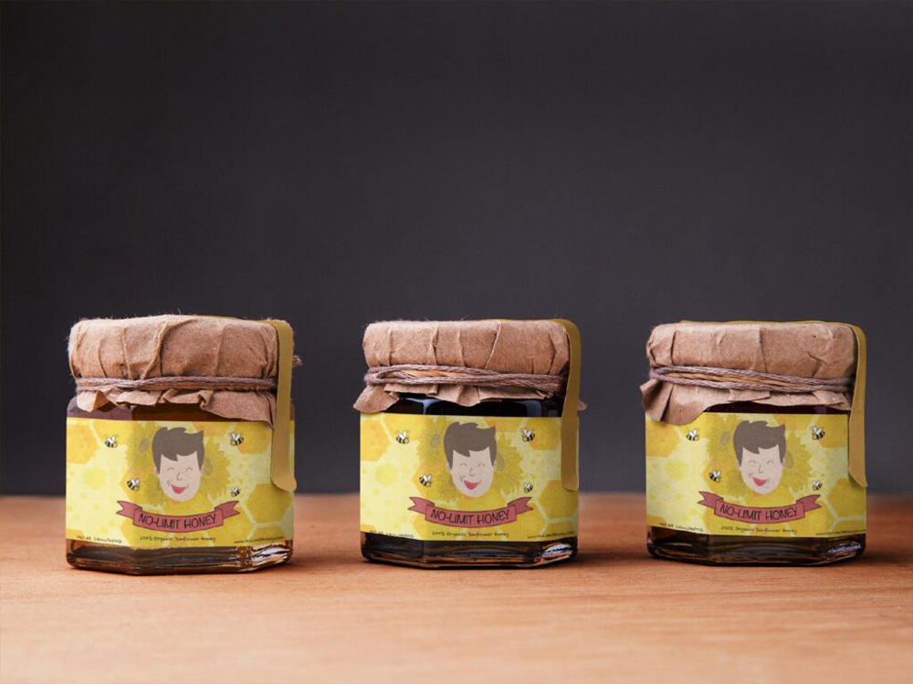
Product Triptych:
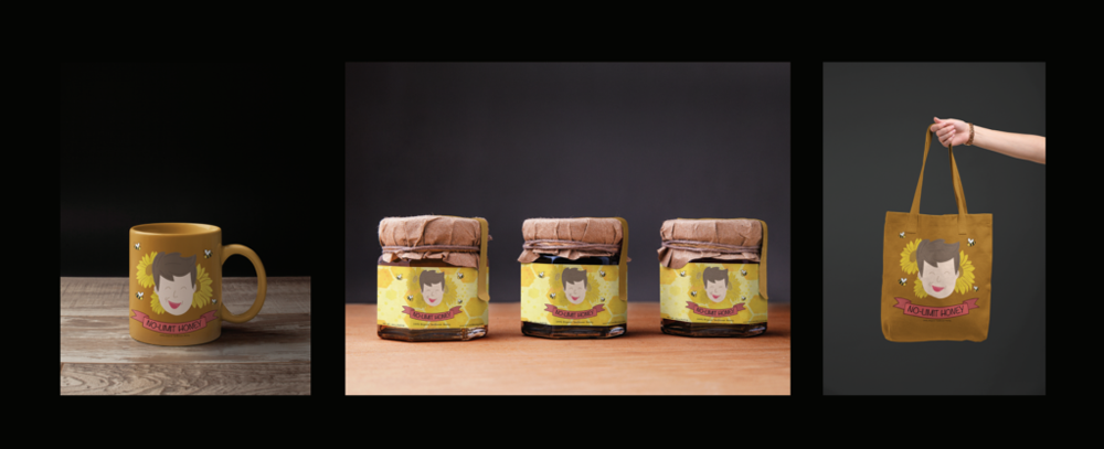
After using placeit.com to create my mockups I then went into Adobe Photoshop and began creating the triptych showing all my product mockups with a theme that fit the No-Limit Honey brand.
Product Label/Triptych Artist Statement:
For this project I wanted to create a homemade honey brand that promotes a healthier and much more organic alternative to other honey brands. While creating my triptych and magazine ad I wanted to give it a fun cartoon look that’s different from other companies. I wanted the viewer to see the brand and understand what I’m trying to promote through the bright colors, different patterns in my background, and fonts. Using these details allow me to show the consumer we are a homemade 100% organic honey company. When you wake up in the morning for breakfast and want that sweet and organic taste of honey with your pancakes or even with a cup of tea, NO-LIMIT HONEY is the best product.
Using Adobe Illustrator I started to create my background. I didn’t want a solid and basic background that isn’t attention grabbing. Using a honeycomb pattern as my background I added different shades and shapes to create my background giving it more detail. Once I had my background ready I started creating my Illustrations using Adobe Illustrator I created my label for my products I went with a cartoon look that was fun and friendly. After doing this I went into Adobe Photoshop and started cutting out stock images and my own product images. I used these to show how NO-LIMIT HONEY could be used on everyday things like breakfast allowing it to be more appealing and attention grabbing.
Movie Poster Project
Movie Poster Mood Board:
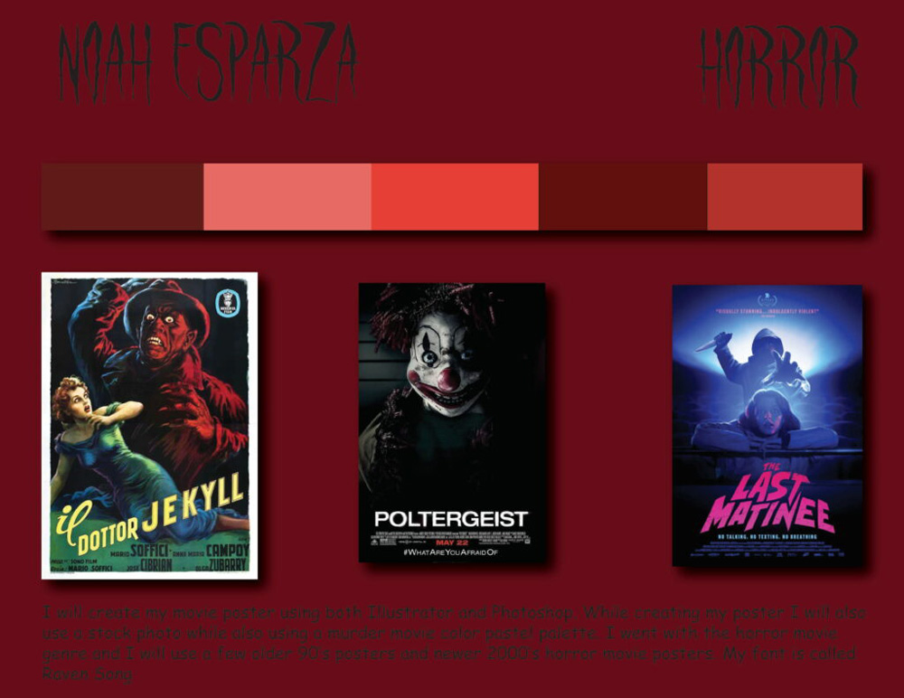
Movie Poster Process:
Artist Statement:
Noah Esparza
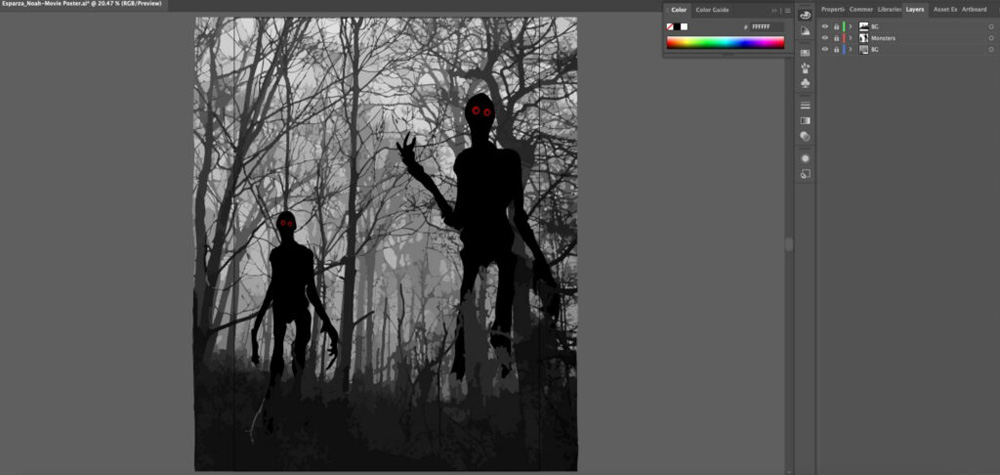
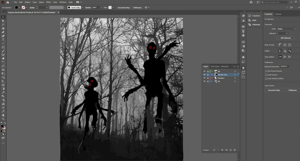
“The Watchers” is a horror film about two creatures that a boy named John made up one late night while drawing in an unknown notebook he found in his basement. While John finishes these drawings in the notebook he finds he starts to get tired and heads to bed leaving the notebook in the living room. John falls asleep and has no idea that the notebook brings anything you draw to life. As John is sleeping these creatures he drew out come to life which is the scene showed in my movie poster and begin to start there murderous rampage. The whole city is in absolute chaos and John has no idea that these creatures he created are going to come after him next. What will he do?
When creating my movie poster project I wanted to create something super creepy. Using Adobe Illustrator I began to start my horror film movie poster. Using image traces in Illustrator I was able to create my creepy woods background. I then used some sketches of random monsters/creatures I had already drawn for fun. I used the pen tool to trace over my sketches. Once I finished with that I then drew out my moon and different shades on the moon to give it that creepy look as well as add detail to it. I then finished the poster off by adding an outer glow to my moon to make it pop and give it a more real look. I then put my finished movie poster into Adobe Photoshop and added my movie poster template which added credits, movie premiere date, and a website.
Reflection:
This year for design I learned and valued a lot from the projects I got to work on. From creating mood boards to getting to finish the actual project it allowed me to learned a lot and opened my eyes to valuing what it takes to create these kind of projects. Being creative and having freedom to make and come up with a logo and movie poster of our liking really allowed me to create projects I liked. I valued these projects I got to work on this year as it helped me learn new skills work with different Adobe apps and use my creativeness to the fullest.