In Design, we learned how to make a logo, label, and overall how to create a product. We then had a ton of fun creating a movie poster and book jacket for our Worldbuilding story we wrote in English. Through this process, I learned a ton about design. I loved learning how to make things look professional and realistic. We used a lot of Adobe Illustrator and also Adobe Indesign.
Product Design
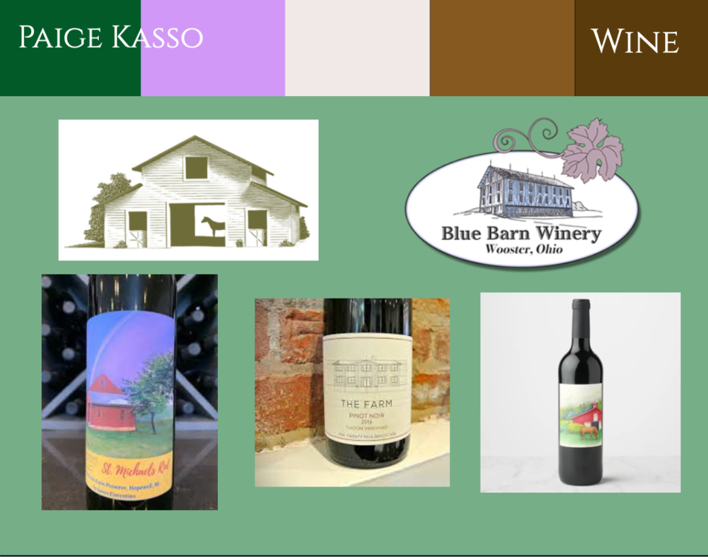
For this project, I wanted to do something for my parents. They recently just bought a five-acre property and call it Five Acres Farm. My dad has a hobby of making wine and the wine made at this new property will be under Five Acres Farm. Our current wine labels are tiny and aren’t really a label. I decided to design a logo for Five Acres Farm and an actual wine label. I did this project with help from my parents. They are my first-ever client. We have a very big barn that will hold horses and plan to add a vineyard to the property. I drew a replica of our barn and a horse as requested by my mom. I wanted the vineyard to be in the background to show that we make the wine on the property.
I first started out with a rough sketch of three ideas for a logo. I reviewed the ideas with my parents and we all decided on the best one. I drew the winning sketch in Illustrator and after many tweaks, like the color of the barn, it was finished. I then moved on to the wine label. I had to research what is required to be on a wine label and add it to my design. One thing I found helpful was looking through my parent’s wine fridge at all the different labels. After finding all the information I needed to put on the label and the layout I wanted to go for, I put everything together. I got a lot of help from my dad about the logistics, like the size of our bottle and if our wine contained sulfites. I then found an image on Placeit.com of a wine bottle to put my label on. I also found a photo of a tote bag and a shirt to put my logo on. My mom liked the tote bag so much that she made me buy one for her to use. Finally, I put all three of my products on a triptych. This was a little difficult because I am not the best at math. Overall, I love how everything turned out and I can’t wait for my parents to use my designs for our new place.
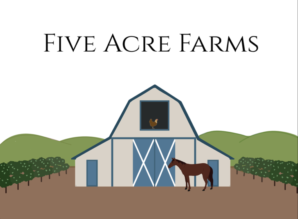
After creating my logo, I moved on the create the wine label. We used a website to place our labels on Mock-ups. For this project, we also had to create 3 different examples of the logo and the label on everyday objects that it would be used with. I chose to have my logo and label on a wine bottle, a tote bag, and a travel mug and shirt in one.

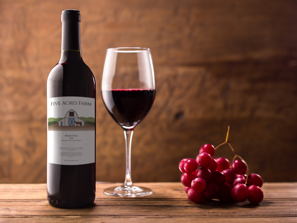

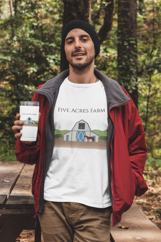
Finally, after creating these three, I compiled all of them into a triptych. I decided to place the wine glass in the center because it is the product I created and it is the widest photo. The other two photos are skinnier and both are just my logo so I put them on either side. I am very proud of how this turned out and I really enjoyed this project because we were able to take so much freedom and creative liberty. This project gave me a peak into what I would like to do as a career later in life.

Movie Poster
For the next project, we were tasked with creating a movie poster based on the story we created in English. Along with the movie poster we created several different media all based on the same story.


My movie poster was based on a story that we wrote in our English class. Twin brothers, Finn and Leo, live in a politically polarized society in which political ideas make or break relationships. While Leo stays at home with a cold, Finn and the rest of their 11th-grade class take a bus to a museum, on the way they pass through a tunnel and accidentally transport to a universe in which the political candidate has put lives in danger by ignoring their town’s lead crisis, they are left with no choice but to try to fix what has gone wrong. However, with a class full of diverse political opinions, it will be difficult for them to all work together to change the town’s future. After seeing the harmful effects of the governor’s choices on their loved ones, they banded together to form a protest, and their protest brought in a lot of support.
I used Illustrator to create my movie poster. I had the idea to show the bus being transported to the new universe. Inside the portal, I wanted to show the healthy city the characters lived in before by having the colors be very bright and vibrant. On the outside of the portal, I wanted to show the lead-poisoned city by having the colors be desaturated. I also changed the city buildings in the healthy city to factories that polluted the air. I used the road to make it look like the bus traveled through the portal. I wanted to keep the academic theme by using an academic font. I changed the color of the title to break it up from the tagline. I chose my tagline because I wanted it to be clear that the theme of the story is lead poisoning in the water. Overall I am really happy with how my poster turned out. This was a fun project to work on.
Book Jacket
After finishing The Movie Poster project, I started the design of the book jacket. Here is my mood board for it:


I really love how the final Book Jacket turned out. I love how professional my book jacket turned out. This was another really fun project.
What did I value from the specific processes and productions in Design?
I valued learning how to communicate a story visually with the Movie Poster and the Book Jacket. These projects got me excited for what I to come in my future as I would like to study Design in College.