Our reflections unit was all about exploring ourselves and answering the question “Who am I?”. In Digital Media, we created a Mandala that is meant to reflect ourselves, as well as many Photoshop projects. In English, we wrote a Personal Essay for our college application. In Design, we created a Public Service Announcement based on the subject of that essay. We also created a Collage based on our summer and Aboriginal art with attributes about ourselves. In all of these classes, we tried to capture ourselves in everything we created. While brainstorming for our English essay, we had to research different Essence Objects which are supposed to show who you are. Some of the things I came up with were my camera, my necklaces and a rabbit. All of these things help explain who I am.
Mandala
For our Mandala Project, we created a mandala in Adobe Illustrator that reflects us. We first learned how to set up the document and then started drawing. We started with a black and white Mandala, and then later colored it in. I chose my design to be very nature oriented with redwoods, flowers, different plants, and animals. Nature is my happy place. Finally, we it laser printed, and I chose to have mine printed on a piece of cut wood with bark on the outside. We also created a Mandala Reveal Build video, where we broke down the process of how we created all the small details.

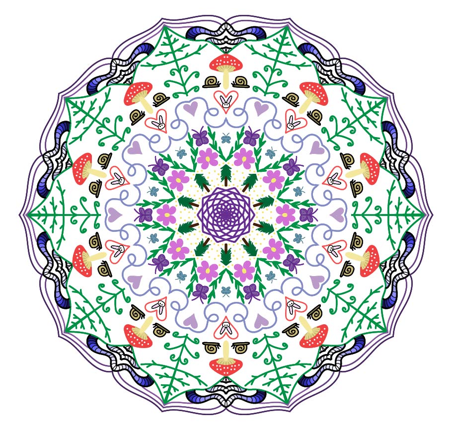

My inspiration for my mandala was nature. I love being out in nature and wanted to create something that reminds me of it. I struggled to come up with ways to tie the whole mandala together. I started it in the middle and worked my way out. I loved how the middle turned out, but I felt that the outer part wasn’t as detailed. After some finessing with it, I think the result is excellent. After working on my mandala in Illustrator, I chose to have mine printed on a slab of wood. I wanted it on wood to tie it into the forest theme of my mandala. I then took a photo of it on some grass to really tie in the nature/forest theme. I really love how it turned out.
Photoshop Art
In digital Media this year we focused a lot of time on learning different things you can do in Photoshop. I found it very interesting all the things you can do with just Photoshop. I kept all of my works with the same nature theme because I love it so much. I am now a lot more comfortable using photoshop for different things.
Pastel Painting
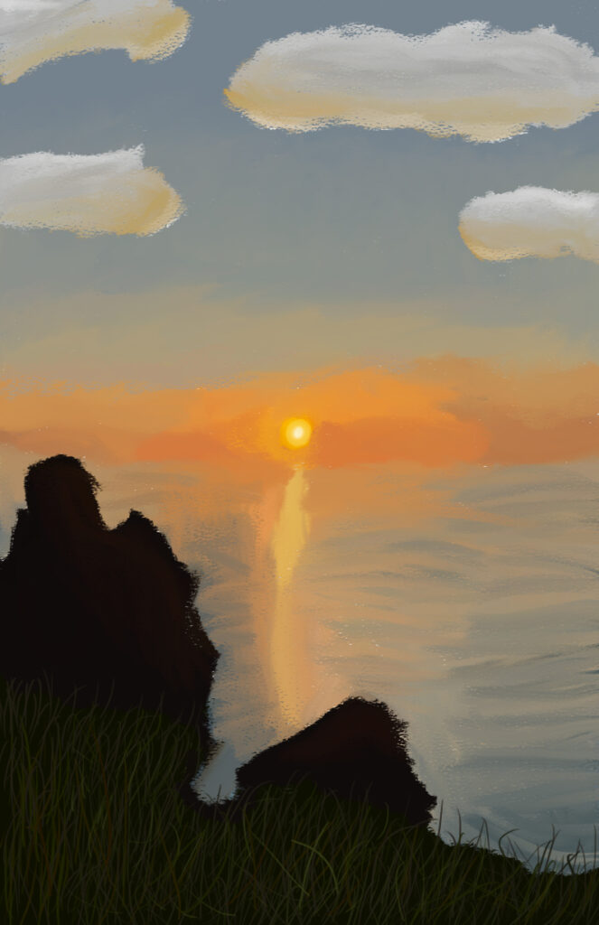

My inspiration for this project was a photo I took of the sunset along the coast. The image is one of my favorites, so I thought I would paint it. I did not know about all the different brushes there are to use in photoshop. I struggled with blending the colors together. My go-to painting style is the blended realistic look and not being able to achieve that was frustrating. I think I could have added more details to the painting. Overall I think I did a good job and I’m really happy with how it turned out.
Water Color Painting

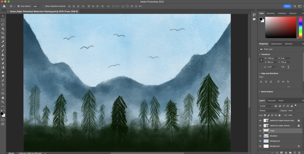
I wanted to do something simple for this project because I like the look better. I chose to do a nature scene because that’s what I enjoy painting. I struggled to figure out the brushes. I’m used to painting with acrylic paint where it is easy to blend. Watercolor I’ve realized is hard to blend. After a while I got the hang of it. Overall, I really enjoyed this project. I do wish the trees were closer together and looked more like a forest.
Watercolor Painting Effect
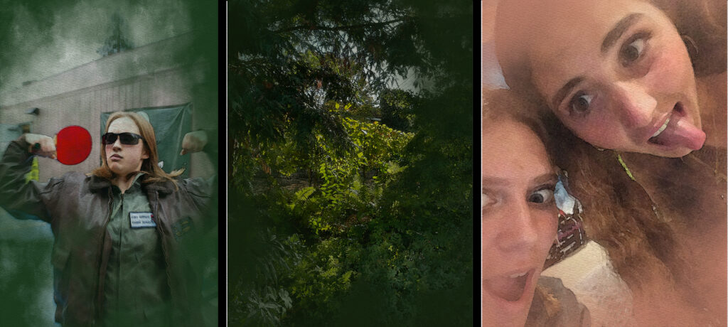
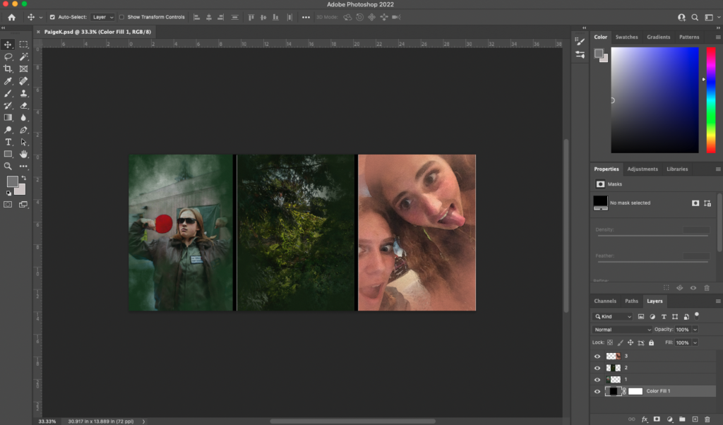
This project was really cool to do, I love how easy it is to use the effects. All of the photos I choose for this project I was having a good time in. This was a fun project and I didn’t have any struggles. Overall, I really like how all of the images turned out and I am proud of them all.
Photoshop Composite of 2 photos
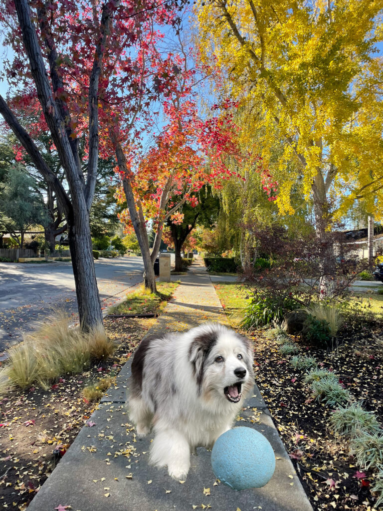
Photoshop Composite of 3 photos

Photoshop Surreal Art

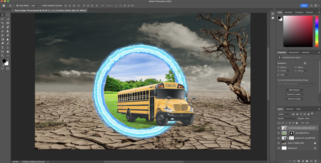
I based this project on my world-building unit in English. My group’s story is about these two universes, one has no issues with water and the other has severe lead poisoning in the water. The main character goes from the healthy universe to the lead-poisoning universe. I represented the healthy universe with a bright green image of nature and the lead-poisoning universe is represented by a dry desert. The main character takes a bus from one universe to the other.
I had to go back and refresh my memory on how to do some parts of the editing. After a refresh, It was pretty easy to get this project done. Overall, I am really happy with the results, which relate to my world-building project.
Design
We started out this year with making a collage of things we did over the summer. This project refreshed our memory on how to use Photoshop and Illustrator. We then moved on to the Public Service Announcement project that related to our personal essay that we wrote in English. Finally, we started our Aboriginal Art project. This project was all about us and who we are as a person. I have really enjoyed Design this year. All of the projects have been fun and everyone in my class has become really close. I have decided to purse Design in college. I am excited to see the fun things we do next semester.
Collage


We started off the year by making a collage in Photoshop about one meaningful thing we did over the summer. I chose to make a collage about an annual trip my family takes out to a cabin in northern California. After we put together the collage we traced in in Illustrator. This project was used to refresh our memories on how to use Photoshop and Illustrator after the long break.
Public Service Announcement


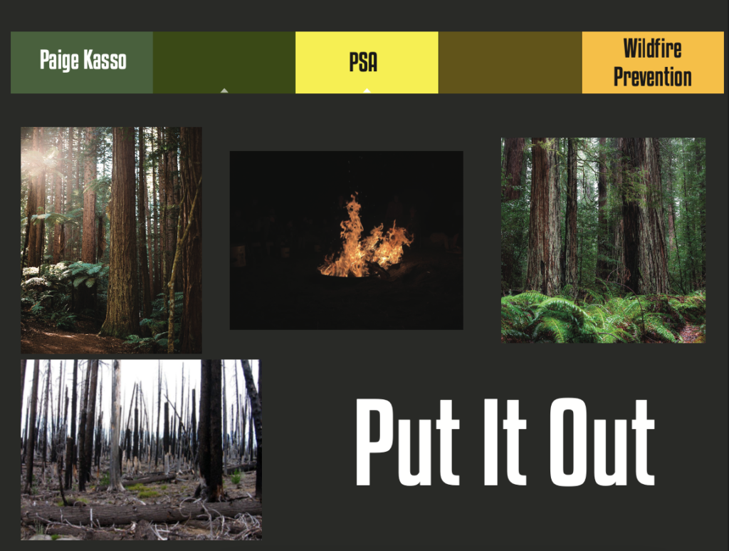
In the lower left-hand corner of my, PSA has a blazing fire. The right half is an alive and healthy forest, while the left half is an already burnt forest, showing that the fire had already passed through it. The words Put It Out read in the middle, signifying to put out your campfires when you are finished with them. I chose to do this topic because I love nature and hate wildfires. I have learned the importance of fire safety at the camps I go to. One thing we always cover is making sure our fires are under control and fully out when we are done. The forest in the background is muted and had the text and fire be bright oranges and yellows to make them pop out.
I started the project by finding images I thought would work in my piece. I found four different images and put them all into Photoshop. I cut out all the parts of the images I wanted. I then put together the two forest images and brought them to Illustrator. I used the Image Trace tool to color them in. It would have taken me twice as long to finish if I had done it by hand. I did the same process for the fire and the wood in the fire and put that on top of the forest. I struggled a lot with the text. It took me forever to find a font I liked, don’t get me started on the colors. Eventually, I found the font and chose the colors based on the fire. I italicized the font to add to the movement in the fire. In the end, I added sparks coming from the fire to add orange throughout the forest. Overall I am very happy with how it turned out. I think I did a good job.
Aboriginal Art
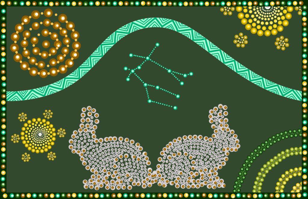

My star sign is Gemini, meaning twin. I drew my spirit animal, a bunny, and duplicated it to show twins. The half circles next to the bunnies are the symbol of clouds. Gemini is an air sign, to show that I added the cloud. The yellow symbols are stars to represent air. My constellation in the middle is the Gemini star constellation. The brown circles in the upper left-hand corner are the symbol for a campsite. I have been camping my entire life, it’s a really big part of my life.
I really struggled to start this project. I had an idea but when I executed it, it just didn’t work. That was very frustrating and I kept making small changes to see if it would fix the problem. In the end, I had to completely restart because the idea just wasn’t working. I started by drawing the bunnies because that was the one thing I was certain was going to be in my final project. Originally the cloud symbol was in the background, but that just had too much going on to be a background. The bunnies didn’t originally have the dark dots as an outline, I found that adding them made the bunnies’ shapes stand out. I added the line through the middle to have more movement in the piece and not just a bunch of symbols. Overall, I like how it turned out. I do wish I had a background and not just a plain color.