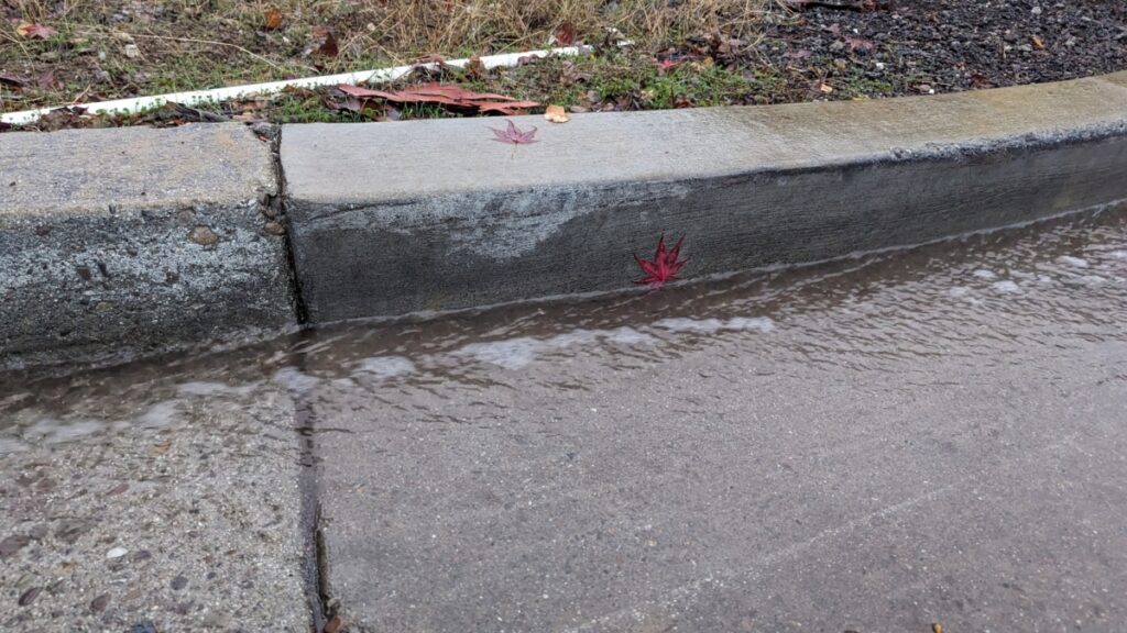
1/270 sec; f/2; ISO 1780; 6.00 mm
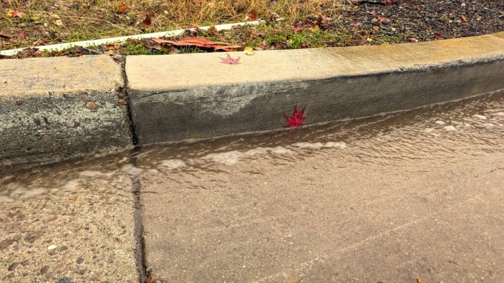
1/270 sec; f/2; ISO 1780; 6.00 mm
“Use white balance for a creative photo that’s not necessarily color accurate”
During one winter rainstorm, I took some photos of the water running down the roads of my neighborhood. Both rain and the winter are associated with gray skies, clouds, the cold, poor weather, etc. The AWB setting on the camera chose to appropriately portray that symbolism.
Then, I wanted to make the antithesis to that photo. The rain, during winter, but… warm? During Golden Hour? With bright orange skies overhead? Definitely not color accurate, but intriguing. The altered photo uses the “cloudy” setting (around 6000K), turning the scene into one of warm orange tones– a tone not usually associated with the winter and the rain.