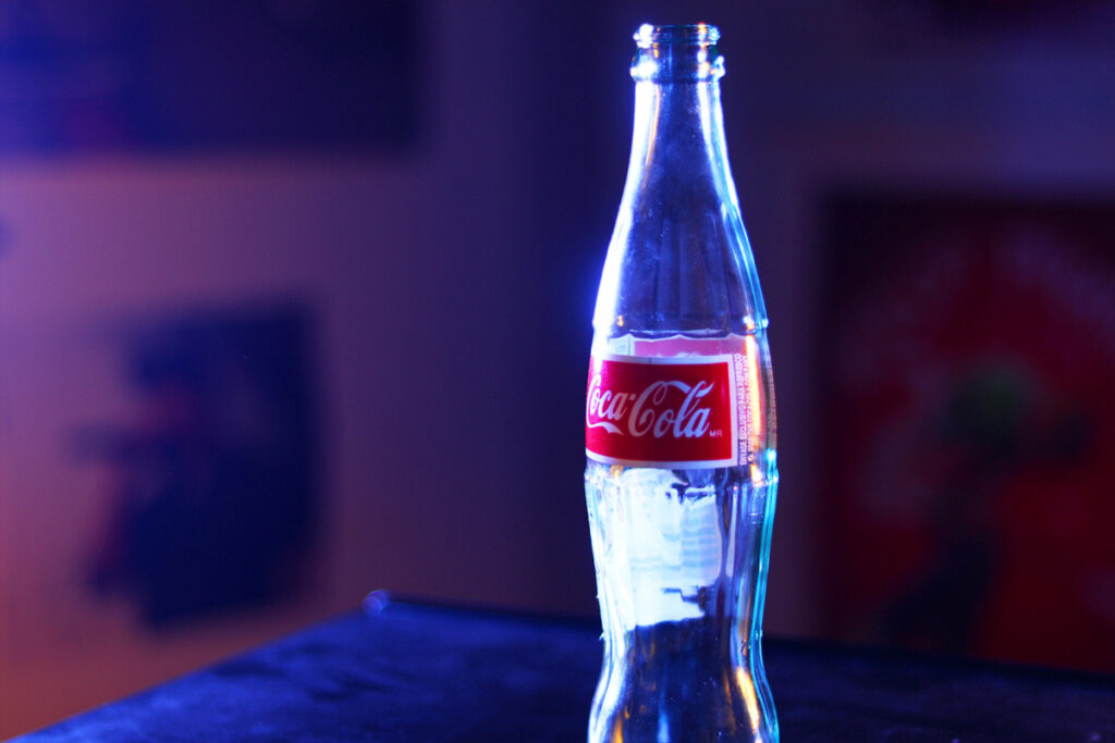
To show color theory, I decided to use complementary colors. Movies often use complementary colors, especially the colors blue and orange. Blue and orange are opposite on the color wheel so they complement and contrast with each other. This color combination usually shows up in movie posters, so much that it has become a cliche. I tried to make this picture look like a movie by using blue and orange lights and a Coca Cola bottle. I like the way that the colors reflected in the bottle.
In Photoshop, I increased the saturation and added a screen layer to bring out the highlights.