Introduction
The first unit we focused on in our Senior year at Freestyle was Reflections: Who are we? What inspires us? We had to spend time thinking about us as individuals and take those thoughts and realizations and implement them into our projects such as Art curation, the Mandala project, College essay, and more.
English
Art Curation for Personal Museum
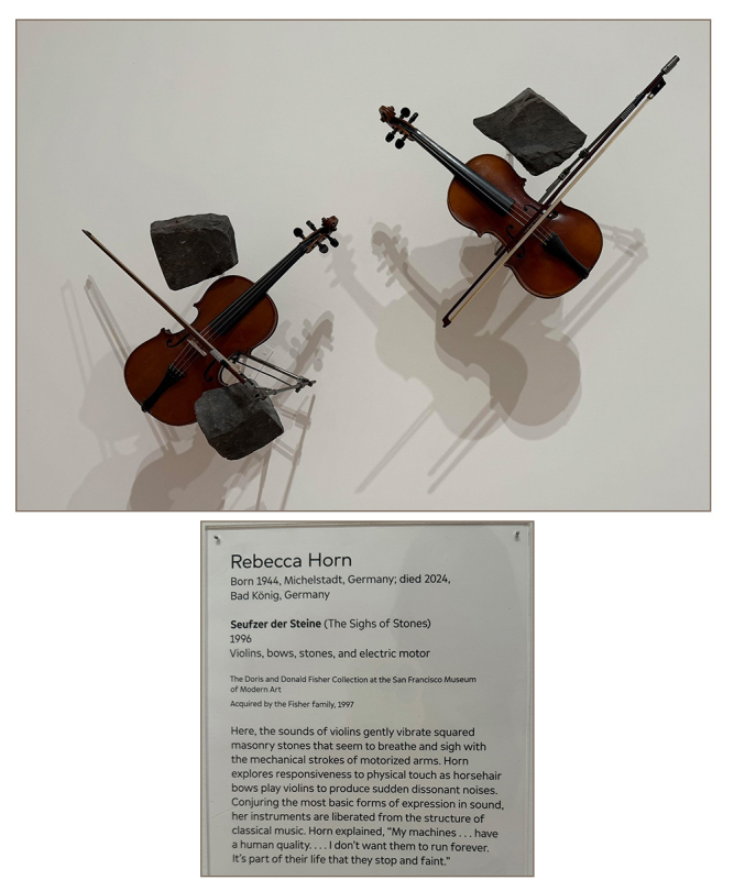
Returning to San Francisco Museum of Modern Arts (SFMOMA), the seniors had a different task to complete. We had to go around looking at different pieces of art, taking photos of which we liked and even which we didn’t. Along with an important photo of the plague(?) next to it for the title and artist. In the photos below, I got to decide what pieces had stood out to me the most. In my choices, i looked for those that weren’t as straight to the point, having a different idea in them–or pieces that let me see other visuals when appreciating it.
3 Pieces I would ADD
to my Personal Museum


2 Pieces I would EXCLUDE
from my Personal Museum


Reflection
When I look back at any of my own work, I actually realize in some ways maybe it could connect to how I chose pieces for the Personal Museum, and ways it doesn’t. I normally like making things that pop, colors and showing the joyful parts of pieces. But if I look back at the ones that I did pick, there’s a pattern of greys and a seemingly darker aspect to it. It’s like digging deeper to a meaning behind just the piece, like the violins that’ll play forever, which seems to connect to my enjoyment for music, but a connection to a character from a piece. Broken, but still remaining to stay forever (if that makes any sense..)
Behind all art, there’s also going to be something that an artist may want to convey or even hide, these artists like to show something many would possibly ignore or walk away from. My art shows characters and such in a more lighthearted display, as I keep any of their darker aspects hidden–to be shown later.
College Essay
In English, we had to write our own college essay that helps us talk about our experiences, how we’ve shaped ourselves as individuals and talking about our own core values in subtle ways–Showing without telling directly. Through stories, or descriptions we are able to write ourselves in ways our readers could see who we are. This project shows how our experiences we went through changed us, and how we engage with others–and what we learned from the past.
Digital Media
Mandala Project
In Digital Media, a big project we were given was to create a mandala using Adobe Illustrator, a design that represents who we are as individuals. It had multiple stages before the end, creating a black and white design and a colored design that gets laser engraved and printed onto two materials of our choosing. Afterwards, we take photos of the finished products and create a video on the process of both the creation and laser at the end.
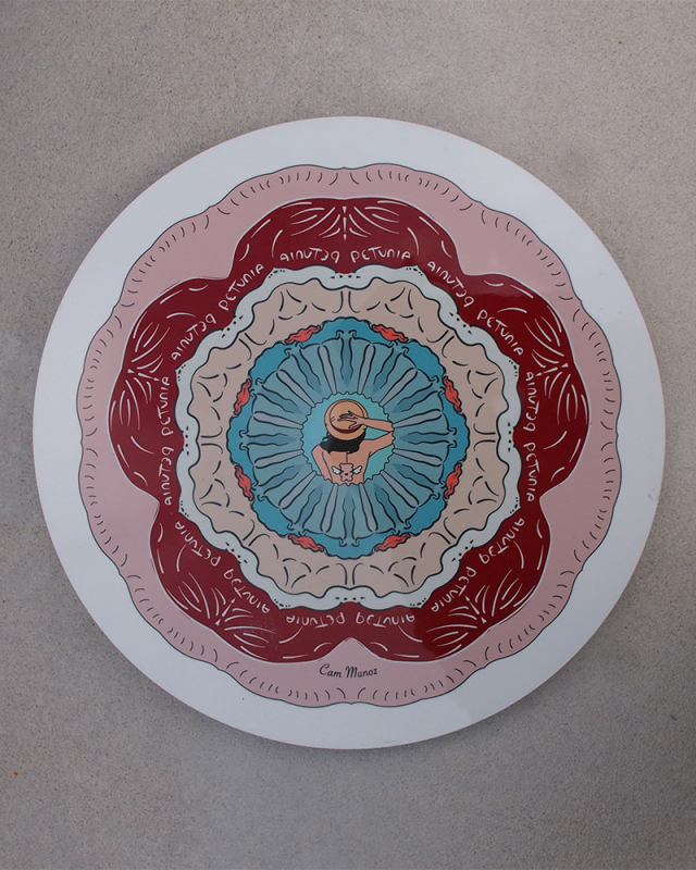
Black & White Mandala: Mi Petunia

For the mandala project, I wanted to create something that represented me in a way that not a lot of people know. In the form of a specific flower, using simple designs that didn’t need to be so popped out or anything. We had to use a lot of Adobe Illustrator for this assignment, making it easier to manage through tools and so that the finished product wouldn’t end up so blurred from being printed out in different sizes. I didn’t want to stay within one slice when creating the mandala, so I decided to use 12 slices, 8, and 5. I chose a few things for easter eggs or symbols to represent who I am–a specific flower and two items in the center artwork. Growing up, my mom used a nickname for me, Petunia, the same name as the flower. I don’t know the reason behind why she picked it out of all things, but over time, I learned to love it. And In general, I do love floral designs or even collecting lego flowers, so I thought, “Why not draw a Petunia?” because it would fit perfectly–being my mom’s little Petunia. As for the center piece, I chose to do a faceless sketch of me for fun, not too detailed, just simple enough. The bear with wings is actually supposed to represent the bear on my wallet. I really like animals–I have a whole collection of stuffed animals at home, which I love all dearly. Using the bear design, I had a different thing in mind, my old stuffed bear that I had back when I was a baby, carrying it around constantly listening to the old music box that was inside. The final easter egg was the hat, something important from one of my favorite anime series, One Piece. I’ve been watching it for a while, and I deeply enjoy it because of many aspects of the show. The storyline itself, the animation, and the characters. The way Oda wrote them felt genuine and each had depth to their own stories–that and the way he wrote the difference between “pirates” and “Marines.” Simple titles, but showing how both can be used in different ways, depending who’s behind it. All these Easter eggs are parts of me I don’t talk about often–the simple and hidden parts. How I cherish a name from my mom, my favorite plush bear that was my best friend growing up, and a series that gave me insight on the real world around us.
Drawing tablets are interesting tools, and they’re pretty effective when it comes to digital artwork. To me, I do enjoy using the wacom tablets–though they can be a little challenging to use at times. But I don’t mind learning how to get better at them, to help drawing on the computers. It does remind me of when I use my apple pencil on my ipad at home–just without the ability to see what exactly you’re drawing on without looking at the other screen. I believe the best part of my Black & White mandala is that it’s simplistic–I didn’t want to go all out and have these small details like most mandalas. Although it would be interesting to have that, I wanted to create something that makes it easier for most to see without having to squint or be too overwhelmed by a lot of small details.
Colored Mandala:
(Reflection)
Reflection
When I got to see my laser engraved mandala, I was honestly really happy about it. I really love how it turned out, both by the simple look and by the material I decided to choose. At first, with just the digital artwork, I thought that the piece would’ve come out a bit wonky, or something would look wrong with it. But in the end, it turned out great with how it was lasered against the bamboo material. I personally think the material works out well with this piece, a simple space for it, giving it texture in the flower design from the wood. I had my doubts at first, of course, but I’m really glad about the outcome in my piece.
This entire mandala project has been an interesting experience for the start of senior year, it was challenging figuring out how to play around with photoshop–and then coming up with a design that defines us as individuals. I know I had a huge struggle in finding what I wanted in my pieces, yet I still got through it. Even through the challenge, this project has been fun and creative–with a prize of being able to see your design become physical through the laser process. I’d like to keep doing projects like this, so in the future I’ll be sure to remember how to set up the slices in Photoshop, and improve in my designs to slowly make them more complex and with hidden details. It was great to see the finished products of not just my own work, but of my peers–noticing parts and subtle designs that are a part of their personality.
My personal Mandala
Intructions
If the images do not display below,
On a Mac, press Command + (plus) then press press Command – (minus)
On a PC, press the Ctrl + (plus) then press the Ctrl – (minus)
BW mandald

colored mandala

Core Values Video
In Digital Media we were given a short assignment to work on: Core Values Video. It’s supposed to be a video representing our core values, while also allowing us to learn how to use and animate text through Adobe After Effects. It was a short video, but it had been a fun one to do, using different transitions for texts.
For my own core values, I think they pretty much represent a part of who I am as a person–having more fun, creativity and connections with others. For example, writing, creativity, or even music are there because of how much I enjoy art and the different mediums. I love to write as it’s important to me through communication and skills–I love art itself, creating illustrations, and I appreciate music because of how helpful it is and how relaxing it can be to listen to. The other values like Family, trust, honesty come from the values I hold when it comes to relationships with others. Whether it be friends, family, or peers in my classes–I value our connection through important aspects so I can become close with them, and so we can have more freeing and fun moments together.
Using Adobe After Effects was a fun choice, because of my values, and because of how I am–I chose more bubbly yet calligraphy style fonts. I’ve always loved how they looked, not like general fonts such as Ariel or Times New Roman. As for the shades of pink, it has always been my favorite color till I grew out of it. Now, it’s come back as one of my favorites again, and I chose a single white color for “vulnerability” just to show importance in it. It’s an important value of mine, because I love to be vulnerable with people I know I can trust, it goes to show a true version of myself.
Animation: Character Creations
.curationColumns > div {
border: 1px #000 solid;
}