The Conceptual unit challenges students like me to utilize the skills we are taught in the Freestyle program- whether it be Film, Animation or, in my case, Design- as well as industry-grade equipment and software, to create works of art, opinion and self-expression.
I value being a Freestyle student very much, because it has given me access not only to advanced equipment such as a DSLR camera and Adobe applications, but it has also given me the knowledge and experience required to utilize these tools to the best of their ability. Equally valuable to me is the interconnectedness of the curriculum, with many projects and assignments demanding work from two or more classes. This makes learning much more engaging, and ensures that no class is ignored. Perhaps above all of this, I value the many friends and acquaintances I have made here.
Photo Haiku
The photo haiku assignment brought the worlds of literature, photography and video together. Firstly, we were given a prompt about which to write a haiku. My prompt was to explore the feeling of awe through the experience of playing a sport. I immediately chose to base my poem around boating, because something that has always filled me with awe is the reflectivity of water. I took a photo related to the theme but not too obvious in its connection, so as to offer some room for audience interpretation.

I valued this project very much, because it introduced me to Premiere Pro. Though I did not nearly reach all of the complexities of this software, I now have sufficient experience with it to produce my own videos at home, for which I am very thankful. I also appreciated the opportunity to write poetry, something I do not do as often as I probably should considering my talent.
Poetry
In our next project, I would get my wish of writing more poetry. This, however, took it a step further than the Haiku Photo unit by allowing any kind of poem. It was here that the creative flood gates opened completely, and my creative genius was allowed to reach its maximum potential. This assignment integrates both English and Digital Media, since we needed to pair our poem with a fitting photo, as well as a tasteful verbal rendition.
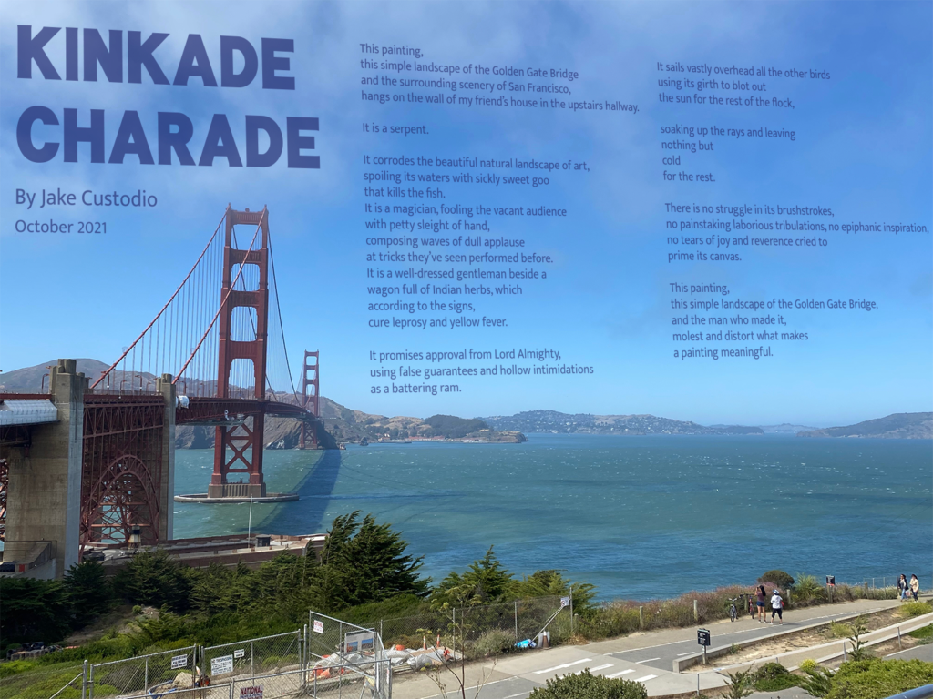
My poem, Kinkade Charade, is a criticism of the art, character and business methods of famous landscape painter Thomas Kinkade. My inspiration for this subject matter comes mainly from my deep resentment towards Kinkade, but also from my opinion that critique and negative emotions are much more impactful, both when spoken and when read, in swaying an audience and producing an emotional response. The poem itself is read from my own perspective, and I did this so that the criticisms would feel more personal and thus carry more dramatic weight. The poem starts nonchalantly, simply explaining that the subject painting exists in my friend’s house. It then moves to the isolated line “It is a serpent,” the word ‘serpent’ being and objective correlative for deceit, in reference to its biblical depiction. The next stanza contains three metaphorical analogies describing the effect of the painting on the broader art world. The first analogy exposes that the painting is artificial and harms the vitality of other, more thoughtfully made paintings. The second analogy claims that the painting and its composition are unoriginal, since the magician uses “tricks they’ve seen performed before.” The final analogy in the stanza is in reference to Thomas Kinkade’s insistence that his paintings carry with them the Light of God, and that they will enhance their buyer’s Christian faith and identity. I find this business practice similar to that of a snake oil salesman, hence the imagery. The next three stanzas are shorter to build anticipation and lead-up to the ending of the poem. The next stanza describes Kinkade’s business tactics in getting galleries to buy his art; he would claim that purchasing and distributing his paintings was a “religious opportunity,” essentially using the faith of his clients as leverage. The next two stanzas represent how Kinkade’s brand overshadows other artists and leave them in the “cold” of poverty and obscurity by absorbing all the attention. The following stanza is more literal and iterates on the very first analogy, claiming that there was no creative or intellectual effort involved in the production of the painting, which is what makes a painting “natural.” The final stanza mirrors the first one, but differs in the final lines, expressing the contempt for Kinkade in the same way that the factual statement of the first stanza was presented, implying that it is beyond merely the opinion of the speaker. Throughout the poem, I used enjambment and end stops to emphasize specific words and ideas. The most prominent examples of this are the word “cold” occupying its own line to add more weight to the metaphorical implication, and the line “that kills the fish” being separated, for the same reason. I received peer feedback regarding expanding the poem and explaining the reasons as to the harsh opinions, as well as finding a way to disrupt the progression of the stanzas and lineations to create surprise. A Poem for Trapped Things by John Wieners was an inspiration of the lineation of the poem, as it also contains isolated words of significance and impact.
This project gave me a great deal of experience with Pro Tools, which is a very handy software for editing audio and which I can see myself using for personal projects in the future. It was also a very good means of becoming more familiar with Photoshop and its many different options and functionalities. I think that poetry has much more dramatic and narrative weight when spoken aloud rather than simply read, so I am thankful that I was able to bring as much intensity and emotion as possible out of my poem.


Photoshop Blend Mode Editing
This series of assignments was intended to familiarize us with the blend modes of Photoshop, which can be utilized to edit photos in a great variety of ways- modify saturation, vibrance, contrast and color, or even blend multiple photos together in creative ways. We were given a series of photos to edit, each in different ways.
I think blend modes in Photoshop are very versatile in their potential uses. They can allow improperly lit or exposed photos to look much better, and they can add certain intensities or different moods to images. I enjoy working with them very much.
I value my new knowledge of Photoshop blend modes because I can apply them to my own personal work to make photos look better. It also means that I may not necessarily need to retake a photo which was poorly exposed, because I can now correct the exposure and brightness levels with blend modes. What’s more, I can make creative photo collages by blending multiple photos together, a process which I enjoy very much.


Design
The design elective has focused primarily on familiarizing us with both the principles of design and elements of art, and how to incorporate this knowledge into visual projects and making them as appealing as possible. Color theory, visual balance and photography have been a few of the many things we have studied and mastered, and implemented into our work to create visually stimulating works of art. I value Design class perhaps the most of any of the Freestyle classes, because the skills it has taught me are most relevant to both my personal enjoyment and use, as well as my future career prospects.
Alpha Name Photography
This assignment challenged us to critically and carefully observe our surroundings for inspiration. We were tasked with photographing the letters of our name, but only from things in our environment. This not only sharpened our ability to detect patterns and motifs in architecture and nature, but it was also good experience in handling our DSLR cameras. I am quite thankful that my name is short, because I imagine it would be quite tedious to seek out many different letters.


Conceptual Photo
This was one of the biggest projects of the class. The task was simple: take a photo conveying the conceptual feeling of a prompt statement- which happened to be the same statement as our Haiku videos. The difficult part was finding objects which represented such abstract concepts, as well as framing these objects in an appealing composition. My prompt, “I am exploring the feeling of awe through the experience of playing a sport,” produced this:

I am exploring the feeling of awe through the experience of playing a sport. The first and primary subject, the red balloon, is symbolic of awe. In the frame, the balloon is large and dominating of the space around it, in part because of its vivid color and in part because of the leading lines which steer the viewer towards it from all directions. It is meant to draw your attention with its irregularity compared to its own surroundings. Where the background is cold and muted, the balloon is bright red. Where the rest of the composition is dictated by sharp, straight lines, the balloon is round. It is this contrast that gives the balloon a sense of awe. Its fellow subject, the yellow figure, is symbolic of playing a sport. It is bright yellow, the color of sunshine and warmth, which are almost always present when playing a sport. The figure’s abdominal structure is separated into four distinct sections in the rough proportion and position of a heart. This is to represent both vitality and the effort that is placed on the heart during moments of great physical exertion. The figure also clutches a blue ribbon in its hand, which is traditionally awarded to first place athletes. This object portrays both awe and sports, as the prospect of arriving in first place in any sport is quite awesome. The two subjects of my photo, the figure and the balloon, both support a similar visual quality of the photo, which is vastness. The fact that they are so far apart from one another, as well as flanking either side of the frame, draws attention to the great amount of negative space in the center of the photo. This negative space offers a clear view into the background, which presides far behind both subjects, even though they are on different plains themselves. The vastness of the composition contributes to the feeling of awe. The two objects interact by occupying opposite sides of the photo while both being accentuated by the rule of thirds, giving them a sense of balance and harmony. If one were absent, the other would seem lonely and out of place. Also important to their interaction is the leading line which exists between them, guiding the viewer from one subject to the other, strengthening both of their presences in the photo.
In many ways, the Photoshop post-production is more important than the base photo itself. However, extreme edits can detract from a photo’s overall composition or believability. The key is to be subtle and make edits without making any change immediately obvious, but rather subconscious. If a person can look at a photo and immediately recognize that a filter or effect had been used, then the photo was edited poorly. I have used this knowledge to make smart edits and adjustments to the photo, which are subtle enough to not be obvious, but still significant enough to improve the composition. The most important touch-up I did was increasing the saturation and vividness of the red balloon. As the focal point of the image, it needs to stand out significantly against the background and the other elements of the image. Another edit I made was applying a warm filter over the photo. As previously mentioned, the figure is yellow because it symbolizes warmth and sunshine, and I wanted to carry this symbolism over by making the whole image seem warmer. Before this transformation, it was too cold and grey, which contradicted the theme of sunlight. I also modified the brightness and contrast of the image by increasing them both. The enhanced contrast works to make the image more visually interesting and varied overall, and the increased brightness both makes the image less gloomy and brings out the color in both subjects.

Color Theory Pastel Drawing
This piece I am particularly fond of; so much so that it now sits comfortably atop my windowsill at home. The project was a test of our knowledge of color theory and compositions. A different, unique color scheme was to be used for each of the different sections, all handmade with pastel crayons. Not only was it a good source of experience with color and composition, but it was also a good introduction to using pastel crayons. I have learned much about design, not only digital but physical as well.