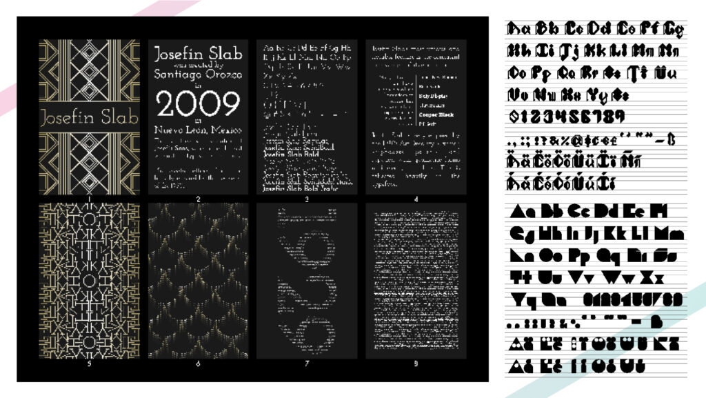
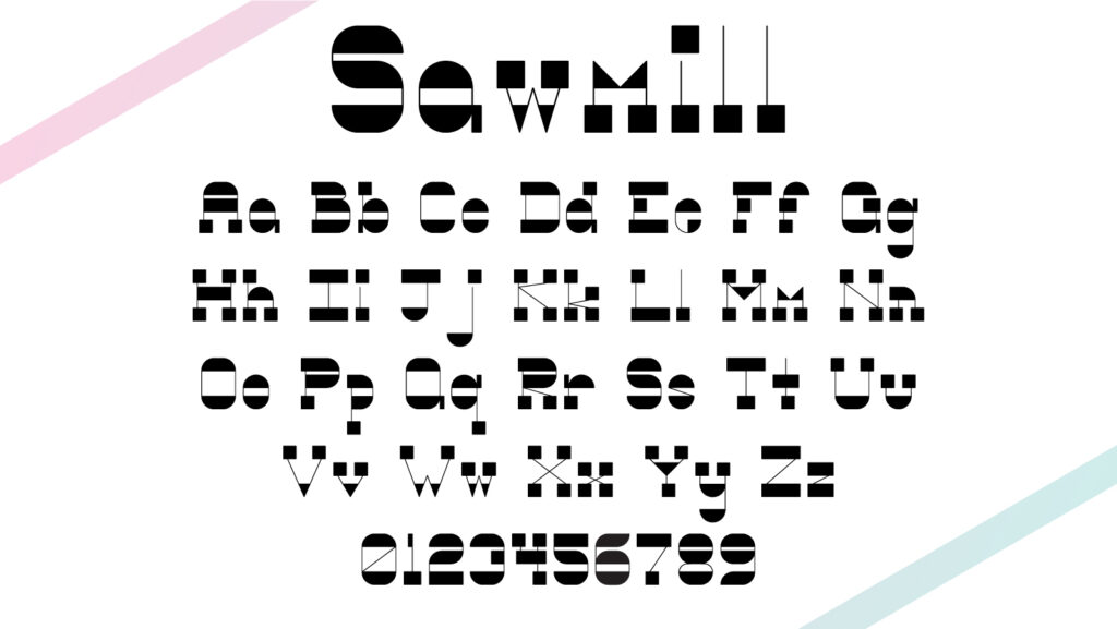
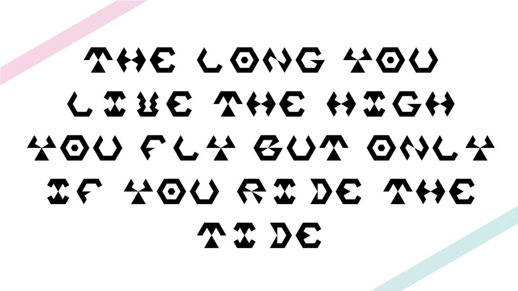
My Zenith consists of four fonts- one of which has a solid and outlined form- as well as four posters to represent a use case for each of the four fonts. The first font, Sawmill, is inspired by rustic aesthetics as well as the old west and industrial stencil type. The second font, Fang, is inspired by Gothic manuscripts and architecture and, more specifically, the aesthetic of Dracula. I wanted to give the font a modern edge by adhering to strict geometric conformity. The third font, Mind’s Eye, is inspired by science fiction and monospace fonts. It was developed from expanding upon a logo I had made for a friend’s Zenith project. The final font, Space Monks, was inspired by a challenge I gave myself: could I design all the letters of the alphabet using just a hexagon? Over time, the style of the letters became inspired by the psychedelic movement.
I developed the first two fonts based on sketches I made in my notebook. Translating them to Adobe Illustrator proved to be relatively straightforward, but I often found myself modifying my original sketches to make the letters look more natural as members of a unified set. This was especially so for Fang, where many of the letters I sketched turned out to be incongruous or simply off-looking. The last two fonts were both developed based on previous work I had done, when neither of which were full fonts. I approached them in a different way, using the letters in the initial design as a loose baseline to develop a full font based on those design principles. I think both instances were fairly simple due to the geometric nature of both fonts. In all, I’d say I am very proud of the work I’ve done. My favorite font is probably MInd’s Eye; I think it is the most cohesive and visually interesting. I learned that visual interest and legibility are an incredibly difficult thing to balance.


