Intro
This is not a part of my Freestyle work like the rest of my website, however I thought I might share the pieces I submitted in my portfolio when applying to colleges. Hope you enjoy!
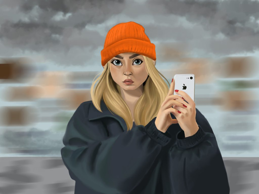
Ren was modeled after several reference photos where I took inspiration and developed into my own style of drawing. This piece uses a motion blur in the background to replicate Ren taking a photo of herself on the street looking at a reflective building. In this piece, I flourished with blending techniques and was able to interpret real life in my own style.
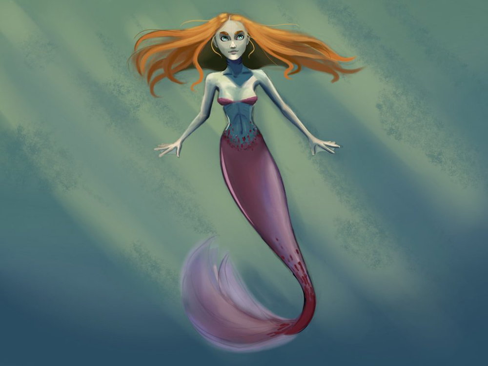
Delphin is a character I created as a way to experiment with human hybrid creatures. I incorporated pale green skin as well as gills on her neck and webbing between her fingers to further convey she is adapted to an underwater environment. Delphin has large intense bright blue eyes similar to a fish. Her fiery hair floats in contrast with her predominantly blue surroundings. I modeled her tail after a similar fish with iridescent scales and slowly faded the scales onto her torso to create a more organic connection between the tail and torso.
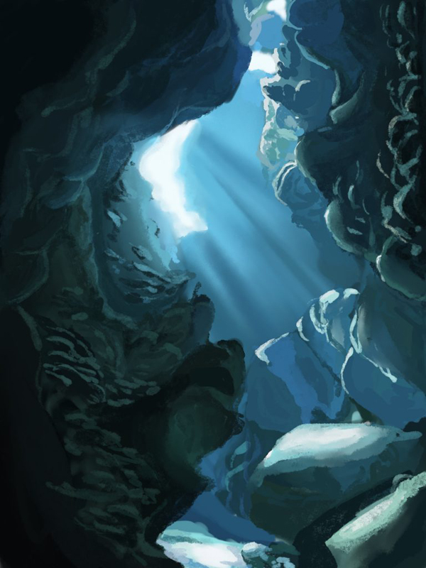
To compliment my mermaid drawing, I painted an underwater grotto pulling inspiration from several underwater photos. This is the area where Delphin would most likely spend her time if not swimming around. It is difficult to create an environment for a mermaid who most likely wouldn’t stay in one place for a long period of time. By using various brushes and blending modes on Procreate, I created a soft welcoming environment adding rays of sun shining on the rock formations. These brushes and blending modes added a level of depth to my painting with providing similar rough rock textures.
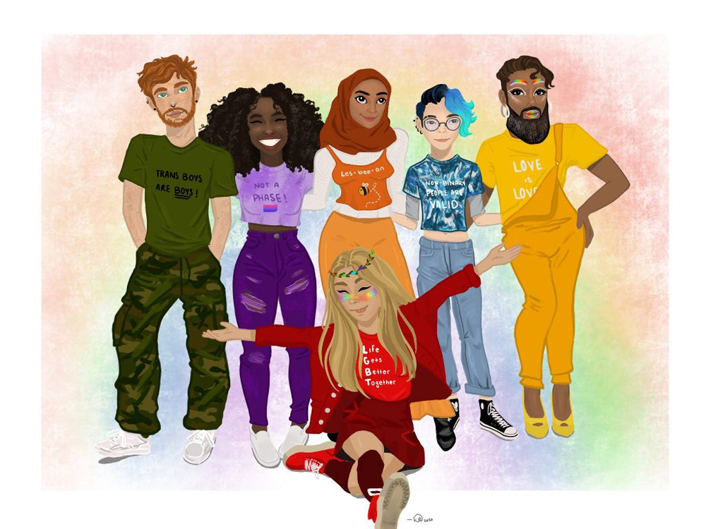
I created this piece with the core factor of diversity in mind. Not only in the various identities each person portrays, but also in the way I used color. I planned on using colors of assorted LGBTQ+ flags on each character to represent different categories within the LGBTQ+ community. This drawing was difficult for me since I am not directly part of this community but while researching, it became clear the rainbow flag is an umbrella representing everyone. I meticulously made every person’s outfit monochromatic to model one color of the rainbow each, implementing contrasting tones and tints for the outfit to pop. I also used the arrangement and posture of each person to illustrate each one’s uniqueness. Using Procreate I used multiple layers and a few selected brushes. I chose the Freycinet 1 brush with the opacity lowered to produce the lightly textured background.
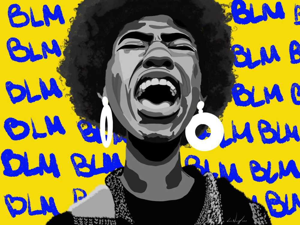
After the rise in anger in our country this summer and with George Floyd’s tragic passing, I was inspired to create my own “Black Lives Matter” piece as a way to combat my own frustration. The woman has her shoulders down and her face scrunched, not crying but screaming in fury. I chose to color her in a black and white fashion to show the simplicity of the injustice of racism at hand and to contrast the bright yellow background with the bold “BLM” repeating in the background. Through this contrast, I aimed to achieve a connection with the simplicity of the black and white and the vibrancy of the background representing the enthusiasm this movement has had.
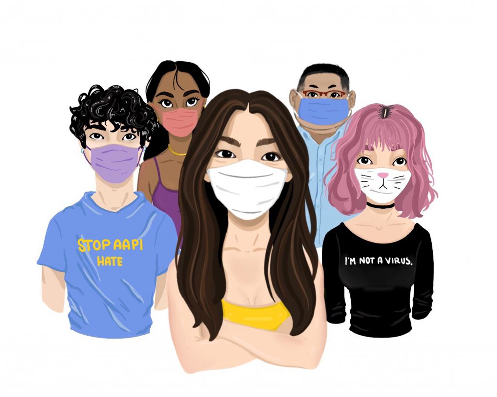
This piece was designed to communicate the diversity and strength of the Asian American Pacific Islander community holds. In recent months the AAPI community has been hit with brutal discrimination being blamed for the coronavirus. I intentionally positioned each person with their shoulders down and the front woman with her arms crossed ready to stand up for what she believes in. The image of an Asian American wearing a mask has created fear in the minds of others who believe Asian Americans “are the virus.” I drew each person considering this idea to change the perception and display a new empowering image.
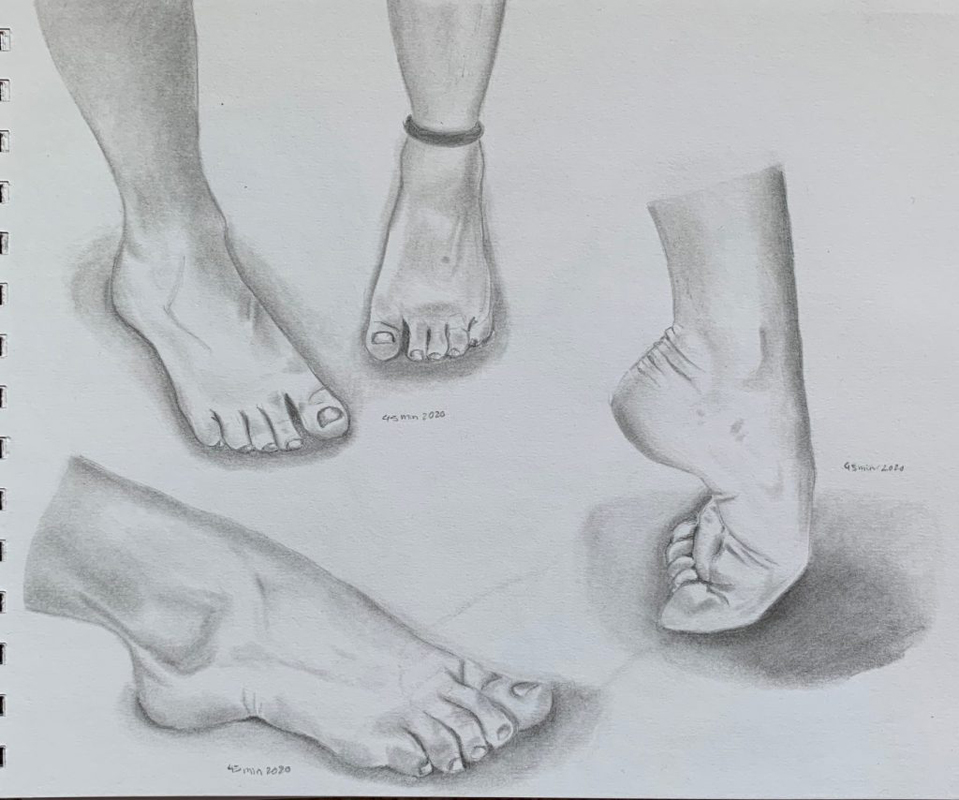
This is a collection of my feet I sketched while looking in the mirror. I spent roughly forty-five minutes on each foot. In contrast to hands, feet are much more straightforward and effortless for me to draw. After learning from the life drawing class of the man at my local art school, I focused my time efficiently on each foot properly scaling proportions and shading to the time I gave myself.
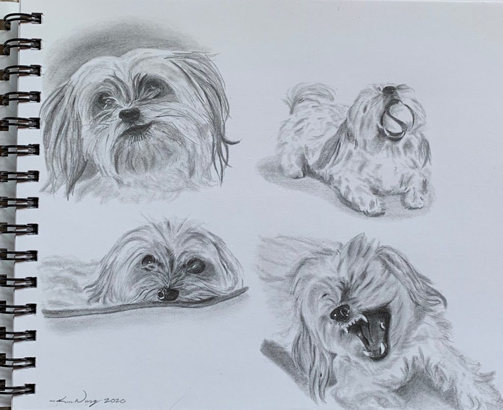
Similar to my foot study this piece is a compilation of my dog Patches in various entertaining poses. Patches is a loud rambunctious small dog who has a lot of energy for his age. By manipulating the graphite on my blender I was able to achieve textured sketches. It was important to me that I capture him in action exemplifying his exuberant characteristics. Using numerous poses as opposed to only one made certain his personality would be visible.
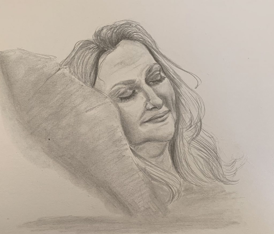
Since COVID shut down my timed life drawing sessions, I decided to time myself and sketch my mom sleeping for forty-five minutes. With limited time I used graphite to sketch and blend. I steered my attention to her facial features ensuring I got the right angle of her face against the pillow. As the timer ran out I used fluid motions with my wrist to sketch her hair and used my blender to guarantee she wouldn’t be a floating head.
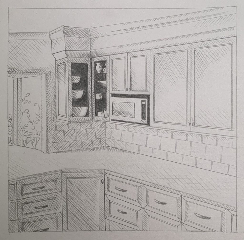
My kitchen is the subject of this observational prospective study. I often struggle with perspective drawings finding the geometry to be tedious and inorganic to other subjects I focus on. This said, I chose a particularly difficult section of my house to study for a challenge with many intersecting lines. By choosing the graphite as my medium I kept with the pattern of using almost strictly straight lines and I opted to use hatching as an alternative technique to blended shading.
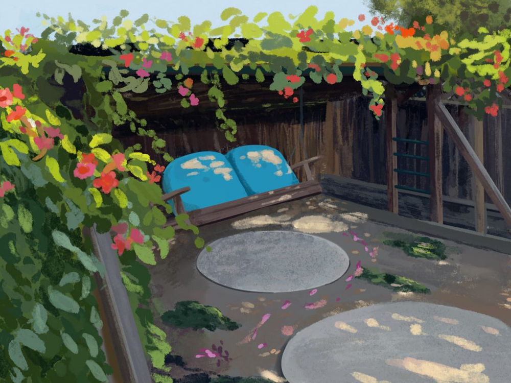
This is an observational piece of a corner in my backyard I designed using the app Procreate on my iPad pro. This corner has overgrown trumpet flower vines with a wooden bench swing below. My main focus was to capture the lighting and perspective of this location by taking a slightly impressionistic approach. I attempted to emphasize the feeling of relaxation rather than the detail of each leaf and grain of dirt. The piece overall is somewhat dark, however, I incorporated a warmer green near the top of the canopy and spots on the grounds and swing where the light showed through. This grabs the attention away from the swing and the dark fence.
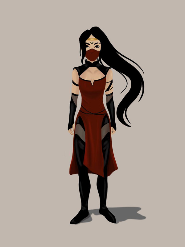
In contrast to my character Celeste, I created Homura as an extreme hardcore version of femininity. She is a representation of someone I aspire to be more like. The meaning of the name Homura in Japanese translates to “blaze” or “flame.” I specifically chose this name to illustrate her strong, fiery, extroverted personality. Homura’s shoulders are back with her feet slightly apart indicating in her stance she is ready for action. When designing her clothing I took careful consideration in reflecting warrior and assassin outfits from various video games and other concept art. The mask she’s wearing does not depict the struggles with Covid the world is currently dealing with but is used to hide her face so others won’t recognize her.
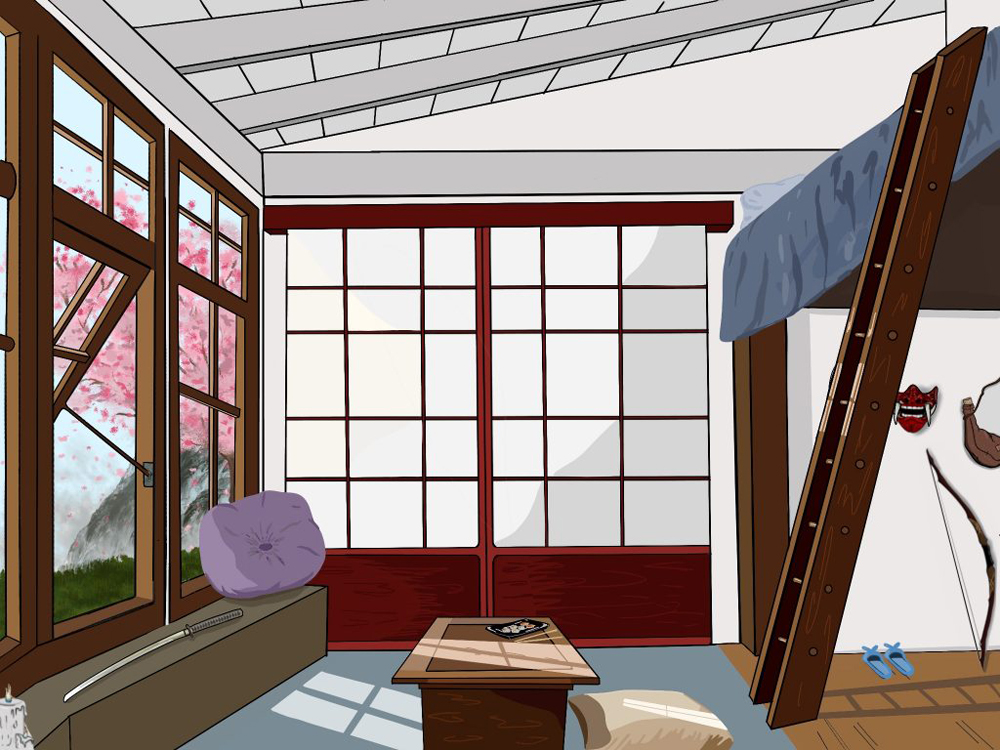
This piece is an environment I created for my character Homura. The focal point of this room is not inside the room itself but, beyond the windows. The viewer’s eyes are immediately drawn to the view outside rather than the details inside the room. The lighting on the floors and table is another feature that draws the attention towards the windows where the lighting is coming from. Homura is an extroverted character who spends most of her time elsewhere rather than at home. This gives her environment a much more plain atmosphere. I incorporated Japanese characteristics such as the sliding doors and shorter table with her props and assets scattered throughout the space.
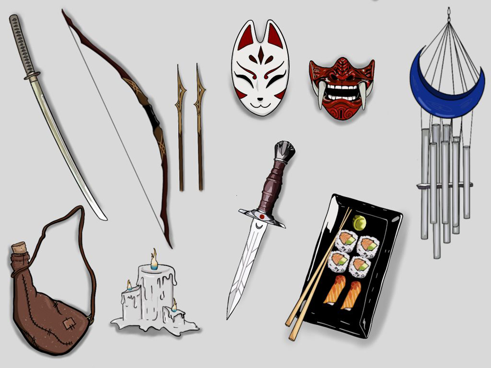
The props and assets page I designed for Homura is a collection of her most used items representing a lot about her character. I included weapons like the katana, bow and arrows, and the dagger to hint at her skills as a warrior. The masks are alternate masks she uses during stealth missions like the simple cloth one she currently wears. I added the water jug as an asset Homura uses often on outings and the sushi as her favorite quick easily packable meal. The subtle indicators of the upturned moon on the wind chimes and blade of the dagger allude to the tattoo on her forehead.
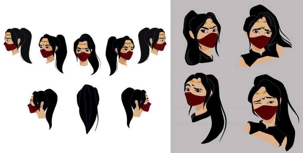
As a way of understanding Homura on a deeper level than just her full body composition, I created a 360-degree head rotation and four facial expressions. Both the head rotation and facial expressions provide better angles and detail to her upper shoulder area. The expressions were a challenge since she has a mask covering a large section of her face. This prompted me to exaggerate and emphasize her eyebrows and how wide she opens her eyes featuring small creases in her tight mask to show she’s smiling.
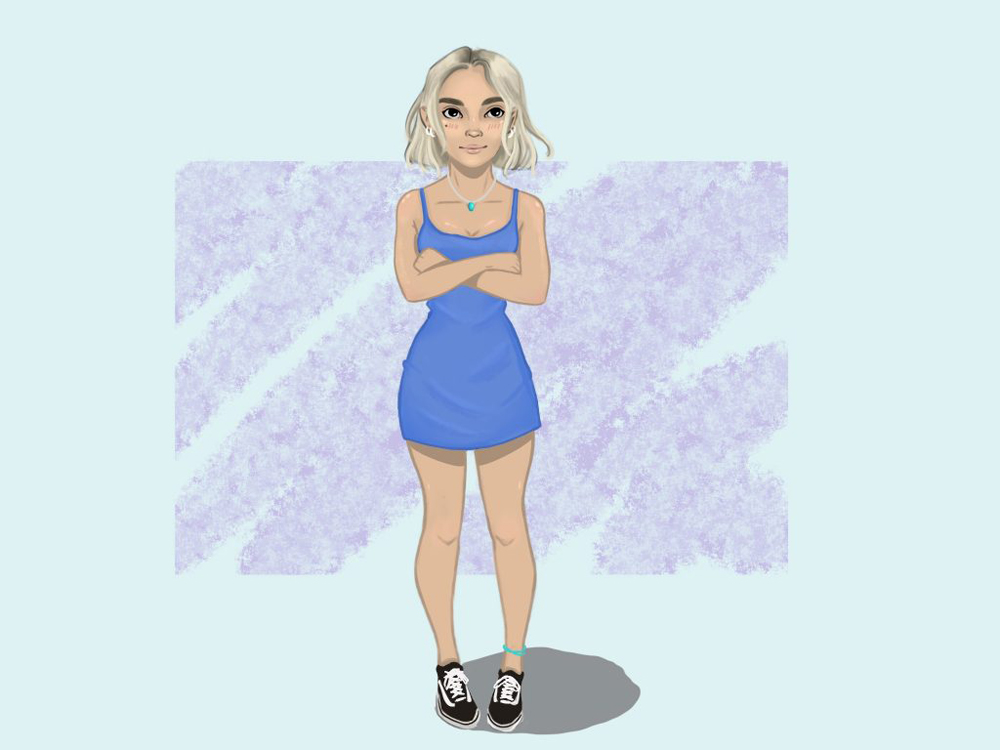
In contrast to Homura, I created Celeste as the more stereotypical soft version of femininity. To put it plainly she is the perfect example of a “girly-girl.” Celeste was designed as an introverted character, which is clear in the way she is positioned. She holds herself with her arms crossed, and her toes facing slightly inward. Celeste is the illustration of a more extreme version of myself. She simply wears an intense short blue dress which nicely contrasts with her skin tone and platinum blonde hair. The accessories of an anklet, necklace, and four earrings complement her interest in her appearance.
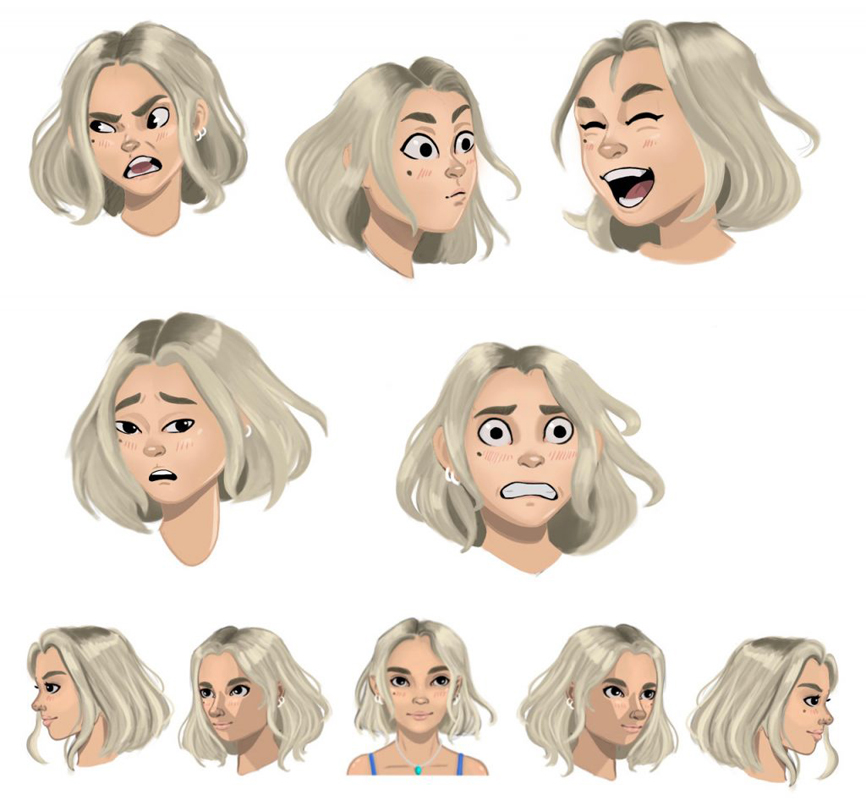
To understand Celeste’s features on a deeper level than just a full body composition, I designed an expressions page and a 180-degree head rotation. The full body composition does not exemplify the attitude of Celeste in the same way. This piece adds to her fun-loving personality by showing off her facial features and expressions in more detail.
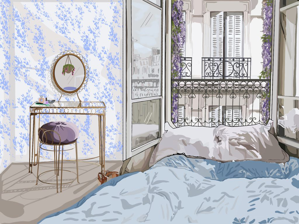
This piece is an environment I created for my original character Celeste. Celeste lives in France, specifically a Paris flat on the third floor above a busy street. Elements of this drawing, such as the color palette, play a major role in developing not only the character but the emotion the viewer experiences when looking at this piece. I incorporated floral hints into the architecture as well as soft creams, lavenders, and French blues. I emphasize the delicate and feminine features of the room with fluid lines and organic shapes. By highlighting the folds of the covers on the bed and the detail of shoes sprawled out on the floor it is clear to the viewer that this room is well lived-in. All these aspects play into the larger role of exemplifying the personality of my character through the environment she lives in.