Introduction
Through our projects in the Conceptual unit, we learned to develop our communication skills and how to express ideas and opinions through a variety of abstract aesthetics: music and poetry, art, animations, experimental films, and website production. We spent time learning to use equipment like DSLR cameras (a personal favorite!) and Tascam audio recorders and also navigate applications such as Adobe Photoshop, Premiere Pro, After Effects, Avid Pro Tools, and (yours truly) WordPress. This unit held a purpose for exploring new facets of communication and taking risks creatively to produce content that resonates with ourselves.
In the Freestyle English/Digital Media classes, I value being able to access these applications and learn about their nooks & niches. It feels really amazing that we as students can have ‘free rein’ with editing photos or audio, or creating a digital work from scratch. I never thought I could learn to edit audios and produce song parodies as part of a school curriculum, but here we are this week, recording live in a cool studio and editing out the original lyrics in the song ‘Riptide’!
Photo Haiku
For this project, we first examined in English class the styles of several well-known haiku authors, learning how to write effective imagery to create a surprising plot. When we carried the final haiku-photo composition (png) over to Digital Media class, we learned to create a video using Premiere Pro and incorporate the visual, audio, and animation elements, in my project below. My prompt was: “I am exploring the feeling of being rejected through the experience of being honest with someone.”
Some behind-the-scenes magic: Premiere Pro! When we first began using Premiere Pro, I was surprised that there were so many factors included in animating text and images within a video, such as Position, Scale, Opacity, and Speed. I learned to use key framing to design a sequence of elements to create the video.
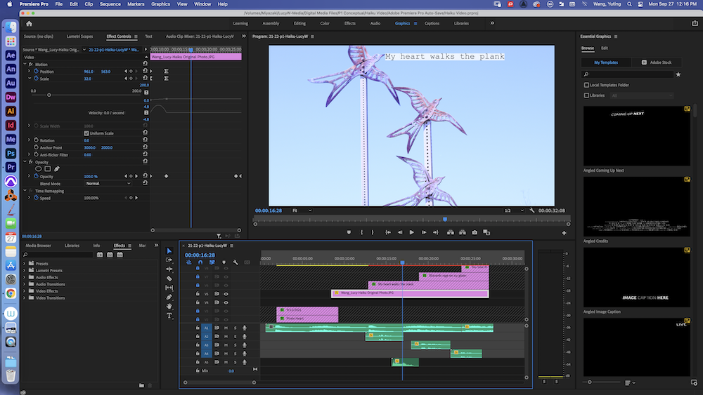
This project gave me a constant opportunity to connect figurative language to the photographs that I took every day. Sometimes there were unexpected connections and matches made between a photo and a concept, which felt rewarding. I valued learning to create a project that was inspired by a prompt but ultimately centered around a concept that we create out of our imagination.
Poetry
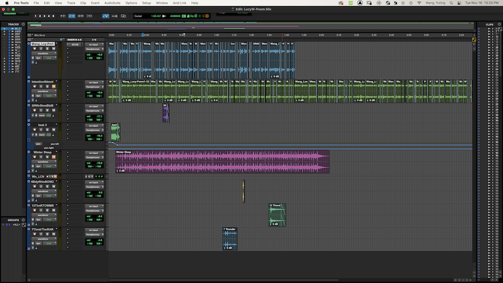
In the poetry unit, we were introduced to different types of poetry writing such as sound, free verse, and ekphrastic poems. We explored how both the visual lineation and figurative content of a poem can work together to create appeal to an audience and convey emotion. This unit presented many hands-on opportunities through analyzing the works of others (I enjoyed “I Remember the Carrots” by Ada Limón!) as well as writing drafts of our own poems based on what inspires us. In Digital Media, we created the visual and audio components of the project. We made recordings of ourselves reading our poems and intention statements, designed an image composition to create a more powerful experience, and worked using Pro Tools to produce a mix and incorporate music and sound effects. Finally, we worked in DreamWeaver to create an html website – linked below!
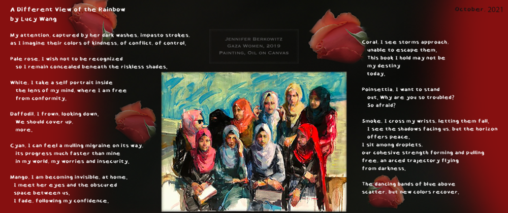
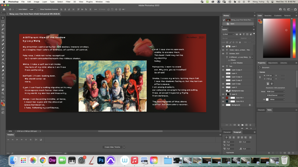
Intention Statement: “A Different View of the Rainbow” is an ekphrastic free-verse poem about the struggles experienced by women living in Gaza, a territory of Palestine – but having a final resolution of hope. There are multiple speakers in this poem, beginning with my own perspective as a student marveling at the artwork, to each of the perspectives of the painted women in Berkowitz’s work. These speakers reflect on their situation of growing up in an area where it is difficult to follow their own decisions; especially now, while conflict between Israel and Palestine (I apologize for an error in the audio: Pakistan) continues, there are many restrictions on what women in Gaza can accomplish & how they can express their individuality. I considered the themes of insecurity, confinement, and uncertainty for the future, but finally, possibility. In the first stanza, I used parallel structure in the phrase “…colors of kindness, of conflict, of control”, paired with alliteration, to emphasize that these feelings have varying nuances and depths, experienced from the different perspectives of each woman. I repeat this strong “k” sound in the rest of the poem by using words like “concealed”, “conformity”, “cover”, & “confidence”, to enhance my theme of conflict. I organized many of my stanzas to begin with the specific color word based on the hijab worn by the current speaker. The remaining lines in each stanza are offset below the opening line to create a personalized group of descriptions. I was inspired by the poet Matthew Dickman, who uses very short stanzas with short enjambed lines to deliver smooth ideas & transitions. For each figure, I was captivated by their unique characteristics and chose qualities to create a story. Although many of the women suggest feelings of frustration and desperation, I was inspired to portray a different attitude from the woman with the bright red hijab, because she has prominent features and faces in a different direction from her peers. There is a shift in tone away from resignation and helplessness, toward possibility, in the phrase, “I want to stand/out”. I enjambed this line to encourage a stronger effect from “out” as a very powerful word and mindset. I used an objective correlative of impending storms and rain to connect to this shift in mindset. In the stanza describing the figure in coral, the “storm” is viewed as a negative force which will bring devastating impacts, like the loss of education. In the second-to-last stanza, the final speaker states, “I see the shadows facing us, but the horizon/offers peace”, which brings a spirit of hope for new beginnings. “Droplets” reference the changing of the storm to rain, and in the aftermath of the storm, a rainbow appears as “an arced trajectory” helping the women depart “the darkness”. Originally, my poem centered on the feeling of helplessness. I received feedback from peers (& Mr. Greco) to connect the lives of these women to a hopeful ending (or beginning), inspiring me to revise my final two stanzas. I added the objective correlative of rain to create an extended metaphor as suggested.
I value the experience of producing my own poetry in a variety of mediums such as in traditional text, incorporating images, and through audio. Working with writing was the element that was the most familiar to me, and I learned a lot through producing initial drafts, then continuing to revise them based on objective correlatives and focal concepts. Although it wasn’t easy to decide what changes would help the text be more impactful, I learned how to receive constructive feedback and incorporate them together with my own ideas while offering feedback to others as well. Being happy with how I reached my final product makes the process entirely worth it!
In Digital Media, I was also able to conquer my fear of listening back to my own voice! I enjoyed experimenting with seeing how adding new music tracks and sound SFXs could enhance the mood and spirit of my poem.
With Photoshop, I composed a visual background onto which to place the text of my poem. The idea of this aspect of the project was to employ a meaningful image to enhance the viewing effect of interpreting the poem. However, I chose to create a visual that showcased the solid colors of black and red rather than objects. I felt this would best bring out the focus on colors in my poem as well as highlight the image of the painting that my ekphrastic poem was inspired by, especially when seen together with the figure in poinsettia. I also added layers of soft-edged roses from an original image, functioning almost like an afterthought behind the canvas.
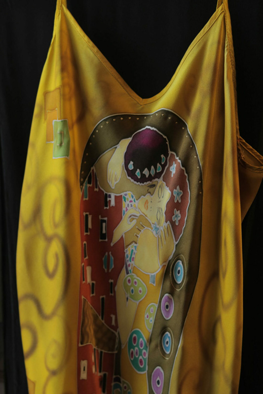
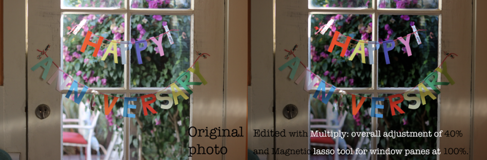
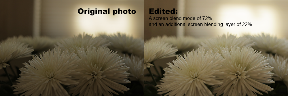
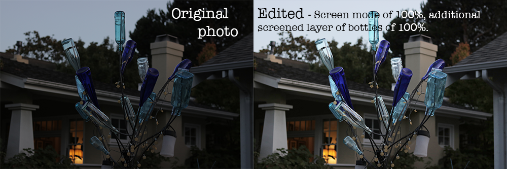
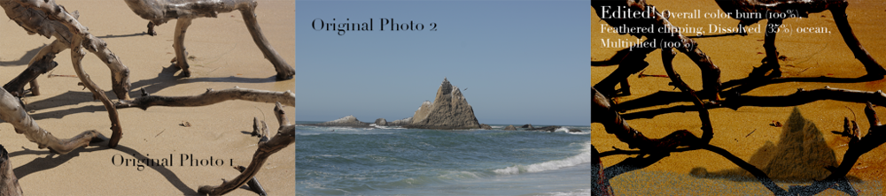
Photoshop Blend Mode Editing
We started off by learning the functional concept of darkening or screening an image using Photoshop (relating to pixels and units of color!) and began to apply these modes onto standard images. As we got further into the unit, we had the chance to manipulate photos we took ourselves in more creative manners.
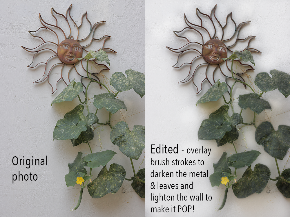
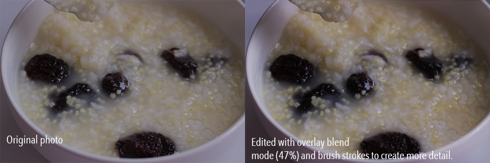
I was surprised by how easy it is to make simple modifications like darkening or lightening up an image (multiple/screen 100%), though photoshopping with creative license is much harder to do. I improved at applying techniques to create compositions of multiple photos blended together, though it’s still difficult to wrap my head around how the units of darkness or light are changed in each mode. One of my favorite techniques was using the magnetic tool to multiply or screen sections of images. Something I want to better understand is applying the overlay blend mode between the ‘automatic’ mode that applies the darkening/lightening for you and the use of dark and white brush strokes that help make the image pop.
In learning about Photoshop blend modes, I value having the total freedom to design how ideas can come together and having numerous tools at hand to help us reach a vision that we have. As Mr. Flo often says, knowing how to use Photoshop blend modes is definitely a large step toward being UNSTOPPABLE!
Here are a few images that I applied the Photoshop blend modes to:
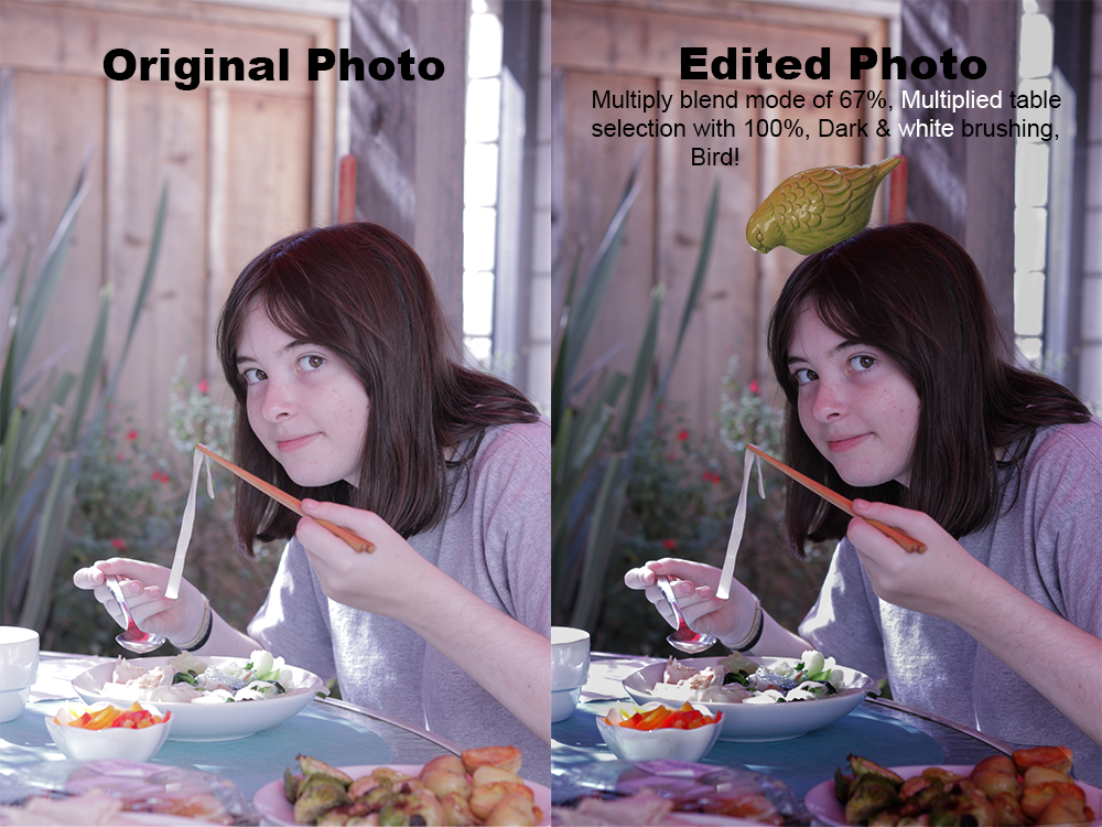
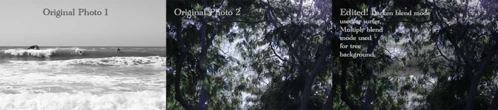
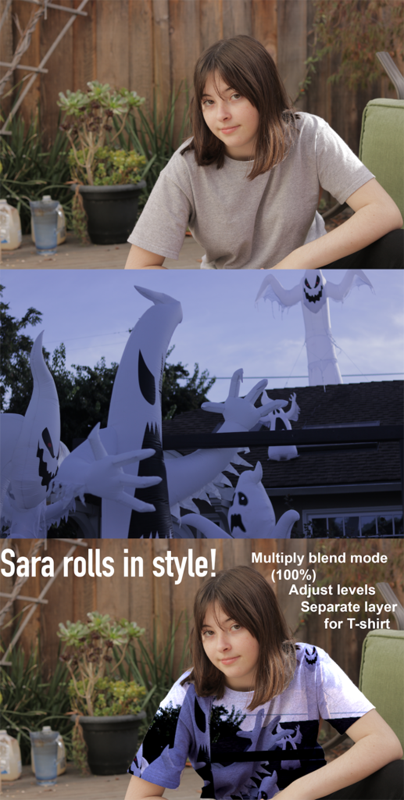
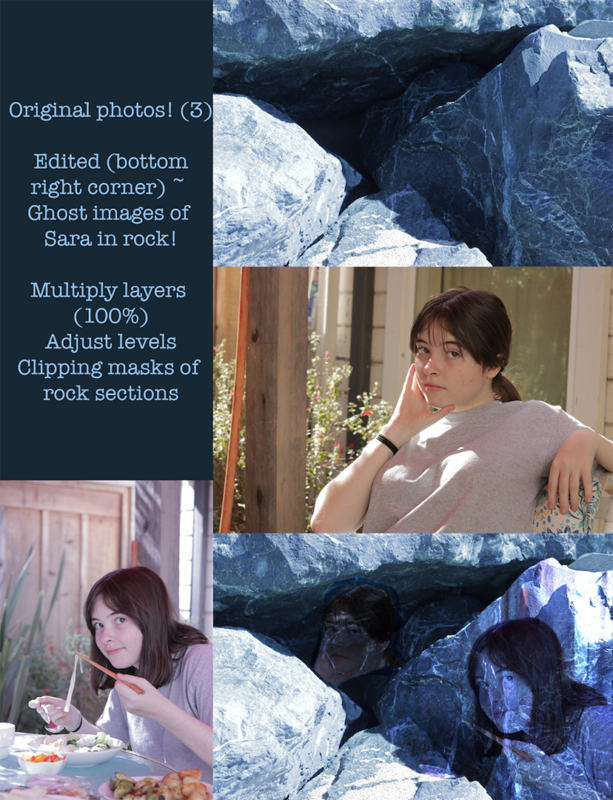
On the left below is one of my personal favorites, modeling my friend Sara:
Animation
Going into Freestyle I had no prior experience with animating and creating motion through drawings. Wanting to learn these skills was what ultimately attracted me to join Freestyle – along with being able to do projects that involve physical drawing! Throughout this semester, I’ve really enjoyed being able to spend time working on drawing projects and developing them into productions that are meaningful to me and that in the end, I am very proud of. I value learning how to produce animations using Photoshop and Dragonframe and seeing first-hand how certain types of animations are created behind the scenes.
Zoetrope
Simply put, a zoetrope is like a merry-go-around! It is a spinning device with open slits through which you can view the animation, which is reflected in the mirrors forming a column in the center of the ring. For this project, we drew a series of drawings on a strip of paper. I used a light board to help with guiding my lines when I drew to be able to match the movement on each frame.
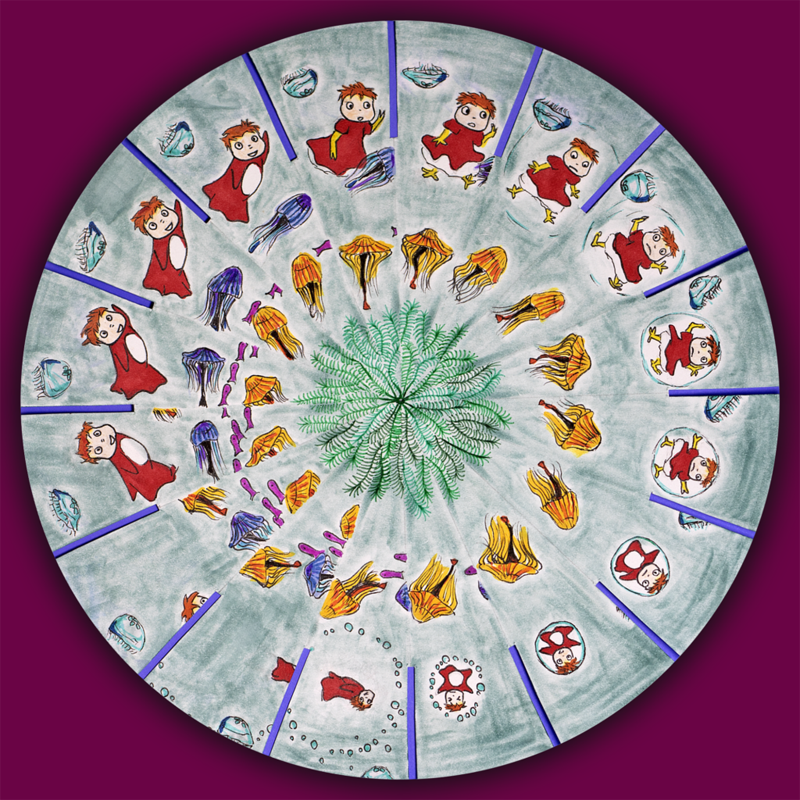
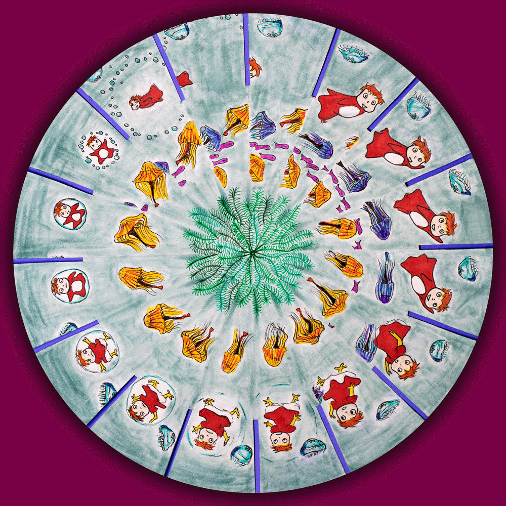
Phenakistoscope wheel
A phenakistoscope is simpler than its extremely complex name! We used a paper wheel consisting of 16 frames, shaped like pieces of a pie. My inspiration for this project was Studio Ghibli all the way! Ponyo was one of the first movies I saw by the studio. I also thought that recreating the sinuous movement of jellyfish through waters would be a fun challenge.
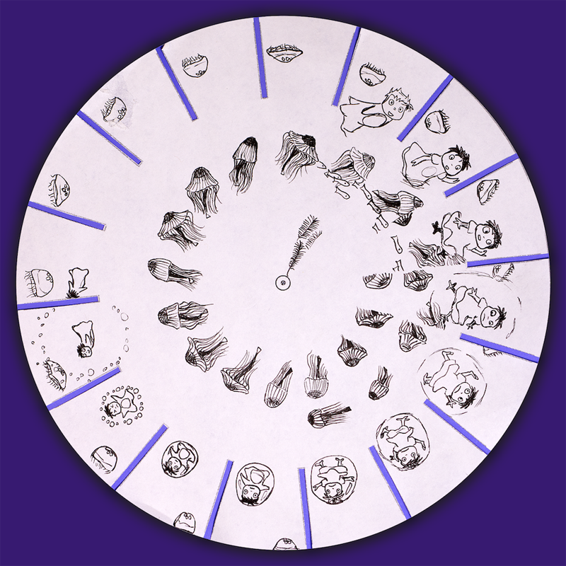
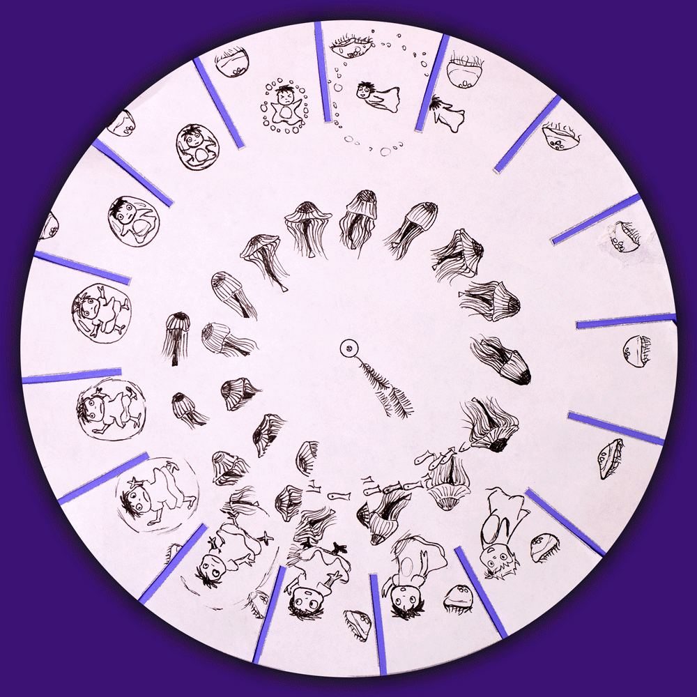
Dual-Toned: Black & White
This black and white version was not my illustration before adding colors, but rather a separate draft of the project. I drew on two paper wheels in order to have a template with which to use the light board. By using this draft template, I was able to draw with more accurate positions on my final draft.
In Full Color
I used brush markers with vivid colors to bring attention to certain subjects in my composition, such as Ponyo and the jellyfish. For the background, I chose a faded and textured light color to create the feeling of water, while leaving white space around the subjects, like an underwater halo.
Tip! At first it may feel disorienting to try to make sense of the phenakistoscope animation (and it may seem like the jellyfish are being dragged backwards), but one trick is to focus only on the top two frames of the wheel. This way, other parts of the composition are less distracting and the wheel does the work for you as it rotates different frames across the fixed space.
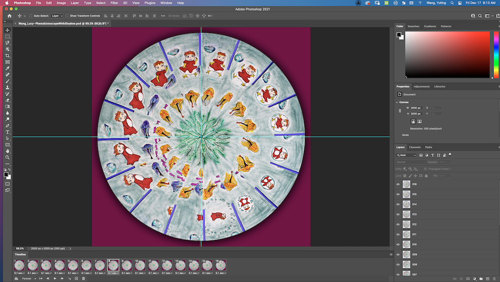
To create GIFs from our physical drawings, we began with taking a single top-view photo of the wheel. In Photoshop, we created 16 layers by duplicating the layer previous to it, each time rotating the wheel by 22.5° (or -22.5° for movement in the opposite direction). We created a clipping mask around the wheel itself to remove the original background in the image and add a new layer introducing a solid background color. The shadow effect around the wheel could be created by creating another clipping mask slightly larger than the wheel and using a Gaussian blur effect, then darkening it, layering it below the animation.
Flipbook Animations
Before starting on our flipbook project, we learned about the elements of movement that are characteristic of a good animation, such as bounce (squash & stretch), exaggeration, following through, and overlapping action. We were able to practice applying these techniques ourselves through a short flipbook animation.
My first flipbook animation (ever) was inspired by pelicans and the movement of flight. I drew about 96 frames and used a light board in order to carefully plan out how each pose would be spaced out from the previous/following frames.
To create this final composition video of the flipbook, we used a program called Dragonframe to take top-view photos on a DSLR camera that had a live connection to our computers at each shooting station. The mp3 file exported from Dragonframe is the result you see here!
Exquisite Corpse Flipbook Animation
The exquisite corpse flipbook project is based on the idea of creating a ‘train’ of animations from combining the works of a group of students. Before beginning the project, each person chose a shape that their animation would begin with, such as my own being an octagon. The first person would end their animation with the chosen shape of the second person, who would then end their animation with the chosen shape of the third person, and so on.
I created 72 frames for this short animation. Although I’d chosen to start with an octagon, I knew I wanted to include the element of hexagonal honeycombs in my animation, so I used squash and stretch to transform the octagon into a circle, springing back up into the rigid shape of a hexagon.
Direct Technique Animations
Stop Motion Paper Cutout Animation
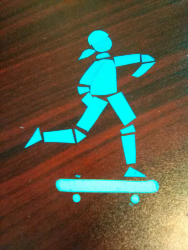
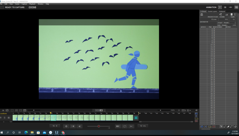
The paper cutout project brought us a step closer to creating a full narrative animation. For this project, we cut out objects and/or characters from paper and created a scene using these components. These paper cutouts were reused throughout the entire animation, and the animation itself was created by repositioning the parts for each new frame.
I created a scene where a skateboarding girl is traversing the sidewalk, bends down to pick up her skateboard, turns around to see a flock of birds chasing her, and promptly runs out of the frame. I was inspired by some of the events in my own life and I thoroughly enjoyed taking this idea and create something meaningful to me, watching it come alive in a different form. Although I didn’t start out with a full picture of what I wanted to create, the fun part was ‘going with the flow’ of where my animation was headed and I was able to incorporate new elements (such as the birds) into my original idea along the journey.
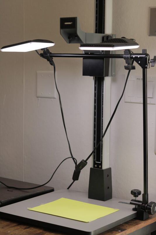
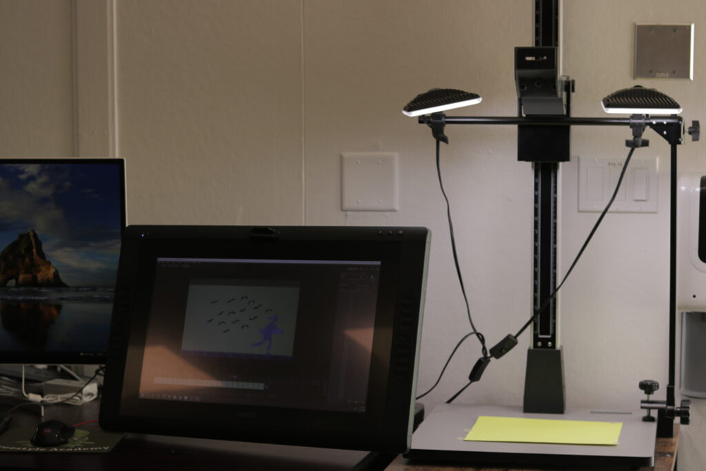
To create the video composition of the animation, we also used the Dragonframe software. Each frame of the animation was directly created through Dragonframe by taking an image. This certainly presented some challenges and risks, as you couldn’t easily return to the setup of a previous frame.
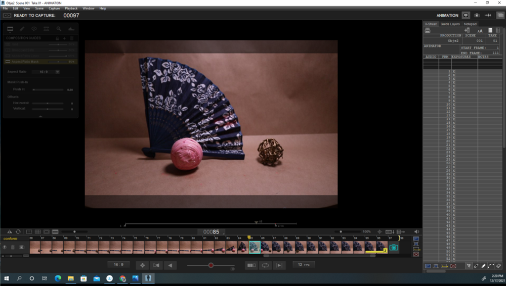
Stop Motion Object Animation
For this direct technique animation, we used 3-dimensional objects to create a storyline. Taking a step further from our paper cutout animation, we had to consider a 3D setup with a defined space and background as the setting of our animation.
In my project below, I experimented with shifting frames of reference: when the objects are rolling, the movement of the badminton birdies past them indicates that the objects are moving forward, like racers traveling past trees. This frame of reference changes when the fan slides into view; it remains fixed as the objects move to investigate the fan. This project presented a fun opportunity to practice personifying objects to give them unique characteristics.
When I used Dragonframe to shoot my 96 frames, I created a horizontal setup rather than the vertical shooting station setup used for the paper cutout animation. I placed the camera onto a tripod and adjusted its leg length to focus the camera on a height level that worked for shooting the scene.
other works
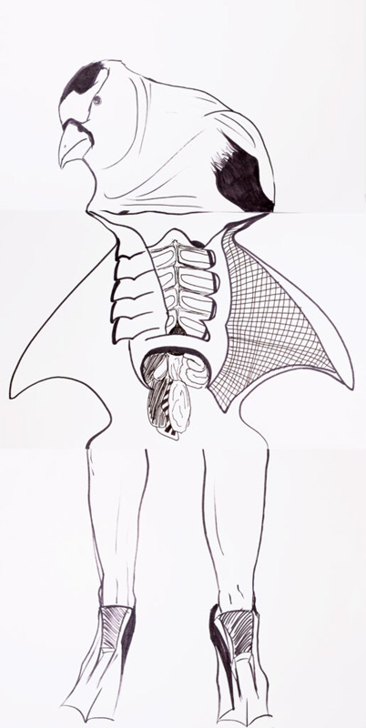
This was my combination of drawings in a class activity where each student drew a head, an upper/middle body, and a lower body. Although it is not an animated project, I believe that drawing and structure is an important foundation of animation, especially the way that borders are defined through lines. In this composition, the head is of an American Goldfinch (very cute birds!), the body of the underside and organs of a stingray (credits to an online image), and the lower body of human legs with flippers on the feet.