Introduction
In the Reflections unit, we explored answers to:
“Who am I?”
“What do I value?”
In English class, I read the book, “College Essay Essentials”, by Ethan Sawyer, otherwise known as ‘The College Essay Guy’. I started brainstorming for writing my personal essay by listening objects that are important to me and remind me of core memories:
My Essence Objects
1. Colorful glass apple with stem missing
2. Postcard from friend with an ink painting of ducks
3. Plaque for MVP, badminton
4. UCLA Summer Sessions lanyard
5. Stone elephant figurine
6. Blue double-shock mouthguard
7. A piece of orange agate, polished
8. Micron ink pen (size 0.8)
9. Peter Pauper Press journals
10. Scott Joplin Repertoire book
11. Science Olympiad Anatomy Nationals medal
12. Needle and thread
13. Regular skateboard that I helped build
14. Book from my grandma’s home, 蓝石头
15. Book, 窗边的小荳荳 (The Little Girl by the Window);
I used it to practice my reading and writing
16. Packets of origami paper
17. Any nice fresh yellow bananas
18. Photo collage of friends, 2016
19. Green-blue neon spatula
I decided to write about what I learned form joining the wrestling team in junior year. I used this project for my personal statement on the Common Application!
.
I felt very prolific in Digital Media class, where we reflected our values in a personal mandala made in Illustrator, created digital paintings using Photoshop, and used Photoshop’s awesome tools to carry out its classic purpose: editing images!
In Animation, we explored 3D modeling and learned to sculpt and texture characters. We will continue to learn 3D animation techniques as we create our Narrative 2 group project next semester!
Digital Media works
personal mandala
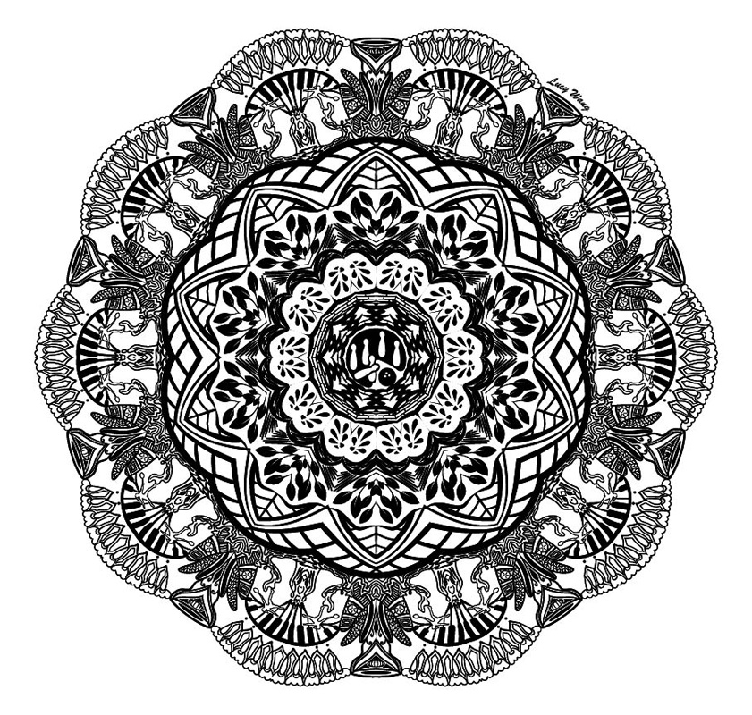
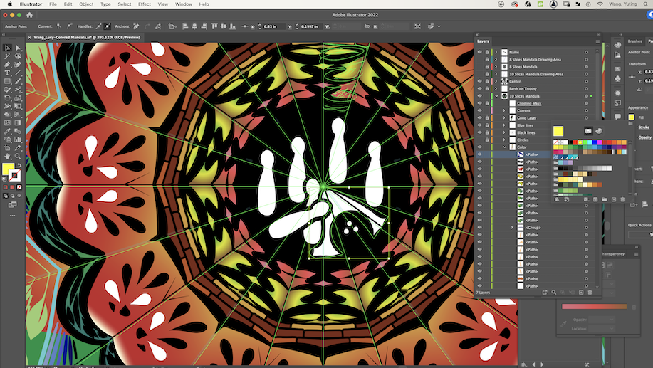
The personal mandala project encouraged us to translate our core values into visual representation. In Illustrator, 1. drew pattern, 2. colored it, 3. created a build-reveal video, and 4. got it engraved into 3D object.
When I began this project, I struggled to create a design that would embody my core values, similar to my obstacles in writing my personal statement. How can I present a few key details through visual and literary work, that would represent who I am? Who I’m headed to become? The infinite possibilities for filling a blank white space seemed daunting.
(Please reload the page if a mandala comparison doesn’t appear below this line! Working on fixing bug.)
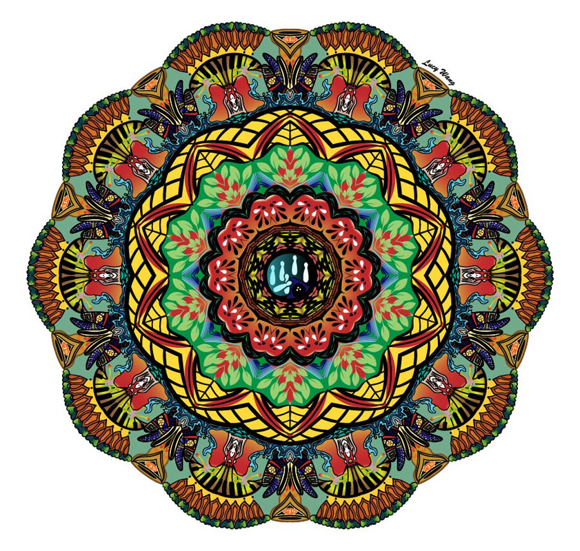
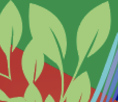
But, like writing, once I got started, I continued to find inspiration in my essence objects and from old memories that floated back to me at different points in time. Within my mandala design, I drew symbols inspired by watermelon slices, carrots, lace, bananas, Science Olympiad, piano keys, and a water polo ball, among others.
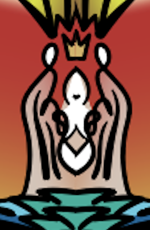
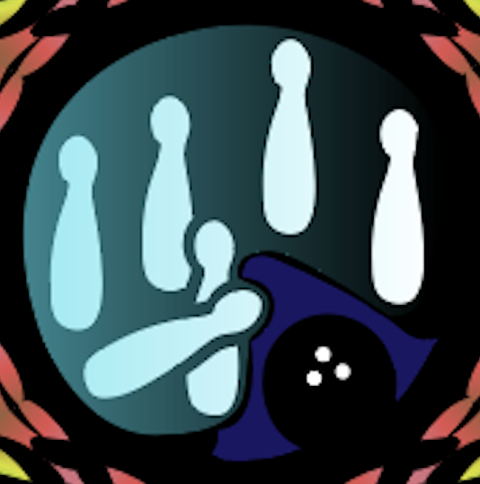
Perhaps one of the most important details lies in the center of the mandala, drawing the eye to a bowling ball among pins. I had drawn this while looking at a silver medal belonging to my grandfather, hanging against the wall; this aspect represents my family.
This project changed the way I saw the role of pre-planning in art. Some of the most interesting symbols in the mandala were formed as a result of spontaneous brush strokes, such as the angel holding up a crown and the head silhouettes on either side of it. I valued being able to take time to reflect on what is important to me while creating something beautiful from it.
I’ve filled my mandala with colors. Though vibrant, they are balanced by duller, almost nostalgic shades in the background. I used color gradients especially to represent fruit and vegetables and multi-colored yarn. The interaction of patterns in the mandala show how I have many passions that have guided my growth, and so many more things I want to try in the future. Just like in the song Childhood Dreams by Ary, I ‘dream a hundred dreams a minute.’
As I make decisions about where and how I might be spending the next few years of my life, sometimes it feels harder to stay with my present and past. I find myself spending less time reflecting on who I used to be, instead forming ideas about who I want to be in the future. But both are equally important. In creating this project, I’m especially grateful for having space to reconsider what is valuable to me and represent it through art.
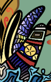
Here are some close-up insights to show smaller details of objects I wanted to represent:
Check out the video progression of building this mandala, layer by layer!
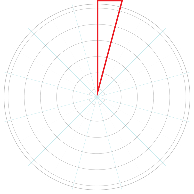
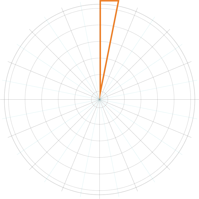
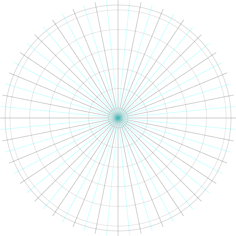
Before drawing our mandala designs, we created templates in Illustrator by using transformation effects to repeat lines every x-degrees (36 degrees for 10 slices, 30 degrees for 12 slices, 22.5 degrees for 16 slices, and 11.25 degrees for 32 slices). This set-up made it possible to have anything drawn within the area boundary (marked by red and orange) be reflected across its adjacent light blue line, then both slices replicated around the circle.
I chose to use the 10-sliced mandala template!

For the transformation effect to be applicable for the details, I drew onto the same layer that the template was on, locking the original black and blue circles and lines. Since each brush stroke makes a separate sublayer, I ended up with many groups of brushstrokes. I drew using a pressure-sensitive black brush.
To create asymmetrical patterns, I drew onto another layer above the template layer to relieve it from the transformation effects. For example, I did this to draw the viewer’s eye to the center of my mandala, which shows an icon for bowling to represent my grandfather’s hobby.
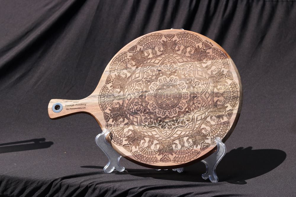
The digital media room has a laser, opening up many options for engraving mandala designs onto objects. I chose to make a wooden pizza board that I can use daily.
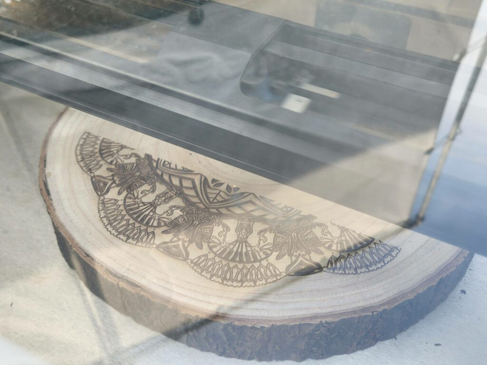
I asked Mr. Flo to help me engrave my design one more time, this time on a cross-sectional slab of a tree (it has pretty rings), for a holiday gift for family. This is what the engraving process looks like!
Photoshop Art
In Photoshop, we learned to use artisan brushes to create original pastel and watercolor paintings, then to efficiently transform photographs to watercolor paintings using filters. We were also introduced to using selection and masking to blend together multiple photos into one composition. Finally, we put together the skills we learned to create a surreal composition related to our worldbuilding project in English.
I enjoyed working on these Photoshop art projects because they have helped me take one more step toward being invincible with these skills; in other words, being able to create anything I imagine.
Pastel Painting
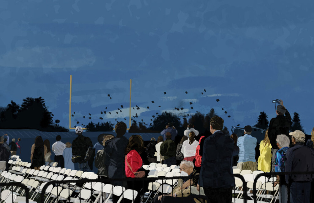
Titled: It’s Raining Caps!
For this project, I recreated a scene from a photo I took at the ✨Senior Graduation✨ last June. I got to see friends receive their diploma, toss their caps, and say goodbye before they leave for the summer and for college.
I chose this subject because even though fall semester has been really busy, I am really excited for opportunities in the future. I’m really looking forward to submitting thorough applications, enjoying the rest of my time in high school, and being able to graduate together with my friends.
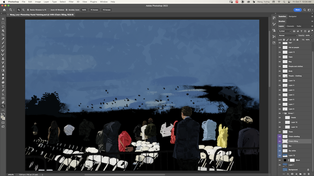
I enjoyed using different tones of a color to create shading on the chairs, clothing, and hair. This helped to make the figures appear realistic. If I could create another digital painting project with a similar concept, I would want to try painting with rougher strokes to have the composition look more like a Van Gogh or other Impressionist paintings.
hello
Watercolor Painting
This project was all about that watercolor brush. Choosing an image as inspiration, we explored sets of digital watercolor brushes in Photoshop to create a painting. This project took me a long time, but I enjoyed working on it; I learned to adjust the flow and opacity of a brush to lead to better blend a detail into or help it pop out from its surroundings.
Here is my painting and original photo:
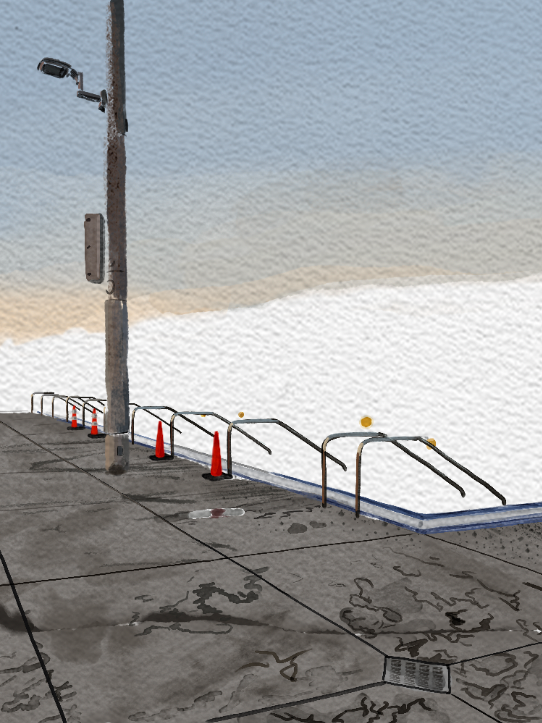
(If there is no image with a slider here, please reload the page. This is a bug that I haven’t figured out how to fix.)
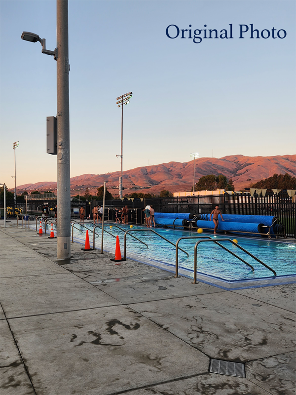
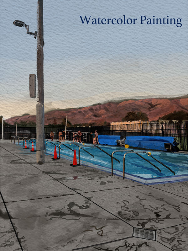
I titled this painting Milpitas Hills because…
This digital watercolor painting is based on a photo I took while at a water polo game at Milpitas High School. I chose to paint this scene because I never want to forget the joyful feeling of trying something new, even if it comes with embarrassing moments. I loved being a part of the girls’ ‘wapo’ team during this last year of high school despite being a beginner swimmer.
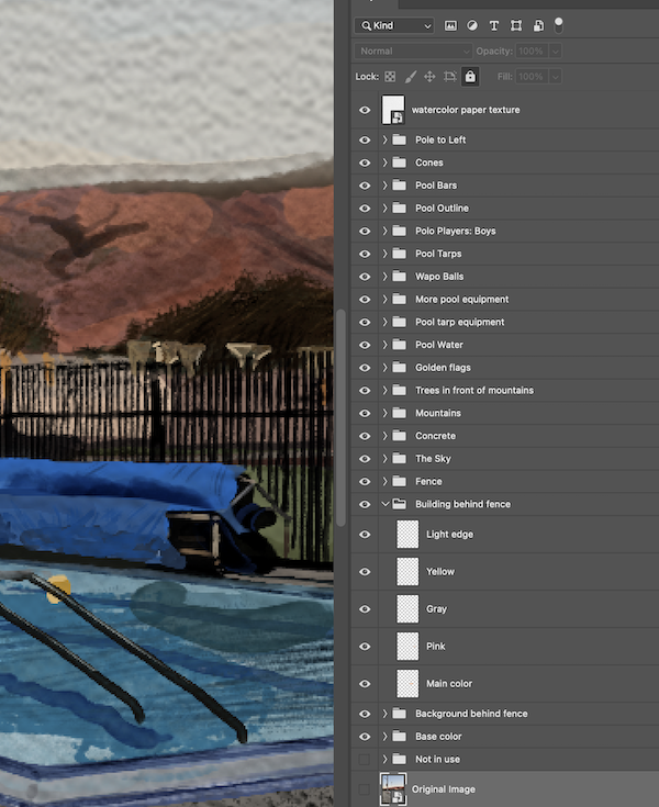
In Photoshop I grouped my layers by the subject (“pool tarps,” “golden flags,” “left side pole,”) so that I always knew which layers to reference back to when I wanted to make changes later in the process.
One of my favorite parts was drawing was the pattern of water splashed onto the concrete. To create this, I splotched three or four patches of overlapping gray, and added clean layers on top with drawings of squiggles. See the progress shots below!
I organized my (many) layers into groups in Photoshop and named them appropriately. It also really helped me to assign the same color to related groups of layers, such as the pool water group and the pool equipment group, in order to remember where to access a layer I needed.
Watercolor Painting Effects
We learned how to convert an original photo into a digital watercolor painting using a few handy filters in Photoshop. This was similar to our watercolor painting project, but takes much less time: as little as 5 minutes!
I chose three photographs I took and applied filters to place a watercolor effect, bring out the darkened edges of subjects in the photo, and generate a cloudy background which I blended with the watercolor image. After grouping the effects layers, I applied a black mask to the group in order to conceal the image. Painting over the mask with a white brush, I chose where and how to reveal the image.
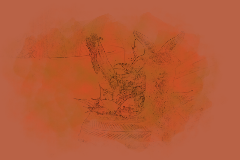
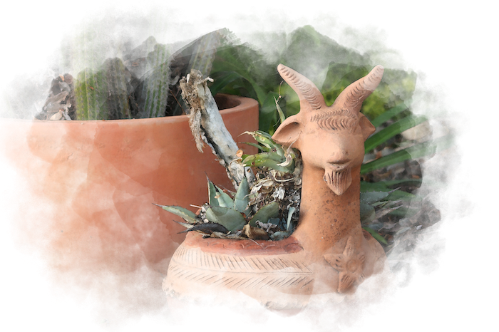
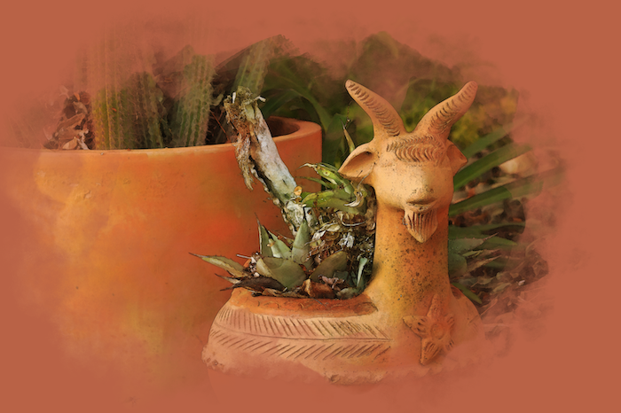
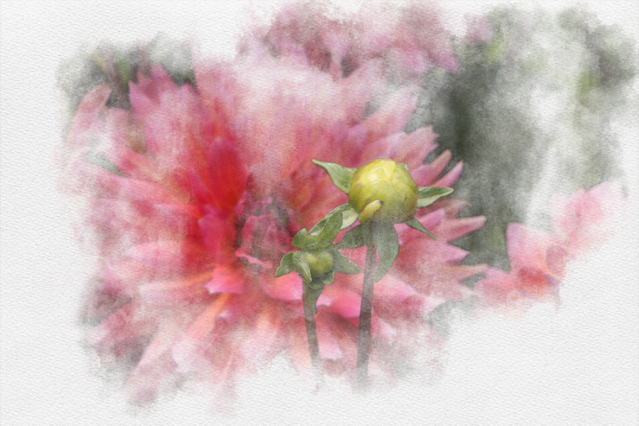
Below is a triptych of my watercolor effect images, depicting a Filoli garden lamb-shaped pot, my friend Janine mid-smile, and vibrant blooms of chrysanthemums:
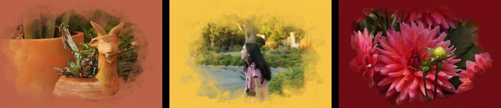
I enjoyed creating the hazy, blended edges of the vignette for my first two pieces, and I also like how the more distinct brush edges for my third photo allows the visuals to pop from the background. The three background colors range from a wine red to cheerful yellow to give warmth to the composition.
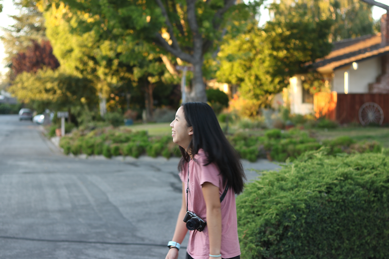
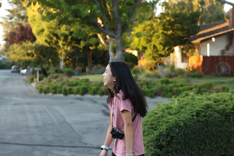
I wanted to show what the watercolor filter looks like. Below is a Before/After comparison showing the original photo of Janine on the left, and the watercolor-ed Janine on the right; no yellow mask. I notice that the effect causes the hedges behind to to look like swirly ghosts.
(Please reload the page if you don’t see an image below this line! Working on fixing bug.)
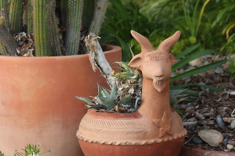
Here is another behind-the-scenes snippet, showing the different stages behind creating the Filoli lamb-pot composition: (from left to right) the original image, the selected outlines darkened using a black-white adjustment layer, the mask of the edited image created using a watercolor brush, and the components altogether on the bottom.
Below is another side-image I thought was really cool! It reminds me of pencil etching.
I am excited to create more pieces and experiment with different types of brushes that will create different appearances for how the image is revealed: either above or underneath the solid-colored background.
Photoshop Compositing
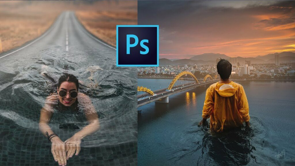
I’ve been curious for a long time about how artists make compositions like this. In learning Photoshop compositing, I finally got to try it myself!
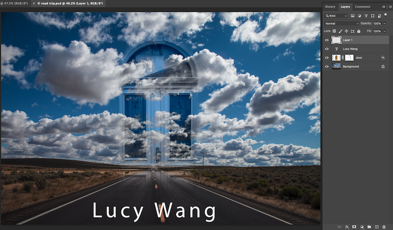
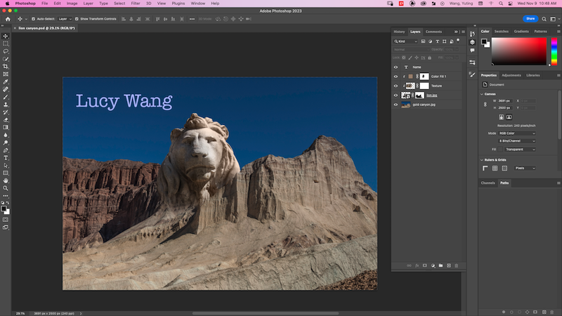
In class, we learned to apply masks atop images which were converted to smart objects (nondestructable images) by practicing creating a set of tutorial compositions. They included a lion’s head protruding from a canyon peak, a floating door against a sky, an ocean view pattern on a cracked clock, and a half-cathedral/half-forest environment.
I applied these new skills to my own photos to create a 2-photo (below, left) and 3-photo (below, right) composition:
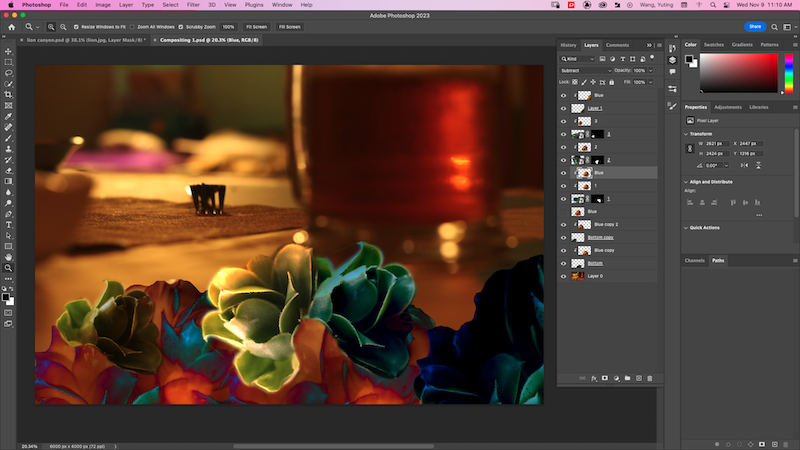
I made my 2-photo composition using photos of a succulent and the background photo you see of a drink and fork atop the table. I selected one bloom of a succulent, brushing out the rest of the image using a mask, and duplicated that same bloom to experiment with color filters. My friend Lori says this image reminded her of Lofi Girls’ graphics.
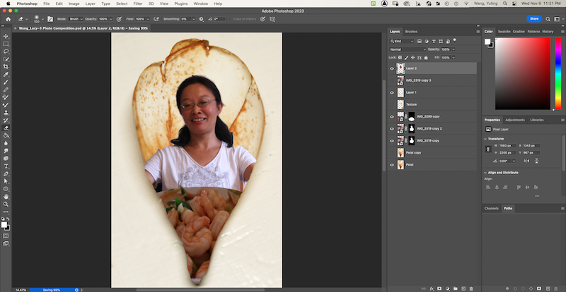
Since my mom loves shrimp (growing up in Xi’an, she tasted shrimp for the first time when she was ten), my 3-photo composition shows her head and upper body within a magnolia petal, reacting delightedly to a bowl of shrimp in front of her.
hello
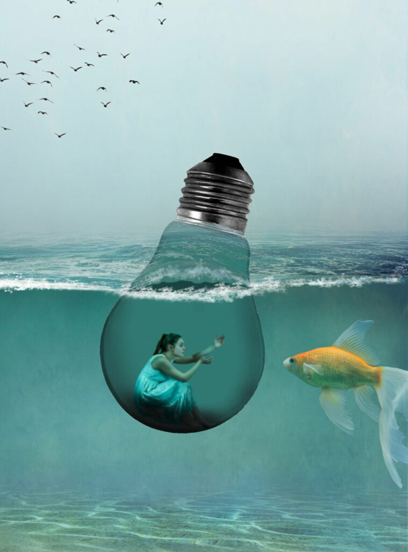
Surreal Art Composition
I created this surrealist composition as a teaser for the worldbuilding project I created in collaboration with ZoeyB and LillianC. Our world involves a nature-conscious community plagued by an epidemic of spore-spread, orange fungus (inspired by the Cedar-Apple Rust; it’s really cool).
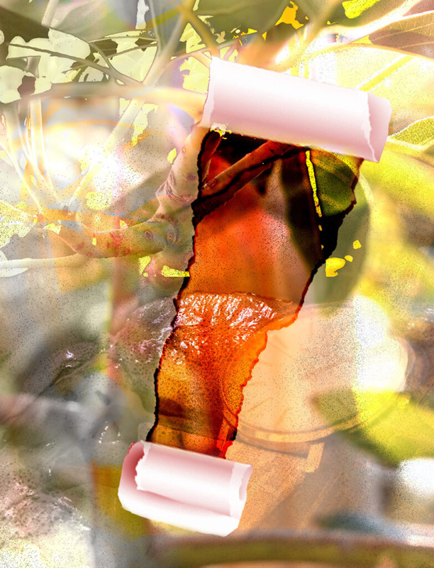
To create this composition, I blended photos I’d taken of a clutch of yellow blooms, a plant’s stem and leaves, my mom’s hand watch, and shrimp in a bowl. I placed revealing (white) masks over the images and brushed over parts I wanted to conceal using a soft round black brush setting. The brightened hint of the hand watch adds an element of urgency, while the faded yellow blooms representing the fungal infection are encroaching downward from the leaves at the top left. Half of the composition is gray to represent life and diversity fading away, as is the conflict in our narrative.
Blending modes were really fun to experiment with in emphasizing color and texture in the composition. For example, I duplicated the image I had and placed a ‘dissolve’ blend mode over it, which broke the image down into small spore-like dots choking the atmosphere space. I also used a color burn blend mode fixed atop the paper tear to create a disturbance against the light-toned composition. I think the enhanced orange tones together with the spotted texture of the shrimp resemble a sticky fungal outgrowth.
Animation
This semester’s Animation curriculum was all about 3D content! We learned to create 3D models using simple geometric shapes in Autodesk Maya, add detail to them through sculpting by drawing in ZBrush, and apply color and texture using Adobe Substance Painter to enliven our models’ characteristics.
Creating 3D animation is actually easier than I expected (and takes much less time than drawing frames in 2D animation). I feel lucky to have these advanced tools and applications to freely explore animated motions.
I felt super prolific, having all these projects below. Hope you enjoy exploring them!
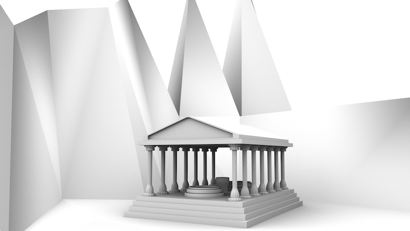
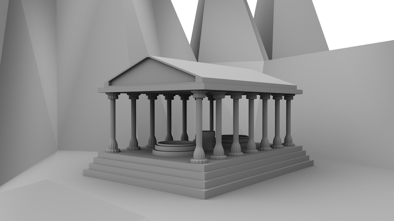
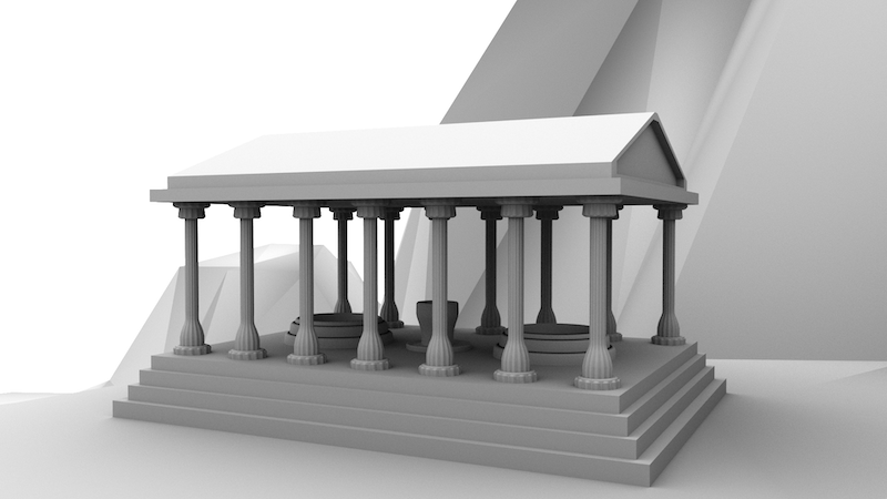
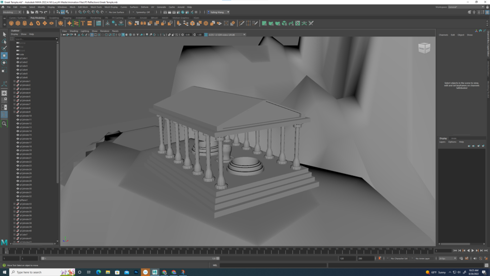
Environment Modeling: Greek Temple
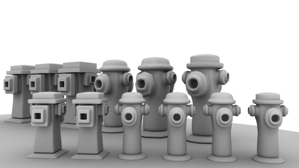
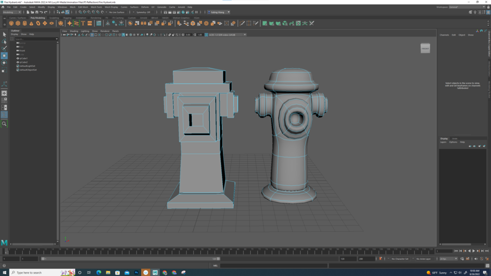
Prop Modeling / Rendering: Fire Hydrant
Instead of using multiple 3D geometric shapes to model my fire hydrant, I used a single rectangular prism and was able to create the hydrant’s characteristics from the bottom-up, using the extrusion tool. This tool allows you to duplicate a selected plane (in my understanding), which you can then transform: move up, scale to be wider, and even rotate.
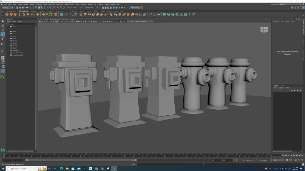
Once I modeled my fire hydrant, I used two different viewing modes to create this sequence of a dozen hydrants. Autodesk Maya has the option to view a selected model in the rectangular (which matches how the model was geometrically built, rounded (which smooths the edges, often taking a more realistic shape), and wireframe modes (showing the basic scaffolding of vertices and lines forming the model), along with other options.
Each hydrant in its row of six is different from the others, whether it be having an additional bevel edge for extra classiness, or fewer planes to create a blockier look.
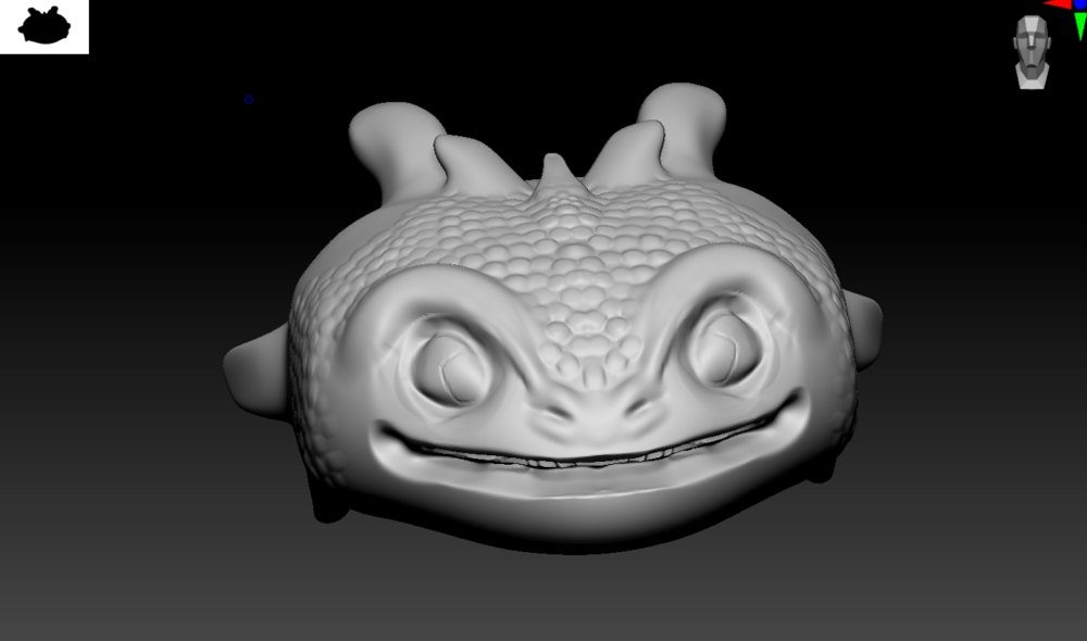
Digital Sculpting / Rendering: Human Skull
Are you ready?
I introduce…
ZBrush! Using this digital sculpting application, I imported .obj files of my models and accessed tools to add detail to help them appear more realistic!
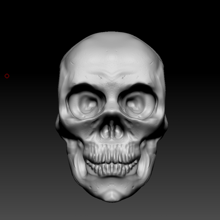
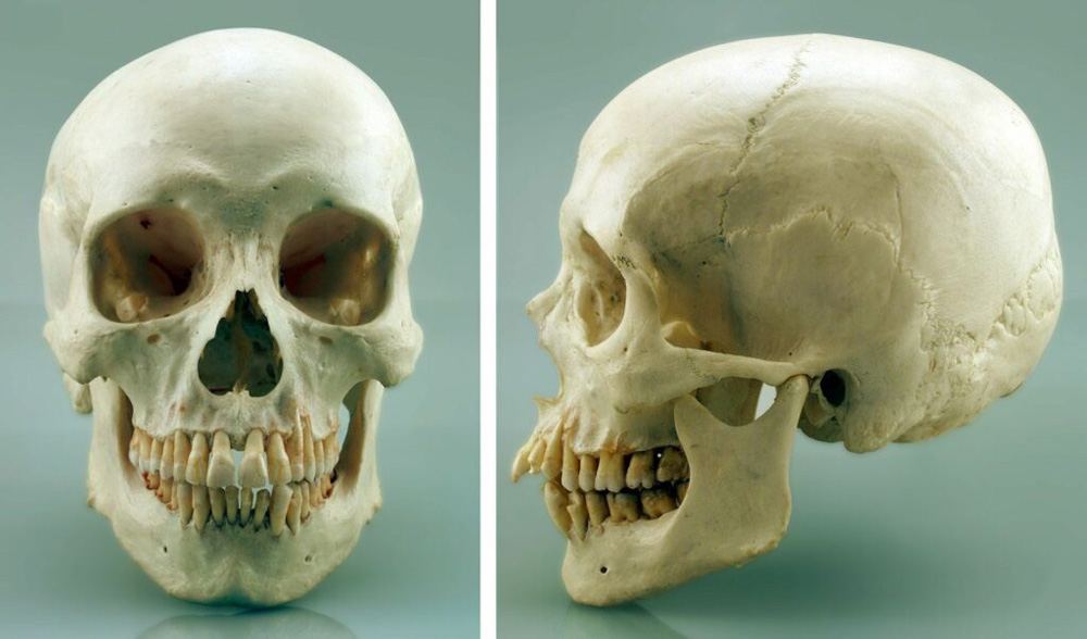
To sculpt this (unfortunately rather anatomically inaccurate) skull model, I used reference images of both the frontal and sagittal (side) views of an example skull. It was important to take into account both perspectives as together they help guide me to adjust the model to have as accurate of a shape as possible.
hello
Digital Sculpting / Rendering: Head Bust
Digital Sculpting / Rendering: Table Scene
Geometry:
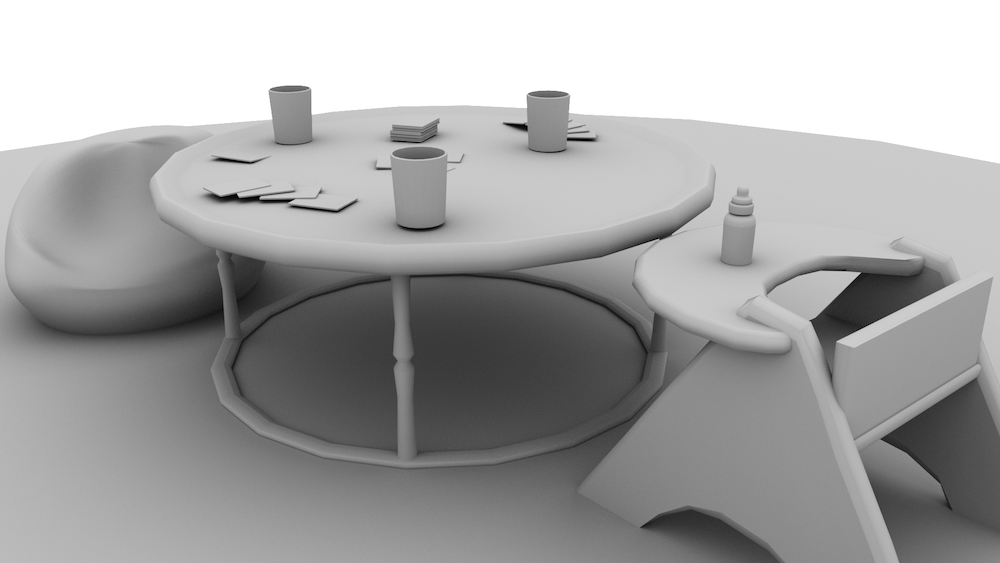
Sculpting:
Painting:
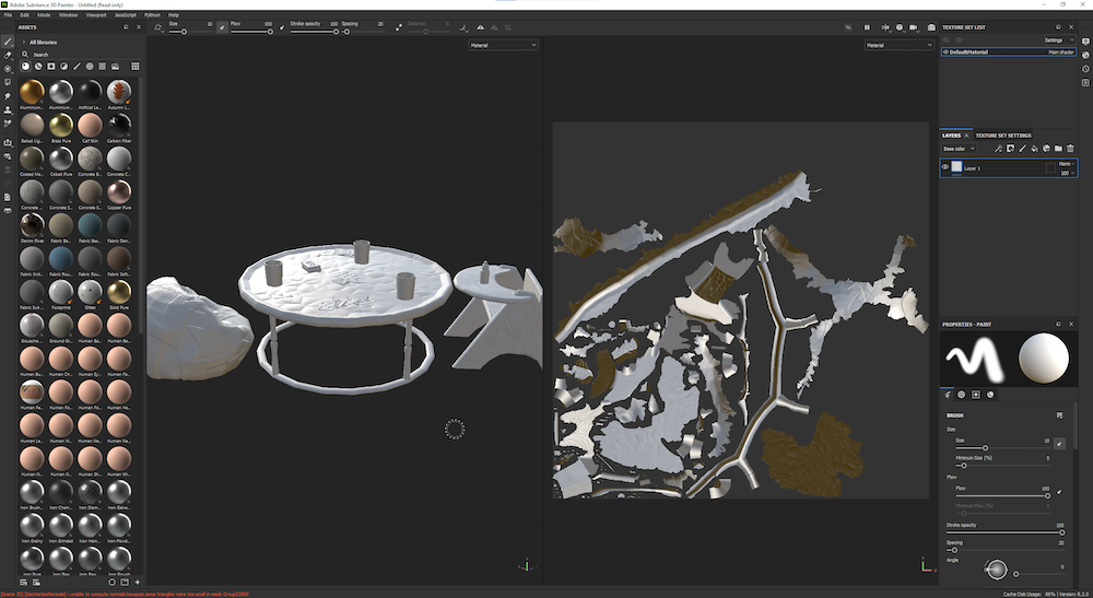
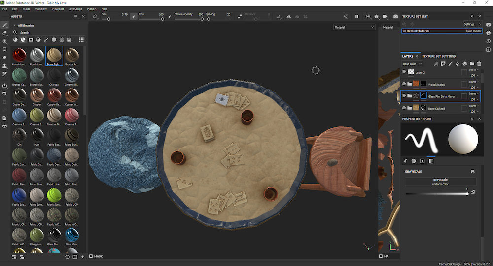

Render:
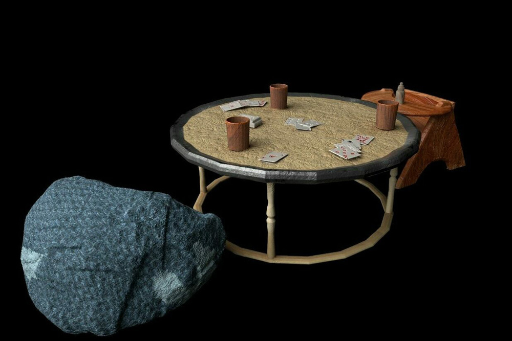
I am not sure of my logic behind setting up a card game between a grown occupant in a beanbag and a baby. I decided to have a little fun in ambiguity!
hello
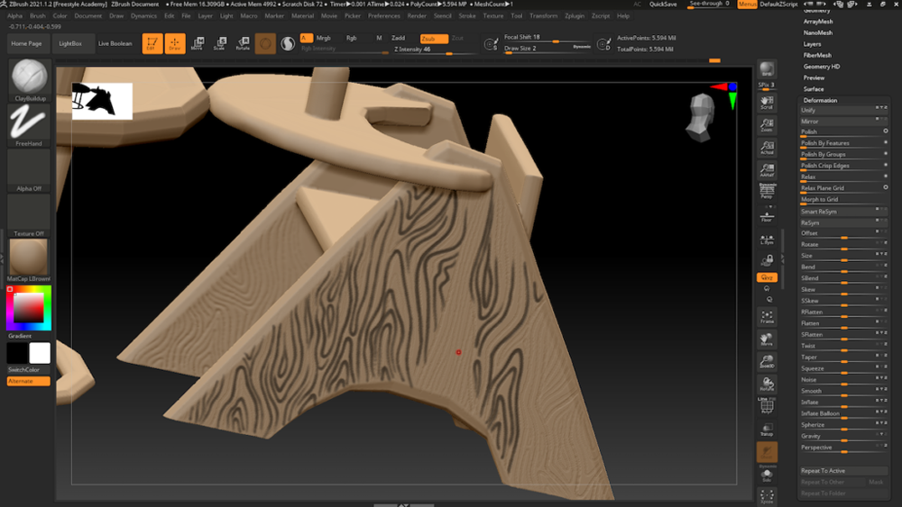
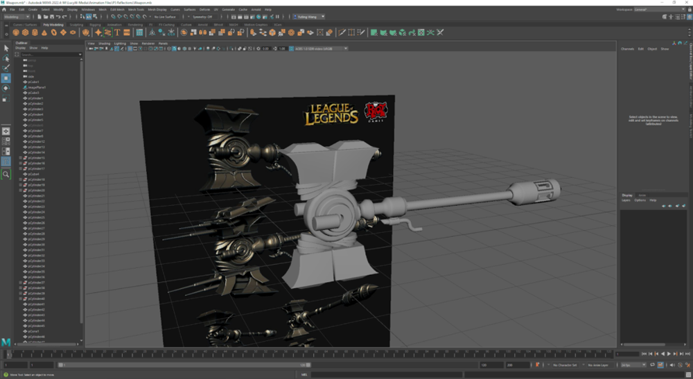
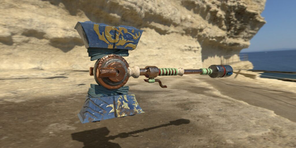
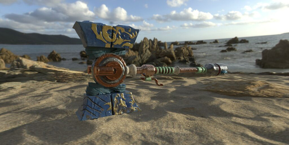
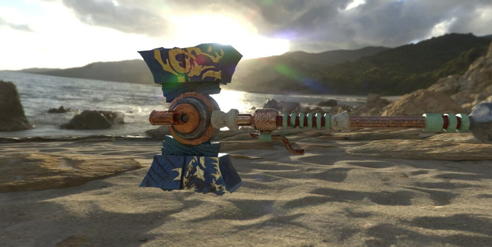
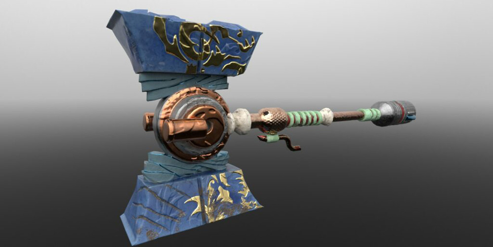
Digital Sculpting / Rendering: Game Weapon Design
Model a weapon of my choosing.
When we began creating the model for this weapon project in Maya, I didn’t know what I wanted to make. My first thoughts went to League of Legends, a video game that some of my friends play, which I haven’t tried! Well, I looked up weapon designs used by characters in the game, and for a change (since I usually settle on delicate, intricate projects) I chose the chunkiest, blockiest weapon I saw as inspiration.
In Maya, I selected vertices and cut lines across the basic polygonal form I began with in order to create more complex shapes. Having multiple views in the workspace (front, back, top, and bottom) was really helpful, as I used an image in the background as a reference for the model’s silhouette. My model looks like this:
In ZBrush, I mostly used the Clay Buildup brush to add details to my model. I also learned to apply patterns in AlphaBrush (where one can download any image and convert the patterns within it to print upon models), for example, by downloading a dragon swirl image and printing it upon the lapis blue hammer part.
I hope you enjoyed exploring my projects for this unit!