Essential Question: Who am I?
For the Reflections unit, we explored topics that interested us individually, each project being personal and distinct to each student. We were able to really tap into what sparked our creativity and we did a lot of self reflecting to come up with unique finished products. This unit included a PSA for Design, a Personal Essay for English, two versions of mandalas, black and white, and color for Digital Media, along with an After Effects video revealing the mandala. Finally, in Digital Media, we made a Core Values video through After Effects.
Through these projects, I learned that vulnerability when creating art helps out the process and finished project a lot. For our Personal Essays, we wrote about past experiences or moments that have shaped the way we are today and what we want to do with our futures. The vulnerability in this essay was able to make each essay very unique to each student
Core Values Video
One of our main projects from digital media was the Core Values Video, where we found creative ways to show off our core values through Adobe After Effects.
Personal Mandala
For the mandala project, we learned how to make a mandala using Adobe Illustrator, where all we had to draw was one line and it was repeated around in a circle. We learned how to make the templates for all the settings for the mandala, and then we started the final project. We were encouraged to include symbols or themes of something personal to us, for example our culture, or values that are important to us.
Personal Mandala Artist Statements:
Black & White Mandala:
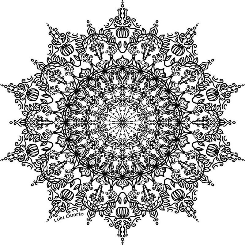
The main value that I wanted to portray in this mandala was personal growth, as that is one of my own core values. I decided to relate personal growth with nature and plants, specifically fruits. Throughout the mandala you can see various fruits, as well as vines and floral designs that are also associated with the fruits.
My biggest challenge going into this project was at first, the starting idea. It took me a while to come up with what I wanted to do, partially because there were so many different options of designs I could’ve done. Once I had the idea, I just started drawing without a defined plan of what I was actually going to draw. This ended up being really fun because I wasn’t so focused on it looking perfect, I was just drawing what I wanted to draw. In the end, I am happy with how it turned out, and working on Illustrator like this was a good refresher for me.
Colored Mandala:
For this iteration of the mandala, I knew I wanted to make it pretty colorful seeing as there are a lot of different elements of my mandala. I decided to keep the same design just in color because I really like my design, and I thought parts of it, such as the strawberries, would be enhanced when in color. I chose pinks, greens, blues, and oranges in the drawing, and I made sure that every color is repeated at least twice to display cohesion despite all the colors involved. Overall, I had a lot of fun adding color to this project!
Before & After Comparison:

Mandala Build Reveal Video:
Reflection:
What I valued from this project was the self refection we were able to do while creating it. We had a god amount of creative freedom in this project because it represented ourselves as individuals. On top of that, it enhanced my skills in Illustrator and taught me new techniques I hadn’t known before.
The Personal Essay
With the Personal essay, we had the decision to to be writing our Common App essay as the Personal Essay or to have them separate. We also worked through a book called “College Essay Essentials”. mainly for the students, like myself, who decided to write the college essay for the project. This was super helpful for me because it provided me a lot of help on my essay, and not only was the essay for english, but also for a couple schools I am applying to, which raises the stakes a lot.
Work in Design
Collage
The first project we started in Design, was a surreal collage in Photoshop, which included what what did over the summer. We were also tasked with picking a genre of art where we had to include components of it in the collage. I ended up choosing Baroque art which features a lot of drama, extreme lighting, and in a lot of cases in its prime, glorified the monarchy or religious figures.
PSA
Our next project was a PSA, where we were able to make it about any topic that was important to us. I decided to make mine about the environment, specifically about the waste problem. This project was really fun because we had a lot of creative freedom and we were able to pursue any issue that is important to every student in Design.
We started the project with a mood board, to set our vision for the project and have a clear head start.

After the mood board, we started our projects on Illustrator. I ended up changing my route here a bit, and made the final product less colorful and bright than I had planned in the mood board.
Artist statement for PSA:
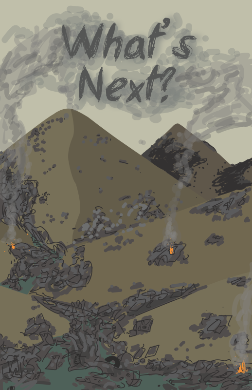
In my PSA, you see a hill scene, yet instead of lush grass and a clear river, the grass is brown, and the river and hills are littered with trash. There are a few fires that have erupted amidst the garbage, with smoke billowing up into the hazy sky, as well as the tagline; “What’s next?”. Overall, this scene is sad, dystopian, and how I feel like Earth will look like in many places if we don’t fix the way we manufacture products and deal with the waste. I was also inspired by the Pixar movie “WALL-E”, with the way it portrays the destruction of the Earth. The colors I chose are mostly different shades and tones of browns and grays, to make the scene feel drab and overall portray negative emotions. The fires are a bright orange to contrast the other colors and so they don’t get lost throughout the trash.
When making the PSA, it was difficult for me at first because I thought I was going to take a bit of a different approach, but when I tried it on Illustrator, I wasn’t happy with it anymore. After sketching more ideas, I found the one I liked and restarted, leaving me with the design that I finished with. I had minimal problems up until I was nearing the end, when I felt like something was off. After asking my peers for advice, and a walk around the classroom to clear my head, I ended up taking out some of the trash to help draw your attention to the tagline a little more, and I deepened some of the colors to increase the contrast since the colors are all so similar to each other. Overall, I really enjoyed this project because of the creative freedom we had in it, being able to take issues that matter to us and express them how we saw fit.
Aboriginal
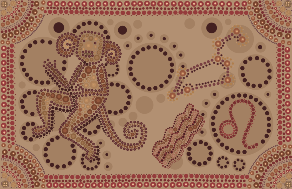
For the next project in Design, we made a piece of art in Photoshop that mimics the dotted style of Australian Aboriginal art. We had to include the symbol and constellation for our zodiac sign, our spirit animal, and several aboriginal symbols. We also had to keep the color scheme pretty muted because they didn’t have access to super bright colors.
Artist statement for Aboriginal:
This project was a version of a self portrait, so the symbols I used I picked because they represented me. I ended up choosing the gathering place symbol to represent one of my core values, community. I also chose the fire symbol and the star symbol. We had to incorporate our astrological signs in this piece, and I am a Leo, which is a fire sign. This is the reason I used the Aboriginal fire sign in the piece, and included the Leo symbol and constellation. I chose a monkey as my spirit animal because I feel like it just fits, and they are very social animals, and I consider myself social as well.
We created this piece on Photoshop, and this made the project a bit harder for me. It was a bit frustrating at times working with the brush tool on Photoshop as it was harder to manipulate the colors and the placement of the dots due to Photoshop’s limitations. I also had a hard time just figuring out the layout of the design and where I wanted all the elements of the piece to go. After a bit, I figured out mainly what I was going to do and with each session working on it I started to understand what I was doing even more. Advice from peers and Ms. P also helped me a lot when I would get stuck and feel like something was off but I couldn’t tell what. If I had to change anything, I would make the monkey even more of a focal point by darkening the dots of the monkey, and highlighting it with the circles around the monkey as well. Other than that, I am proud of how it turned out and had a lot of fun with the project.