Portfolio
Movie Poster

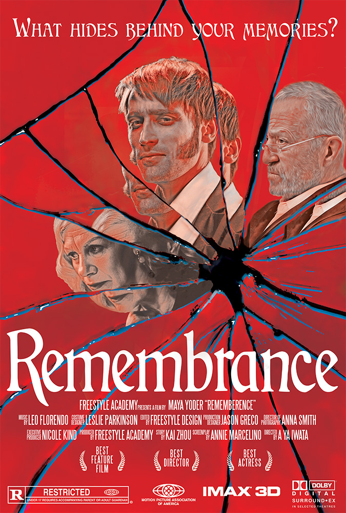
Bryton Davis wakes up in a cult without remembering anything. As he is trying to adjust to his new life, he found out that certain locations, objects, and action can trigger a memory of his past life. As he collects these memories, he begins to uncover the dark truth of the cult as well as his past life. However, this process of retrieving memories begins to deteriorate Bryton’s morals and well being.
When designing the poster, I focused on how I can showcase the main characters in a unique way. In the story, the memories that Bryton receives come in forms of glass shards. Taking inspiration from this, I decided to use a cracked mirror as the base of this design. Using the different Fragments of the mirror, I inserted the protagonist, Bryton in the middle, surrounded by the antagonists, Ernest and Catherine. The split mirror effects represent how each character puts on a facade and presents a different personality in front of different people. I looked for the pictures on a free photo website, focusing on choosing the photo which fits the look of the characters. In order to emulate the cracked mirror effect, I split and moved parts of the reflection. Using Illustrator, I expanded the shapes of the cracks in the mirror in order to create solid lines. I transferred the lines to the photoshop file to add the blue streaks in between the cracks to add contrast. I used a red color scheme across this piece to fit with the horror mood of the story. In order to keep the red theme consistent, I added a solid red blend layer on to the characters portraits. I used a gothic font to match the gothic elements in the story. Lastly, I added movie poster elements, like icons and credits, to finalize by design.
Perfume Packaging

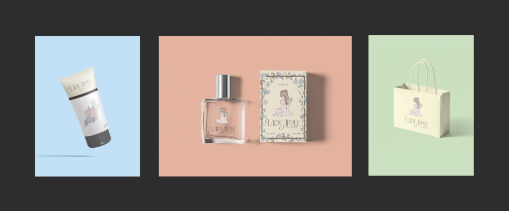
The Pink Lady Perfume from the In Bloom brand is a fragrance inspired by pink lady apples, containing notes of Apple and Jasmine. The logo on the bottle represents a pink lady drawn in an abstract style, attracting butterflies from her floral, fruity scent. To go along with the Perfume, I created mockups of a hand cream and a bag. I decided to do a Perfume design for my product design because of how versatile perfume designs are. I wanted to be able to execute a detailed design representing a certain scent profile. The name and scent of the perfume was developed after creating the design of the logo. The picture of the lady colored in pink reminded me of pink lady apples, and I decided to commit to the scent of apples for my perfume. To give more personality to the label design, I created a border of branches with apples and flowers.
At first I created the logo from a simple sketch and transferred it into Adobe Fresco, where I simplified and colored the design. I chose a font that gives a feminine vibe that matches my logo. Realizing that the label design was too simple with the logo alone, I surrounded the negative space with a border of branches, flowers, and apples. I created a separate design with the ingredients of the perfume for the Hand Cream mockup and used the logo for the bag mockup. I combined all these mockups through a triptych created in Photoshop. I layed out the 3 elements in a grid, centering the perfume mockup.
PSA

In order to send the message about the importance of voting to those who don’t feel the need to vote, I focused on what colors, graphics, and textures I wanted to include in my PSA. The design is centered around multiple mics pointing towards an empty podium. This addresses how the viewers fill this empty space. The microphone is a call to action for the viewers to speak up for their views by voting. To emphasize this empty space, I experimented with negative space around the center, which is the focal point. I used bold shades of red and blue from the American flag. The bold red in the background represents the urgency of this issue as well as the need for action. The blue rectangle at the top balances out the harsh red, and it catches the eye of the viewer. The words “vote” is thoughtfully placed as it captures the main message of the PSA. I used an effect similar to a threshold effect to add value to the microphones, which contrast with the flat colors. This effect also adds a dramatic feel to the design.
To form shapes using Illustrator with strong definition, I relied on paths and shapes which show a clear border between different colors. For the shading of the microphone, I added darker values to where the shadows were on the microphone. This was the hardest part of the project because of the heavy detail involved. I used a reference picture with a threshold effect to use as a base for the graphic. I also struggled with how to fill the space of the PSA. I experimented with which spaces needed to be filled or open. To balance the designs, I moved around the text to fill up the unneeded negative space
Non Freestyle Work
Here are some personal projects!
Risk Website
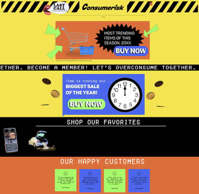
For this project, I responded to the prompt of “interpreting risk” through a critique of consumerist culture and how there is a higher risk to being a consumer than one realizes. We often don’t think twice when buying a product from online stores. Due to the integration and ease of online shopping, the consequences of consumerism are easily hidden. The production of what we buy often involves unethical labor and devastating environmental consequences- or risks. I chose to design a website inspired by maximalist fast-fashion brands to encourage the viewer to buy without thinking. I created graphics that depict the consequences of purchasing a specific item, whether it be risking morals, values, health, or even the future. I reinterpreted these risks as currency within the graphics. My website is aimed at transporting the consumer through a journey that reveals the unsavory truths behind the simple action of pressing “Buy Now.” mayaryoder.wixsite.com/my-site
Self Portrait
This project was inspired by design usage from Korean Pop Music groups. K-pop album packaging communicates a narrative that reinforces the story told through their music. Leveraging my inspiration for this promotional method, I created my own album packaging as a means to advertise myself and experiment with an identity-focused concept.
For my packaging, I practiced using different mockups for each object’s structure and texture. I personalized these elements by emphasizing doodle patterns, favorite colors, photos, and fonts. A challenge I faced was creating a cohesive brand identity that was authentic to my personality, background, and self. By incorporating vivid colors, illustrations, and personal details, I represented a version of myself that reflected my story. The conception for this project aligned with my feelings towards the college admission process; as I advertise my authentic self to admissions, I feel commodified into a product for schools to buy.
<Click on the photo to enlarge!

