Reflections
With the reflections unit being the first one after coming back from school, it was a time of recollection and review. I revisited a lot of applications and processes that I learned in the last school year to create new works I am proud of. In this unit, I had to do a lot of self reflection to produce the projects. It was perfect timing because I had already begun to do that through doing my college applications over the summer. I valued being able to translate the ideas of what make up who I am in to various pieces of art.
Personal Mandala
The first project we created in the Digital Media Class was the Personal Mandala Project. For this project, we used the unique shapes and composition of a Mandala to create an intricate design representing ourselves. The creation of this Mandala was done on Adobe Illustrator. With the help of clipping masks and transformation effects, I created a structure which reflected through 8 sections of a circles to create repetition in my design like ones in a Mandala. Plating around with the brush tool, I drew different elements that were personal to me.


I have always loved the intricate and repetitive designs of Mandalas. When I heard about this project I first wanted to replicate the designs of a traditional mandala, but it was not turning out how I planned. I changed routes and decided to make a Mandala that was more unique. Because of the heavy use of symmetry in mandalas, I brainstormed what things that I liked were symmetrical.
I decided to draw in a more sketchy style to make the mandala more personal to me. I incorporated a lace pattern for some of the borders since it fit perfectly with the mandala structure. I added individual drawings, like the bunny, butterfly, and flower, and drew more patterns around them.
Through this project, I was able to explore symmetry and repetition in the art, which allowed me to make unique designs. Next time, I would like to try and incorporate more traditional mandala elements into my work.
To elevate my previous design of Reflecting Rabbits, I decided to make a colored version. What I liked most about the colored version is how much the lace patterns pop out. Although I included the same design before, it was hard to tell that it was a lace inspired design because of the black outline color. With changing most of the outline to white, you are able to recognize the lace patterns throughout the piece.
I was also able to color in other elements, like the rabbit, cherries, butterflies, and tulips, which helped them standout from the rest of the design. Overall, I decided to use a muted light color scheme to go along with the lace pattern.
In addition to the design, we got the opertunity to engrave our mandalas onto a physical object. I decided to get mines engraved on a pizza board! For my Mandala design for Reflecting Rabbits, I decided to get it laser engraved on a pizza board. I love how the design turned out on the wood. The engraved parts are clean, and the wood texture gives the piece a whole new feel. It was great seeing my art work on a physical object. I hope to use this to make some pizza one day.

Personal Essay
The Personal Essay project in my english class was a way for us to develop our essays to submit for college applications. The concept of writing an essay under 650 words that summarize yourself was difficult to do. There were so many aspects of myself I wanted to write about, but I decided to focus it on me developing the ability to combine my different cultures and appreciating the uniqueness of individuals through diversity. I presented this idea through my journey of acculturation from moving to America, and the personal identity crisis faced through the process.
Recording of my Personal Essay
Motion Graphics (my favorite project in this unit)
One of the Adobe applications I found the most difficult is After Affects. So you could imagine how I felt when I heard that the next Digital Media project was focused on learning the effects used in After Effects. To my surprise, this ended up being my favorite project in this unit. Within this project, I was able to discover new ways to use After Effects, and was introduced to the various effects used to make videos more interesting. Because I was always interested in how effects in movies, TV, and social media are created, I was excited to finally be able to use it for my own works.
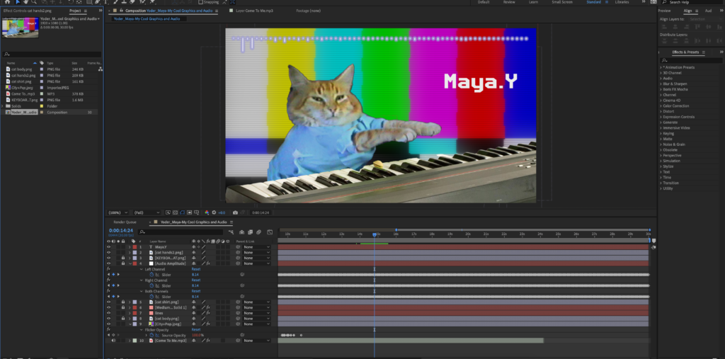
One of the main effects I have seen that I have always wanted to try was rotoscoping. I was always impressed by how elements like shape were able to be cut through an object of a video. I learned this effect through one of the tasked projects, using a video of a lady walking excitedly while listing to music.
Aside from rotoscoping, we learned how to use the ability of sound recognition to sync to the movement of the graphics. By using the sound waves of the audio file, After Effects creates keyframes to match the different levels throughout the audio, creating a synced movement.
Using this effect, I wanted to creatively implement this into my own video. Inspired by a video on the Internet of a cat playing a piano, I created a video of a piano cat that hit the keyboard in connection to the music I chose. I used the rotation keyframe and connected the movement to the Audio file, which triggered the cat to hit the piano whenever the audio was loud. I wanted to implement a city pop vibe to the video, so I used a synth-y song with a vibrant backround og the city. Then I added a VHS effect to perfect the vintage look.
I really like how this video turned out, and I think it is funny and cute.
Later we learned how to create simple moving graphics in After Effects, ranging from bubble pops, squiggly lines, star bursts, and pen movements. Taking in some of these elements I created a video of fireworks in the sky. I used the pen movement effect to mimic the firework flying up in the sky. Then I used the star burst effect which show the firework blowing up in the sky. I found a firework exploding sound effect to use for when the firework explodes. Because fireworks remind me of new years, I decided to make this video into a moving new year card. I added the words “Happy New Year” in the bottom, and implemented the pen tool to make it look like the word is being written. I added a glow effect to make it look like lights illuminating the dark (I also added this on the fireworks). I added a song that reminds me of new years to complete the video.
I liked how this project turned out, but for the next time, I hope I can make the fireworks look more realistic. I plan to send this to people in new years.
In this assignment, I learned what types of effects I could create in After Effects. I learned how important timing and speed is for video effects and how much of a difference it can make when you pay attention to it. I am excited to use these effects, especially rotoscoping, to edit future video projects.
DESIGN
In our design class, we used the applications we learned how to use last year to develop new projects. The two main applications we used in this unit were Photoshop and Illustrator. The main purpose of this unit was to reflect on our selves, especially in this time of college application season. We created work in design that aligned with our interests, values, and showing our selves through our art.
PSA Design
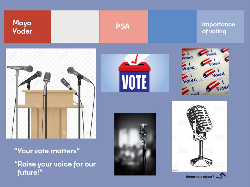
The first project we created was a PSA(Public Service Announcement) about an issue we care about.
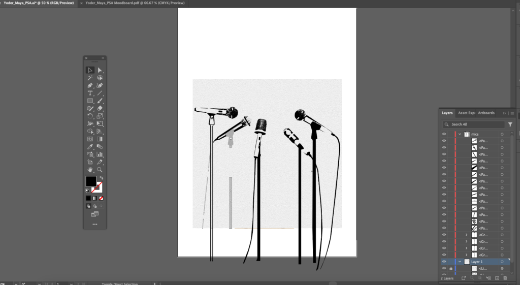
When creating the PSA we had to take special attention on what elements to add to our design to visualize our message. In my PSA I focused on color, shape, and texture the most. Because my PSA was on encouraging people to vote, I used the red, white, and blue color scheme to invoke a patriotic feeling for the viewer. To show the urgency of voting, I used sharp shapes for the typeface as well as the shading for the microphones.
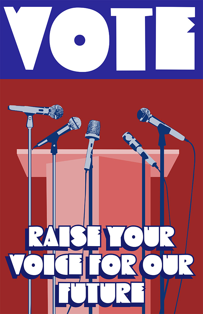
Using Illustrator, I crated shapes using the pen tool, including for the shading for the microphone. This was the most time consuming part of this project. I made sure that the darker shapes were more prominent in the shading to add more detail to the microphone.
I used richer shades for the color to integrate an intense look to the overall design. I made sure the text “vote” was the first writing the viewer sees by increasing the size and placing it on top. I made sure there was negative space above the Lectern, showing that the viewers are the one to use their voting rights to voice their vision for the future of the country.
Overall, I am satisfied with how I was able to use stylistic elements in this design to convey the message. One thing I would change in this piece is to change the coloring of the lectern to fit the threshold effect shown in the microphone.
I hope this design encourages you to vote in the next election!
Artist Statement
In order to send the message about the importance of voting to those who don’t feel the need to vote, I focused on what colors, graphics, and textures I wanted to include in my PSA. The design is centered around multiple mics pointing towards an empty podium. This addresses how the viewers fill this empty space. The microphone is a call to action for the viewers to speak up for their views by voting. To emphasize this empty space, I experimented with negative space around the center, which is the focal point. I used bold shades of red and blue from the American flag. The bold red in the background represents the urgency of this issue as well as the need for action. The blue rectangle at the top balances out the harsh red, and it catches the eye of the viewer. The words “vote” is thoughtfully placed as it captures the main message of the PSA. I used an effect similar to a threshold effect to add value to the microphones, which contrast with the flat colors. This effect also adds a dramatic feel to the design.
To form shapes using Illustrator with strong definition, I relied on paths and shapes which show a clear border between different colors. For the shading of the microphone, I added darker values to where the shadows were on the microphone. This was the hardest part of the project because of the heavy detail involved. I used a reference picture with a threshold effect to use as a base for the graphic. I also struggled with how to fill the space of the PSA. I experimented with which spaces needed to be filled or open. To balance the designs, I moved around the text to fill up the unneeded negative space.
Aboriginal Art
Aboriginal Art are paintings made by aboriginal Australians that tell a story or tradition made with lines and shapes. When seeing these artworks for the first time, I was fascinated with the variety of symbols used that work to represent a story. In this project, we were tasked to create our own aboriginal art and stories that connected to our personal characteristics.
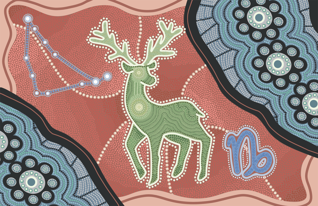
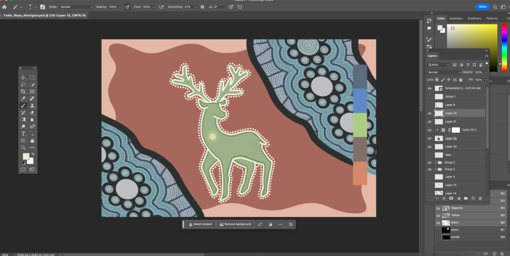
We first decided the elemnts we wnated to present in the painting. This includes your spirit animal, astrology sign, astrology constelation, and a choice of various aboriginal symbols. The color pallete I chose is a tsplit complementary palette which is muted. Because traditional aboriginal painting were created with natural hues and paints, I though it was important to make a muted color palette. The dots present thrughout the piece was created using the brush tool, specifically the hard round brush. Because the brush used was the same, a combination of lines and dots are used to add variety to the texture. The different size of dots also added to create a cohesive pattern with more variety. Drawing the dots was the most time consuming part of this project, and I encountered lots of hand cramps.
Artist Statement
Related to the astrology theme of this assignment, I wanted to incorporate the aboriginal star symbol somewhere in the piece. To incorporate the deer, my spirit animal, I created a scenery of a deer walking across a river. Inspired by the Japanese word for milky way, Amanogawa (meaning Heavenly river), I created a river filled with the symbol of stars. With this, the scenery takes on a new meaning of the deer gazing at the milky way, where all life resides. Within the deer, I used the aboriginal symbol for a traveling track which shows how the heart and the brain of the deer are interconnected. The wavy pattern which is in the shading of the deer represents the aboriginal symbol for blood which runs inside the body. The constellation and the sign for capricorn are placed on the side to balance the negative space. The overall piece is a representation of how all life should be appreciative of the galaxy we live in.
The overall piece used the dotting technique used in aboriginal art, with incorporations of lines as well. I outlined the main symbols used in the painting, including the deer and the river, and filled them with different colors of dots along the way. I focused on creating different dotting techniques for different symbols. The most challenging part of this piece was figuring out how to arrange the dots to make them look uniform. To overcome this, I studied the dotting techniques of aboriginal painters who created dots closer together and sometimes in certain shapes. With this, I was able to make the painting look more clean.
Reflection
The reflection unit in our design class provided an opportunity for me to do more traditional art and design projects, compared to the more interdisciplinary projects we create though freestyle. Because it was a different project compared the usual projects, I had the ability to change my approach to my art process. For example, the Aboriginal Painting allowed me to be more flexible with how I incorporated different designs through my process rather than planning everything out from before hand. With the PSA project, I had to visualize the important message I wanted to convey into different elements like color, texture, and shape. I believe this experimentation has helped me see new ways of approaching my art.