NARRATIVE 2
ENGLISH
The world building unit in our English class was split into two parts. In the first part, we were assigned to discuss a social/ political topic of our choice through a research essay. I decided to do mine on the effects of screen time on young children’s development. I have taken interest in this topic because I feel that screen time had somewhat of a negative effect on my development as a child and teen. I was also interested because of the recent discourse of “iPad Kids” online.
For this paper, I first had to develop my thesis: “In order to support children’s socialization, communication, and problem solving skills, parents of young children should focus on monitoring, being present, and curating active screen content instead of limiting it.” For this thesis, I focused on approaching this issue in a critical way while also providing ways to alleviate the effects of it. While doing my research, I used many government sources and papers, and I annotated them through Diigo.
For the second part in our world building unit, we took part in a group project of creating a world within an original narrative. For this project, I collaborated with my friends Annie and Kai to create a thriller cult story in the medium of a video game.
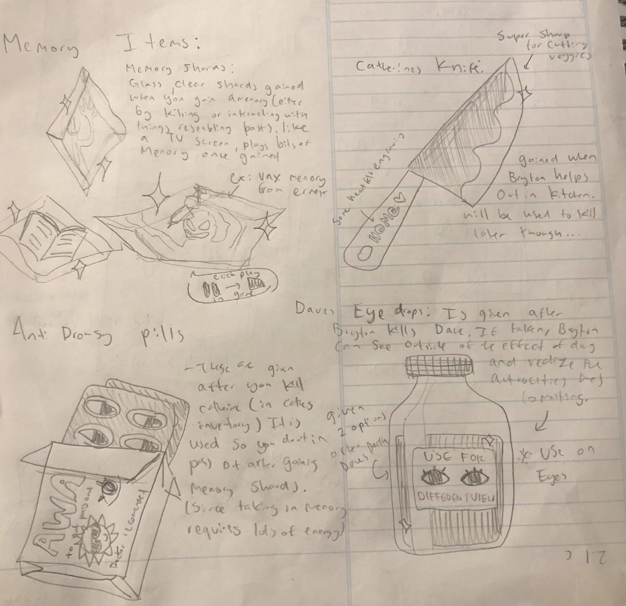
We created a narrative treatment of the story. Our logline was “A wary cult member wakes up with no recollection of his past, and as he desperately tries to recover his memories he stumbles upon a sinister truth about his own role in a series of disappearances.” In the story, one approach we wanted to take was to have a morally gray protagonist that becomes the antagonist at the end. We decided to set the story in the cult so it would be harder to predict who the antagonist would be at the end. We created four main characters in our story. Bryton is the main character, who wakes up one day in the cult with no memories and tries to get them back. His best friend Dave is the friendly sidekick who, despite not knowing Bryton’s true intention, helps his friend with his goals. The cult leader, Ernest, is a charismatic father figure in the cult who prioritizes his “family’s” well being. Catherine, Ernest’s wife, is the mother of the community who helps lead the kitchen staff.
Because this story is told in the form of a video game, we made sure to emulate the style throughout the story. Although the player is playing through the eyes of Bryton, we made sure to give them choices to make along the way. This was hard to implement because of deciding how to make the overall story come together with the different choices. The important choice the player takes is in the end, which decides the fate of the story. In our story, we also added items that you can gain through playing which becomes important in order to progress throughout.
Although we faced problems while creating the story, I am proud of how it came together in the end. To conclude this unit, we presented our story like we were pitching our idea to a group of Nintendo executives. I had a great time with the presentation and watching others present their original worlds as well.
DIGITAL MEDIA
Surreal Composition
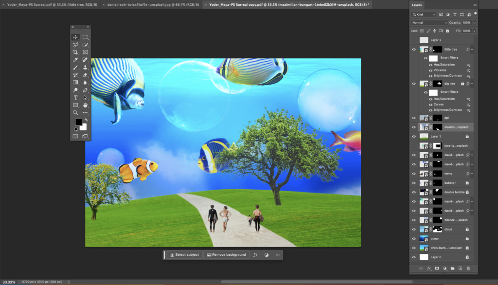
To start off with the world building project in Digital media, we were tasked to create a “surreal composition” of a world we create through photoshop. In order to do this, I used lots of editing techniques like masks, blending layers, and smart objects. We made some practice images before the main project.

When thinking of world building, I first thought of the setting of Spongebob Squarepants. I found the idea of the ocean floor becoming its own civilization fascinating. I decided to make my own twist of this. In my interpretation of a world under the sea, I decided to combine bright colors and greenery. Taking inspiration from the Frutiger Aero that came from 2000s digital styles, I incorporated a saturated green and blue color scheme throughout my piece. I also included bubbles in the sky to give the illusion of being under the sea.
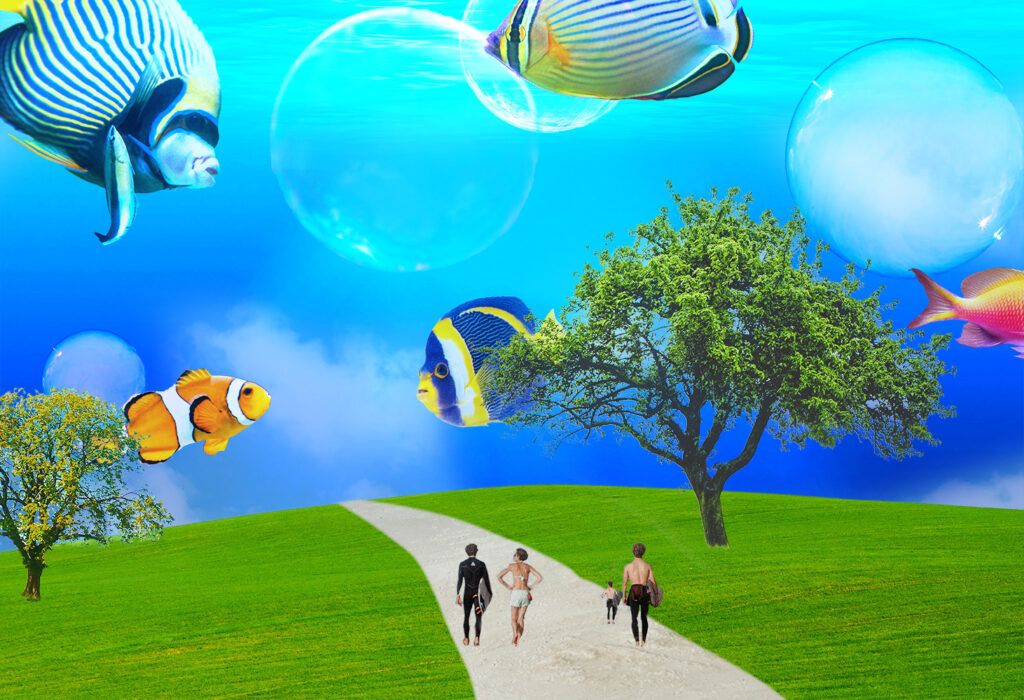
In order to create this project, I used a variety of photoshop tools. The technique I used the most was using a mask to cut out different images to put on to the main image. With the mask, I was able to add and delete parts of the image to make a more seamless blend. I used photoshop blend modes. like “hard light” to make the bubbles in the ocean seem more natural. In the future I would like to learn more techniques to incorporate into other colleges.
3D Layering Art
The main project for this unit in Digital Media was the multi layered art project, where we were given a choice to produce a layers wood art, a light box, or a wood ring art. I decided to go with the 3D layered wood art.
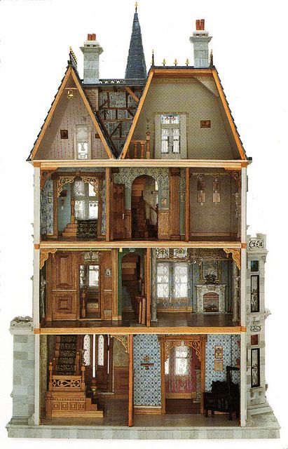
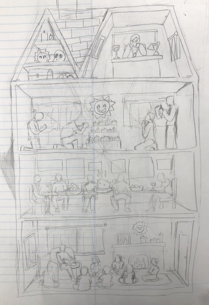
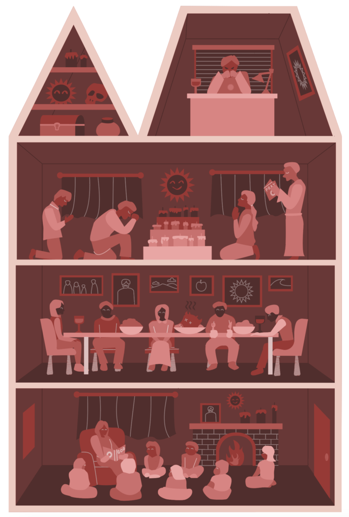
For my world building wood art, I decided to create the house of the fictional cult featured in our story. When I heard we were creating 3D art for this, I wanted to create a doll house-like structure with the wood. Although it won’t be built like an actual doll house, I thought I could replicate that effect through the layering of the wood.
In the design, wanted to showcase a narrative, where the house is controlled through the cult leader and his ideology. In the first story, the older cult member is educating the young kids on the cult’s history and lore. In the second story, the cult is having a happy family meal. On the third story, members are performing a ritual and praying.On the top floor is where the cult leader’s (Ernest) office is, where he is thinking about his plan to take over the world. Next to the office is the storage room full of random cult equipment. Throughout the house, you can see the sun which is the “god” of the cult. You can also see multiple photos of Ernest. It was very fun to design the different rooms of this house.
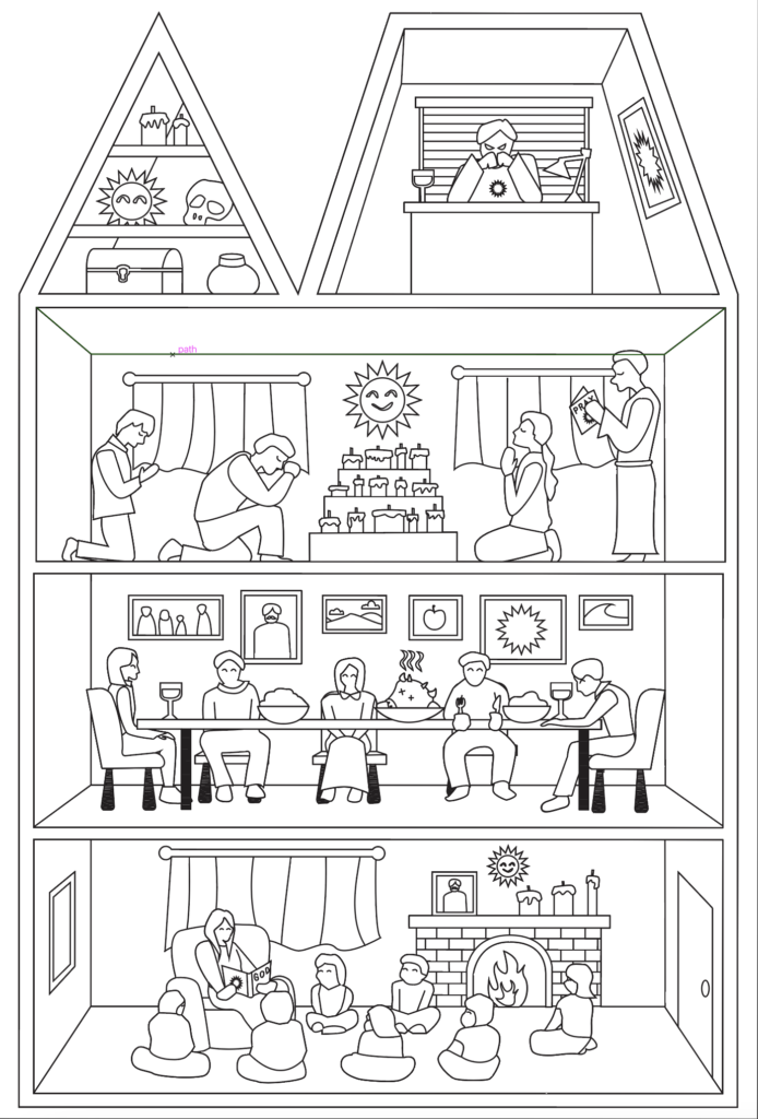
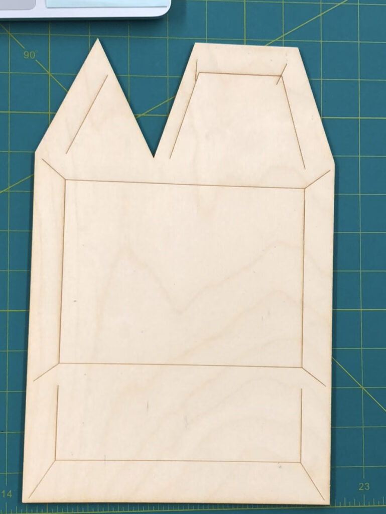
With creating the wood art, the hardest part was figuring out how to layer all the wood pieces together. Because I added a lot of small details, I needed to make sure that I got the order of the wood pieces right. During the printing process, some parts got lost since they were too small. I did what I could with the scraps I had and made it work. I used the pathfinder tool and grouping feature a lot in order to organize the different pieces.
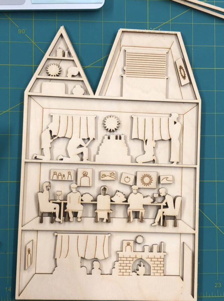
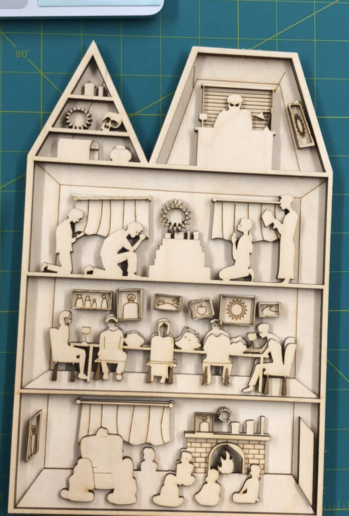
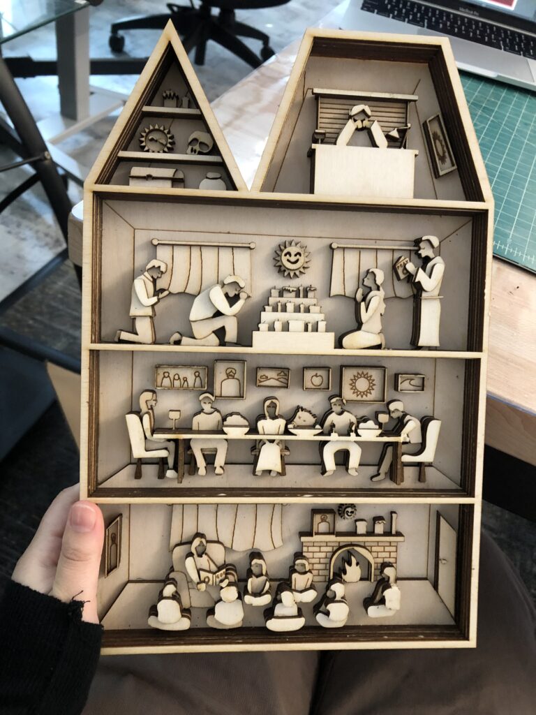
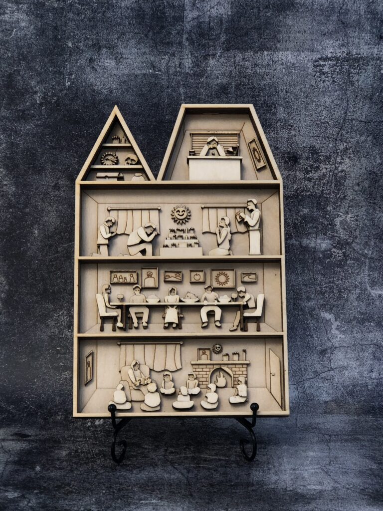
Because I don’t usually work with wood when creating art, I thought that this was a value experience in learning how to use a material I am not familiar with. I hope to use more unique art mediums in the future to experiment with.
Design
Our Projects in design were aligned with our world building project in english. We had 3 main projects in total where we created product packaging, a book cover, and a movie poster.
PRODUCT PACKAGING
The first project, the product design assignment, was the only one which wasn’t aligned with our world. For my project, I decided to design the logo and packaging for a fake perfume brand called “Lady Apple”. I chose a perfume because I love the unique ways that the perfumes and the scents are presented in the packaging. I have also noticed that Perfume Logos are more creative and conceptual with their designs. I wanted to emulate that style in my own work.
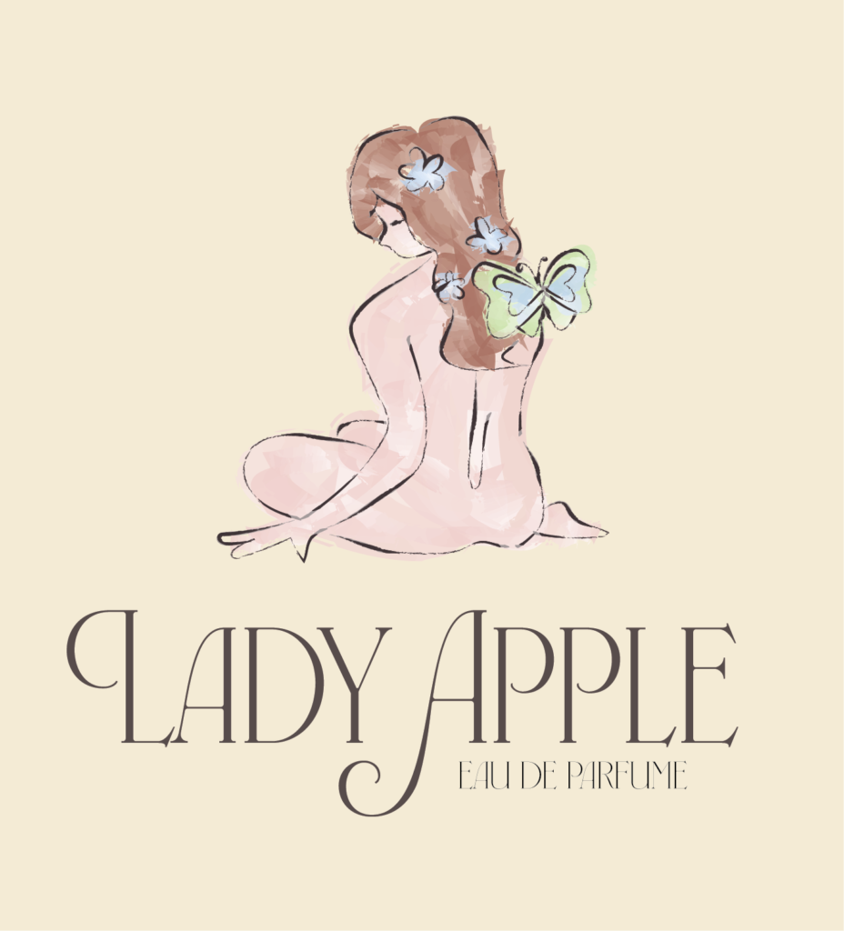
My focus for this project was incorporating a story and identity behind the perfume. For the advertising technique, I used the snob appeal because it is common within perfume advertisements. For the scent, I wanted a young and feminine scent that teens and young adults can use for everyday life. The main notes in this perfume are apples (specifically lady apples!) for the sweet scent, and jasmine for the relaxing/casual scent.
Taking inspiration from the name “Lady Apple” I designed my Logo around the idea of a lady that… is like an apple. Because of her sweet and fresh scent, there are flowers growing on her and butterflies flying around her! I decided to make the style of the drawing a little abstract. I wanted to emulate Monet’s style of painting, so I decided to use a painting brush in Illustrator when coloring in the logo. I decided to use light pastel colors for the color palette, and I used a split complementary color combination. I used natural colors that matched the scents profile (like red for the apple).
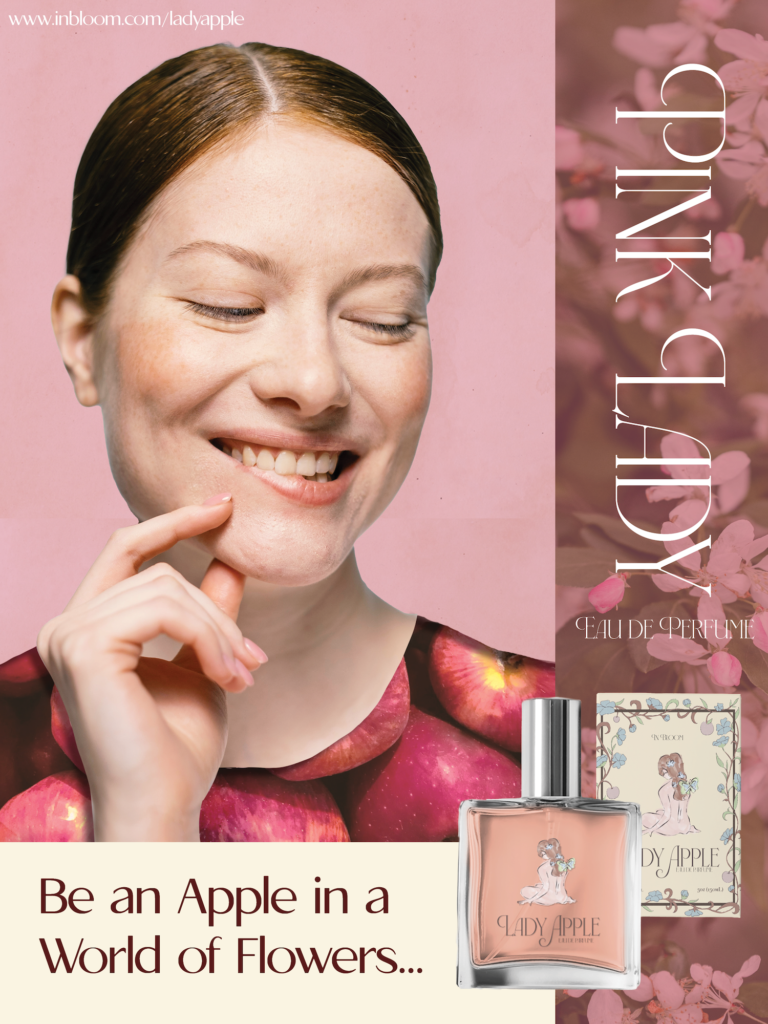
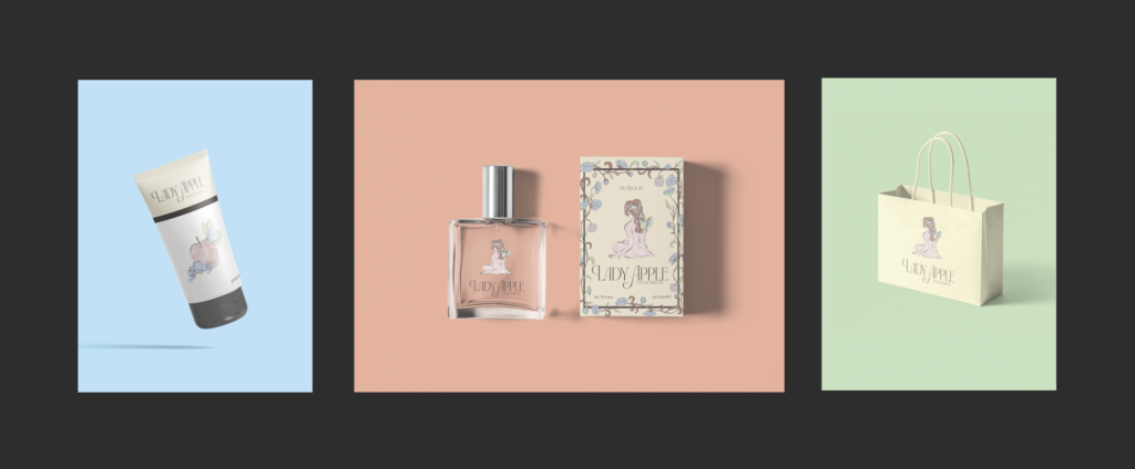
For my products, I chose a perfume bottle and the box, a hand creme, and a little gift bag. Although I used the same logo that I did for the perfume in the gift bag, I wanted to use a different image/ design for the hand creme. Using the same colors, I decided to draw an apple in place of the lady in the logo. It fits with the theme of how the lady smells like an apple.
After creating the products, we had the assignment of creating a magazine spread to advertise our new products. I loved this part of the project because I have created many magazine spreads before. I looked up examples of perfume magazine advertisements to study what I should include for my design.
In order to call out to the general audience of this perfume, I put a photo of a happy looking young women as the main focus of this advertisement. I decided on a monochromatic color scheme that matched the color of the perfume. To fill up the solid colors, I added patterns of the key notes onto the side and on the women’ shirt. I added a shadow under the shirt to make it look like it was cut out. To surround the women, I added boxes to enclose the space. In those boxes, I added the tagline, the title of the perfume, and then the perfume itself on the corner.
Book Cover
After creating the world building narrative in english, we were taxed with creating a book cover for our story. For this project, I wanted to use a simple illustration that emphasized shapes and solid colors rather than detailed images. My favorite types of book covers are ones that are a bit weird since it makes you curious and want to read the book. I knew that I had to include a weird visual as the main focus.
For the focus of the front cover, I decided to put a pill box. I chose this because in the story (spoiler!) the cult leader uses drugs as a way to control the members. The drugs are injected into the food the cult members eat, and it makes them forget their memories. What makes this pill box weird is that eyeballs are inside where the pills should be. The eyeballs are used to represent Bryton’s point of view. Because of the difference in the new dose of drug he received, he was able to see his past memories. This drug is what made Bryton see his cult differently.
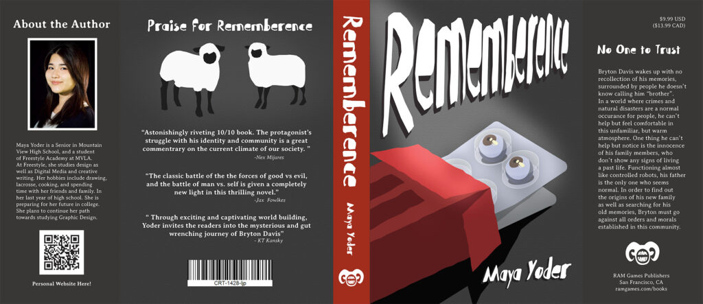
For the color scheme of this book cover, I used a red monochromatic color scheme, but focusing on grays. I decided to use red for the focal points of the cover, like the spine and the pill box. I used Illustrator to create the image of the pill box as well as the sheep in the back cover. To add a unordered look to the images, I used a slight roughen effect. For the main text, used in the title, I used a distorted font that matched the horror genre style. For the title in the front cover, I wanted to make it look more distorted as well as fill in the negative space. I adjusted the perspective of the text and stretched the front part of the title. This created a cool effect where the letters got tinier as they line up. I added a drop shadow to the text as well as a regular shadow to the pill box to create some dimension. I wanted more of the focus to be on the pillbox, so I added a focused lighting effect using photoshop.
For the back cover, I added some praises for my book. I used some praises from world renowned book critics (my friends) to show how great my book is. I added the illustration of the sheep on the top to fill in the negative space as well as make the back cover more interesting. I added a bar code at the bottom.
For the side flap on the back of the book, I included an about the author page. I had my friends take the photo. I added an author’s blurb explaining who I am, and then added a QR code to this website. For the side flap on the front, I added a summary of the book to hook the possible readers into reading the book. I added a reasonable price to the book and the publisher details. I created the logo for the publisher using Photoshop.
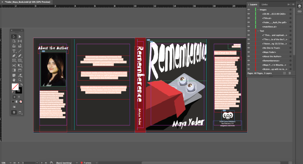
Although it was hard to come up with what visuals to put for the front cover, I am very satisfied with how this turned out. I am excited to see this printed and used on an actual book.
Movie Poster
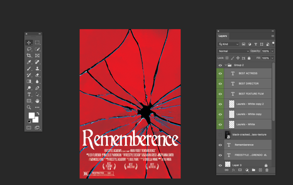
Besides the book, we also had created the narrative into a movie. I have never designed a movie poster before but I was excited, especially with the genre of my narrative world being thriller/horror. The main thing I wanted to focus on for the poster was how I can present the concept of a movie through a metaphor. I decided to use a cracked mirror to compose the overall design. This is because in the story, the memories that Bryton must collect are in the shape of glass shards. I cam up with the idea of the mirror metaphor during my book project, but I decided to save it for the movie poster since it fits better under this medium.
For the color scheme of the poster, I used a red monochromatic color scheme just like the book cover. However, this time, I wanted to make the colors more saturated and vibrant. Through looking at examples of many horror film photos, especially the older ones, I have noticed that they often have high contrast on the overall image. I decided to incorporate this element into the overall colors.
Using a photo of a cracked mirror, I edit out all the reflections to have a cracked mirror with solid colors only. After, I brought a copy of the cracked mirror photo on to Illustrator, then used image trace to expand the shape of the cracks. I took the expanded shape and transferred it to my photoshop file where I placed on top as a blending mode layer (vivid lights).
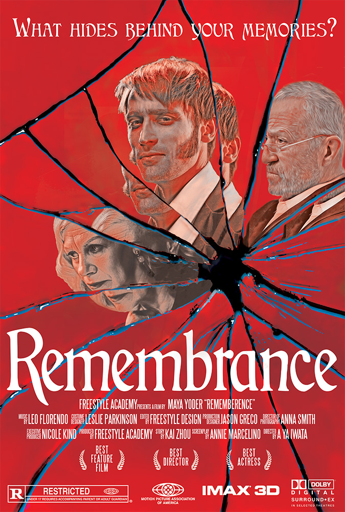
The design was based on the idea that in the different broken pieces of the mirror, you could see a reflection of the main characters. I decided to use Bryton, Ernest, and Catherine for the characters to add. This was fitting because all three of these characters had different personas they show in different situations to hide their true intentions. The broken mirrors represent how their personalities are split apart. Because Dave did not fit this theme, he was not featured in the final poster (sorry Dave). In order to incorporate the characters into the mirrors, I used the mask tool to cut out the parts that I needed in the reflection. With the mask tool and the brush, I was able to correct small details during this process. In the photos of the characters, I adjusted the highlights/shadows of the photos, which helped add the old film style filter. I added a oil paint effect to smooth out the photos like in the vintage posters. Lastly, I added a red color blending mode layer on top to match the color scheme.
In the end, I added different elements of the movie poster, like the credit block, logos, title, and tagline. I used classical looking fonts because they reminded me of the setting of the story. I am very pleased with how this turned out. I think it was one of my favorite projects of the year!
