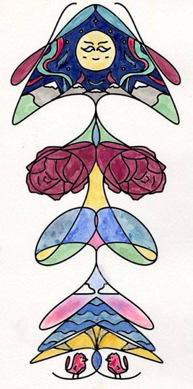
Cursive Name
As a transition between Reflections and Narrative, we got to do a little painting project for the sake of art. The goal here was to write my name in cursive, then hide the fact that it was my name. First, my digitally drawn name was reflected vertically to create symmetry, then it was rotated sideways and details added. Sideways you can better see the word Noam in there.
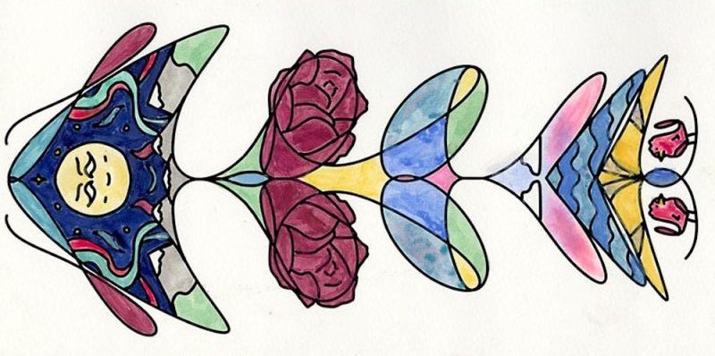
The design was the printed and colored in. I got to try different watercolor techniques, across the different shapes. I also had fun being inspired by the likes of the half moon Google Doodles, and the canary from the game Bits & Bops. Finally, I’m pleased with how I held a color palette together while still keeping the content varied.
Product Logo
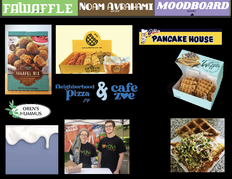
The brand project was my first project that let me connect multiple final parts to build on top of each other, and the first part of this project was the logo. My brand, “Fawaffle!” takes the food trend of putting falafel mix into a waffle iron, and turns it into a frozen product. I started by finding inspiration for different aspects that I wanted to draw from, and put them all on this mood board. This was a place I could reference other logos, or colors, or fonts that I was interested in throughout the project. I primarily wanted to highlight the Mediterranean influence and the shape of the waffle.
After sketching drafts of the logo, and combining different elements, I digitized the final logo:
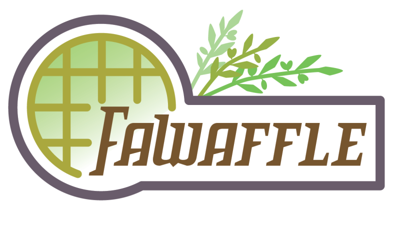
I made my logo and label in Adobe Illustrator. After sketching a few logo ideas, I combined my favorite parts of each. This was a good way to keep me from just using the first design I had as-is. It was hard getting a font that would be square enough to work with the grid of the waffle, and I manually extended parts of the letters as shapes to preserve the thickness of the font.
Product Label & Mockup
Next, I made the actual product’s box. I had to consider the regulations requiring certain information, as well as the appeal to buyers. I leaned more towards greens for its positive and natural connotations, with the lighter colors being creamier for warmth. For depth of the background, I added a lantern tile pattern over everything. The picture of the actual fawaffle was very difficult not because of the colors, but because most stock images of waffles I had access to featured additional elements like powdered sugar or strawberries. It seems people want to be classy on the internet!
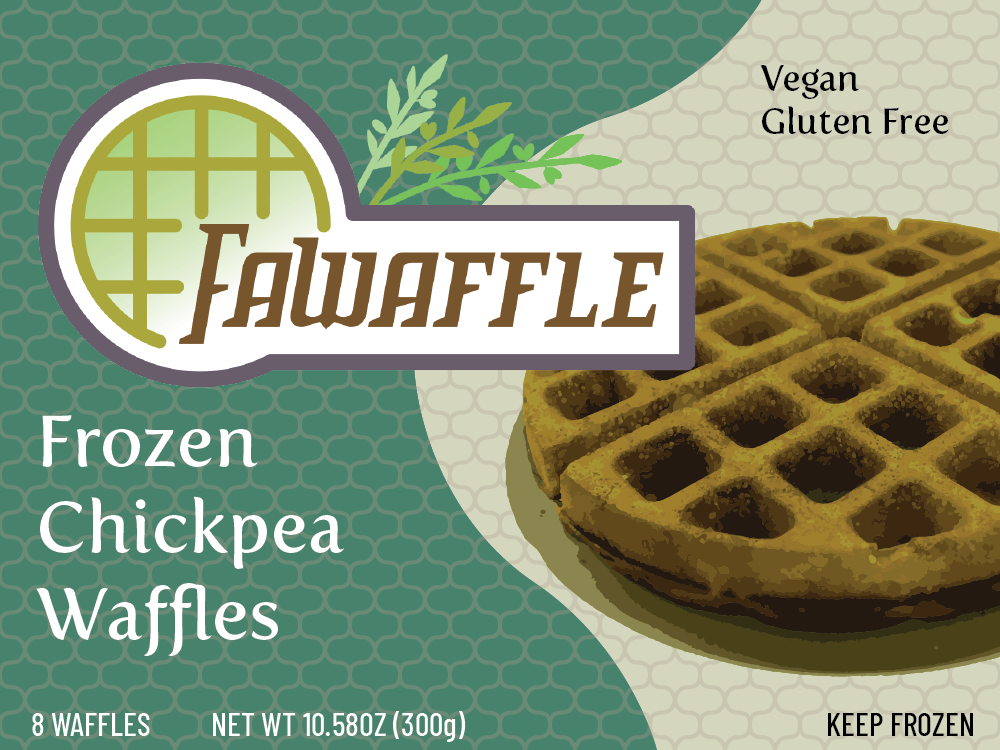
I got the sizes of the faces of the box I needed from a mockup site, then imported the final images for the box.

I then made a label for my box. I researched the requirements for food packaging, and made it in Illustrator as well. Making the label made me revise my logo colors for contrast on a background. Although real pictures of fawaffle exist, mine on the label is a recolored normal waffle. The last thing I added, for texture, was a subtle lantern tile pattern over the background by creating copies through transformation. The mockups were made on a website called placeit. It asked for very specific dimensions, and then sometimes stretched the images after, which was frustrating, so I would not recommend it.
Product Triptych
I made two more mockups on the website, in this case for merchandise. I chose a t-shirt and a cup, and added the logo. All 3 mockups were spaced out nicely and I tried my best to make them cohesive together.
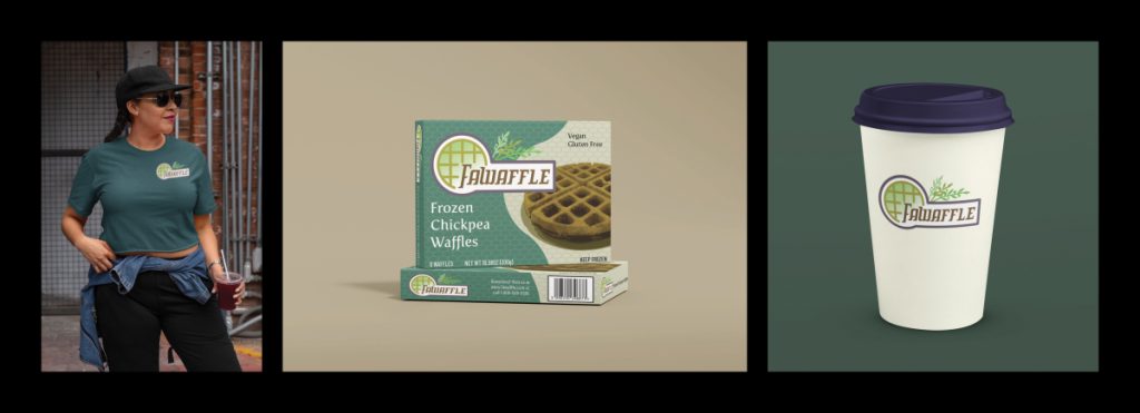
My product is a box of frozen waffles, except the waffles are made of falafel. This started as a silly family debate on whether falafel in the shape of a waffle would be called fawaffle or walafel. Since the answer is obviously fawaffle, I saw in this assignment an opportunity to support my position. Initially, this would have been a cafe (not unlike a real place called Fawaffle that was open briefly in Egypt), but since we were making a product mockup, I remembered how I used to have waffles as a child and made a frozen product. We also had to make merchandise, and mine is slightly still geared toward a cafe, with a cup and shirt, but if my product were to sell unreasonably well then it could happen.
For the triptych, I used photoshop to put my final mockups side by side. I had to change the colors on one of the backgrounds because it was too bright, and now it has a cohesive look.
Product Magazine Ad
Finally, I created a one-page magazine advertisement for Fawaffle! using Adobe InDesign. We studied advertising techniques, and I decided to focus on transfer and common appeal. From the plain kitchen I faded to a Mediterranean beach, symbolizing how the product would supposedly transport you there. The plated waffle after color grading was composited on the table with perspective warping and an added drop shadow.
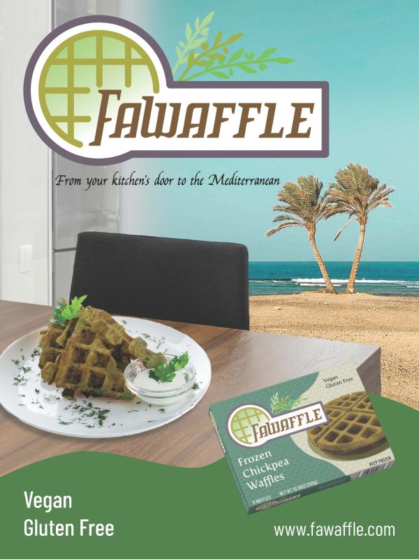
The brand project was my first project that let me connect multiple final parts to build on top of each other. It was gratifying to carry over considerations and feel causality for everything I made here.
Book Jacket
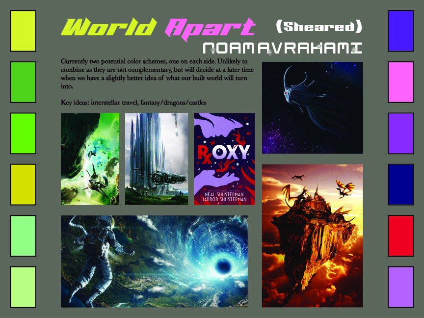
Tying in with our world building project from English, we made a book cover based on our story proposal. I started by collecting concepts and assets I wanted to draw inspiration from in a mood board. At this point in the year, I got better at arranging my mood boards more aesthetically. There are two color themes because I wasn’t sure yet where it was going, but I initially wanted a dragon in space.
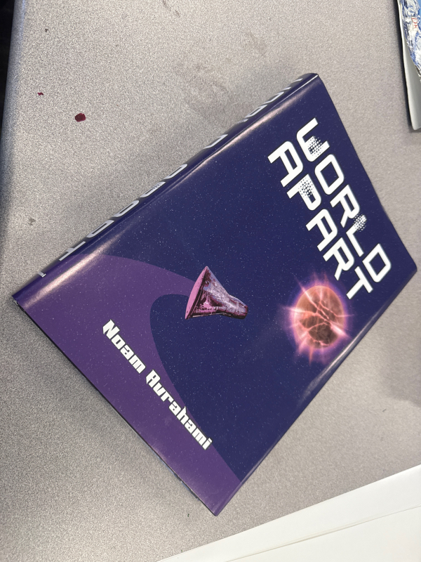
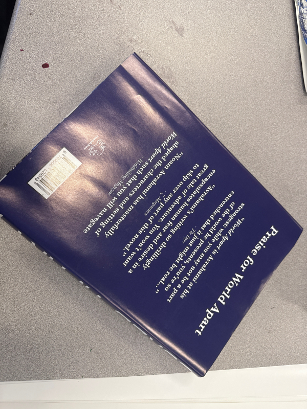
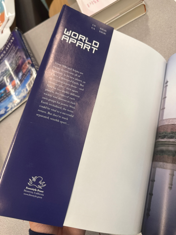
The book jacket involved both the creation of the image, which I did in Photoshop and Illustrator, as well as creating the layout in InDesign and writing blurbs and quotes and doing everything I could to make it look realistic. We lost the dragon in the world building project, so I opted to go full space and use a little capsule. We also had to learn new Photoshop techniques, so I learned how to manipulate images to create the exploding planet on the cover. This ended up connecting to the exposition better than I had initially expected!
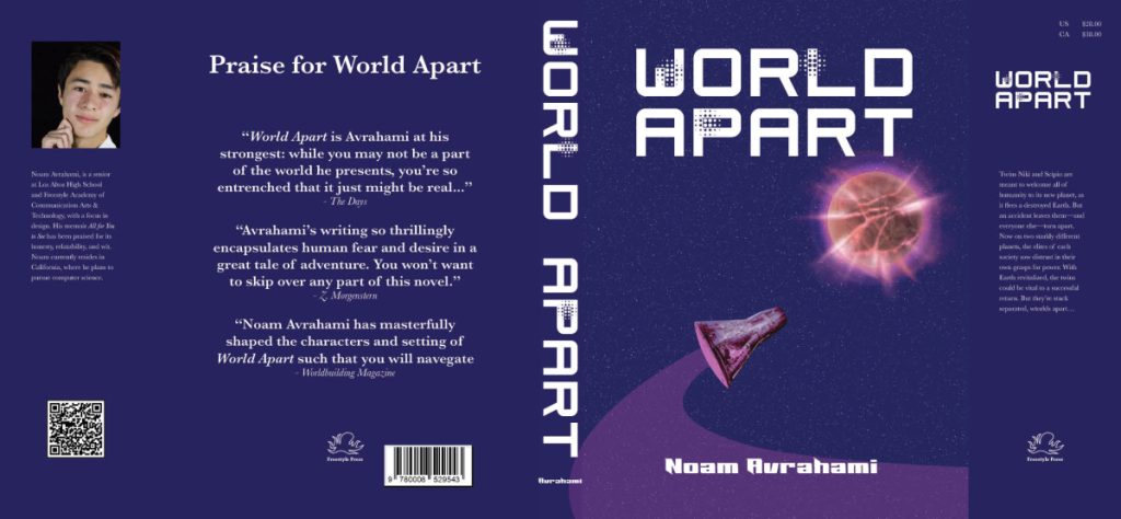
When we made our book jackets, we had to make them a very specific size so that they would fit on books that we brought. Freestyle has good printers, so the final look when printed and cut is professional.
Movie Poster
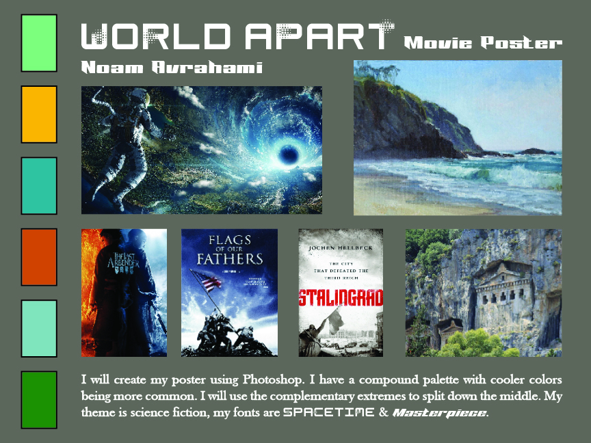
Sometimes, books get adapted into movies. My group’s world building project was a TV show, so the movie poster was more fitting. I started with a mood board, which collected bits for inspiration and reference. While I was following the book jacket, since I wanted a landscape this time, I looked to demonstrate both the colors and the background elements I would feature.
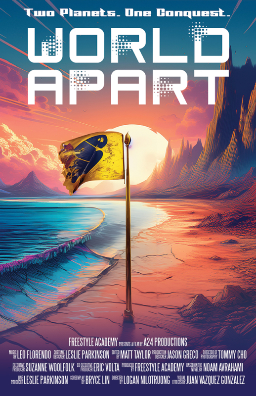
My poster was created in Photoshop, and aimed to be more eye-catching than the book cover, as well as showing just generally a different part of the world building. I opted for contrast in landscape, as by this time it was more fleshed out. I kept the fonts for the title, but ambiguously changed the decorations on the lettering because I thought that was in the spirit of adaptation.

My movie poster is based on my world building project from English. In a distant solar system to which humanity had to evacuate long ago, the leaders from two planets race to conquer a third, ideal planet. The poster features two contrasting landscapes representing the two contrasting exoplanets, which meet in the middle. In the centerpiece there is a flag representing space conquest with a bird on the flagpole.
I created my movie poster in Adobe Photoshop. First, I composited stock photos for the landscapes and sky together. I adjusted the colours with overlays, adjustment layers, and blend modes. This allowed for the transition between the colours and the environments, because the sand on both sides is from the same image. I then composited a flag with the canary to ease the transition and have a focal point. Finally, I drew in shadows to keep it looking realistic.
This project challenged me to think critically about the composition of my poster. I wanted contrasting colors between warm and cold, and this was helpful for visual balance. Still, I wanted some sort of asymmetry, which was achieved with the cliffs. I ended up making the flag a bright yellow and leaning into the cool side to make it stand out more and prevent the balance from shifting too much to the cliffs. This project also taught me more about blend modes, since I needed them to be the most effective I could be with the colours.
Prompting Software
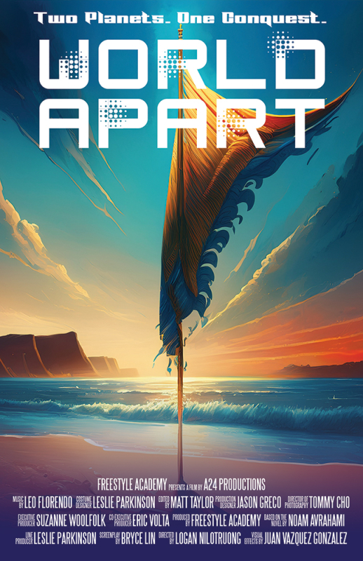
We tried out Adobe Firefly in order to practice prompting, since prompting seems to be the future, and also because we wanted to compare to our work. We wanted to see how close we could get to our original vision and actual posters. Firefly absolutely hated the asymmetry of the split down the middle to the point where I had to use generative fill to get the flag in without exceeding the character limit. I also out of curiosity asked a LLM chatbot to examine the original movie poster and generate a prompt to recreate it. It also was not really good with the split of the colors. I added all the text over after for consistency, adding text was not part of the exercise.
Reflecting on Design
Overall, I really appreciated how much design let me connect the projects together while exploring a lot of different software. Looking back, I can see my awareness increasing, just generally with composition and increasingly effective use of space and contrast. I got a lot more comfortable creating and considering, which is great because that’s exactly what I set out to do when I applied for Design.