Mandala
Our first assignment in Digital Media was making a personal mandala in Adobe Illustrator. We learned to make the patterns we drew repeat symmetrically. The assignment then became about creating fine details with meaning. I also got my mandala laser-engraved in bamboo, and it was printed in color as well.
If the images do not display below:
On a Mac, press ⌘ + (plus) then press press ⌘ – (minus)
On a PC, press Ctrl + (plus) then press Ctrl – (minus)
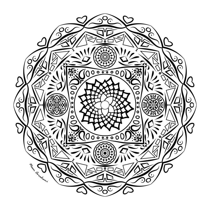
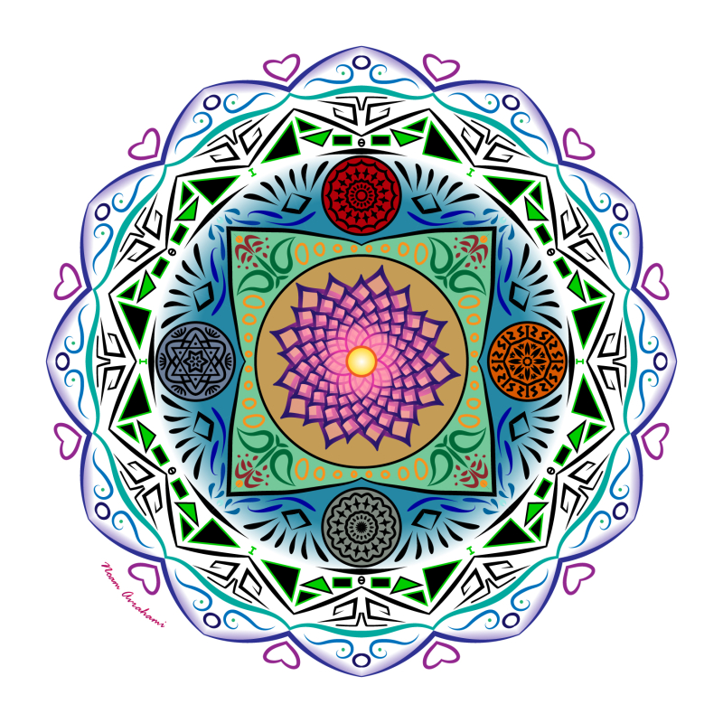
Here’s what I had to say when I made my mandala:
I didn’t know much about mandalas beyond coloring book images. When I learned we were creating our own, I wanted to do them ‘justice’, which led to a lot of ironically shallow research. My mandala served as an opportunity for me to examine different layers of my character, and I made it from the outside inwards as I delved deeper into myself.
I found that many mandalas feature palaces in the center for a concept or deity they represent. This inspired me to use a similar form of a square among the concentric circles and stars. I then filled the rest of the space in that layer with four different mini-mandalas representing 4 different factors that have impacted my way of thought. The central flower is a blend of my silly and technical sides (my two outer layers), as I learned about petal distribution in a fun and glorious math video in elementary school.
My colored mandala is an extension of my black and white design. First I chose colors for my mini-mandalas, which I completely filled since the details were small. I also chose a lush green for the square, keeping in mind what saturation would overpower other parts. The dots and flowers in the square were then colored for contrast.
The central flower was adorned with both a gradient and translucency. As the layers overlap, this adds depth and dimension, as well as a general pop form the color choice.
To prevent the outer layers from feeling heavy, I opted for colored strokes instead of fills. I used a rainbow for the frills on the outside, while a sharp green and black make contrast on the next layer. Since the inside was filled and the outside colored on the strokes, I applied a radial gradient with white on the outside. This transition created a satisfyingly cohesive product despite the different methods of color.
All together, my mandala is a landscape of my motivations and the ways they manifest themselves in my character. I had to tone back some details, especially in my mini-mandalas, but I’m proud of how all my layers—with their different numbers of segments—are cohesive together.
Mandala Engraving
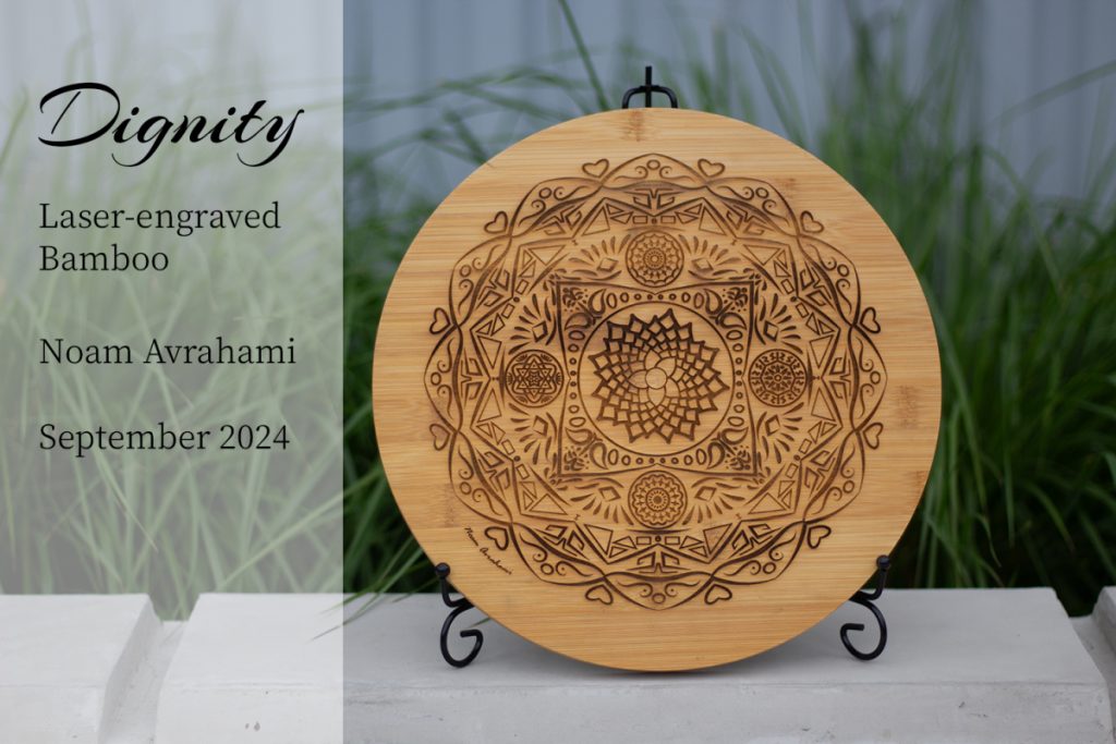
We also got a physical final product: my mandala engraved on a material of my choice! Mine was bamboo because it felt like the right balance between something natural and something manufactured. Here’s a video of it being engraved. I would use a laser cutter when I was in middle school, so it was exciting to see one in action again!
Here’s my final physical product.
Mandala Reveal Video
A big part of dignity is letting go. Can my dignity withstand being presented alongside circus music? I tried this contrast out in the last thing I made for this project: a video showing the steps to make the mandala. Layer by layer, I unveiled the whole image, and in Adobe After Effects, I set it to some music along with a title scene. This was my first time using the program ever, so it was interesting to see how much that it can control. And this video doesn’t even scratch the surface; we’ve already learned so much more! But in the meantime, enjoy my reveal video:
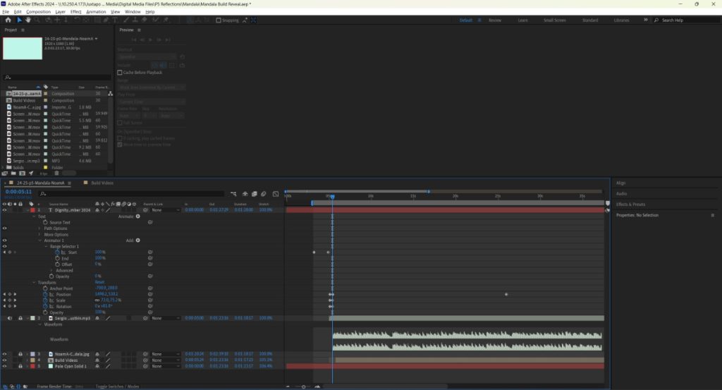
Behind the Scenes: Mandala Reveal
Below is also a picture of my workspace. As you can see, I had the waveform up for the music to try and sync the images at least somewhat to it. It was hard since I had recorded large chunks using a screen recorder. You can also see different text layers for my title, music, and background. There’s also another tab called “Build Videos” because pre-composition is After Effects’ way to put things into one layer, and I had multiple screen captures that I wanted to combine.
I really appreciated how much detail I was able to put in, to express myself more symbolically and less broadly. It was a great introduction to the Digital Media class as a first year senior, I got to use many tools right from the get go!
Core Values Video
Based on our English exercise of finding our own core values, we practiced text effects in Adobe After Effects by narrating out our core values and writing them out on screen. My narrowed down list ended up different from my original collection from English. Since the values in the video lack explanation, I chose words I thought would give a better picture of me with their brevity. It was entertaining trying to fittingly match values to different types of animations and fonts.