Summer Collage
As our introductory assignment in Design we made a surrealist collage in Photoshop by compositing images together. This was set to tell the story of what we did over the summer break. However, since this was my first project ever in Design, I had reduced requirements and was instead given requirements for elements to put in, such as a car or a house. Still, I wanted to put in elements from my summer.
My focal point pretty quickly became a house that was in a bubble of gum. The task was then constantly removing distractions. I set it large like a celestial body in the sky.
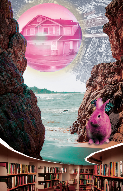
At the bottom is a picture of a library because over the summer we went to a librarians’ convention. The effect I wanted with everything rising out of it didn’t work, and instead it distracts from the rest of the composition, which is regretful. I wasn’t able to move everything else down, though, due to some of the pictures I used being cut off. If I were to do it again, I’d either make the whole thing smaller, or try to find another way to deal with the top of the cliffs being cut off.
PSA
The PSA was a chance to act on an issue that’s important to me. I biked to school for 4 years, and was always disappointed when kids would bike without helmets—even when they had e-bikes that could go twice as fast as me. I started by finding inspiration of imagery I wanted put them all on this mood board. This was a place I could reference other PSAs, icons, fonts, and slogans that I could pull from to make my own PSA. I wanted to connect the concept of a bike helmet to a seat belt in a car, so I took from both for the moodboard.
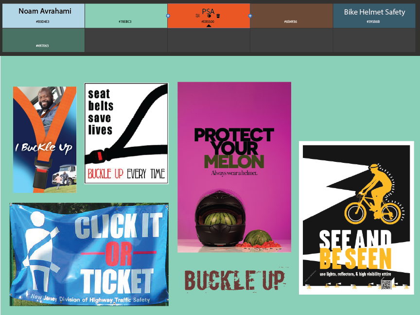
I then created my actual PSA using Adobe Illustrator. With a bold, complementary color scheme, I traced over images with the pen tool for a clean vector look. This ended up being one of my favorite projects and products.

This PSA, which advocates for wearing bicycle helmets, features a red bicycle helmet, which takes up the top 80% of the board, set to contrast on a sky blue background with a faint cyan tire track. Because I want to emphasize how much safer one is wearing a helmet, I’ve replaced the buckle on the straps of the helmet with a typical seat belt buckle from a car and positioned the helmet so that the straps will fall at an angle resembling a seat belt. This PSA is aimed at young cyclists at my school who don’t wear a helmet. As a cyclist myself, it worries me how undervalued helmets are. Because it’s more widely accepted that seat belts are crucial to safety and required by law, I’m looking to liken the two in their eyes. At the bottom is my tagline: “Buckle Up”.
Using Adobe Illustrator, I found reference images of a helmet and a seat belt and hand-traced them with the pen tool to create new vector paths. I then adjusted rotation and size, then added shading for depth. It was a challenge to convincingly add highlights and shadows for the illusion of depth and lighting. Over many iterations, I adjusted the position and thickness of the light and dark parts (some of which I ended up switching), and while it isn’t the same as the reference image, I am pleased with how I got my helmet to look round.
Aboriginal-Style Dot Painting
This project in Design was a compositional challenge that allowed us to think about visual representations of our identities. Based on Aboriginal cave paintings from Australia, we were supposed to look at our spiritual selves by drawing animals and other symbols using dots. We used symbols commonly found in the source material, as well as our spirit animals and our zodiac signs. I chose the snake, and then worked it into the design of my Pisces zodiac for some flair that felt more personal. I found it difficult trying to have contrast and direct focus to the center with the earthy color scheme, and drawing the dots was time consuming (even digitally), but I’m satisfied with the result.

The centerpiece of my Aboriginal dot painting is my zodiac constellation, Pisces: two fish tied together by a string. Except my Pisces is not tied by a string, it’s tied by a snake. The fish each bear the Pisces symbol, and each lies over a body of water, which by closing off the center, represent how my parents were born overseas. I decided to represent myself with the snake tying the fish. One reason is that the first glyph in my name, N, is in the likeness of a snake, originally one in the Proto-Sinaitic script before the letter evolved into what it is today. The snake is also linked with the Black Tortoise in Chinese astrology, together representing the part of the sky where part of Pisces is found, and conveniently also the water element. The snake in my art is wrapped around the fish, but perhaps without the tortoise the subject is left incomplete.
I started by sketching where the centerpiece and water would be. I chose colors based on Jerusalem stone. Using pictures of a burial cave I had been to in Israel, I could make realistic choices on pigments, even if the cave art wasn’t in the style we were replicating. Initially, the distance part was going to be represented with footprints extending the fish, but I had to scrap this because I was struggling to differentiate between the fish and the snake. Eventually, after iterating many variations, it was suggested I make the fish much bigger. I had to rearrange many of the dots in the water around the fish to prevent overlap, and the fish took up enough space that there was no more room for footprints. Still, I’m proud of the interplay between the fish and the water.