Product Project
In Design class, we worked on creating a product and advertising it. We made a logo, a label, and a magazine ad.
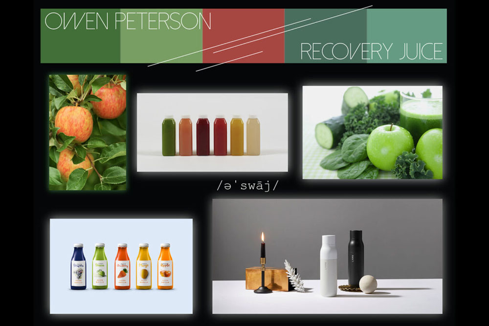
Moodboard
Logo
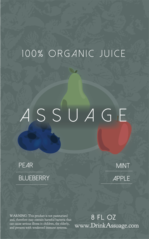
Label
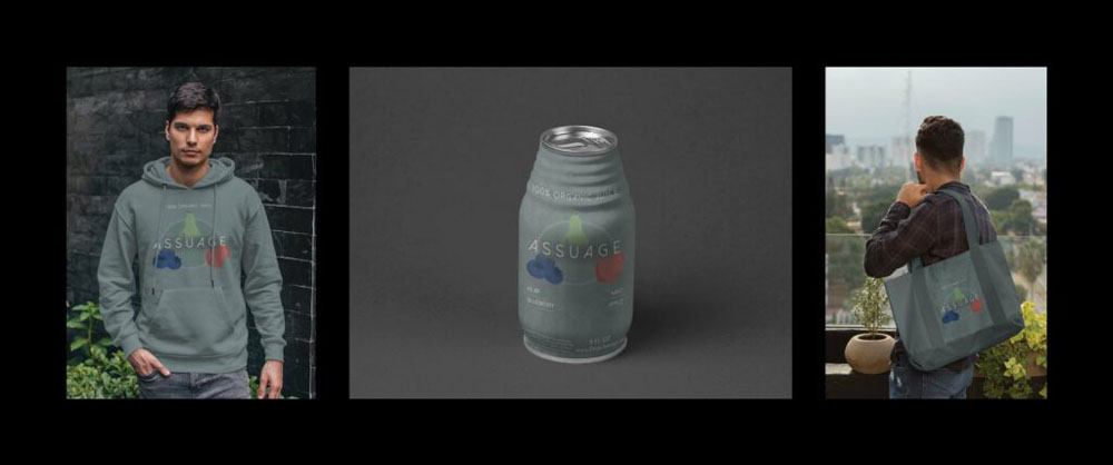
Tryptic
Artist Statement
My product is a juice that is made from apples, pears, blueberries, and mint. It is marketed towards those who aren’t afraid to spend a little more money on an exquisite taste bud experience. It is a glorified fruit juice that is known for its health benefits and great taste. If you are looking for a juice that stands on top of all other juices and isn’t afraid to be a bold health staple while keeping a pleasant taste, Assuage is for you.
In order to persuade my audience to buy this beverage, I would work to convince the reader that they need it for their own health. The use of health benefits facts of each of the fruits that Assuage is made of will help the reader understand why it is highly recommended to have Assuage as a part of their daily diet. Also, the clean, modern logo design catches the eye and makes the product easy to approach.
The company Assuage wasn’t based on any other company, the way I created it was by sketching some logo designs and then creating my favorite one in Illustrator. Once I had finished that, I created ovals in the back of the logo to bring symmetry to it, and put a shadow behind the word “Assuage” in order to make it readable. For the label, I went to Placeit to look for juice cans, and picked out one that I thought was unique and stood out. I then used that logo for the label of the can, adding the ingredients and website below it, and specifying that it is “100% Organic Juice” at the top of it. One issue that I ran into was that the label looked too repetitive with the font, so I ended up making some phrases bolder than others to make them stand out. I also used another font for the website and the warning at the bottom of the can.
Movie Poster
Artist Statement
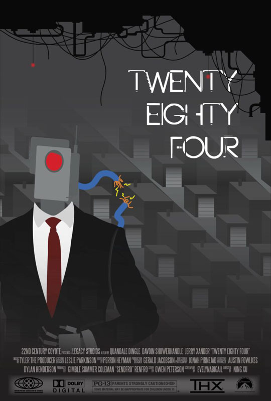
Twenty Eighty Four is a movie about a government that was overthrown by robots, causing a dystopian society to arise and humans to be at the mercy of these robots. Robots cannot understand the freedom and need for interesting situations that humans desire, and force them into a repetitive style of living with no freedom. These robots were made with the goal of being a consistent and reliable government, but it backfires and creates tyranny.
In order to create my movie poster, I found some inspiration pictures of cookie cutter neighborhoods to use for the background, and a picture of a robot in a suit for the foreground. I went into Illustrator and made my own house design, copy and pasting it into rows of them. I put a gradient over them to show that it is the background, and then drew the robot over them. After that, it still looked a little empty so I created the pipes and broken wires hanging down from the roof that cover the title a bit. For the credits block, I put the exported image into Photoshop and placed the block on top of that.
Reflection
I really loved this unit in Design for the freedom of our projects. Similar to English, we were able to make our own project with relatively little instruction, so it helped fuel creativity.